'%3e%3cpath%20fill-rule='evenodd'%20clip-rule='evenodd'%20d='M51.1303%2019.2492C50.7278%2019.913%2050.1346%2020.4426%2049.3508%2020.838C48.5669%2021.2335%2047.6172%2021.4312%2046.5014%2021.4312C44.8208%2021.4312%2043.4367%2021.0216%2042.3492%2020.2025C41.2617%2019.3833%2040.6686%2018.2394%2040.5697%2016.7706H44.4253C44.4818%2017.3355%2044.6831%2017.7804%2045.0291%2018.1052C45.3751%2018.43%2045.8164%2018.5924%2046.3531%2018.5924C46.8192%2018.5924%2047.1864%2018.4653%2047.4547%2018.2111C47.7231%2017.9569%2047.8572%2017.618%2047.8572%2017.1943C47.8572%2016.8129%2047.7337%2016.4952%2047.4865%2016.241C47.2393%2015.9867%2046.9322%2015.7784%2046.565%2015.616C46.1978%2015.4536%2045.6893%2015.2594%2045.0397%2015.0334C44.0934%2014.7086%2043.3202%2014.3944%2042.72%2014.0907C42.1197%2013.7871%2041.6042%2013.3351%2041.1735%2012.7349C40.7427%2012.1347%2040.5273%2011.3544%2040.5273%2010.394C40.5273%209.50418%2040.7533%208.73448%2041.2053%208.08481C41.6572%207.43515%2042.2821%206.93731%2043.0801%206.5913C43.8781%206.24528%2044.7925%206.07227%2045.8235%206.07227C47.49%206.07227%2048.8141%206.46771%2049.7956%207.25861C50.7772%208.04951%2051.3315%209.13698%2051.4586%2010.5211H47.5395C47.4689%2010.0268%2047.2888%209.63483%2046.9993%209.3453C46.7097%209.05578%2046.3178%208.91102%2045.8235%208.91102C45.3998%208.91102%2045.0573%209.024%2044.7961%209.24997C44.5348%209.47594%2044.4041%209.80783%2044.4041%2010.2457C44.4041%2010.5988%2044.5207%2010.8989%2044.7537%2011.146C44.9867%2011.3932%2045.2798%2011.5944%2045.6328%2011.7498C45.9859%2011.9052%2046.4944%2012.1029%2047.1581%2012.343C48.1185%2012.6678%2048.9023%2012.9891%2049.5096%2013.3069C50.1169%2013.6246%2050.6395%2014.0872%2051.0773%2014.6945C51.5151%2015.3018%2051.734%2016.0927%2051.734%2017.0672C51.734%2017.8581%2051.5328%2018.5854%2051.1303%2019.2492ZM59.0242%206.3053V21.2829H55.4016V6.3053H59.0242ZM73.9409%206.3053V9.18642H69.8734V21.2829H66.2296V9.18642H62.2046V6.3053H73.9409ZM80.7438%209.18642V12.3218H85.8069V15.0546H80.7438V18.3806H86.4425V21.2829H77.1212V6.3053H86.4425V9.18642H80.7438ZM99.667%2016.0291V21.2829H96.0444V6.3053H101.913C103.692%206.3053%20105.048%206.74665%20105.98%207.62934C106.912%208.51204%20107.378%209.7019%20107.378%2011.199C107.378%2012.1311%20107.17%2012.9609%20106.753%2013.6882C106.337%2014.4155%20105.719%2014.9875%20104.9%2015.4042C104.08%2015.8208%20103.085%2016.0291%20101.913%2016.0291H99.667ZM103.692%2011.199C103.692%209.8855%20102.965%209.22879%20101.51%209.22879H99.667V13.1268H101.51C102.965%2013.1268%20103.692%2012.4842%20103.692%2011.199ZM120.092%2018.5501H114.478L113.546%2021.2829H109.732L115.219%206.41123H119.393L124.879%2021.2829H121.024L120.092%2018.5501ZM119.16%2015.7961L117.295%2010.2881L115.41%2015.7961H119.16ZM131.555%2018.5077H136.385V21.2829H127.933V6.3053H131.555V18.5077ZM143.337%209.18642V12.3218H148.4V15.0546H143.337V18.3806H149.035V21.2829H139.714V6.3053H149.035V9.18642H143.337ZM163.507%206.3053V9.18642H159.44V21.2829H155.796V9.18642H151.771V6.3053H163.507ZM177.449%206.3053V9.18642H173.382V21.2829H169.738V9.18642H165.713V6.3053H177.449ZM184.252%209.18642V12.3218H189.315V15.0546H184.252V18.3806H189.951V21.2829H180.629V6.3053H189.951V9.18642H184.252Z'%20fill='%23EEF0ED'/%3e%3cmask%20id='mask0_3101_7327'%20style='mask-type:alpha'%20maskUnits='userSpaceOnUse'%20x='0'%20y='0'%20width='27'%20height='28'%3e%3cpath%20d='M23.8328%200.759766H2.64808C1.18559%200.759766%200%201.94535%200%203.40785V24.5925C0%2026.055%201.18559%2027.2406%202.64808%2027.2406H23.8328C25.2952%2027.2406%2026.4808%2026.055%2026.4808%2024.5925V3.40785C26.4808%201.94535%2025.2952%200.759766%2023.8328%200.759766Z'%20fill='white'/%3e%3c/mask%3e%3cg%20mask='url(%23mask0_3101_7327)'%3e%3cpath%20d='M23.8328%200.759766H2.64808C1.18559%200.759766%200%201.94535%200%203.40785V24.5925C0%2026.055%201.18559%2027.2406%202.64808%2027.2406H23.8328C25.2952%2027.2406%2026.4808%2026.055%2026.4808%2024.5925V3.40785C26.4808%201.94535%2025.2952%200.759766%2023.8328%200.759766Z'%20fill='%23D8D8D8'/%3e%3cpath%20d='M13.2404%200.759766H0V14.0001H13.2404V0.759766Z'%20fill='%238C61FF'/%3e%3cpath%20d='M13.2404%2014H0V27.2404H13.2404V14Z'%20fill='%2336C3FE'/%3e%3cpath%20d='M26.4806%2014H13.2402V27.2404H26.4806V14Z'%20fill='%236592FE'/%3e%3cpath%20d='M26.4806%200.759766H13.2402V14.0002H26.4806V0.759766Z'%20fill='%236059F7'/%3e%3c/g%3e%3c/g%3e%3cdefs%3e%3cclipPath%20id='clip0_3101_7327'%3e%3crect%20width='190'%20height='28'%20fill='white'/%3e%3c/clipPath%3e%3c/defs%3e%3c/svg%3e)
'%3e%3cpath%20d='M23.8328%200.759521H2.64808C1.18559%200.759521%200%201.94511%200%203.40761V24.5923C0%2026.0548%201.18559%2027.2404%202.64808%2027.2404H23.8328C25.2952%2027.2404%2026.4808%2026.0548%2026.4808%2024.5923V3.40761C26.4808%201.94511%2025.2952%200.759521%2023.8328%200.759521Z'%20fill='%23D8D8D8'/%3e%3cpath%20d='M13.2404%200.759521H0V13.9999H13.2404V0.759521Z'%20fill='%238C61FF'/%3e%3cpath%20d='M13.2404%2013.9998H0V27.2402H13.2404V13.9998Z'%20fill='%2336C3FE'/%3e%3cpath%20d='M26.4809%2013.9998H13.2405V27.2402H26.4809V13.9998Z'%20fill='%236592FE'/%3e%3cpath%20d='M26.4809%200.759277H13.2405V13.9997H26.4809V0.759277Z'%20fill='%236059F7'/%3e%3c/g%3e%3c/svg%3e)
Modern Kitchen Color Palettes for High-End Productivity
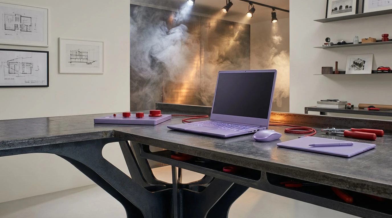
· 5 min readStep into the prep zone of Paris or Copenhagen's top restaurants and notice the immediate spatial logic. Matte steel counters meet industrial extraction hoods, creating a stark, temperature-controlled environment designed strictly for high-velocity output. We are seeing industrial designers map this exact material psychology onto software design and focus-grade physical workstations. Replacing standard corporate blues with brushed metals and soft botanical purples brings a highly specific culinary tension to the studio desk. This is about stripping away visual noise and leaving only what matters. A cold, industrial foundation anchors the eye, while faint floral or botanical brights act as plating accents—small, deliberate hits of color that guide attention exactly where it needs to go without disrupting the rigorous mental workflow required to get things done.
Sous Vide Prep 🔪
Sous Vide Prep borrows its temperature from the back-of-house finishing station, anchoring productivity in high-contrast extremes. Midnight Carbon and Cast Iron establish a heavy, unyielding foundation reminiscent of professional-grade stovetops and matte equipment. Across this dark base, Glazed Porcelain cuts sharply, providing the sterile, wiped-down clarity needed for reading dense data blocks or organizing schedules. The true architectural trick happens with the accents. Raw Wagyu introduces an immediate, visceral punch of urgency, driving the eye toward critical action items or alerts. Meanwhile, Crushed Sage sits quietly in the background, a nod to fresh herbs resting on a cold steel block, offering just enough organic softness to prevent the interface from feeling entirely mechanical. This approach structures virtual environments just like a well-organized prep line, prioritizing speed, readability, and immediate visual feedback.
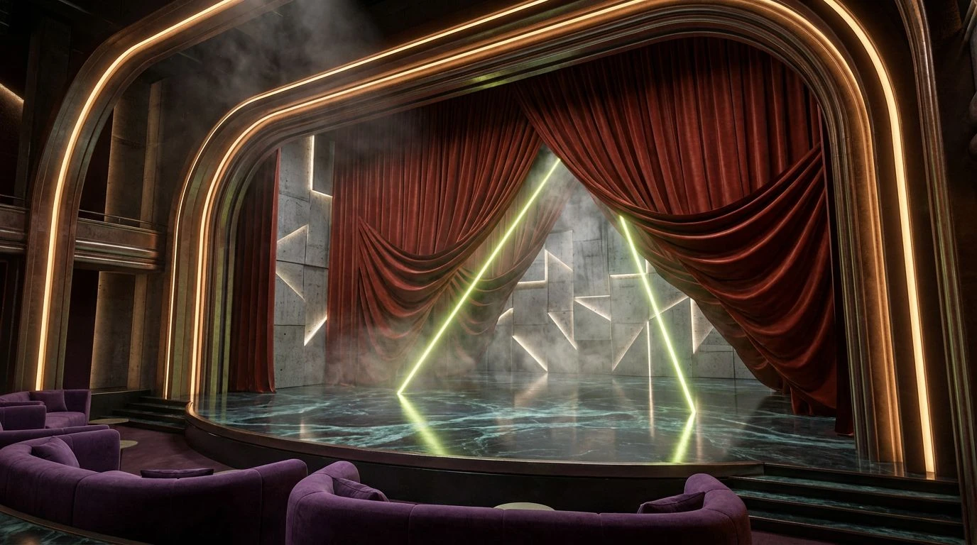
Anodized Lavender 🎛️
Operating exactly on the brief of mixing culinary efficiency with studio aesthetics, Anodized Lavender sets a distinctly cool, metallic stage. Brushed Slate and Aluminum Finish mimic the expansive, scratch-resistant work surfaces found in demanding gastronomy sectors, building a wide-open spatial layout for focus-heavy software. Clean Floursack keeps the negative space breathable, while Matted Charcoal draws borders and grid lines with absolute precision. The breakout move is the introduction of Midnight Violet. Instead of the typical primary colors used for software notifications, this rich, muted purple acts like an unexpected flavor profile. It catches the user's attention with a sophisticated, botanical sharpness that feels highly modern. The resulting layout feels chilled, calculating, and exceptionally calm, providing a workspace that completely avoids visual fatigue while maintaining a hyper-organized, professional-grade atmosphere tailored for continuous pacing.
Service Line Pass 🥘
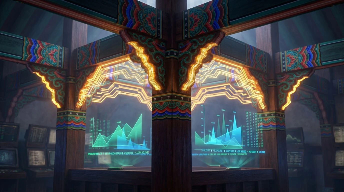
The Service Line Pass arrangement pulls its visual weight from the active cooking zones of a professional galley, translating thermal energy into user interface priorities. Burner Grate and Worn Steel build a durable, industrial-looking wireframe, grounding the user in an environment that feels ready for heavy traffic and rapid inputs. At the top level of the visual hierarchy, Smoked Paprika and Confit Oil function as the crucial warning signals and progression markers. These appetite-inducing tones grab attention effortlessly against the otherwise desaturated background, mimicking the way hot spices and reductions stand out against metal pans. Plating Bone serves as the primary canvas, notably warmer than stark white, reducing screen glare during long hours of deep work. Searing Smoke spans the gap between the dark structural elements and the bright focal points, ensuring that transitioning your gaze across different modules feels smooth and calculated.
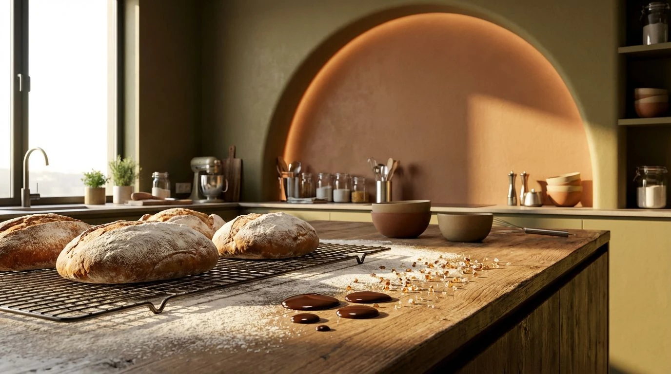
Michelin Pantry 🌿
Shifting the focus toward raw ingredients stored in temperature-regulated bins, Michelin Pantry is deeply rooted in earth and metal. Pitch Black and Polished Zinc deliver that requisite cold-studio baseline, stripping away any unnecessary decoration to leave a highly functional grid. Scratched Counter sits right in the middle value, absorbing light and acting as a muted background for secondary tools and sidebars. Against these flat greys, the accent profile brings an intense, specialized hunger response. Reduction Glaze, Ground Turmeric, and Foraged Moss present as highly concentrated organic pigments, the kind you expect to see dotted onto a plate with tweezers. Applied to productivity tools, these deeply saturated tones organize data chronologically or by importance without resorting to cheap neon indicators. The result is an application or physical desk setup that feels distinctly premium, balancing the clinical nature of high-end gastronomy with the grounded reality of raw culinary provisions.
Cold Storage Logistics 🧊
Cold Storage Logistics steps away from the heat of the pans and moves into the meticulously organized, climate-controlled walk-in freezers where precision rules. Fridge Matte provides a solid, light-absorbing base, while Iced Ceramic offers a sprawling, hyper-clean surface for main content areas. Intersecting these extremes, Frost Vapor and Liquid Nitrogen inject a distinctly freezing thermal quality into the workspace. These sharp blue tones communicate pristine sanitation and exact mathematical measurements, perfect for structuring complicated spreadsheets or timeline blocks. To interrupt the overwhelming chill, Roasted Bean and Tempered Brass serve as navigational anchors, adding touches of warmth that guide the user back to the primary menus or critical alerts. Mushroom Spore acts as a neutral binding agent, softening the harsh edges of the bright blues. This specific arrangement keeps the user alert and highly focused, drawing on the sharp, bracing air of a professional cool room to maximize daily output.
Approaching workspace aesthetics through the lens of gastronomy fundamentally alters how we interact with our daily tasks. By lifting the exact material properties of blast chillers, stainless prep tables, and precise botanical garnishes, designers can strip away the sluggish, uninspired feel of standard utilitarian software. The resulting desk setups and application interfaces carry a distinct temperature and weight, forcing a posture of readiness. Introducing unexpected organic tones like muted purples or concentrated reduction reds into heavy metallic environments proves that functional does not have to mean boring. Treating digital real estate with the exact same rigor that a head chef applies to a service line guarantees a workspace built strictly for speed, clarity, and uncompromising professional output.