'%3e%3cpath%20fill-rule='evenodd'%20clip-rule='evenodd'%20d='M51.1303%2019.2492C50.7278%2019.913%2050.1346%2020.4426%2049.3508%2020.838C48.5669%2021.2335%2047.6172%2021.4312%2046.5014%2021.4312C44.8208%2021.4312%2043.4367%2021.0216%2042.3492%2020.2025C41.2617%2019.3833%2040.6686%2018.2394%2040.5697%2016.7706H44.4253C44.4818%2017.3355%2044.6831%2017.7804%2045.0291%2018.1052C45.3751%2018.43%2045.8164%2018.5924%2046.3531%2018.5924C46.8192%2018.5924%2047.1864%2018.4653%2047.4547%2018.2111C47.7231%2017.9569%2047.8572%2017.618%2047.8572%2017.1943C47.8572%2016.8129%2047.7337%2016.4952%2047.4865%2016.241C47.2393%2015.9867%2046.9322%2015.7784%2046.565%2015.616C46.1978%2015.4536%2045.6893%2015.2594%2045.0397%2015.0334C44.0934%2014.7086%2043.3202%2014.3944%2042.72%2014.0907C42.1197%2013.7871%2041.6042%2013.3351%2041.1735%2012.7349C40.7427%2012.1347%2040.5273%2011.3544%2040.5273%2010.394C40.5273%209.50418%2040.7533%208.73448%2041.2053%208.08481C41.6572%207.43515%2042.2821%206.93731%2043.0801%206.5913C43.8781%206.24528%2044.7925%206.07227%2045.8235%206.07227C47.49%206.07227%2048.8141%206.46771%2049.7956%207.25861C50.7772%208.04951%2051.3315%209.13698%2051.4586%2010.5211H47.5395C47.4689%2010.0268%2047.2888%209.63483%2046.9993%209.3453C46.7097%209.05578%2046.3178%208.91102%2045.8235%208.91102C45.3998%208.91102%2045.0573%209.024%2044.7961%209.24997C44.5348%209.47594%2044.4041%209.80783%2044.4041%2010.2457C44.4041%2010.5988%2044.5207%2010.8989%2044.7537%2011.146C44.9867%2011.3932%2045.2798%2011.5944%2045.6328%2011.7498C45.9859%2011.9052%2046.4944%2012.1029%2047.1581%2012.343C48.1185%2012.6678%2048.9023%2012.9891%2049.5096%2013.3069C50.1169%2013.6246%2050.6395%2014.0872%2051.0773%2014.6945C51.5151%2015.3018%2051.734%2016.0927%2051.734%2017.0672C51.734%2017.8581%2051.5328%2018.5854%2051.1303%2019.2492ZM59.0242%206.3053V21.2829H55.4016V6.3053H59.0242ZM73.9409%206.3053V9.18642H69.8734V21.2829H66.2296V9.18642H62.2046V6.3053H73.9409ZM80.7438%209.18642V12.3218H85.8069V15.0546H80.7438V18.3806H86.4425V21.2829H77.1212V6.3053H86.4425V9.18642H80.7438ZM99.667%2016.0291V21.2829H96.0444V6.3053H101.913C103.692%206.3053%20105.048%206.74665%20105.98%207.62934C106.912%208.51204%20107.378%209.7019%20107.378%2011.199C107.378%2012.1311%20107.17%2012.9609%20106.753%2013.6882C106.337%2014.4155%20105.719%2014.9875%20104.9%2015.4042C104.08%2015.8208%20103.085%2016.0291%20101.913%2016.0291H99.667ZM103.692%2011.199C103.692%209.8855%20102.965%209.22879%20101.51%209.22879H99.667V13.1268H101.51C102.965%2013.1268%20103.692%2012.4842%20103.692%2011.199ZM120.092%2018.5501H114.478L113.546%2021.2829H109.732L115.219%206.41123H119.393L124.879%2021.2829H121.024L120.092%2018.5501ZM119.16%2015.7961L117.295%2010.2881L115.41%2015.7961H119.16ZM131.555%2018.5077H136.385V21.2829H127.933V6.3053H131.555V18.5077ZM143.337%209.18642V12.3218H148.4V15.0546H143.337V18.3806H149.035V21.2829H139.714V6.3053H149.035V9.18642H143.337ZM163.507%206.3053V9.18642H159.44V21.2829H155.796V9.18642H151.771V6.3053H163.507ZM177.449%206.3053V9.18642H173.382V21.2829H169.738V9.18642H165.713V6.3053H177.449ZM184.252%209.18642V12.3218H189.315V15.0546H184.252V18.3806H189.951V21.2829H180.629V6.3053H189.951V9.18642H184.252Z'%20fill='%23EEF0ED'/%3e%3cmask%20id='mask0_3101_7327'%20style='mask-type:alpha'%20maskUnits='userSpaceOnUse'%20x='0'%20y='0'%20width='27'%20height='28'%3e%3cpath%20d='M23.8328%200.759766H2.64808C1.18559%200.759766%200%201.94535%200%203.40785V24.5925C0%2026.055%201.18559%2027.2406%202.64808%2027.2406H23.8328C25.2952%2027.2406%2026.4808%2026.055%2026.4808%2024.5925V3.40785C26.4808%201.94535%2025.2952%200.759766%2023.8328%200.759766Z'%20fill='white'/%3e%3c/mask%3e%3cg%20mask='url(%23mask0_3101_7327)'%3e%3cpath%20d='M23.8328%200.759766H2.64808C1.18559%200.759766%200%201.94535%200%203.40785V24.5925C0%2026.055%201.18559%2027.2406%202.64808%2027.2406H23.8328C25.2952%2027.2406%2026.4808%2026.055%2026.4808%2024.5925V3.40785C26.4808%201.94535%2025.2952%200.759766%2023.8328%200.759766Z'%20fill='%23D8D8D8'/%3e%3cpath%20d='M13.2404%200.759766H0V14.0001H13.2404V0.759766Z'%20fill='%238C61FF'/%3e%3cpath%20d='M13.2404%2014H0V27.2404H13.2404V14Z'%20fill='%2336C3FE'/%3e%3cpath%20d='M26.4806%2014H13.2402V27.2404H26.4806V14Z'%20fill='%236592FE'/%3e%3cpath%20d='M26.4806%200.759766H13.2402V14.0002H26.4806V0.759766Z'%20fill='%236059F7'/%3e%3c/g%3e%3c/g%3e%3cdefs%3e%3cclipPath%20id='clip0_3101_7327'%3e%3crect%20width='190'%20height='28'%20fill='white'/%3e%3c/clipPath%3e%3c/defs%3e%3c/svg%3e)
'%3e%3cpath%20d='M23.8328%200.759521H2.64808C1.18559%200.759521%200%201.94511%200%203.40761V24.5923C0%2026.0548%201.18559%2027.2404%202.64808%2027.2404H23.8328C25.2952%2027.2404%2026.4808%2026.0548%2026.4808%2024.5923V3.40761C26.4808%201.94511%2025.2952%200.759521%2023.8328%200.759521Z'%20fill='%23D8D8D8'/%3e%3cpath%20d='M13.2404%200.759521H0V13.9999H13.2404V0.759521Z'%20fill='%238C61FF'/%3e%3cpath%20d='M13.2404%2013.9998H0V27.2402H13.2404V13.9998Z'%20fill='%2336C3FE'/%3e%3cpath%20d='M26.4809%2013.9998H13.2405V27.2402H26.4809V13.9998Z'%20fill='%236592FE'/%3e%3cpath%20d='M26.4809%200.759277H13.2405V13.9997H26.4809V0.759277Z'%20fill='%236059F7'/%3e%3c/g%3e%3c/svg%3e)
7 Intense Sky Blue Color Palettes for High-Energy Design
· 5 min readSky blue is famously known as the ultimate naptime color. Think wellness retreats, baby blankets, and gentle breezes. But for a 2025 extreme sports brand, that softness is entirely fatal. To make sky blue punch hard, it needs a brutal reality check. This entire approach comes down to the tiny details that make sky blue feel more like adrenaline and less like a spa. It is all about stripping away those tranquil associations and replacing them with stark blacks, jarring neons, and grounding royal blues. Suddenly, that pale tint is no longer a calming breath of air. It becomes the terrifyingly vast expanse you see right before pulling a ripcord on a steep drop. The right context turns a passive shade into pure kinetic force.
Basejump Rush 🪂
The trick to pulling sky blue out of the wellness aisle is giving it something to fight against. Within Basejump Rush, the airy quality of Aero Blue collides violently with Safety Orange and Pitch Drop. That sharp collision turns the pale shade from a gentle breeze into the sheer panic of an open sky. We see this working beautifully in high-end mountain gear where Stratosphere Main and Altitude Wash ground the wilder shades in a deeply technical reality. The Ripcord Yellow flashes like a warning label against the muted purples and blacks. When laid out on a physical product, the stark divide between those cold blues and aggressive safety tones gives the entire identity a visual tension that reads as pure, unadulterated speed.
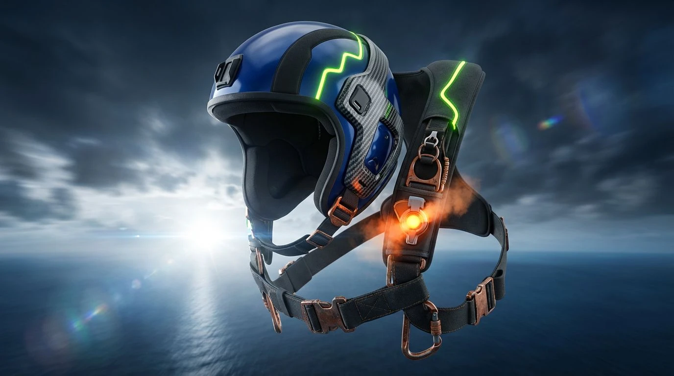
Highline Vertigo 🧗
Highline Vertigo takes the traditional outdoor palette and forces it into a hyper-modern context. Here, Glacial Sky sits dangerously close to Deep Mariana and Abyssal Navy, turning what could be a peaceful sea into a bottomless drop. The trick is deploying Neon Carabiner just sparingly enough to jolt the eye. This optic shock is exactly what flips the pale sky tone, making it read as freezing, thin air rather than a calm spring morning. Across 2025 lifestyle platforms, pairing Sun Bleach with Chalk Dust creates a rugged, weathered canvas. Hitting that canvas with sharp, icy blues completely shifts the mood. It feels like clinging to a sheer rock face, where you realize looking up that the sky is intimidating rather than comforting.
Concrete Surfing 🛹
Street sports demand a visual language built on pavement and motion. Concrete Surfing achieves this by letting Asphalt and Ramp Grey do the heavy lifting, anchoring the brighter tones in a gritty urban reality. When Grip Tape White slashes across Warning Yellow, it mimics the painted stripes of a restricted city zone. This is where Vert Air Blue becomes weaponized. Flanked by Kickflip Green and Royal Velocity, the lighter blue sheds all its soft associations. One of the tiny details that make sky blue feel more like adrenaline and less like a spa is placing it directly against harsh, industrial contrasts. The resulting visual hits fast, looking exactly like the scratched underside of a heavily used skateboard kicking up into the glare of the sun.
Drift Overdrive 🏎️
For a design to scream absolute velocity, it relies on the unforgiving nature of industrial machinery. Drift Overdrive builds its foundation on Burnout Smoke and Steel Fender, acting as the grease and grime of the track. Brake Light Red introduces an immediate sense of danger, flashing against the dullness of Oxidized Gold. Placing Cyan Flash within this gritty environment is a very calculated move. The bright blue acts like a spark of electricity shooting across Exhaust Haze instead of a relaxing pool of water. Supported by the deep, serious tone of Track Royal and the intermediary Slipstream Blue, the vibrant cyan feels almost synthetic and hyper-real. This arrangement captures the chaotic blur of burning rubber and nighttime racetrack floodlights perfectly.
Kiteboard Kinesis 🪁
Oceanic sports gear falls easily into the trap of looking too recreational, but Kiteboard Kinesis avoids that entirely by leaning into an aggressive stance. Neoprene Black and Carbon Fiber firmly establish a technical, equipment-first aesthetic. Alongside the industrial weight of Rust Trim, the brighter colors have to work overtime to register in the viewer's eye. That is exactly why Acid Lime and Caution Flare look incredibly kinetic here. Windward Blue becomes a slicing highlight against the crushing pressure of Ocean Trench. This setup forces the sky blue to act like a sharp blade cutting through churning water. The visual impact is loud, highly visible in bad weather, and deeply rooted in the chaotic reality of high-wind water sports.
Flipping a notoriously tranquil color entirely on its head is a brilliant exercise in visual psychology. These palettes prove that no hue operates in a vacuum, especially when designing for extreme environments. A pale blue only stays peaceful until you smash it into blinding neons, heavy asphalts, and bottomless navies. The addition of deep royal blue grounds the lighter tones, giving them the gravity and seriousness required for high-risk lifestyles. By borrowing the visual cues of warning signs, industrial metals, and harsh weather conditions, a brand can totally overwrite our basic color associations. The outcome is a distinct visual vocabulary for 2025 that makes you feel the sudden rush of cold air and sharp gravity simply by looking at a screen.