'%3e%3cpath%20fill-rule='evenodd'%20clip-rule='evenodd'%20d='M51.1303%2019.2492C50.7278%2019.913%2050.1346%2020.4426%2049.3508%2020.838C48.5669%2021.2335%2047.6172%2021.4312%2046.5014%2021.4312C44.8208%2021.4312%2043.4367%2021.0216%2042.3492%2020.2025C41.2617%2019.3833%2040.6686%2018.2394%2040.5697%2016.7706H44.4253C44.4818%2017.3355%2044.6831%2017.7804%2045.0291%2018.1052C45.3751%2018.43%2045.8164%2018.5924%2046.3531%2018.5924C46.8192%2018.5924%2047.1864%2018.4653%2047.4547%2018.2111C47.7231%2017.9569%2047.8572%2017.618%2047.8572%2017.1943C47.8572%2016.8129%2047.7337%2016.4952%2047.4865%2016.241C47.2393%2015.9867%2046.9322%2015.7784%2046.565%2015.616C46.1978%2015.4536%2045.6893%2015.2594%2045.0397%2015.0334C44.0934%2014.7086%2043.3202%2014.3944%2042.72%2014.0907C42.1197%2013.7871%2041.6042%2013.3351%2041.1735%2012.7349C40.7427%2012.1347%2040.5273%2011.3544%2040.5273%2010.394C40.5273%209.50418%2040.7533%208.73448%2041.2053%208.08481C41.6572%207.43515%2042.2821%206.93731%2043.0801%206.5913C43.8781%206.24528%2044.7925%206.07227%2045.8235%206.07227C47.49%206.07227%2048.8141%206.46771%2049.7956%207.25861C50.7772%208.04951%2051.3315%209.13698%2051.4586%2010.5211H47.5395C47.4689%2010.0268%2047.2888%209.63483%2046.9993%209.3453C46.7097%209.05578%2046.3178%208.91102%2045.8235%208.91102C45.3998%208.91102%2045.0573%209.024%2044.7961%209.24997C44.5348%209.47594%2044.4041%209.80783%2044.4041%2010.2457C44.4041%2010.5988%2044.5207%2010.8989%2044.7537%2011.146C44.9867%2011.3932%2045.2798%2011.5944%2045.6328%2011.7498C45.9859%2011.9052%2046.4944%2012.1029%2047.1581%2012.343C48.1185%2012.6678%2048.9023%2012.9891%2049.5096%2013.3069C50.1169%2013.6246%2050.6395%2014.0872%2051.0773%2014.6945C51.5151%2015.3018%2051.734%2016.0927%2051.734%2017.0672C51.734%2017.8581%2051.5328%2018.5854%2051.1303%2019.2492ZM59.0242%206.3053V21.2829H55.4016V6.3053H59.0242ZM73.9409%206.3053V9.18642H69.8734V21.2829H66.2296V9.18642H62.2046V6.3053H73.9409ZM80.7438%209.18642V12.3218H85.8069V15.0546H80.7438V18.3806H86.4425V21.2829H77.1212V6.3053H86.4425V9.18642H80.7438ZM99.667%2016.0291V21.2829H96.0444V6.3053H101.913C103.692%206.3053%20105.048%206.74665%20105.98%207.62934C106.912%208.51204%20107.378%209.7019%20107.378%2011.199C107.378%2012.1311%20107.17%2012.9609%20106.753%2013.6882C106.337%2014.4155%20105.719%2014.9875%20104.9%2015.4042C104.08%2015.8208%20103.085%2016.0291%20101.913%2016.0291H99.667ZM103.692%2011.199C103.692%209.8855%20102.965%209.22879%20101.51%209.22879H99.667V13.1268H101.51C102.965%2013.1268%20103.692%2012.4842%20103.692%2011.199ZM120.092%2018.5501H114.478L113.546%2021.2829H109.732L115.219%206.41123H119.393L124.879%2021.2829H121.024L120.092%2018.5501ZM119.16%2015.7961L117.295%2010.2881L115.41%2015.7961H119.16ZM131.555%2018.5077H136.385V21.2829H127.933V6.3053H131.555V18.5077ZM143.337%209.18642V12.3218H148.4V15.0546H143.337V18.3806H149.035V21.2829H139.714V6.3053H149.035V9.18642H143.337ZM163.507%206.3053V9.18642H159.44V21.2829H155.796V9.18642H151.771V6.3053H163.507ZM177.449%206.3053V9.18642H173.382V21.2829H169.738V9.18642H165.713V6.3053H177.449ZM184.252%209.18642V12.3218H189.315V15.0546H184.252V18.3806H189.951V21.2829H180.629V6.3053H189.951V9.18642H184.252Z'%20fill='%23EEF0ED'/%3e%3cmask%20id='mask0_3101_7327'%20style='mask-type:alpha'%20maskUnits='userSpaceOnUse'%20x='0'%20y='0'%20width='27'%20height='28'%3e%3cpath%20d='M23.8328%200.759766H2.64808C1.18559%200.759766%200%201.94535%200%203.40785V24.5925C0%2026.055%201.18559%2027.2406%202.64808%2027.2406H23.8328C25.2952%2027.2406%2026.4808%2026.055%2026.4808%2024.5925V3.40785C26.4808%201.94535%2025.2952%200.759766%2023.8328%200.759766Z'%20fill='white'/%3e%3c/mask%3e%3cg%20mask='url(%23mask0_3101_7327)'%3e%3cpath%20d='M23.8328%200.759766H2.64808C1.18559%200.759766%200%201.94535%200%203.40785V24.5925C0%2026.055%201.18559%2027.2406%202.64808%2027.2406H23.8328C25.2952%2027.2406%2026.4808%2026.055%2026.4808%2024.5925V3.40785C26.4808%201.94535%2025.2952%200.759766%2023.8328%200.759766Z'%20fill='%23D8D8D8'/%3e%3cpath%20d='M13.2404%200.759766H0V14.0001H13.2404V0.759766Z'%20fill='%238C61FF'/%3e%3cpath%20d='M13.2404%2014H0V27.2404H13.2404V14Z'%20fill='%2336C3FE'/%3e%3cpath%20d='M26.4806%2014H13.2402V27.2404H26.4806V14Z'%20fill='%236592FE'/%3e%3cpath%20d='M26.4806%200.759766H13.2402V14.0002H26.4806V0.759766Z'%20fill='%236059F7'/%3e%3c/g%3e%3c/g%3e%3cdefs%3e%3cclipPath%20id='clip0_3101_7327'%3e%3crect%20width='190'%20height='28'%20fill='white'/%3e%3c/clipPath%3e%3c/defs%3e%3c/svg%3e)
'%3e%3cpath%20d='M23.8328%200.759521H2.64808C1.18559%200.759521%200%201.94511%200%203.40761V24.5923C0%2026.0548%201.18559%2027.2404%202.64808%2027.2404H23.8328C25.2952%2027.2404%2026.4808%2026.0548%2026.4808%2024.5923V3.40761C26.4808%201.94511%2025.2952%200.759521%2023.8328%200.759521Z'%20fill='%23D8D8D8'/%3e%3cpath%20d='M13.2404%200.759521H0V13.9999H13.2404V0.759521Z'%20fill='%238C61FF'/%3e%3cpath%20d='M13.2404%2013.9998H0V27.2402H13.2404V13.9998Z'%20fill='%2336C3FE'/%3e%3cpath%20d='M26.4809%2013.9998H13.2405V27.2402H26.4809V13.9998Z'%20fill='%236592FE'/%3e%3cpath%20d='M26.4809%200.759277H13.2405V13.9997H26.4809V0.759277Z'%20fill='%236059F7'/%3e%3c/g%3e%3c/svg%3e)
Neon Color Palettes: Bold Design for Modern Accountants
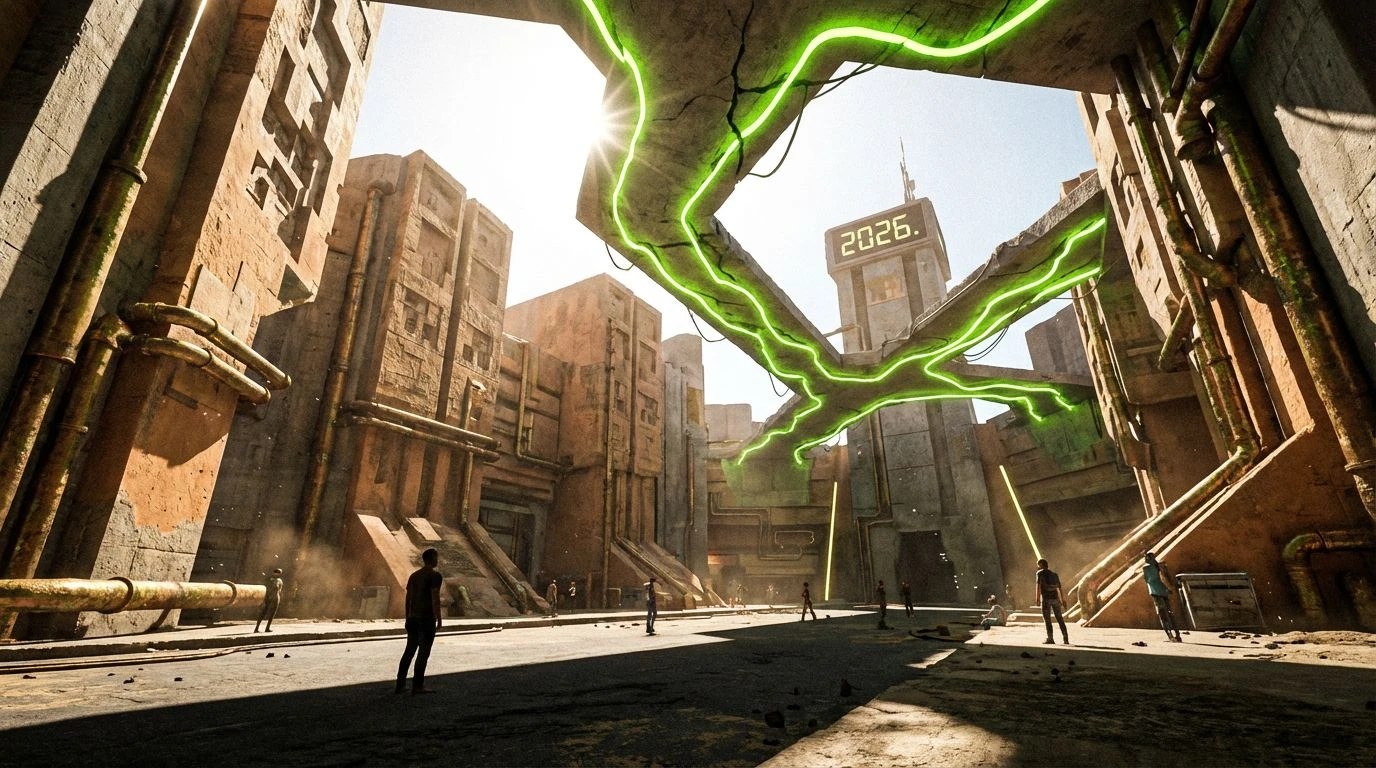
· 6 min readFor decades, the visual language of industrial accounting has been trapped inside a polite hostage situation of beige walls and muted navy spreadsheets. To the traditional corporate sensibility, electricity in color is treated as a suspicious error, a wild variable threatening the sober grid of margins and outputs. Yet, burying data in a tomb of graphite and cream does nothing but put the viewer to sleep. The rigid structures of technical professionalism desperately need a shock to the system, something akin to the high-contrast glow of a midnight street in Shibuya cutting through dense urban smog. When we inject the unapologetic rush of electric greens against deep, institutional charcoals, we drag corporate interfaces out of the filing cabinet and into the living, breathing modern age. The grid does not have to be a cage; with the right aggressive lighting, it becomes an architecture of pure, unashamed energy.
Midnight Ledger 🏮
Midnight Ledger reimagines the sterile spreadsheet as an alleyway soaked in rain and artificial light. Using Graphite Slumber as its heavy, immovable foundation, it grounds the layout in the familiar safety of corporate authority, while Industrial Fog sweeps in the texture of raw concrete and aluminum trim. But the sudden strike of Neon Wasabi disrupts all expectations of conservative accounting. This piercing tone acts as a highlighter, dragging the eye directly to critical margins and deficits with the urgency of a flickering storefront sign. Paired with Matcha Shock and resting on the airy, almost clinical Fluorescent Alabaster, the overall effect transforms a dreary database into a high-stakes dashboard. It tells the user that tracking industrial output does not have to feel like a slow march toward retirement. Instead, the interface becomes loud, demanding immediate attention without sacrificing the structural rigidity required for serious financial labor.
Grid Shinjuku 🚦
Grid Shinjuku embraces the harsh, unyielding reality of city streets at two in the morning, where shadows swallow corners but artificial brilliance keeps the mind painfully awake. Deep Asphalt dominates the background, creating an expansive void that feels deliberately intimidating, the kind of vast dark space a serious analyst respects. Punctuating this heavy darkness is Tarnished Copper, a nod to old pipework and aging corporate infrastructure, stubbornly refusing to fade. Against this industrial decay, Radioactive Mint and Streetlight Venom flash with blinding precision. These aggressive greens refuse to be ignored, violently organizing data points, active modules, and positive cash flow indicators. Supported by the neutral quiet of Steel Overcast, the layout pushes back against typical office exhaustion. The contrast is deliberately abrasive, forcing a sleepy professional to engage with their metrics as if they were navigating a bustling, crowded intersection on foot rather than staring at a monitor in an empty cubicle.
Cybernetic Audit 🔋
Cybernetic Audit plays a clever game with tradition by starting on what looks like a classic, unassuming backdrop of Bleached Paper and Matte Carbon. These two shades establish a crisp, strictly disciplined frame, satisfying the most pedantic demands of corporate oversight. Alongside them, Military Khaki introduces a utilitarian drabness, reminiscent of filing boxes and old uniform regulations. Just as the viewer settles into a state of docile boredom, Acid Yuzu and Electric Flora shatter the illusion. These intensely sour, vibrating shades hijack the layout, injecting the chaotic rush of a late-night street food market directly into the user experience. By confining these loud bursts specifically to interactive elements and critical alerts, the design creates tension between the austere authority of traditional bookkeeping and a distinctly modern, hyper-alert visual culture. It tells the financial planner that precision is essential, but absolute silence is a choice they are no longer forced to make.
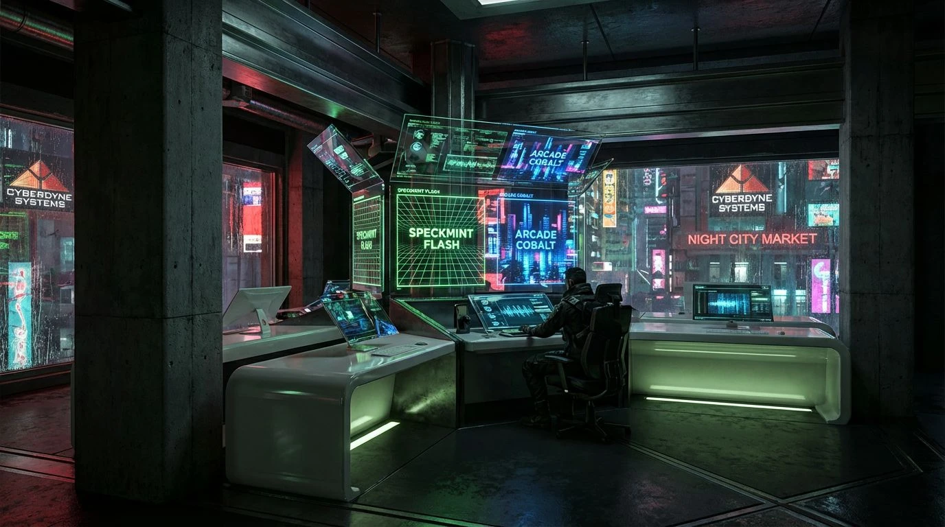
Urban Terminal 🚇
Urban Terminal reads less like a financial platform and more like the control screen of a high-speed transit line. Midnight Pitch and Stark Porcelain construct an unforgiving, high-contrast container, presenting numbers and tables with stark clarity. Concrete Pillar softens the blow just enough to prevent eye strain, holding the structural grid in place. The true character of this scheme reveals itself through the aggressive accents. Spearmint Flash acts as a jolt of pure oxygen, zipping across the screen to signal growth or task completion, while Dark Moss retains just enough natural grounding to keep the layout feeling professional. Unexpectedly, Arcade Cobalt drops in, a brilliant pulse of cool light that separates secondary commands from primary financial flows. The entire interaction feels entirely divorced from traditional ledger keeping, dragging the dusty profession into a futuristic space where tracking inventory and analyzing expenditures feels as urgent and electric as catching the last bullet train out of the metropolis.
Fiscal Voltage ⚡
Fiscal Voltage openly mocks the idea that financial systems must be timid and self-effacing. Iron Void, Morning Fog, and Pavement Ash lay down a foundation of unapologetic concrete realism, treating the interface like a newly constructed office block ready for occupation. Against this brutally grey backdrop, Hazard Lemon screams for attention. This is not a color for polite suggestions; it is a blaring siren dedicated to highlighting critical discrepancies or urgent fiscal deadlines. Beside it, Battery Acid and Subway Tile Green create a layered, acidic hierarchy for positive trends, their toxic vibrancy cutting straight through the visual noise of complicated spreadsheets. This color strategy entirely rejects the polite, country-club aesthetics of old Wall Street software in favor of an aggressively modern, streetwear-inspired alertness. It demands that the individuals crunching the numbers remain wide awake, pushing their focus into overdrive through sheer retinal shock, completely redefining what serious work is supposed to look like.
The insistence that serious financial labor requires an equally depressing visual environment is an archaic rule entirely detached from how modern users process information. By stripping away the timid pastels and lifeless greys of traditional corporate design, we make room for a radically awake aesthetic. Aggressive greens and deep charcoals do much more than just look interesting; they act as a visual combat mechanism against office fatigue, turning data management into a highly active pursuit. This approach recognizes that the spaces where we calculate and forecast should not resemble quiet waiting rooms, but rather the bustling, neon-drenched cityscapes where global commerce actually transpires. Letting go of the safe, institutional past allows the profession to finally look as sharp, unforgiving, and vibrant as the numbers it commands.