'%3e%3cpath%20fill-rule='evenodd'%20clip-rule='evenodd'%20d='M51.1303%2019.2492C50.7278%2019.913%2050.1346%2020.4426%2049.3508%2020.838C48.5669%2021.2335%2047.6172%2021.4312%2046.5014%2021.4312C44.8208%2021.4312%2043.4367%2021.0216%2042.3492%2020.2025C41.2617%2019.3833%2040.6686%2018.2394%2040.5697%2016.7706H44.4253C44.4818%2017.3355%2044.6831%2017.7804%2045.0291%2018.1052C45.3751%2018.43%2045.8164%2018.5924%2046.3531%2018.5924C46.8192%2018.5924%2047.1864%2018.4653%2047.4547%2018.2111C47.7231%2017.9569%2047.8572%2017.618%2047.8572%2017.1943C47.8572%2016.8129%2047.7337%2016.4952%2047.4865%2016.241C47.2393%2015.9867%2046.9322%2015.7784%2046.565%2015.616C46.1978%2015.4536%2045.6893%2015.2594%2045.0397%2015.0334C44.0934%2014.7086%2043.3202%2014.3944%2042.72%2014.0907C42.1197%2013.7871%2041.6042%2013.3351%2041.1735%2012.7349C40.7427%2012.1347%2040.5273%2011.3544%2040.5273%2010.394C40.5273%209.50418%2040.7533%208.73448%2041.2053%208.08481C41.6572%207.43515%2042.2821%206.93731%2043.0801%206.5913C43.8781%206.24528%2044.7925%206.07227%2045.8235%206.07227C47.49%206.07227%2048.8141%206.46771%2049.7956%207.25861C50.7772%208.04951%2051.3315%209.13698%2051.4586%2010.5211H47.5395C47.4689%2010.0268%2047.2888%209.63483%2046.9993%209.3453C46.7097%209.05578%2046.3178%208.91102%2045.8235%208.91102C45.3998%208.91102%2045.0573%209.024%2044.7961%209.24997C44.5348%209.47594%2044.4041%209.80783%2044.4041%2010.2457C44.4041%2010.5988%2044.5207%2010.8989%2044.7537%2011.146C44.9867%2011.3932%2045.2798%2011.5944%2045.6328%2011.7498C45.9859%2011.9052%2046.4944%2012.1029%2047.1581%2012.343C48.1185%2012.6678%2048.9023%2012.9891%2049.5096%2013.3069C50.1169%2013.6246%2050.6395%2014.0872%2051.0773%2014.6945C51.5151%2015.3018%2051.734%2016.0927%2051.734%2017.0672C51.734%2017.8581%2051.5328%2018.5854%2051.1303%2019.2492ZM59.0242%206.3053V21.2829H55.4016V6.3053H59.0242ZM73.9409%206.3053V9.18642H69.8734V21.2829H66.2296V9.18642H62.2046V6.3053H73.9409ZM80.7438%209.18642V12.3218H85.8069V15.0546H80.7438V18.3806H86.4425V21.2829H77.1212V6.3053H86.4425V9.18642H80.7438ZM99.667%2016.0291V21.2829H96.0444V6.3053H101.913C103.692%206.3053%20105.048%206.74665%20105.98%207.62934C106.912%208.51204%20107.378%209.7019%20107.378%2011.199C107.378%2012.1311%20107.17%2012.9609%20106.753%2013.6882C106.337%2014.4155%20105.719%2014.9875%20104.9%2015.4042C104.08%2015.8208%20103.085%2016.0291%20101.913%2016.0291H99.667ZM103.692%2011.199C103.692%209.8855%20102.965%209.22879%20101.51%209.22879H99.667V13.1268H101.51C102.965%2013.1268%20103.692%2012.4842%20103.692%2011.199ZM120.092%2018.5501H114.478L113.546%2021.2829H109.732L115.219%206.41123H119.393L124.879%2021.2829H121.024L120.092%2018.5501ZM119.16%2015.7961L117.295%2010.2881L115.41%2015.7961H119.16ZM131.555%2018.5077H136.385V21.2829H127.933V6.3053H131.555V18.5077ZM143.337%209.18642V12.3218H148.4V15.0546H143.337V18.3806H149.035V21.2829H139.714V6.3053H149.035V9.18642H143.337ZM163.507%206.3053V9.18642H159.44V21.2829H155.796V9.18642H151.771V6.3053H163.507ZM177.449%206.3053V9.18642H173.382V21.2829H169.738V9.18642H165.713V6.3053H177.449ZM184.252%209.18642V12.3218H189.315V15.0546H184.252V18.3806H189.951V21.2829H180.629V6.3053H189.951V9.18642H184.252Z'%20fill='%23EEF0ED'/%3e%3cmask%20id='mask0_3101_7327'%20style='mask-type:alpha'%20maskUnits='userSpaceOnUse'%20x='0'%20y='0'%20width='27'%20height='28'%3e%3cpath%20d='M23.8328%200.759766H2.64808C1.18559%200.759766%200%201.94535%200%203.40785V24.5925C0%2026.055%201.18559%2027.2406%202.64808%2027.2406H23.8328C25.2952%2027.2406%2026.4808%2026.055%2026.4808%2024.5925V3.40785C26.4808%201.94535%2025.2952%200.759766%2023.8328%200.759766Z'%20fill='white'/%3e%3c/mask%3e%3cg%20mask='url(%23mask0_3101_7327)'%3e%3cpath%20d='M23.8328%200.759766H2.64808C1.18559%200.759766%200%201.94535%200%203.40785V24.5925C0%2026.055%201.18559%2027.2406%202.64808%2027.2406H23.8328C25.2952%2027.2406%2026.4808%2026.055%2026.4808%2024.5925V3.40785C26.4808%201.94535%2025.2952%200.759766%2023.8328%200.759766Z'%20fill='%23D8D8D8'/%3e%3cpath%20d='M13.2404%200.759766H0V14.0001H13.2404V0.759766Z'%20fill='%238C61FF'/%3e%3cpath%20d='M13.2404%2014H0V27.2404H13.2404V14Z'%20fill='%2336C3FE'/%3e%3cpath%20d='M26.4806%2014H13.2402V27.2404H26.4806V14Z'%20fill='%236592FE'/%3e%3cpath%20d='M26.4806%200.759766H13.2402V14.0002H26.4806V0.759766Z'%20fill='%236059F7'/%3e%3c/g%3e%3c/g%3e%3cdefs%3e%3cclipPath%20id='clip0_3101_7327'%3e%3crect%20width='190'%20height='28'%20fill='white'/%3e%3c/clipPath%3e%3c/defs%3e%3c/svg%3e)
'%3e%3cpath%20d='M23.8328%200.759521H2.64808C1.18559%200.759521%200%201.94511%200%203.40761V24.5923C0%2026.0548%201.18559%2027.2404%202.64808%2027.2404H23.8328C25.2952%2027.2404%2026.4808%2026.0548%2026.4808%2024.5923V3.40761C26.4808%201.94511%2025.2952%200.759521%2023.8328%200.759521Z'%20fill='%23D8D8D8'/%3e%3cpath%20d='M13.2404%200.759521H0V13.9999H13.2404V0.759521Z'%20fill='%238C61FF'/%3e%3cpath%20d='M13.2404%2013.9998H0V27.2402H13.2404V13.9998Z'%20fill='%2336C3FE'/%3e%3cpath%20d='M26.4809%2013.9998H13.2405V27.2402H26.4809V13.9998Z'%20fill='%236592FE'/%3e%3cpath%20d='M26.4809%200.759277H13.2405V13.9997H26.4809V0.759277Z'%20fill='%236059F7'/%3e%3c/g%3e%3c/svg%3e)
Hyperpop Color Palettes: The New Era of Data UI Design
· 4 min readHuman visual perception prioritizes high-contrast, high-energy stimuli as an evolutionary trait originally tuned for spotting predators and ripe fruit within complex environments. Today, cognitive psychology intersects with software design, stripping away muted, conventional spreadsheets and replacing them with hyper-stimulating interfaces. By adopting the aggressive, over-stimulated aesthetic of electronic dance music and its internet-born offshoots, modern analytics platforms actively manipulate attentional capture. These intensely vibrant interfaces exploit sensory processing mechanisms, treating data points not as static numbers, but as rhythmic, flashing signals that command immediate cognitive processing and mimic the neurological rush of a sudden beat drop.
Ultraviolet Overdrive 🎧
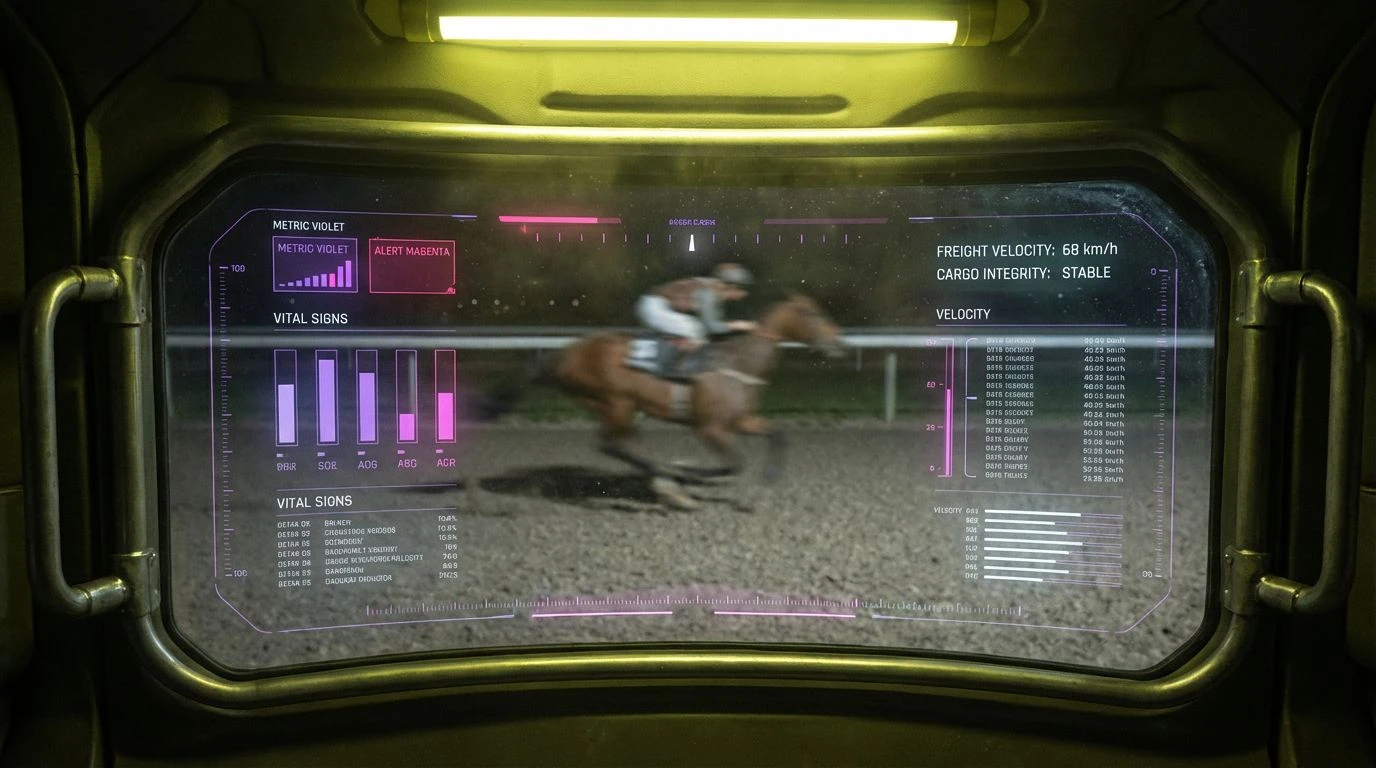
When examining Ultraviolet Overdrive, the progression from Cobalt Pulse to Signal Red demonstrates a calculated manipulation of visual pathways. The human eye processes shorter wavelengths like Ultraviolet Wash and Electric Violet as receding background elements, creating a deep spatial void on a digital monitor. Against this vast Midnight Sensor backdrop, longer wavelengths jump forward with physical immediacy. Plasmic Magenta and Neon Pink Noise act as visual sirens, activating peripheral vision and directing immediate focus toward critical server errors or sudden traffic spikes. This deliberate wavelength scaling transforms a passive monitoring experience into an active, adrenalized state, mimicking the sensory overload of an electronic music festival while accelerating an analyst's reaction time to critical system alerts.
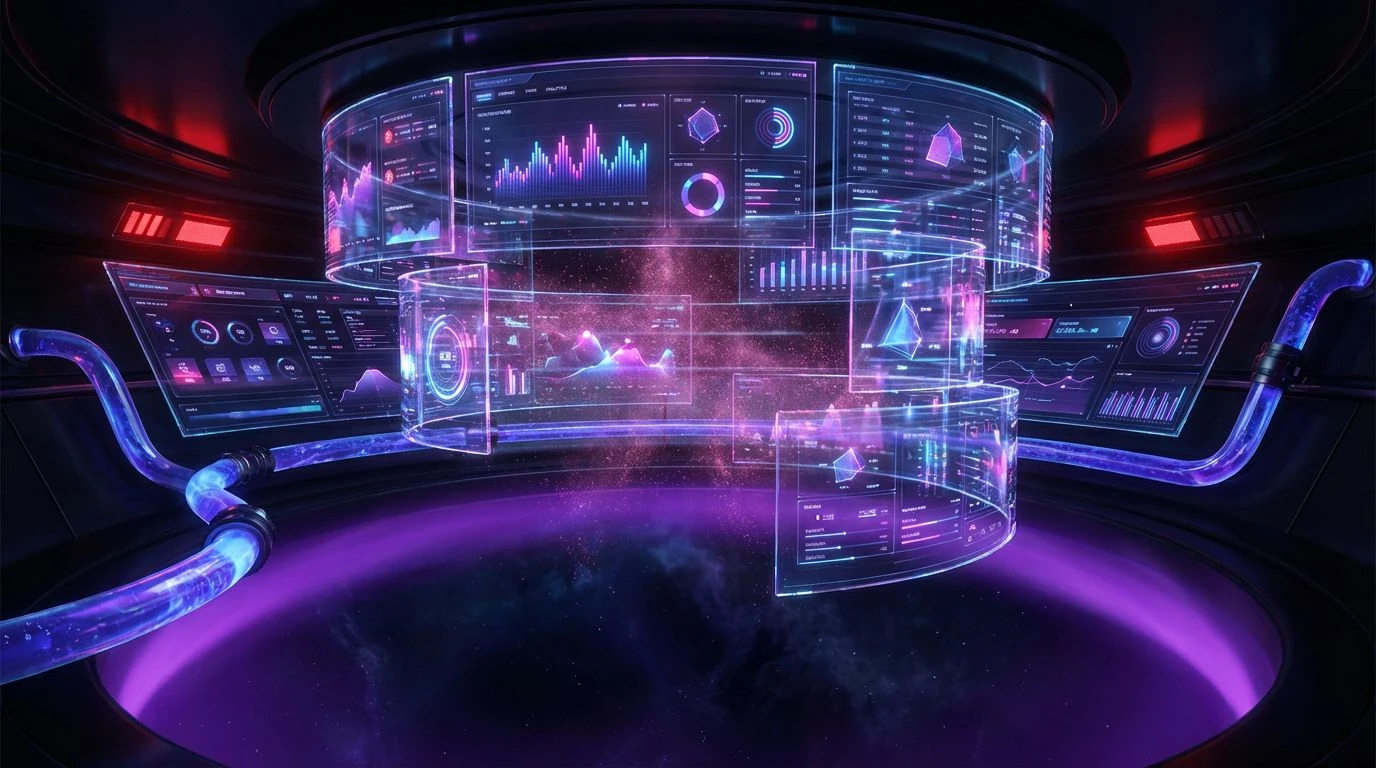
Synaptic Bassline 🎛️
Synaptic Bassline relies on simultaneous color contrast, an optical phenomenon where colors situated opposite each other on the color wheel intensify one another. Placing Kinetic Lime adjacent to Deep Fader Magenta forces the visual cortex into a state of rapid oscillation, creating a flickering effect along the borders of the shapes. This chromatic friction prevents sensory adaptation, meaning the observer never quite gets comfortable staring at a static dashboard. Instead, Ozone Glow and Violet Frequency act as momentary resting points for the optic nerve before another burst of Hyperactive Pink demands renewed attention. Designing a data environment with this level of optical vibration ensures that performance metrics remain highly conspicuous, forcing users to process metric shifts with the same involuntary alertness required when navigating a strobe-lit room.
Algorithmic Rhythm 🔋
In the realm of perceptual psychology, the signal-to-noise ratio determines how efficiently an organism extracts meaningful information from its environment. Algorithmic Rhythm masters this ratio through extreme luminance contrast. By sinking the interface into a Vantablack Void and framing it with Carbon Shadow, the environment aggressively suppresses visual noise. When a data anomaly occurs, it flashes in Toxic Volt or Phosphor Green, striking the retina with maximum luminosity. The inclusion of Static Lilac and Glaring White introduces secondary hierarchical markers, allowing complex datasets to be parsed instantaneously. This stark methodology borrows directly from nightclub stage lighting, where complete darkness frames isolated bursts of intense light, radically reducing cognitive load while making specific structural metrics impossible to ignore.
Kinetic Frequencies ⚡
Form and pattern recognition occur much faster when the brain can group stimuli by color proximity. Kinetic Frequencies exploits this cognitive shortcut by utilizing a tightly packed band of cool temperatures, ranging from Cyan Aura to Electric Azure and Deep Sea Bass. These cool tones establish a baseline rhythmic structure for complex data streams, allowing the visual machinery to quickly filter routine server activity. Once this baseline is established, the sudden introduction of Acid Lime or Ultraviolet Shock visually ruptures the pattern, acting exactly like an unexpected auditory glitch in an experimental electronic track. The jarring contrast generated by Mint Glitch placed against Optical White forces an almost physical reaction, compelling the user to immediately investigate the visual disturbance within the otherwise flowing data architecture.
Monolithic Strobe 📟
Monolithic Strobe investigates the psychology of minimal stimulation punctuated by absolute intensity. A large portion of an analyst's cognitive energy is often wasted scanning cluttered, low-contrast fields. By constructing an interface primarily from neutral, non-arousing tones like Graphite Plate and Aluminum Casing, the visual system is allowed to rest in a low-energy state across the Obsidian Server background. This strategic desensitization magnifies the impact of Synthetic Lime and Chlorophyll Spike. Because the photoreceptors are not fatigued by constant chromatic bombardment, these sudden neon flashes trigger instant feature detection pathways in the brain. The Halogen White serves as a crisp delineator, sharpening the edges of graphical models. It proves that extreme visual energy does not require constant volume; it requires deliberate, tightly controlled bursts.
The science of visual perception reveals that replacing muted, traditional software designs with aggressively saturated, high-contrast interfaces profoundly alters human-computer interaction. By treating data dashboards as rhythmic, sensory-rich environments rather than passive documents, these color strategies hijack the brain's innate mechanism for detecting motion and light anomalies. Cognitive engagement remains artificially high, delaying fatigue and accelerating reaction times toward critical metrics. Ultimately, borrowing the visual intensity of experimental dance music forces neurological pathways to treat abstract data points with the exact same urgency as physical, environmental stimuli.