'%3e%3cpath%20fill-rule='evenodd'%20clip-rule='evenodd'%20d='M51.1303%2019.2492C50.7278%2019.913%2050.1346%2020.4426%2049.3508%2020.838C48.5669%2021.2335%2047.6172%2021.4312%2046.5014%2021.4312C44.8208%2021.4312%2043.4367%2021.0216%2042.3492%2020.2025C41.2617%2019.3833%2040.6686%2018.2394%2040.5697%2016.7706H44.4253C44.4818%2017.3355%2044.6831%2017.7804%2045.0291%2018.1052C45.3751%2018.43%2045.8164%2018.5924%2046.3531%2018.5924C46.8192%2018.5924%2047.1864%2018.4653%2047.4547%2018.2111C47.7231%2017.9569%2047.8572%2017.618%2047.8572%2017.1943C47.8572%2016.8129%2047.7337%2016.4952%2047.4865%2016.241C47.2393%2015.9867%2046.9322%2015.7784%2046.565%2015.616C46.1978%2015.4536%2045.6893%2015.2594%2045.0397%2015.0334C44.0934%2014.7086%2043.3202%2014.3944%2042.72%2014.0907C42.1197%2013.7871%2041.6042%2013.3351%2041.1735%2012.7349C40.7427%2012.1347%2040.5273%2011.3544%2040.5273%2010.394C40.5273%209.50418%2040.7533%208.73448%2041.2053%208.08481C41.6572%207.43515%2042.2821%206.93731%2043.0801%206.5913C43.8781%206.24528%2044.7925%206.07227%2045.8235%206.07227C47.49%206.07227%2048.8141%206.46771%2049.7956%207.25861C50.7772%208.04951%2051.3315%209.13698%2051.4586%2010.5211H47.5395C47.4689%2010.0268%2047.2888%209.63483%2046.9993%209.3453C46.7097%209.05578%2046.3178%208.91102%2045.8235%208.91102C45.3998%208.91102%2045.0573%209.024%2044.7961%209.24997C44.5348%209.47594%2044.4041%209.80783%2044.4041%2010.2457C44.4041%2010.5988%2044.5207%2010.8989%2044.7537%2011.146C44.9867%2011.3932%2045.2798%2011.5944%2045.6328%2011.7498C45.9859%2011.9052%2046.4944%2012.1029%2047.1581%2012.343C48.1185%2012.6678%2048.9023%2012.9891%2049.5096%2013.3069C50.1169%2013.6246%2050.6395%2014.0872%2051.0773%2014.6945C51.5151%2015.3018%2051.734%2016.0927%2051.734%2017.0672C51.734%2017.8581%2051.5328%2018.5854%2051.1303%2019.2492ZM59.0242%206.3053V21.2829H55.4016V6.3053H59.0242ZM73.9409%206.3053V9.18642H69.8734V21.2829H66.2296V9.18642H62.2046V6.3053H73.9409ZM80.7438%209.18642V12.3218H85.8069V15.0546H80.7438V18.3806H86.4425V21.2829H77.1212V6.3053H86.4425V9.18642H80.7438ZM99.667%2016.0291V21.2829H96.0444V6.3053H101.913C103.692%206.3053%20105.048%206.74665%20105.98%207.62934C106.912%208.51204%20107.378%209.7019%20107.378%2011.199C107.378%2012.1311%20107.17%2012.9609%20106.753%2013.6882C106.337%2014.4155%20105.719%2014.9875%20104.9%2015.4042C104.08%2015.8208%20103.085%2016.0291%20101.913%2016.0291H99.667ZM103.692%2011.199C103.692%209.8855%20102.965%209.22879%20101.51%209.22879H99.667V13.1268H101.51C102.965%2013.1268%20103.692%2012.4842%20103.692%2011.199ZM120.092%2018.5501H114.478L113.546%2021.2829H109.732L115.219%206.41123H119.393L124.879%2021.2829H121.024L120.092%2018.5501ZM119.16%2015.7961L117.295%2010.2881L115.41%2015.7961H119.16ZM131.555%2018.5077H136.385V21.2829H127.933V6.3053H131.555V18.5077ZM143.337%209.18642V12.3218H148.4V15.0546H143.337V18.3806H149.035V21.2829H139.714V6.3053H149.035V9.18642H143.337ZM163.507%206.3053V9.18642H159.44V21.2829H155.796V9.18642H151.771V6.3053H163.507ZM177.449%206.3053V9.18642H173.382V21.2829H169.738V9.18642H165.713V6.3053H177.449ZM184.252%209.18642V12.3218H189.315V15.0546H184.252V18.3806H189.951V21.2829H180.629V6.3053H189.951V9.18642H184.252Z'%20fill='%23EEF0ED'/%3e%3cmask%20id='mask0_3101_7327'%20style='mask-type:alpha'%20maskUnits='userSpaceOnUse'%20x='0'%20y='0'%20width='27'%20height='28'%3e%3cpath%20d='M23.8328%200.759766H2.64808C1.18559%200.759766%200%201.94535%200%203.40785V24.5925C0%2026.055%201.18559%2027.2406%202.64808%2027.2406H23.8328C25.2952%2027.2406%2026.4808%2026.055%2026.4808%2024.5925V3.40785C26.4808%201.94535%2025.2952%200.759766%2023.8328%200.759766Z'%20fill='white'/%3e%3c/mask%3e%3cg%20mask='url(%23mask0_3101_7327)'%3e%3cpath%20d='M23.8328%200.759766H2.64808C1.18559%200.759766%200%201.94535%200%203.40785V24.5925C0%2026.055%201.18559%2027.2406%202.64808%2027.2406H23.8328C25.2952%2027.2406%2026.4808%2026.055%2026.4808%2024.5925V3.40785C26.4808%201.94535%2025.2952%200.759766%2023.8328%200.759766Z'%20fill='%23D8D8D8'/%3e%3cpath%20d='M13.2404%200.759766H0V14.0001H13.2404V0.759766Z'%20fill='%238C61FF'/%3e%3cpath%20d='M13.2404%2014H0V27.2404H13.2404V14Z'%20fill='%2336C3FE'/%3e%3cpath%20d='M26.4806%2014H13.2402V27.2404H26.4806V14Z'%20fill='%236592FE'/%3e%3cpath%20d='M26.4806%200.759766H13.2402V14.0002H26.4806V0.759766Z'%20fill='%236059F7'/%3e%3c/g%3e%3c/g%3e%3cdefs%3e%3cclipPath%20id='clip0_3101_7327'%3e%3crect%20width='190'%20height='28'%20fill='white'/%3e%3c/clipPath%3e%3c/defs%3e%3c/svg%3e)
'%3e%3cpath%20d='M23.8328%200.759521H2.64808C1.18559%200.759521%200%201.94511%200%203.40761V24.5923C0%2026.0548%201.18559%2027.2404%202.64808%2027.2404H23.8328C25.2952%2027.2404%2026.4808%2026.0548%2026.4808%2024.5923V3.40761C26.4808%201.94511%2025.2952%200.759521%2023.8328%200.759521Z'%20fill='%23D8D8D8'/%3e%3cpath%20d='M13.2404%200.759521H0V13.9999H13.2404V0.759521Z'%20fill='%238C61FF'/%3e%3cpath%20d='M13.2404%2013.9998H0V27.2402H13.2404V13.9998Z'%20fill='%2336C3FE'/%3e%3cpath%20d='M26.4809%2013.9998H13.2405V27.2402H26.4809V13.9998Z'%20fill='%236592FE'/%3e%3cpath%20d='M26.4809%200.759277H13.2405V13.9997H26.4809V0.759277Z'%20fill='%236059F7'/%3e%3c/g%3e%3c/svg%3e)
Architectural Color Palettes: Beyond Safe Professional Blue
· 4 min readFor decades, the visual language of professional architecture firms has been defined by a predictable dependence on safe, sterile blues. These unchallenging colors project basic competence but lack the gravitas required of institutions that shape our physical world. The transition toward the visual authority of early winter architecture requires abandoning the comfort of pastel and powder tints. Real structural ambition is better expressed through the uncomfortable, unyielding presence of bruised thistle, heavy charcoal, and slate grey. These darker, muted ranges draw inspiration from the raw materials of urban skylines bracing for cold weather. They offer a sophisticated visual vocabulary that communicates technical stability and expert level command over the built environment, prioritizing respect over mere approachability.
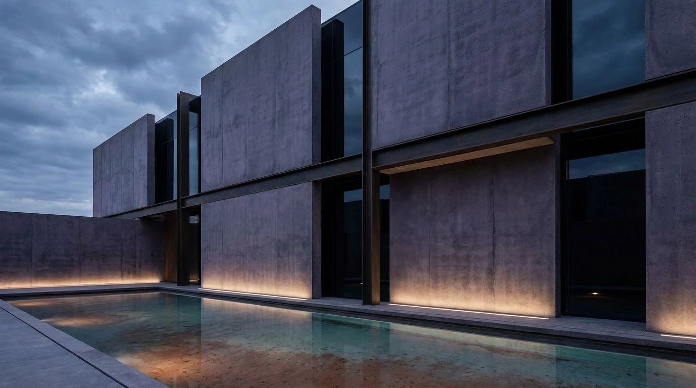
Early Frost Silhouette 🏛️
The Early Frost Silhouette arrangement perfectly captures the stark reality of modern construction as November weather sets in. Stripping away unnecessary warmth, this selection relies on Obsidian Shadow and Frost Swept Concrete to construct an unapologetic framework of visual weight. Rather than a cheerful, anemic accent, the inclusion of Oxidized Thistle provides a commanding chill. This specific blue grey variation behaves like steel exposed to freezing temperatures, projecting a technical stability that softer tones simply cannot achieve. By presenting an aesthetic aligned with bare structural ribs and frosted glass exteriors, this combination offers architectural practices a mechanism to communicate rigorous precision and uncompromised authority.
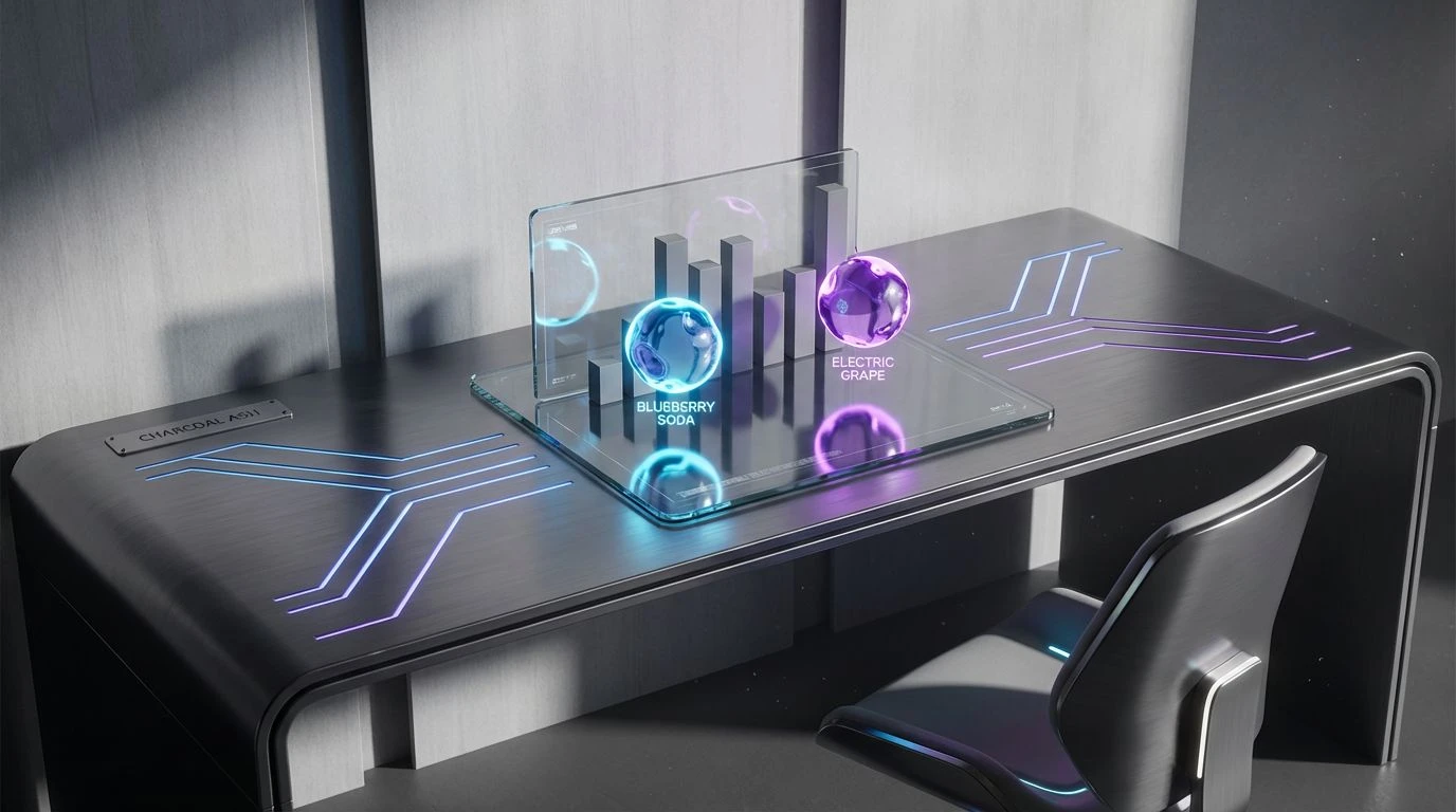
Glasshouse Reflection 🏢
Modern design practices often encounter the problem of introducing energy without returning to amateurish brightness. The Glasshouse Reflection collection solves this issue by anchoring high visibility tones against the unyielding weight of Midnight Tar and Structural Iron. The sudden appearance of Acid Glass and Canopy Green reflects the artificial lighting found in high tech laboratories or late night drafting rooms, cutting through the heavy grey fog of Anodized Steel. Deep Azure and Cyan Blueprint serve as technical anchors, recalling the stark lines of schematic drawings rather than the welcoming skies of a summer afternoon. This arrangement allows a firm to indicate progressive, technological capability while maintaining the severe, commanding presence expected of a master builder.
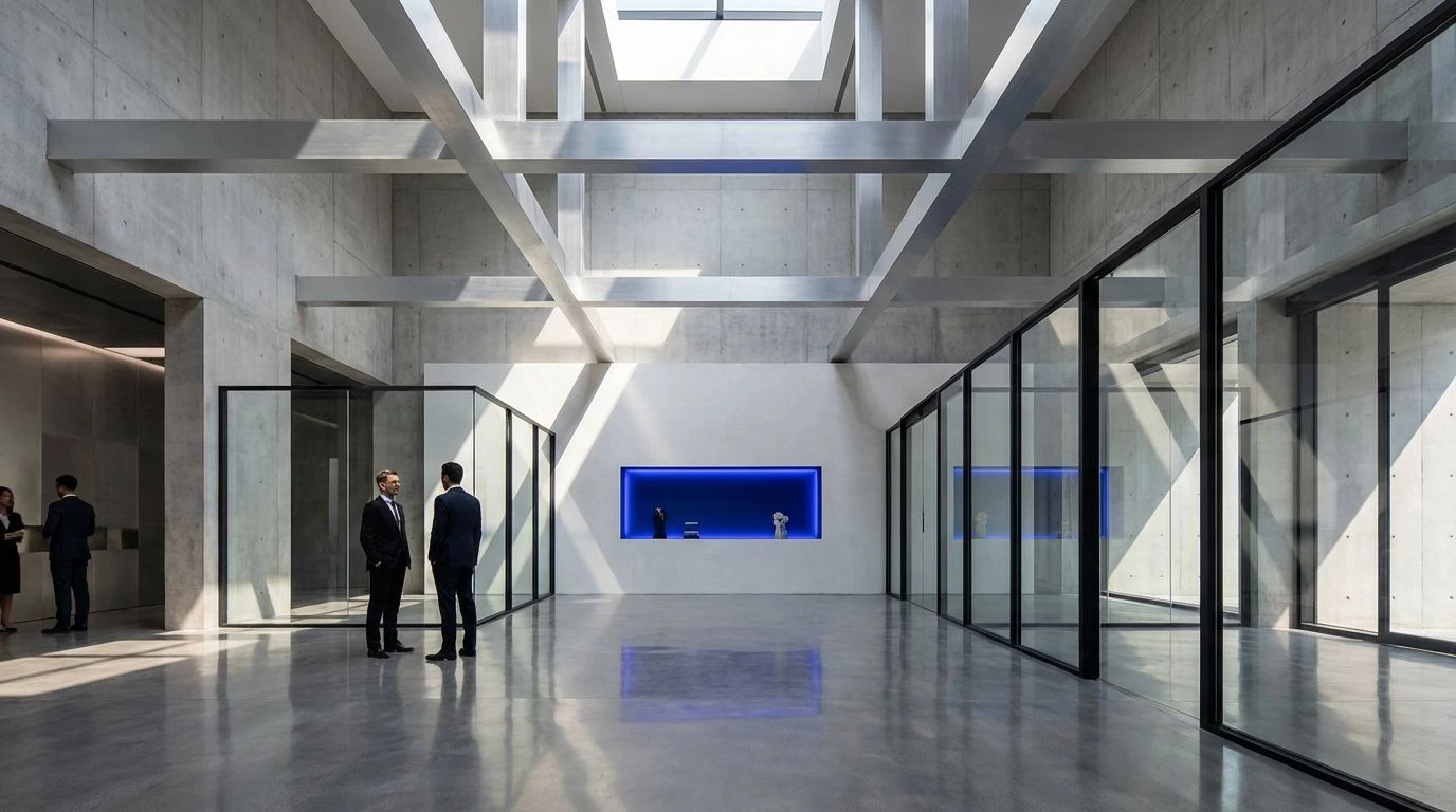
Civic Authority 🗽
Moving beyond sterile minimalism requires a grounded connection to historical building materials, a principle clearly demonstrated by the Civic Authority collection. By positioning Winter Skyline beside the formidable density of Forged Slate and Charcoal Rib, this arrangement captures the imposing nature of municipal structures resting under heavy December clouds. The addition of Terracotta Brick and Tarnished Brass prevents the visual experience from becoming overly clinical, introducing the feeling of classical stonework and oxidized metal detailing. Surrounded by the absolute darkness of Vantablack and the severe clarity of Crystalline Frost, the muted winter blue establishes an atmosphere of profound permanence. Firms utilizing this visual strategy signal their capability to design monuments meant to outlast passing trends.
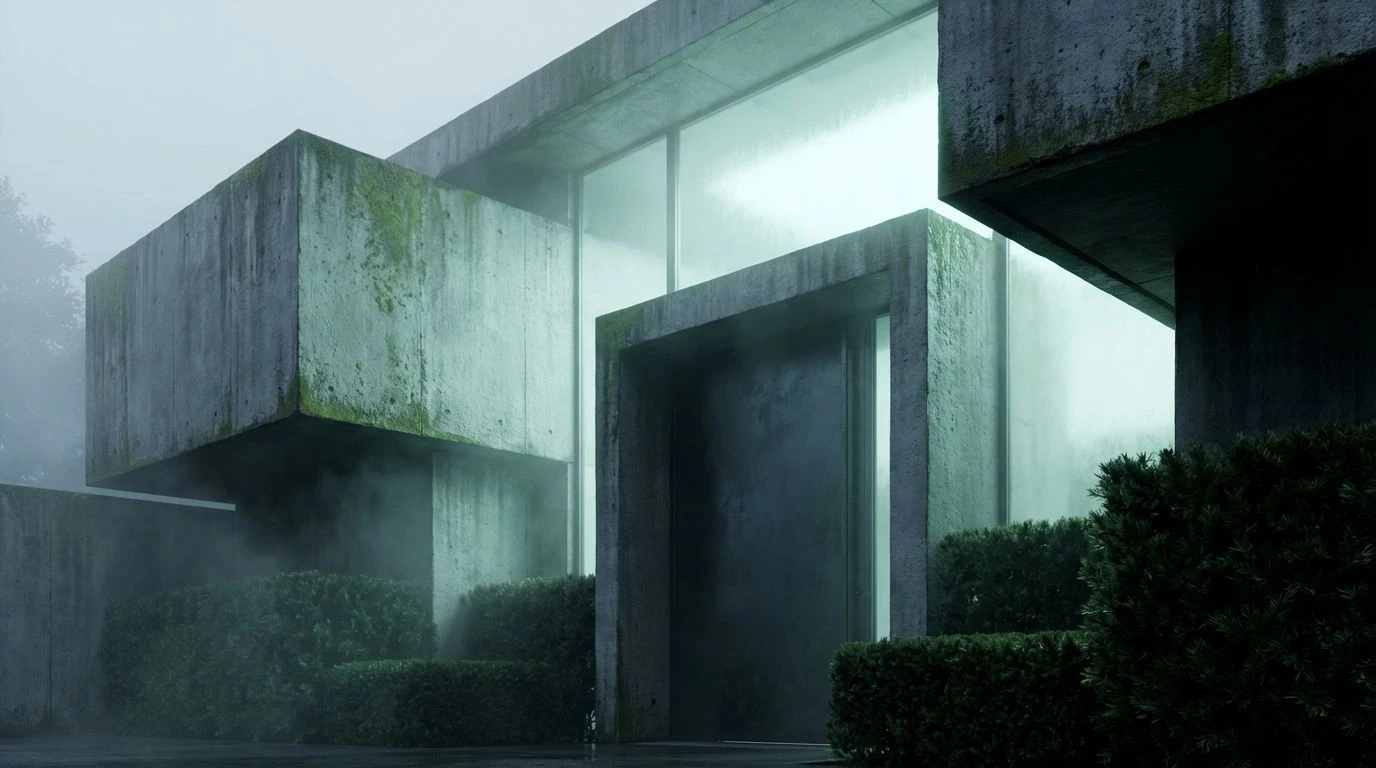
Brutalist Winter 🏗️
A retreat into absolute austerity frequently brings a project closer to absolute truth. The Brutalist Winter sequence operates on this strict logic, stripping away all decorative pretenses to leave only the muscular reality of Cast Iron Night and Industrial Ash. Pushing past the approachability of standard corporate branding, Cobalt Depth and Icy Facade introduce a sharp, biting cold. These tones do not invite casual conversation; they demand respect. They mirror the severe geometry of poured concrete and exposed steel beams weathering a harsh climate. For an architectural practice entirely confident in its structural expertise, relying on Weathered Zinc and these chilling blue variations acts as a declaration of uncompromising quality and technical supremacy.
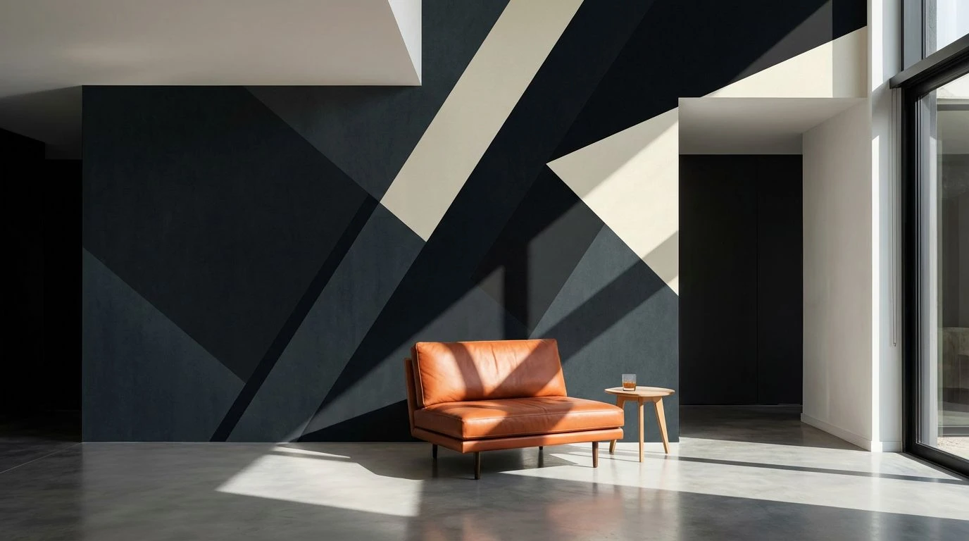
Foundation Stone 🧱
The most direct challenge to the comfortable corporate standard lies in the deliberate use of the Foundation Stone arrangement. Here, the soft, accommodating pastel is replaced by Bruised Thistle, a difficult and complex tone that conveys the bruising reality of heavy construction and raw material manipulation. Bounded by Pitch Black and Oiled Bronze, this central shade takes on an institutional weight, recalling the grand lobbies of depression era skyscrapers and heavy masonry. Dusted Terracotta and Alabaster Wash offer a quiet backdrop that keeps the darker shades from becoming illegible. By relying on this specific visual weight, a design studio establishes itself not as a friendly consultant, but as a definitive authority capable of executing the most daunting structural commissions.
The transition from approachable, friendly colors to the challenging, severe tones of winter architecture represents a necessary maturation in professional branding. Discarding the safety of standard blues in favor of heavy charcoal, muted slate, and imposing thistle requires absolute confidence. These darker, uncompromising colors demand attention and communicate a severe, undeniable expertise. Firms that adopt this heavier visual language separate themselves from mere decorators, standing instead as structural authorities capable of shaping the permanent skyline with gravity and precision.