'%3e%3cpath%20fill-rule='evenodd'%20clip-rule='evenodd'%20d='M51.1303%2019.2492C50.7278%2019.913%2050.1346%2020.4426%2049.3508%2020.838C48.5669%2021.2335%2047.6172%2021.4312%2046.5014%2021.4312C44.8208%2021.4312%2043.4367%2021.0216%2042.3492%2020.2025C41.2617%2019.3833%2040.6686%2018.2394%2040.5697%2016.7706H44.4253C44.4818%2017.3355%2044.6831%2017.7804%2045.0291%2018.1052C45.3751%2018.43%2045.8164%2018.5924%2046.3531%2018.5924C46.8192%2018.5924%2047.1864%2018.4653%2047.4547%2018.2111C47.7231%2017.9569%2047.8572%2017.618%2047.8572%2017.1943C47.8572%2016.8129%2047.7337%2016.4952%2047.4865%2016.241C47.2393%2015.9867%2046.9322%2015.7784%2046.565%2015.616C46.1978%2015.4536%2045.6893%2015.2594%2045.0397%2015.0334C44.0934%2014.7086%2043.3202%2014.3944%2042.72%2014.0907C42.1197%2013.7871%2041.6042%2013.3351%2041.1735%2012.7349C40.7427%2012.1347%2040.5273%2011.3544%2040.5273%2010.394C40.5273%209.50418%2040.7533%208.73448%2041.2053%208.08481C41.6572%207.43515%2042.2821%206.93731%2043.0801%206.5913C43.8781%206.24528%2044.7925%206.07227%2045.8235%206.07227C47.49%206.07227%2048.8141%206.46771%2049.7956%207.25861C50.7772%208.04951%2051.3315%209.13698%2051.4586%2010.5211H47.5395C47.4689%2010.0268%2047.2888%209.63483%2046.9993%209.3453C46.7097%209.05578%2046.3178%208.91102%2045.8235%208.91102C45.3998%208.91102%2045.0573%209.024%2044.7961%209.24997C44.5348%209.47594%2044.4041%209.80783%2044.4041%2010.2457C44.4041%2010.5988%2044.5207%2010.8989%2044.7537%2011.146C44.9867%2011.3932%2045.2798%2011.5944%2045.6328%2011.7498C45.9859%2011.9052%2046.4944%2012.1029%2047.1581%2012.343C48.1185%2012.6678%2048.9023%2012.9891%2049.5096%2013.3069C50.1169%2013.6246%2050.6395%2014.0872%2051.0773%2014.6945C51.5151%2015.3018%2051.734%2016.0927%2051.734%2017.0672C51.734%2017.8581%2051.5328%2018.5854%2051.1303%2019.2492ZM59.0242%206.3053V21.2829H55.4016V6.3053H59.0242ZM73.9409%206.3053V9.18642H69.8734V21.2829H66.2296V9.18642H62.2046V6.3053H73.9409ZM80.7438%209.18642V12.3218H85.8069V15.0546H80.7438V18.3806H86.4425V21.2829H77.1212V6.3053H86.4425V9.18642H80.7438ZM99.667%2016.0291V21.2829H96.0444V6.3053H101.913C103.692%206.3053%20105.048%206.74665%20105.98%207.62934C106.912%208.51204%20107.378%209.7019%20107.378%2011.199C107.378%2012.1311%20107.17%2012.9609%20106.753%2013.6882C106.337%2014.4155%20105.719%2014.9875%20104.9%2015.4042C104.08%2015.8208%20103.085%2016.0291%20101.913%2016.0291H99.667ZM103.692%2011.199C103.692%209.8855%20102.965%209.22879%20101.51%209.22879H99.667V13.1268H101.51C102.965%2013.1268%20103.692%2012.4842%20103.692%2011.199ZM120.092%2018.5501H114.478L113.546%2021.2829H109.732L115.219%206.41123H119.393L124.879%2021.2829H121.024L120.092%2018.5501ZM119.16%2015.7961L117.295%2010.2881L115.41%2015.7961H119.16ZM131.555%2018.5077H136.385V21.2829H127.933V6.3053H131.555V18.5077ZM143.337%209.18642V12.3218H148.4V15.0546H143.337V18.3806H149.035V21.2829H139.714V6.3053H149.035V9.18642H143.337ZM163.507%206.3053V9.18642H159.44V21.2829H155.796V9.18642H151.771V6.3053H163.507ZM177.449%206.3053V9.18642H173.382V21.2829H169.738V9.18642H165.713V6.3053H177.449ZM184.252%209.18642V12.3218H189.315V15.0546H184.252V18.3806H189.951V21.2829H180.629V6.3053H189.951V9.18642H184.252Z'%20fill='%23EEF0ED'/%3e%3cmask%20id='mask0_3101_7327'%20style='mask-type:alpha'%20maskUnits='userSpaceOnUse'%20x='0'%20y='0'%20width='27'%20height='28'%3e%3cpath%20d='M23.8328%200.759766H2.64808C1.18559%200.759766%200%201.94535%200%203.40785V24.5925C0%2026.055%201.18559%2027.2406%202.64808%2027.2406H23.8328C25.2952%2027.2406%2026.4808%2026.055%2026.4808%2024.5925V3.40785C26.4808%201.94535%2025.2952%200.759766%2023.8328%200.759766Z'%20fill='white'/%3e%3c/mask%3e%3cg%20mask='url(%23mask0_3101_7327)'%3e%3cpath%20d='M23.8328%200.759766H2.64808C1.18559%200.759766%200%201.94535%200%203.40785V24.5925C0%2026.055%201.18559%2027.2406%202.64808%2027.2406H23.8328C25.2952%2027.2406%2026.4808%2026.055%2026.4808%2024.5925V3.40785C26.4808%201.94535%2025.2952%200.759766%2023.8328%200.759766Z'%20fill='%23D8D8D8'/%3e%3cpath%20d='M13.2404%200.759766H0V14.0001H13.2404V0.759766Z'%20fill='%238C61FF'/%3e%3cpath%20d='M13.2404%2014H0V27.2404H13.2404V14Z'%20fill='%2336C3FE'/%3e%3cpath%20d='M26.4806%2014H13.2402V27.2404H26.4806V14Z'%20fill='%236592FE'/%3e%3cpath%20d='M26.4806%200.759766H13.2402V14.0002H26.4806V0.759766Z'%20fill='%236059F7'/%3e%3c/g%3e%3c/g%3e%3cdefs%3e%3cclipPath%20id='clip0_3101_7327'%3e%3crect%20width='190'%20height='28'%20fill='white'/%3e%3c/clipPath%3e%3c/defs%3e%3c/svg%3e)
'%3e%3cpath%20d='M23.8328%200.759521H2.64808C1.18559%200.759521%200%201.94511%200%203.40761V24.5923C0%2026.0548%201.18559%2027.2404%202.64808%2027.2404H23.8328C25.2952%2027.2404%2026.4808%2026.0548%2026.4808%2024.5923V3.40761C26.4808%201.94511%2025.2952%200.759521%2023.8328%200.759521Z'%20fill='%23D8D8D8'/%3e%3cpath%20d='M13.2404%200.759521H0V13.9999H13.2404V0.759521Z'%20fill='%238C61FF'/%3e%3cpath%20d='M13.2404%2013.9998H0V27.2402H13.2404V13.9998Z'%20fill='%2336C3FE'/%3e%3cpath%20d='M26.4809%2013.9998H13.2405V27.2402H26.4809V13.9998Z'%20fill='%236592FE'/%3e%3cpath%20d='M26.4809%200.759277H13.2405V13.9997H26.4809V0.759277Z'%20fill='%236059F7'/%3e%3c/g%3e%3c/svg%3e)

Warm Peach Color Palettes for Humanistic UI Data Design
· 5 min readData privacy usually looks like a glowing padlock on a dark screen or an impenetrable matrix of neon green and sterile blue. These visual cues signal defense, a digital fortress warning users to stay away. Yet contemporary user interface design is moving toward a drastically different visual language. By applying a humanistic lens to privacy settings, designers substitute cold cybernetic barriers with welcoming tones. Introducing a warm, vaguely bodily hue against strict architectural greys fundamentally changes how individuals perceive technology companies holding their personal information. A decided softness emerges when harsh interface edges meet yielding, flesh-adjacent tints. This approach builds an atmosphere of radical transparency. Rather than building walls, these aesthetic choices suggest an open dialogue about security, making the exchange of sensitive credentials feel like a trusted, empathetic conversation rather than a rigid contractual obligation.
Monochrome Softness 🍑
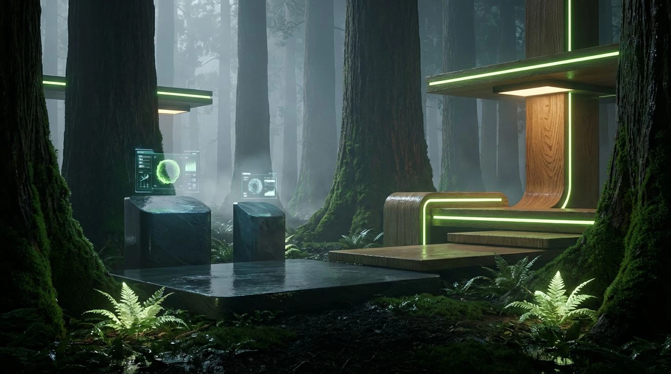
Grounding modern tech visuals in deep contrast, Monochrome Softness 🍑 relies heavily on the stark gradient between Sterile White and an Obsidian Vault. The transitions through Server Rack Grey and a deeply grounding Charcoal Interface create an unapologetically brutalist foundation, reminiscent of raw concrete data centers and minimalist dashboard graphics. Against this highly controlled slate, Clinical Peach acts as a sudden, vital pulse. This striking punctuation changes the entire feeling of the layout, pulling it away from intimidating analytics toward something deeply human. In application, using this soft blush tint for primary action buttons or essential privacy toggles makes the act of granting permissions feel approachable. The stark greyscale ensures the user is grounded in a secure, engineered space, while the solitary burst of peach signals that their personal input is respected and handled with profound care.
Analog Privacy 🗄️
Shifting the visual conversation from harsh screens to physical filing cabinets, Analog Privacy 🗄️ builds a bridge between physical archives and cloud computing. The progression moving from Paper Frost to the deep, reliable tones of Slate Archive and Midnight Encryption establishes a highly dependable, institutionally sound baseline. What breathes life into this arrangement is the delicate warmth of Blushing Audit and the grounding earthiness of Clay Ledger. Matte Steel bridges the gap between these geological and engineered tones. When applied across data-heavy interfaces, these tones recall vintage encyclopedias or carefully minted bureaucratic forms rendered in a hyper-modern digital space. This palette proves that empathetic security does not need to look entirely sterile. Using these rich, earthen pinks for consent forms or data export protocols grants the digital experience a tactile, trustworthy weight, reassuring users that their most sensitive logs are curated by human hands rather than indifferent algorithms.
Biometric Warmth 🖐️
Biometric Warmth 🖐️ strips the interface down to its most elemental variables, utilizing Blank State and Absolute Zero to frame intensely human tones. Flesh Tone Alpha steps in as the primary communicative agent, acting like a digital thumbprint against the stark black and white scaffolding. The addition of Roasted Sienna provides a grounded depth, while Alert Ochre functions as a warm, non-threatening notification mechanism. This set of visuals excels in applications where personal identification, health records, or biometric data are heavily processed. Rather than triggering anxiety with aggressive reds or clinical blues, the golden and peach hues offer an inviting, almost therapeutic presence. It signals that the operating system recognizes the living, breathing person behind the data points. Navigating privacy settings bathed in these tones feels akin to walking into a beautifully lit, modernist clinic where the priority is squarely on the individual's comfort and psychological safety.
Strictly Redacted ⬛
While previous configurations rely on flesh-adjacent tones to signal empathy, Strictly Redacted ⬛ serves as the necessary architectural counterbalance, defining the rigorous, unyielding side of data protection. This set relies on a stark transition from Vantablack Protocol through the measured industrialism of Concrete Ledger and Brushed Anodized, resting completely on the off-white starkness of Alabaster Terminal. In the context of our broader theme, this strict greyscale acts as the vault. When designers employ this austere selection for terms of service, encryption logs, or background architectural wireframes, they establish an environment of unquestionable authority and precision. The lack of chromatic warmth here is entirely intentional. It strips away distractions, forcing the user to focus strictly on the mechanics of their privacy. Used in tandem with softer focal points in a broader design system, these tones build the unshakeable bedrock required before any meaningful sense of transparency can be established.
Cryptographic Ecosystem 🌐
Presenting a starkly alternative approach to the humanistic peach, Cryptographic Ecosystem 🌐 relies on the cool, calculated reliability of Mint Verification and Ultramarine Trust to soften the severity of a traditional cybernetic palette. The backdrop consists of Optic White, Pure Void, and Ash Keyboard, maintaining that crucial high-fidelity tech aesthetic. The introduction of Deep Sea Cipher and Fog Screen shifts the atmosphere from a defensive posture to an open, navigable space. Mint Verification acts as the perfect confirmation signal, a gentle nod that systems are secure without shouting at the user. This selection thrives in environments managing complex decentralized assets or encrypted messaging platforms. The deep ultramarine grounds the experience in classic trustworthiness while the mint offers a sharp, modern freshness. It shows that empathetic security can also be achieved through cool clarity, providing a serene, frictionless visual journey through even the most complicated data administration portals.
Redefining the aesthetics of data security requires more than just slapping a fresh coat of paint over old wireframes. The shift toward accommodating, bodily hues and meticulously controlled industrial greys signals a fundamental change in how technology companies communicate with their users. By trading intimidating barriers for inviting, open dialogues, designers actively lower the cognitive load associated with managing private information. A simple blush toggle or a stark alabaster modal window can silently reassure individuals that their digital footprints are guarded with intention and respect. Ultimately, this approach proves that rigorous technological safety and a deeply human, transparent visual language can exist in the exact same space.