'%3e%3cpath%20fill-rule='evenodd'%20clip-rule='evenodd'%20d='M51.1303%2019.2492C50.7278%2019.913%2050.1346%2020.4426%2049.3508%2020.838C48.5669%2021.2335%2047.6172%2021.4312%2046.5014%2021.4312C44.8208%2021.4312%2043.4367%2021.0216%2042.3492%2020.2025C41.2617%2019.3833%2040.6686%2018.2394%2040.5697%2016.7706H44.4253C44.4818%2017.3355%2044.6831%2017.7804%2045.0291%2018.1052C45.3751%2018.43%2045.8164%2018.5924%2046.3531%2018.5924C46.8192%2018.5924%2047.1864%2018.4653%2047.4547%2018.2111C47.7231%2017.9569%2047.8572%2017.618%2047.8572%2017.1943C47.8572%2016.8129%2047.7337%2016.4952%2047.4865%2016.241C47.2393%2015.9867%2046.9322%2015.7784%2046.565%2015.616C46.1978%2015.4536%2045.6893%2015.2594%2045.0397%2015.0334C44.0934%2014.7086%2043.3202%2014.3944%2042.72%2014.0907C42.1197%2013.7871%2041.6042%2013.3351%2041.1735%2012.7349C40.7427%2012.1347%2040.5273%2011.3544%2040.5273%2010.394C40.5273%209.50418%2040.7533%208.73448%2041.2053%208.08481C41.6572%207.43515%2042.2821%206.93731%2043.0801%206.5913C43.8781%206.24528%2044.7925%206.07227%2045.8235%206.07227C47.49%206.07227%2048.8141%206.46771%2049.7956%207.25861C50.7772%208.04951%2051.3315%209.13698%2051.4586%2010.5211H47.5395C47.4689%2010.0268%2047.2888%209.63483%2046.9993%209.3453C46.7097%209.05578%2046.3178%208.91102%2045.8235%208.91102C45.3998%208.91102%2045.0573%209.024%2044.7961%209.24997C44.5348%209.47594%2044.4041%209.80783%2044.4041%2010.2457C44.4041%2010.5988%2044.5207%2010.8989%2044.7537%2011.146C44.9867%2011.3932%2045.2798%2011.5944%2045.6328%2011.7498C45.9859%2011.9052%2046.4944%2012.1029%2047.1581%2012.343C48.1185%2012.6678%2048.9023%2012.9891%2049.5096%2013.3069C50.1169%2013.6246%2050.6395%2014.0872%2051.0773%2014.6945C51.5151%2015.3018%2051.734%2016.0927%2051.734%2017.0672C51.734%2017.8581%2051.5328%2018.5854%2051.1303%2019.2492ZM59.0242%206.3053V21.2829H55.4016V6.3053H59.0242ZM73.9409%206.3053V9.18642H69.8734V21.2829H66.2296V9.18642H62.2046V6.3053H73.9409ZM80.7438%209.18642V12.3218H85.8069V15.0546H80.7438V18.3806H86.4425V21.2829H77.1212V6.3053H86.4425V9.18642H80.7438ZM99.667%2016.0291V21.2829H96.0444V6.3053H101.913C103.692%206.3053%20105.048%206.74665%20105.98%207.62934C106.912%208.51204%20107.378%209.7019%20107.378%2011.199C107.378%2012.1311%20107.17%2012.9609%20106.753%2013.6882C106.337%2014.4155%20105.719%2014.9875%20104.9%2015.4042C104.08%2015.8208%20103.085%2016.0291%20101.913%2016.0291H99.667ZM103.692%2011.199C103.692%209.8855%20102.965%209.22879%20101.51%209.22879H99.667V13.1268H101.51C102.965%2013.1268%20103.692%2012.4842%20103.692%2011.199ZM120.092%2018.5501H114.478L113.546%2021.2829H109.732L115.219%206.41123H119.393L124.879%2021.2829H121.024L120.092%2018.5501ZM119.16%2015.7961L117.295%2010.2881L115.41%2015.7961H119.16ZM131.555%2018.5077H136.385V21.2829H127.933V6.3053H131.555V18.5077ZM143.337%209.18642V12.3218H148.4V15.0546H143.337V18.3806H149.035V21.2829H139.714V6.3053H149.035V9.18642H143.337ZM163.507%206.3053V9.18642H159.44V21.2829H155.796V9.18642H151.771V6.3053H163.507ZM177.449%206.3053V9.18642H173.382V21.2829H169.738V9.18642H165.713V6.3053H177.449ZM184.252%209.18642V12.3218H189.315V15.0546H184.252V18.3806H189.951V21.2829H180.629V6.3053H189.951V9.18642H184.252Z'%20fill='%23EEF0ED'/%3e%3cmask%20id='mask0_3101_7327'%20style='mask-type:alpha'%20maskUnits='userSpaceOnUse'%20x='0'%20y='0'%20width='27'%20height='28'%3e%3cpath%20d='M23.8328%200.759766H2.64808C1.18559%200.759766%200%201.94535%200%203.40785V24.5925C0%2026.055%201.18559%2027.2406%202.64808%2027.2406H23.8328C25.2952%2027.2406%2026.4808%2026.055%2026.4808%2024.5925V3.40785C26.4808%201.94535%2025.2952%200.759766%2023.8328%200.759766Z'%20fill='white'/%3e%3c/mask%3e%3cg%20mask='url(%23mask0_3101_7327)'%3e%3cpath%20d='M23.8328%200.759766H2.64808C1.18559%200.759766%200%201.94535%200%203.40785V24.5925C0%2026.055%201.18559%2027.2406%202.64808%2027.2406H23.8328C25.2952%2027.2406%2026.4808%2026.055%2026.4808%2024.5925V3.40785C26.4808%201.94535%2025.2952%200.759766%2023.8328%200.759766Z'%20fill='%23D8D8D8'/%3e%3cpath%20d='M13.2404%200.759766H0V14.0001H13.2404V0.759766Z'%20fill='%238C61FF'/%3e%3cpath%20d='M13.2404%2014H0V27.2404H13.2404V14Z'%20fill='%2336C3FE'/%3e%3cpath%20d='M26.4806%2014H13.2402V27.2404H26.4806V14Z'%20fill='%236592FE'/%3e%3cpath%20d='M26.4806%200.759766H13.2402V14.0002H26.4806V0.759766Z'%20fill='%236059F7'/%3e%3c/g%3e%3c/g%3e%3cdefs%3e%3cclipPath%20id='clip0_3101_7327'%3e%3crect%20width='190'%20height='28'%20fill='white'/%3e%3c/clipPath%3e%3c/defs%3e%3c/svg%3e)
'%3e%3cpath%20d='M23.8328%200.759521H2.64808C1.18559%200.759521%200%201.94511%200%203.40761V24.5923C0%2026.0548%201.18559%2027.2404%202.64808%2027.2404H23.8328C25.2952%2027.2404%2026.4808%2026.0548%2026.4808%2024.5923V3.40761C26.4808%201.94511%2025.2952%200.759521%2023.8328%200.759521Z'%20fill='%23D8D8D8'/%3e%3cpath%20d='M13.2404%200.759521H0V13.9999H13.2404V0.759521Z'%20fill='%238C61FF'/%3e%3cpath%20d='M13.2404%2013.9998H0V27.2402H13.2404V13.9998Z'%20fill='%2336C3FE'/%3e%3cpath%20d='M26.4809%2013.9998H13.2405V27.2402H26.4809V13.9998Z'%20fill='%236592FE'/%3e%3cpath%20d='M26.4809%200.759277H13.2405V13.9997H26.4809V0.759277Z'%20fill='%236059F7'/%3e%3c/g%3e%3c/svg%3e)
Rustic Color Palettes for Compassionate Healthtech Design
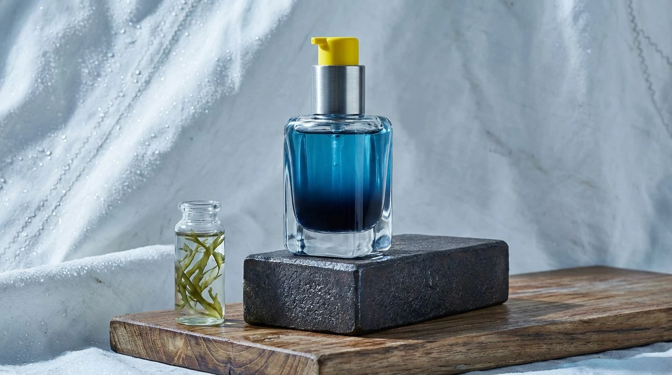
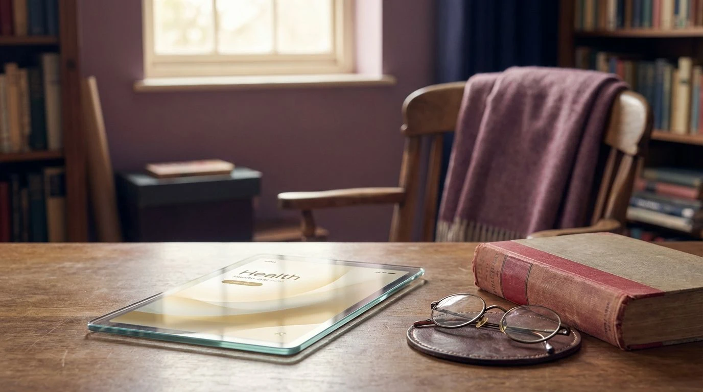
· 5 min readA worn oak table in a quiet room brings an immediate sense of calm to anyone who sits at it. When building patient-facing artificial intelligence tools, designers often default to clinical blues and sterile whites, which ultimately do little more than spike user anxiety. Instead, looking directly at the patinated surface of an aging library desk in a rural outpost offers a completely different design direction. Rich terracottas, grounded earth tones, and deep wood textures bring a desperately needed human touch to modern health platforms. By adopting these organic colors, digital interfaces trade cold efficiency for quiet reassurance. The visual textures of weathered leather and worn timber create a trusted environment where an anxious patient feels safely held by the technology rather than impersonally processed by it.
Rural Archive 📔
The Rural Archive palette captures the quiet authority of an old reading room perfectly. Striking a careful balance between the intense warmth of Oxidized Iron and the heavy grounding presence of Charred Walnut, this combination turns a potentially intimidating medical chatbot into a welcoming space. When Worn Card Catalog acts as a background shade against soft Vellum Pages typography, reading medical test results feels less like receiving a sterile lab report and more like opening a trusted reference book. Using these rich pigments in digital dashboards anchors the user experience in familiar physical sensations, offering patients a deep sense of psychological safety when they need straightforward answers.
Outpost Morning 🌲
Moving through a health platform treated with the Outpost Morning palette feels like stepping onto a rural porch just as the sun rises. The sharp energy of Burnt Copper paired with the warm glow of Sunlit Clay prevents the application from appearing too subdued or traditional, keeping the layout feeling distinctly modern and quietly optimistic. Using these vibrant earth tones alongside Dusty Linen and Black Iron gives user interface elements a satisfying physical weight, making buttons and navigation bars look like tactile architectural materials. Throwing in a splash of Wild Moss introduces a direct nod to nature and wellness. For a symptom tracker or mood journal, this composition strips away clinical anxiety, replacing it with a restorative morning calmness.
Studious Horizon 🌅
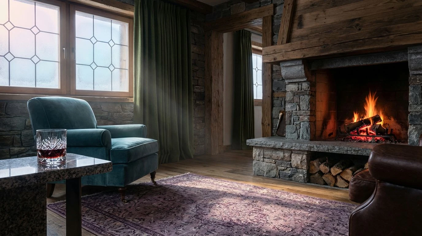
Studious Horizon borrows from the quiet corners of forgotten reading rooms while injecting a surprising punch of contemporary energy suitable for modern applications. The pairing of Weathered Steel and Rich Mahogany builds a dependable foundation that feels just like sitting at a sturdy wooden table, quietly encouraging users to focus and slow down their breathing. Meanwhile, Plaster Rose softens the digital environment, providing a gentle backdrop for sensitive self-reporting tools or daily health questionnaires. The sudden flash of Goldenrod Marker works as an ideal accent for notifications or call-to-action buttons, drawing the eye without triggering alarm. Grounded securely by Ink Wash, this color composition builds a visual space where patient-facing algorithms transform from rigid technical features into approachable digital companions.
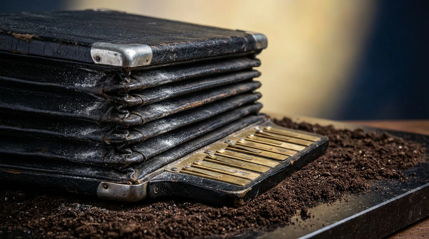
Heritage Cabinet 🗄️
The Heritage Cabinet palette leans fully into a vintage academic aesthetic, offering an immediate sense of trustworthiness and historical permanence to healthtech environments. Clove Brown establishes a deeply comfortable baseline that wraps around the user like a heavy woolen blanket, while Aged Parchment and Cream Binder provide expansive, breathable areas for reading complex medical histories or AI-generated recovery plans. Deep Pine anchors the lighter tones with a color long associated with old apothecary bottles and undisturbed forests. Outfitting a telemedicine app with these specific tones sends a clear message that user data is being handled with the utmost care and respect, replacing the standard fast-paced tech aesthetic with the deliberate, careful rhythm of a rural archivist working by lamplight.
Late Shift 🕰️
The Late Shift combination conveys the complex, quiet beauty of working late into the night surrounded by physical books and analog records. A crisp Fresh Page base is given tremendous character when framed by Tawny Leather and Muted Sunlight, softening the harsh glare of a virtual waiting room. Crimson Bound and Faded Plum add notes of organic warmth that recall old cloth-bound medical journals, while Midnight Ink provides sharp contrast for typography and vital data visualization. Dusty Heather serves as a gentle transition shade, rounding out the hard edges of digital boxes and modal windows. This specific atmospheric mixture proves that artificial intelligence tools do not need to look like spaceships to feel advanced, showing how a heritage aesthetic makes cutting-edge software feel highly reassuring and profoundly human.
Stepping away from the default white and blue environments of modern telemedicine applications opens up entirely new ways for patients to experience medical algorithms. The rich browns, worn terracottas, and deep greens found in old wood, analog tools, and quiet outpost libraries prove that cutting-edge software is capable of feeling grounding rather than alienating. Adopting a contemporary rustic style gives digital platforms and chatbots a satisfying physical weight that instantly reassures the user. By building medical spaces that look and feel like well-worn, welcoming libraries, designers can craft software that treats people with the quiet dignity they require when navigating a difficult health journey.