'%3e%3cpath%20fill-rule='evenodd'%20clip-rule='evenodd'%20d='M51.1303%2019.2492C50.7278%2019.913%2050.1346%2020.4426%2049.3508%2020.838C48.5669%2021.2335%2047.6172%2021.4312%2046.5014%2021.4312C44.8208%2021.4312%2043.4367%2021.0216%2042.3492%2020.2025C41.2617%2019.3833%2040.6686%2018.2394%2040.5697%2016.7706H44.4253C44.4818%2017.3355%2044.6831%2017.7804%2045.0291%2018.1052C45.3751%2018.43%2045.8164%2018.5924%2046.3531%2018.5924C46.8192%2018.5924%2047.1864%2018.4653%2047.4547%2018.2111C47.7231%2017.9569%2047.8572%2017.618%2047.8572%2017.1943C47.8572%2016.8129%2047.7337%2016.4952%2047.4865%2016.241C47.2393%2015.9867%2046.9322%2015.7784%2046.565%2015.616C46.1978%2015.4536%2045.6893%2015.2594%2045.0397%2015.0334C44.0934%2014.7086%2043.3202%2014.3944%2042.72%2014.0907C42.1197%2013.7871%2041.6042%2013.3351%2041.1735%2012.7349C40.7427%2012.1347%2040.5273%2011.3544%2040.5273%2010.394C40.5273%209.50418%2040.7533%208.73448%2041.2053%208.08481C41.6572%207.43515%2042.2821%206.93731%2043.0801%206.5913C43.8781%206.24528%2044.7925%206.07227%2045.8235%206.07227C47.49%206.07227%2048.8141%206.46771%2049.7956%207.25861C50.7772%208.04951%2051.3315%209.13698%2051.4586%2010.5211H47.5395C47.4689%2010.0268%2047.2888%209.63483%2046.9993%209.3453C46.7097%209.05578%2046.3178%208.91102%2045.8235%208.91102C45.3998%208.91102%2045.0573%209.024%2044.7961%209.24997C44.5348%209.47594%2044.4041%209.80783%2044.4041%2010.2457C44.4041%2010.5988%2044.5207%2010.8989%2044.7537%2011.146C44.9867%2011.3932%2045.2798%2011.5944%2045.6328%2011.7498C45.9859%2011.9052%2046.4944%2012.1029%2047.1581%2012.343C48.1185%2012.6678%2048.9023%2012.9891%2049.5096%2013.3069C50.1169%2013.6246%2050.6395%2014.0872%2051.0773%2014.6945C51.5151%2015.3018%2051.734%2016.0927%2051.734%2017.0672C51.734%2017.8581%2051.5328%2018.5854%2051.1303%2019.2492ZM59.0242%206.3053V21.2829H55.4016V6.3053H59.0242ZM73.9409%206.3053V9.18642H69.8734V21.2829H66.2296V9.18642H62.2046V6.3053H73.9409ZM80.7438%209.18642V12.3218H85.8069V15.0546H80.7438V18.3806H86.4425V21.2829H77.1212V6.3053H86.4425V9.18642H80.7438ZM99.667%2016.0291V21.2829H96.0444V6.3053H101.913C103.692%206.3053%20105.048%206.74665%20105.98%207.62934C106.912%208.51204%20107.378%209.7019%20107.378%2011.199C107.378%2012.1311%20107.17%2012.9609%20106.753%2013.6882C106.337%2014.4155%20105.719%2014.9875%20104.9%2015.4042C104.08%2015.8208%20103.085%2016.0291%20101.913%2016.0291H99.667ZM103.692%2011.199C103.692%209.8855%20102.965%209.22879%20101.51%209.22879H99.667V13.1268H101.51C102.965%2013.1268%20103.692%2012.4842%20103.692%2011.199ZM120.092%2018.5501H114.478L113.546%2021.2829H109.732L115.219%206.41123H119.393L124.879%2021.2829H121.024L120.092%2018.5501ZM119.16%2015.7961L117.295%2010.2881L115.41%2015.7961H119.16ZM131.555%2018.5077H136.385V21.2829H127.933V6.3053H131.555V18.5077ZM143.337%209.18642V12.3218H148.4V15.0546H143.337V18.3806H149.035V21.2829H139.714V6.3053H149.035V9.18642H143.337ZM163.507%206.3053V9.18642H159.44V21.2829H155.796V9.18642H151.771V6.3053H163.507ZM177.449%206.3053V9.18642H173.382V21.2829H169.738V9.18642H165.713V6.3053H177.449ZM184.252%209.18642V12.3218H189.315V15.0546H184.252V18.3806H189.951V21.2829H180.629V6.3053H189.951V9.18642H184.252Z'%20fill='%23EEF0ED'/%3e%3cmask%20id='mask0_3101_7327'%20style='mask-type:alpha'%20maskUnits='userSpaceOnUse'%20x='0'%20y='0'%20width='27'%20height='28'%3e%3cpath%20d='M23.8328%200.759766H2.64808C1.18559%200.759766%200%201.94535%200%203.40785V24.5925C0%2026.055%201.18559%2027.2406%202.64808%2027.2406H23.8328C25.2952%2027.2406%2026.4808%2026.055%2026.4808%2024.5925V3.40785C26.4808%201.94535%2025.2952%200.759766%2023.8328%200.759766Z'%20fill='white'/%3e%3c/mask%3e%3cg%20mask='url(%23mask0_3101_7327)'%3e%3cpath%20d='M23.8328%200.759766H2.64808C1.18559%200.759766%200%201.94535%200%203.40785V24.5925C0%2026.055%201.18559%2027.2406%202.64808%2027.2406H23.8328C25.2952%2027.2406%2026.4808%2026.055%2026.4808%2024.5925V3.40785C26.4808%201.94535%2025.2952%200.759766%2023.8328%200.759766Z'%20fill='%23D8D8D8'/%3e%3cpath%20d='M13.2404%200.759766H0V14.0001H13.2404V0.759766Z'%20fill='%238C61FF'/%3e%3cpath%20d='M13.2404%2014H0V27.2404H13.2404V14Z'%20fill='%2336C3FE'/%3e%3cpath%20d='M26.4806%2014H13.2402V27.2404H26.4806V14Z'%20fill='%236592FE'/%3e%3cpath%20d='M26.4806%200.759766H13.2402V14.0002H26.4806V0.759766Z'%20fill='%236059F7'/%3e%3c/g%3e%3c/g%3e%3cdefs%3e%3cclipPath%20id='clip0_3101_7327'%3e%3crect%20width='190'%20height='28'%20fill='white'/%3e%3c/clipPath%3e%3c/defs%3e%3c/svg%3e)
'%3e%3cpath%20d='M23.8328%200.759521H2.64808C1.18559%200.759521%200%201.94511%200%203.40761V24.5923C0%2026.0548%201.18559%2027.2404%202.64808%2027.2404H23.8328C25.2952%2027.2404%2026.4808%2026.0548%2026.4808%2024.5923V3.40761C26.4808%201.94511%2025.2952%200.759521%2023.8328%200.759521Z'%20fill='%23D8D8D8'/%3e%3cpath%20d='M13.2404%200.759521H0V13.9999H13.2404V0.759521Z'%20fill='%238C61FF'/%3e%3cpath%20d='M13.2404%2013.9998H0V27.2402H13.2404V13.9998Z'%20fill='%2336C3FE'/%3e%3cpath%20d='M26.4809%2013.9998H13.2405V27.2402H26.4809V13.9998Z'%20fill='%236592FE'/%3e%3cpath%20d='M26.4809%200.759277H13.2405V13.9997H26.4809V0.759277Z'%20fill='%236059F7'/%3e%3c/g%3e%3c/svg%3e)
Scandi-Boho Color Palettes for High-Focus App Design
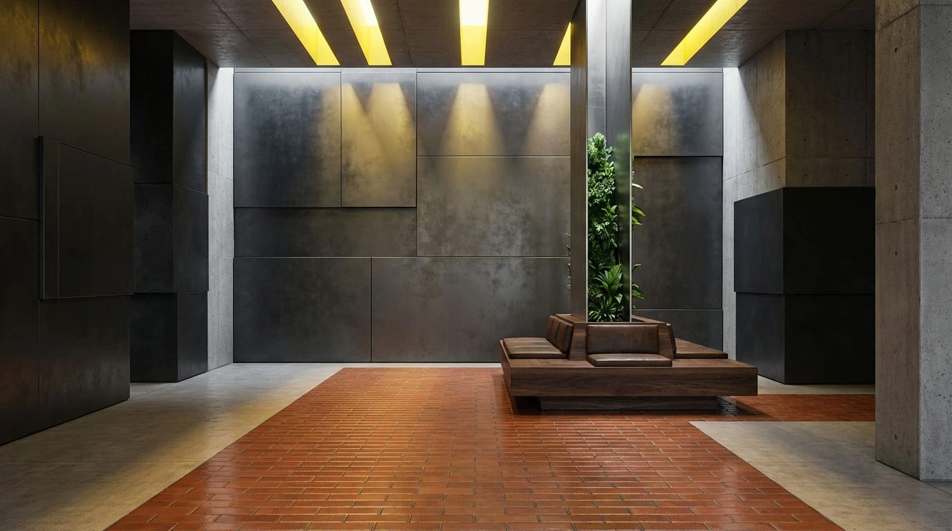
· 5 min readUtility applications often fall victim to a sterile aesthetic, mistaking clinical emptiness for efficiency. Yet, human attention thrives not in barren spaces, but in environments that afford comfort alongside purpose. The Scandi-Boho interior movement offers a compelling alternative to digital austerity, pairing the strict functionalism of Nordic design with the organic warmth of bohemian textures. Translating this particular sensibility to an interface dedicated to alertness requires a careful calibration of color. By applying muted earth tones alongside sharp, professional blues, designers can construct digital tools that maintain operational clarity while offering the psychological grounding of a well-appointed living room. The visual vocabulary shifts rapidly from sheer productivity to sustained, comfortable focus, treating the user space as a crafted habitat rather than a mere dashboard.
Nordic Shadow 🌿
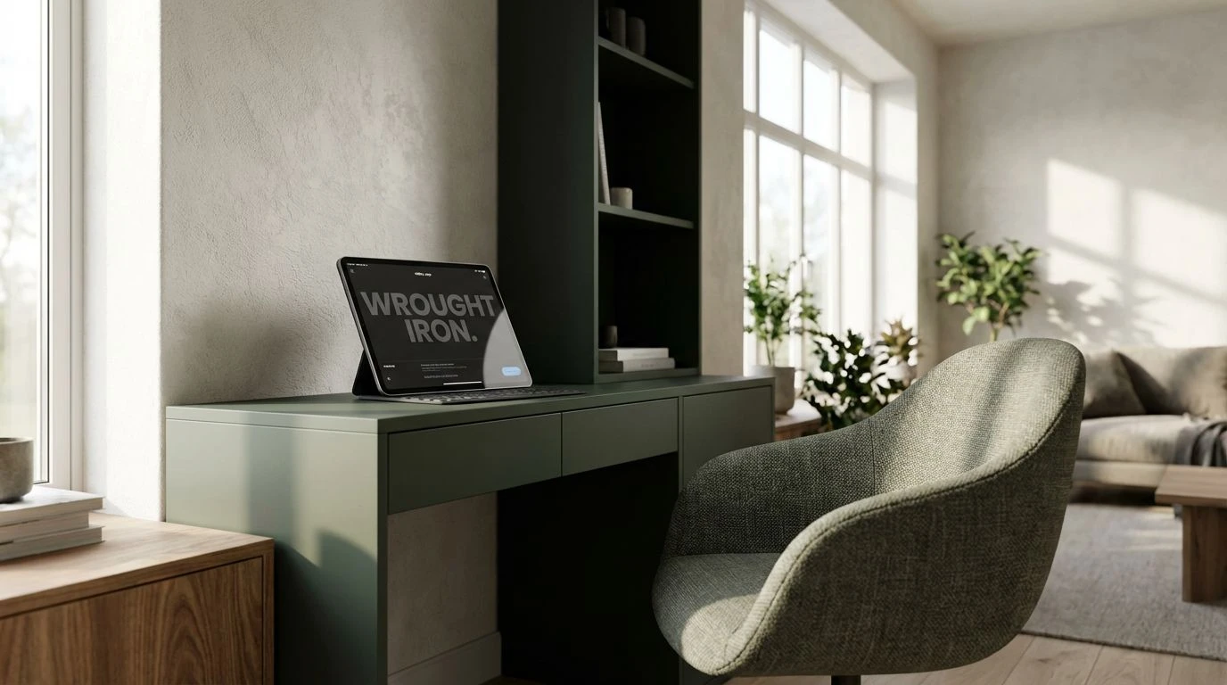
The interplay of natural shadow and gentle light defines this understated scheme, presenting a sequence of grounded neutrals that anchor the eye without demanding excess cognitive effort. Midnight Moss provides a grounding weight, acting as a soft alternative to harsh blacks for typography or structural borders. Plaster White offers a forgiving background, stripping away the glaring intensity of pure screen white to reduce visual fatigue during extended periods of utility use. Lichen Grey acts as a transitional layer, ideal for secondary menus or inactive states, while Wrought Iron delivers the necessary contrast for actionable elements. In an alertness-focused application, this collection builds a deliberate spatial hierarchy. It replicates the quiet order of a minimalist study, where every element possesses a defined function but refrains from competing for immediate attention. The result is an interface that supports sustained concentration, wrapping strict structural boundaries in natural, approachable tones that encourage prolonged engagement.
Fjords and Linens 🛋️
Bridging organic warmth with sharp cognitive signals, this selection introduces a striking contrast drawn from natural coastal landscapes. Dried Pampas and Oatmeal Linen establish a reassuring foundation, mimicking the tactile comfort of woven textiles in a relaxed domestic space. Against this unassuming domestic backdrop, Deep Fjord and Glacial Melt emerge as tools of precise communication. These professional blues cut through the calm, directing the user toward vital notifications or primary actions with distinct authority. Charcoal Ink rounds out the set, securing legible typography that remains gentle on the eyes. For a platform prioritizing both comfort and vigilance, this configuration applies color as an behavioral cue. The softer shades lower the baseline anxiety often associated with task management, while the sharp maritime blues keep the intellect sharp and responsive. The interface becomes a balanced habitat, mirroring a sunlit reading room where urgent matters are addressed promptly without disturbing the overall peace.
Baltic Morning ☕
Anchored by an expansive sense of light, this progression pairs pristine backgrounds with deep, stabilizing anchors. Pure Snow establishes an atmosphere of absolute cleanliness, akin to morning light streaming across an uncluttered floor. Driftwood Taupe offsets this openness with earthy grounding, perfect for subtle containment areas or card backgrounds that require slight separation from the main canvas. Slate Hearth delivers a necessary typographic solidity, ensuring clarity is maintained across all reading levels. The application of Maritime Blue and Winter Sky introduces the alertness mechanism, functioning as clear, recognizable signals for navigational interaction. These icy blues maintain a professional detachment while remaining fundamentally connected to the natural world. Applied to utility software, this arrangement creates an atmosphere of alert readiness. It removes visual clutter while utilizing strategic placements of blue to guide decision-making, ensuring the user remains comfortably aware and capable of swift, deliberate action.
Nomadic Botanical 🪴
Moving toward a more expressive bohemian vocabulary, this diverse spectrum embraces the energetic clutter of organic spaces without sacrificing usability. Unbleached Cotton and Jute Rug act as the structural canvas, absorbing the high energy of the companion shades. Roasted Walnut offers deep framing, mimicking timber furniture that organizes a varied room. The true character emerges through Mustard Seed, Vibrant Fern, and Azure Glass. These highly active pigments serve as precise highlighters in a digital environment. Azure Glass communicates primary utility actions, while Vibrant Fern signals successful task completion or positive status updates. Mustard Seed can be deployed cautiously for warnings or secondary calls to action. In the context of a productivity application, these vivid accents prevent the experience from becoming monotonous. They deliver small, rewarding bursts of visual interest that stimulate human attention, proving that a strictly organized tool can still possess a spirited, lively personality.
Terracotta Solstice 🕰️
Centering on the grounding properties of earthen materials, this rich collection utilizes psychological weight to command focus. Frost provides a crisp but approachable stage, upon which River Stone and Aged Graphite map out a restrained, highly functional grid. Obsidian guarantees uncompromising legibility for critical data display. The distinction lies in the pairing of Burnished Clay and Forest Canopy. The terracotta tone introduces an unexpected emotional warmth, suggesting tactile ceramic surfaces, while the deep sage acts as a sophisticated marker of progression or safety. For tools demanding high alertness, the terracotta shade functions as an elegant mechanism for urgent alerts, avoiding the panic-inducing qualities of traditional warning reds. The resulting environment feels mature and historically rooted, offering a psychological refuge. It assures users that their tasks are being handled within a reliable, solidly constructed framework that values aesthetic sophistication as highly as operational efficiency.
The translation of interior design principles into digital utility software requires more than simply borrowing a pleasing set of colors. It demands a rigorous understanding of how tone, contrast, and visual weight influence human psychology and task endurance. By adopting the natural grounding elements of bohemian living spaces alongside the sharp, directional blues characteristic of modern operational tools, designers can construct interfaces that directly respect the user. These curated selections demonstrate that efficiency does not require an aesthetic penalty. Comfort and vigilance can exist within the exact same spatial framework, resulting in applications that sustain attention precisely because they are a pleasure to inhabit.