'%3e%3cpath%20fill-rule='evenodd'%20clip-rule='evenodd'%20d='M51.1303%2019.2492C50.7278%2019.913%2050.1346%2020.4426%2049.3508%2020.838C48.5669%2021.2335%2047.6172%2021.4312%2046.5014%2021.4312C44.8208%2021.4312%2043.4367%2021.0216%2042.3492%2020.2025C41.2617%2019.3833%2040.6686%2018.2394%2040.5697%2016.7706H44.4253C44.4818%2017.3355%2044.6831%2017.7804%2045.0291%2018.1052C45.3751%2018.43%2045.8164%2018.5924%2046.3531%2018.5924C46.8192%2018.5924%2047.1864%2018.4653%2047.4547%2018.2111C47.7231%2017.9569%2047.8572%2017.618%2047.8572%2017.1943C47.8572%2016.8129%2047.7337%2016.4952%2047.4865%2016.241C47.2393%2015.9867%2046.9322%2015.7784%2046.565%2015.616C46.1978%2015.4536%2045.6893%2015.2594%2045.0397%2015.0334C44.0934%2014.7086%2043.3202%2014.3944%2042.72%2014.0907C42.1197%2013.7871%2041.6042%2013.3351%2041.1735%2012.7349C40.7427%2012.1347%2040.5273%2011.3544%2040.5273%2010.394C40.5273%209.50418%2040.7533%208.73448%2041.2053%208.08481C41.6572%207.43515%2042.2821%206.93731%2043.0801%206.5913C43.8781%206.24528%2044.7925%206.07227%2045.8235%206.07227C47.49%206.07227%2048.8141%206.46771%2049.7956%207.25861C50.7772%208.04951%2051.3315%209.13698%2051.4586%2010.5211H47.5395C47.4689%2010.0268%2047.2888%209.63483%2046.9993%209.3453C46.7097%209.05578%2046.3178%208.91102%2045.8235%208.91102C45.3998%208.91102%2045.0573%209.024%2044.7961%209.24997C44.5348%209.47594%2044.4041%209.80783%2044.4041%2010.2457C44.4041%2010.5988%2044.5207%2010.8989%2044.7537%2011.146C44.9867%2011.3932%2045.2798%2011.5944%2045.6328%2011.7498C45.9859%2011.9052%2046.4944%2012.1029%2047.1581%2012.343C48.1185%2012.6678%2048.9023%2012.9891%2049.5096%2013.3069C50.1169%2013.6246%2050.6395%2014.0872%2051.0773%2014.6945C51.5151%2015.3018%2051.734%2016.0927%2051.734%2017.0672C51.734%2017.8581%2051.5328%2018.5854%2051.1303%2019.2492ZM59.0242%206.3053V21.2829H55.4016V6.3053H59.0242ZM73.9409%206.3053V9.18642H69.8734V21.2829H66.2296V9.18642H62.2046V6.3053H73.9409ZM80.7438%209.18642V12.3218H85.8069V15.0546H80.7438V18.3806H86.4425V21.2829H77.1212V6.3053H86.4425V9.18642H80.7438ZM99.667%2016.0291V21.2829H96.0444V6.3053H101.913C103.692%206.3053%20105.048%206.74665%20105.98%207.62934C106.912%208.51204%20107.378%209.7019%20107.378%2011.199C107.378%2012.1311%20107.17%2012.9609%20106.753%2013.6882C106.337%2014.4155%20105.719%2014.9875%20104.9%2015.4042C104.08%2015.8208%20103.085%2016.0291%20101.913%2016.0291H99.667ZM103.692%2011.199C103.692%209.8855%20102.965%209.22879%20101.51%209.22879H99.667V13.1268H101.51C102.965%2013.1268%20103.692%2012.4842%20103.692%2011.199ZM120.092%2018.5501H114.478L113.546%2021.2829H109.732L115.219%206.41123H119.393L124.879%2021.2829H121.024L120.092%2018.5501ZM119.16%2015.7961L117.295%2010.2881L115.41%2015.7961H119.16ZM131.555%2018.5077H136.385V21.2829H127.933V6.3053H131.555V18.5077ZM143.337%209.18642V12.3218H148.4V15.0546H143.337V18.3806H149.035V21.2829H139.714V6.3053H149.035V9.18642H143.337ZM163.507%206.3053V9.18642H159.44V21.2829H155.796V9.18642H151.771V6.3053H163.507ZM177.449%206.3053V9.18642H173.382V21.2829H169.738V9.18642H165.713V6.3053H177.449ZM184.252%209.18642V12.3218H189.315V15.0546H184.252V18.3806H189.951V21.2829H180.629V6.3053H189.951V9.18642H184.252Z'%20fill='%23EEF0ED'/%3e%3cmask%20id='mask0_3101_7327'%20style='mask-type:alpha'%20maskUnits='userSpaceOnUse'%20x='0'%20y='0'%20width='27'%20height='28'%3e%3cpath%20d='M23.8328%200.759766H2.64808C1.18559%200.759766%200%201.94535%200%203.40785V24.5925C0%2026.055%201.18559%2027.2406%202.64808%2027.2406H23.8328C25.2952%2027.2406%2026.4808%2026.055%2026.4808%2024.5925V3.40785C26.4808%201.94535%2025.2952%200.759766%2023.8328%200.759766Z'%20fill='white'/%3e%3c/mask%3e%3cg%20mask='url(%23mask0_3101_7327)'%3e%3cpath%20d='M23.8328%200.759766H2.64808C1.18559%200.759766%200%201.94535%200%203.40785V24.5925C0%2026.055%201.18559%2027.2406%202.64808%2027.2406H23.8328C25.2952%2027.2406%2026.4808%2026.055%2026.4808%2024.5925V3.40785C26.4808%201.94535%2025.2952%200.759766%2023.8328%200.759766Z'%20fill='%23D8D8D8'/%3e%3cpath%20d='M13.2404%200.759766H0V14.0001H13.2404V0.759766Z'%20fill='%238C61FF'/%3e%3cpath%20d='M13.2404%2014H0V27.2404H13.2404V14Z'%20fill='%2336C3FE'/%3e%3cpath%20d='M26.4806%2014H13.2402V27.2404H26.4806V14Z'%20fill='%236592FE'/%3e%3cpath%20d='M26.4806%200.759766H13.2402V14.0002H26.4806V0.759766Z'%20fill='%236059F7'/%3e%3c/g%3e%3c/g%3e%3cdefs%3e%3cclipPath%20id='clip0_3101_7327'%3e%3crect%20width='190'%20height='28'%20fill='white'/%3e%3c/clipPath%3e%3c/defs%3e%3c/svg%3e)
'%3e%3cpath%20d='M23.8328%200.759521H2.64808C1.18559%200.759521%200%201.94511%200%203.40761V24.5923C0%2026.0548%201.18559%2027.2404%202.64808%2027.2404H23.8328C25.2952%2027.2404%2026.4808%2026.0548%2026.4808%2024.5923V3.40761C26.4808%201.94511%2025.2952%200.759521%2023.8328%200.759521Z'%20fill='%23D8D8D8'/%3e%3cpath%20d='M13.2404%200.759521H0V13.9999H13.2404V0.759521Z'%20fill='%238C61FF'/%3e%3cpath%20d='M13.2404%2013.9998H0V27.2402H13.2404V13.9998Z'%20fill='%2336C3FE'/%3e%3cpath%20d='M26.4809%2013.9998H13.2405V27.2402H26.4809V13.9998Z'%20fill='%236592FE'/%3e%3cpath%20d='M26.4809%200.759277H13.2405V13.9997H26.4809V0.759277Z'%20fill='%236059F7'/%3e%3c/g%3e%3c/svg%3e)
Serious Academic Color Palettes for Elegant EdTech Design
· 5 min readFor years, digital education platforms have suffered from a terminal case of the playground. Primary blues, traffic-light reds, and aggressively cheerful yellows have dominated screens under the misguided assumption that learning must always look like a children's television program. But adults and serious students engaging with media and arts subjects require an environment that respects their cognitive effort. A profound shift is occurring in interface design, abandoning the finger-painting aesthetics for something far more distinguished. By adopting the serious, grounded presence of parchment textures and the sharp, directing energy of amber and navy, designers are building virtual spaces that feel like the quiet reading rooms of grand national libraries. This visual maturity tells the user that the information ahead holds real weight, creating an atmosphere of intellectual rigor rather than endless recess.
Midnight at the Bodleian 🏛️
Midnight at the Bodleian steps away from the juvenile trap by anchoring its interface with Inkwell Navy, a shade so dark and serious it practically demands quiet in the library. Against this commanding backdrop, Pure Guild Gold and Sunlit Manuscript provide the necessary navigational focus, acting like brass reading lamps slicing through the gloom. The resting spaces are filled out with Vellum White and Archival Silver, offering the eyes a place to rest without resorting to stark, clinical backgrounds that strain tired retinas. Burnished Walnut grounds the entire experience with an earthy permanence, while Tarnished Brass brings a restrained metallic quality that signals value without flashing. This particular arrangement proves that academic gravity does not mean visual boredom. Instead, it creates an environment where late-night study sessions feel less like a chore and more like an initiation into a secret, highly exclusive society of scholars.
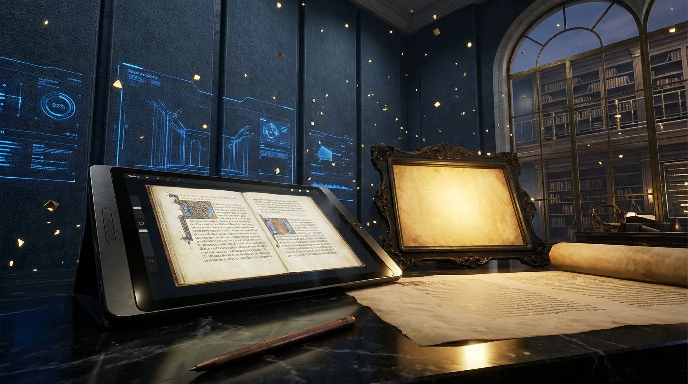
The Scholar's Desk 🕯️
The Scholar's Desk proves that educational media can carry historical weight while still functioning as a modern tool. Deep Night Sky provides the vast, uninterrupted space needed for deep concentration, heavily contrasting with the sudden, sharp interruptions of Gilded Spine and Antique Ochre. These golds are not the primary colors of building blocks; they are the colors of wealth and preserved knowledge, ideal for highlighting crucial navigational paths or progress markers. Muted interludes of Stone Bust and Faded Blueprint offer a softer resting state for sidebars and secondary menus, preventing the eye from being overwhelmed by the high contrast of the primary components. A surprising injection of Wax Seal Red adds to the administrative, official feeling of the interface, providing an alarm or notification shade that feels like a vital stamp of approval rather than a screeching error message. The entire arrangement flatters the user, treating them like a sophisticated academic rather than a distracted child.
Illumination Hours 🕰️
Sometimes the primary visual requirement of an educational interface is sheer, unadulterated energy, but channeled through an adult aesthetic. Illumination Hours achieves this tricky balance by leaning heavily into a spectrum of glowing ambers rather than the standard, blinding caution yellows. Soft Amber Glass and Sunburst Gold deliver a constant, driving momentum that keeps the user engaged, mimicking the effect of late afternoon light hitting a reading desk. Rich Saffron and Aged Medal pull these intense shades down to earth, giving the gold tones an oxidized, historical context that prevents them from looking cheap or transient. Dust Cover Grey acts as the solitary anchoring element, a quiet, unassuming neutral that absorbs the surrounding heat and provides a legible baseline for long passages of text. In an arts and media context, this palette works perfectly for interactive dashboards or active creation tools, offering all the intense focus required for productivity while maintaining the dignified atmosphere of a rare books collection.
Archives Masterclass 📜
Archives Masterclass takes a decidedly cooler, more clinical approach to the ancient library aesthetic, relying on wide open spaces and crisp contrasts. Clean Parchment replaces the standard bright screen background with a marginally warmer, aged tone that reduces visual fatigue during marathon reading sessions. Set against this quiet backdrop, Maritime Blue and Obsidian Type deliver maximum legibility, rendering text and primary architecture with absolute authority. Muted Cerulean acts as a gentle interactive layer, a forgiving shade for hover states and secondary links that refuses to shout for attention. The introduction of Faded Map Yellow provides just enough of a gilded accent to connect this cool, efficient space back to the historical theme. It is exceptionally well suited for text-heavy archival research platforms or dense media libraries, where the design must vanish into the background and let the material stand entirely on its own merit.
Chancellor's Portrait 🖌️
Chancellor's Portrait brings a theatrical, almost severe atmosphere to digital learning spaces, demanding absolute attention and respect from the moment the user logs in. The vast, lightless expanse of Pitch Black provides a stark canvas that makes the metallic accents of Antiquarian Gold and Oxidized Bronze look genuinely expensive, almost three dimensional in their rendering. Royal Academic Blue serves as a striking primary action color, a shade deeply tied to traditional institutional crests and formal academic robes. Slate Denim bridges the gap between the heavy darks and the brilliant accents, offering a muted, functional space for peripheral tools. This is a design language unapologetically aimed at advanced, executive tiers of education or high end arts media, completely abandoning any pretense of playful accessibility. It crafts an intimidating but deeply rewarding space, reminding the user that acquiring knowledge is a serious, prestigious undertaking that requires their absolute best effort.
Leaving behind the candy colored aesthetics of early educational software is not merely a stylistic update, it is a necessary correction in how we treat the digital learner. By adopting the atmospheric qualities of navy, gold, and aged paper, these designs respect the user's intelligence and demand their focus. The shift towards muted, sophisticated interfaces proves that digital learning environments can be as dignified and inspiring as their physical counterparts in the world's great universities. The modern student is no longer patronized by aggressive primary colors; instead, they are invited into a virtual reading room that quietly but firmly insists on academic excellence.