'%3e%3cpath%20fill-rule='evenodd'%20clip-rule='evenodd'%20d='M51.1303%2019.2492C50.7278%2019.913%2050.1346%2020.4426%2049.3508%2020.838C48.5669%2021.2335%2047.6172%2021.4312%2046.5014%2021.4312C44.8208%2021.4312%2043.4367%2021.0216%2042.3492%2020.2025C41.2617%2019.3833%2040.6686%2018.2394%2040.5697%2016.7706H44.4253C44.4818%2017.3355%2044.6831%2017.7804%2045.0291%2018.1052C45.3751%2018.43%2045.8164%2018.5924%2046.3531%2018.5924C46.8192%2018.5924%2047.1864%2018.4653%2047.4547%2018.2111C47.7231%2017.9569%2047.8572%2017.618%2047.8572%2017.1943C47.8572%2016.8129%2047.7337%2016.4952%2047.4865%2016.241C47.2393%2015.9867%2046.9322%2015.7784%2046.565%2015.616C46.1978%2015.4536%2045.6893%2015.2594%2045.0397%2015.0334C44.0934%2014.7086%2043.3202%2014.3944%2042.72%2014.0907C42.1197%2013.7871%2041.6042%2013.3351%2041.1735%2012.7349C40.7427%2012.1347%2040.5273%2011.3544%2040.5273%2010.394C40.5273%209.50418%2040.7533%208.73448%2041.2053%208.08481C41.6572%207.43515%2042.2821%206.93731%2043.0801%206.5913C43.8781%206.24528%2044.7925%206.07227%2045.8235%206.07227C47.49%206.07227%2048.8141%206.46771%2049.7956%207.25861C50.7772%208.04951%2051.3315%209.13698%2051.4586%2010.5211H47.5395C47.4689%2010.0268%2047.2888%209.63483%2046.9993%209.3453C46.7097%209.05578%2046.3178%208.91102%2045.8235%208.91102C45.3998%208.91102%2045.0573%209.024%2044.7961%209.24997C44.5348%209.47594%2044.4041%209.80783%2044.4041%2010.2457C44.4041%2010.5988%2044.5207%2010.8989%2044.7537%2011.146C44.9867%2011.3932%2045.2798%2011.5944%2045.6328%2011.7498C45.9859%2011.9052%2046.4944%2012.1029%2047.1581%2012.343C48.1185%2012.6678%2048.9023%2012.9891%2049.5096%2013.3069C50.1169%2013.6246%2050.6395%2014.0872%2051.0773%2014.6945C51.5151%2015.3018%2051.734%2016.0927%2051.734%2017.0672C51.734%2017.8581%2051.5328%2018.5854%2051.1303%2019.2492ZM59.0242%206.3053V21.2829H55.4016V6.3053H59.0242ZM73.9409%206.3053V9.18642H69.8734V21.2829H66.2296V9.18642H62.2046V6.3053H73.9409ZM80.7438%209.18642V12.3218H85.8069V15.0546H80.7438V18.3806H86.4425V21.2829H77.1212V6.3053H86.4425V9.18642H80.7438ZM99.667%2016.0291V21.2829H96.0444V6.3053H101.913C103.692%206.3053%20105.048%206.74665%20105.98%207.62934C106.912%208.51204%20107.378%209.7019%20107.378%2011.199C107.378%2012.1311%20107.17%2012.9609%20106.753%2013.6882C106.337%2014.4155%20105.719%2014.9875%20104.9%2015.4042C104.08%2015.8208%20103.085%2016.0291%20101.913%2016.0291H99.667ZM103.692%2011.199C103.692%209.8855%20102.965%209.22879%20101.51%209.22879H99.667V13.1268H101.51C102.965%2013.1268%20103.692%2012.4842%20103.692%2011.199ZM120.092%2018.5501H114.478L113.546%2021.2829H109.732L115.219%206.41123H119.393L124.879%2021.2829H121.024L120.092%2018.5501ZM119.16%2015.7961L117.295%2010.2881L115.41%2015.7961H119.16ZM131.555%2018.5077H136.385V21.2829H127.933V6.3053H131.555V18.5077ZM143.337%209.18642V12.3218H148.4V15.0546H143.337V18.3806H149.035V21.2829H139.714V6.3053H149.035V9.18642H143.337ZM163.507%206.3053V9.18642H159.44V21.2829H155.796V9.18642H151.771V6.3053H163.507ZM177.449%206.3053V9.18642H173.382V21.2829H169.738V9.18642H165.713V6.3053H177.449ZM184.252%209.18642V12.3218H189.315V15.0546H184.252V18.3806H189.951V21.2829H180.629V6.3053H189.951V9.18642H184.252Z'%20fill='%23EEF0ED'/%3e%3cmask%20id='mask0_3101_7327'%20style='mask-type:alpha'%20maskUnits='userSpaceOnUse'%20x='0'%20y='0'%20width='27'%20height='28'%3e%3cpath%20d='M23.8328%200.759766H2.64808C1.18559%200.759766%200%201.94535%200%203.40785V24.5925C0%2026.055%201.18559%2027.2406%202.64808%2027.2406H23.8328C25.2952%2027.2406%2026.4808%2026.055%2026.4808%2024.5925V3.40785C26.4808%201.94535%2025.2952%200.759766%2023.8328%200.759766Z'%20fill='white'/%3e%3c/mask%3e%3cg%20mask='url(%23mask0_3101_7327)'%3e%3cpath%20d='M23.8328%200.759766H2.64808C1.18559%200.759766%200%201.94535%200%203.40785V24.5925C0%2026.055%201.18559%2027.2406%202.64808%2027.2406H23.8328C25.2952%2027.2406%2026.4808%2026.055%2026.4808%2024.5925V3.40785C26.4808%201.94535%2025.2952%200.759766%2023.8328%200.759766Z'%20fill='%23D8D8D8'/%3e%3cpath%20d='M13.2404%200.759766H0V14.0001H13.2404V0.759766Z'%20fill='%238C61FF'/%3e%3cpath%20d='M13.2404%2014H0V27.2404H13.2404V14Z'%20fill='%2336C3FE'/%3e%3cpath%20d='M26.4806%2014H13.2402V27.2404H26.4806V14Z'%20fill='%236592FE'/%3e%3cpath%20d='M26.4806%200.759766H13.2402V14.0002H26.4806V0.759766Z'%20fill='%236059F7'/%3e%3c/g%3e%3c/g%3e%3cdefs%3e%3cclipPath%20id='clip0_3101_7327'%3e%3crect%20width='190'%20height='28'%20fill='white'/%3e%3c/clipPath%3e%3c/defs%3e%3c/svg%3e)
'%3e%3cpath%20d='M23.8328%200.759521H2.64808C1.18559%200.759521%200%201.94511%200%203.40761V24.5923C0%2026.0548%201.18559%2027.2404%202.64808%2027.2404H23.8328C25.2952%2027.2404%2026.4808%2026.0548%2026.4808%2024.5923V3.40761C26.4808%201.94511%2025.2952%200.759521%2023.8328%200.759521Z'%20fill='%23D8D8D8'/%3e%3cpath%20d='M13.2404%200.759521H0V13.9999H13.2404V0.759521Z'%20fill='%238C61FF'/%3e%3cpath%20d='M13.2404%2013.9998H0V27.2402H13.2404V13.9998Z'%20fill='%2336C3FE'/%3e%3cpath%20d='M26.4809%2013.9998H13.2405V27.2402H26.4809V13.9998Z'%20fill='%236592FE'/%3e%3cpath%20d='M26.4809%200.759277H13.2405V13.9997H26.4809V0.759277Z'%20fill='%236059F7'/%3e%3c/g%3e%3c/svg%3e)
Pop Art Horror Color Palettes: The Radioactive Renaissance
· 6 min readIn the history of visual culture, few collisions are as jarring or as generative as the meeting point between the hyper-saturated commercialism of 1960s Pop Art and the psychological shadows of modern arthouse horror. This stylistic intersection, often termed the Radioactive Renaissance, represents a shifting cultural anxiety where the bright promises of consumerism decay into something sinister. We see the cheerful cyan of a vintage advertisement curdling against the abyssal blacks of noir cinema, creating a visual language that feels simultaneously nostalgic and threatening. The palettes examined here do not merely decorate; they narrate a specific kind of tension. They reflect a world where neon signage buzzes over abandoned alleyways and where the artificiality of pink or lime green serves not to comfort, but to disturb. By stripping away the comforting separation between the vibrant and the macabre, deep charcoal shadows act as a grounding force, allowing aggressive hues to pierce through the darkness with surgical precision. This is color theory applied to dread, transforming the candy-colored aesthetic of the past into the nightmare fuel of the present.
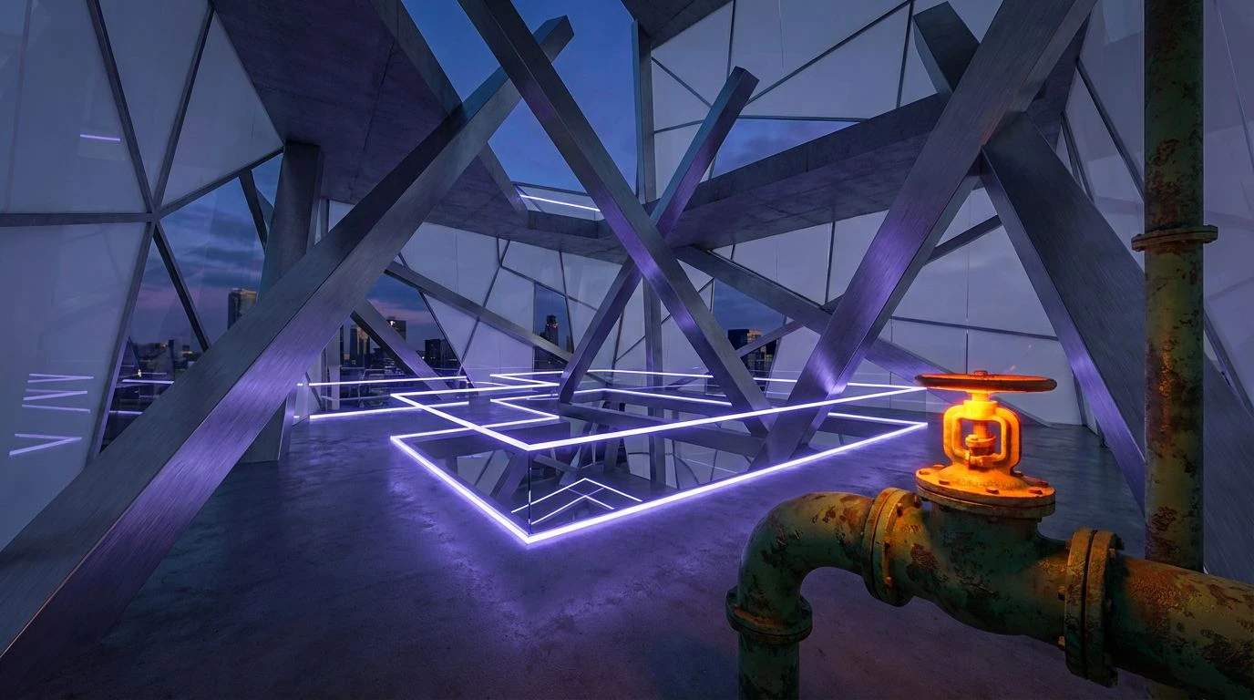
Neon Necropolis 💜
There is a calculated violence in the way Acidic Fuchsia and Bruised Violet cut through the oppressive weight of Asphalt Void in this selection. It evokes the specific lighting of Giallo cinema, where stylization takes precedence over realism and color becomes a signal for impending danger. The grayscale foundation—ranging from the near-black of the void to the metallic sheen of the Silver Screen—establishes a rigid, brutalist structure reminiscent of urban decay. Against this monochromatic heavy lifting, the vibrant purples and pinks do not offer relief; rather, they act as warning signs, glowing with the unnatural intensity of a chemical spill on wet pavement. The arrangement suggests a narrative of glamour gone wrong, perfect for environments that require a sense of sleek, high-stakes drama. It captures the feeling of walking home alone under flickering streetlights that distort rather than illuminate, embodying a precise balance between the seductive and the terrifying.
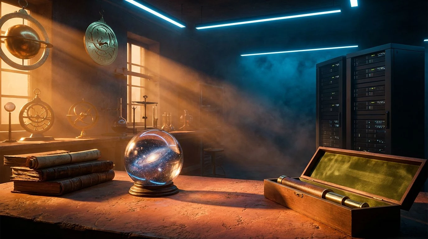
Isotope hysteria 🧪
Chaotic energy defines this grouping, which reads like a corrupted video file or a hallucination induced by exposure to hazardous materials. The clash between Geiger Green and Reactor Red creates a vibration that is almost painful to the eye, mimicking the visual assault of a strobe light in a dark room. Grounded only by the severe neutrality of Abyssal Carbon and Lead Shadow, the chromatic hues seem to float, untethered and dangerous. This is the palette of the breakdown—where the mechanical fails and the biological takes over in grotesque spurts of growth and decay. It suits designs that aim to disorient or challenge the viewer, rejecting harmony in favor of a frenetic, glitch-laden aesthetic. The inclusion of Sanitarium Scrub adds a clinical, cold undertone that contrasts sharply with the heat of the magenta and red, reinforcing the theme of a laboratory experiment spiraling out of control.
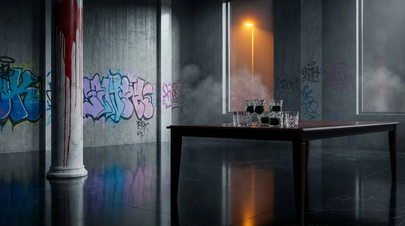
Fatal Romance 🔪
The narrative arc here is deceptively simple, moving from innocent artificiality to deep, biological horror. The interaction between Plastic Barbie and Coagulated Maroon tells a story of corruption, where the pristine surface of 1960s consumer culture is slit open to reveal something dark and organic beneath. Midnight Velvet provides a theatrical backdrop, absorbing the light and allowing the pinks to pop with eerie isolation. It brings to mind the image of a discarded doll in a gutter, or a lipstick stain on a crime scene photo. The tension focuses on the dual nature of pink—simultaneously a signifier of childhood innocence and, in this context, a marker of vulnerability. This selection works effectively in spaces that explore themes of obsession or lost innocence, using the visual language of romance to deliver a psychological blow.
Comic Book Decay 💥
Drawing heavily on the halftone printing techniques of mid-century graphic novels, this assembly subverts the optimism of the funny pages by introducing the tones of oxidation and age. The stark contrast of Ink Outline and Page White creates a rigid, illustrative framework, but the chromatic fills—Rusted Orange and Hazard Yellow—feel sickly and weathered. It is the visual equivalent of finding a stack of cheerful comics left to rot in a damp basement. The Cyanide Teal offers a striking counterpoint to the warm, bilious yellows, creating a vibration that feels distinctly vintage yet undeniably toxic. This aesthetic speaks to a corruption of nostalgia, suggesting that the heroes of the past have effectively rusted over. It commands attention through high contrast while instilling a subtle unease through its specific, slightly off-kilter hue selection.
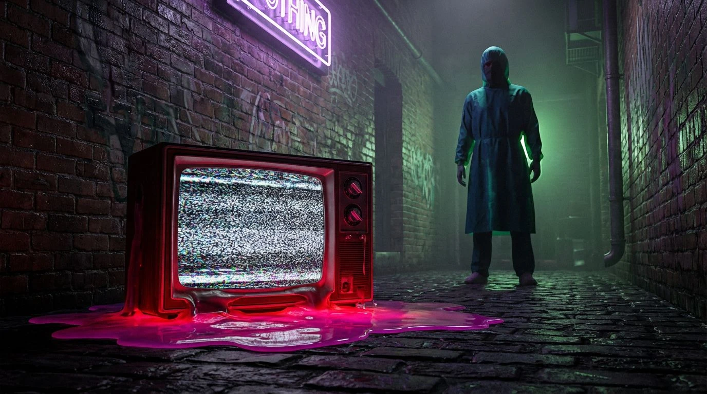
Suburban Nightmare 📺
This broad spectrum captures the cluttered, sensory overload of American suburbia viewed through a distorted lens. The juxtaposition of domestic colors like Pumpkin Glow and Bubblegum Shock against the ominous depths of Vantablack and Deep Lagoon suggests a hidden menace lurking behind the white picket fence. It creates a collage effect, similar to a ransom note cut from glossy magazines. The cool blues and teals provide a damp, nocturnal atmosphere, while the hot reds and pinks pierce through like classic jump-scares. This range feels erratic and unstable, perfect for narratives that fragment reality or explore the chaos beneath a manicured surface. It does not seek to blend these colors into a smooth gradient but rather forces them to coexist in an uneasy, jagged proximity, mirroring the fractured psyche of a thriller protagonist.
The visual dialogue established by these palettes suggests that the boundary between allure and repulsion is far thinner than typically assumed. By dragging the high-gloss aesthetic of mid-century advertising into the suffocating gloom of horror noir, a new form of storytelling emerges—one that relies on heavy contrast to unsettle the viewer. The aggressive use of neon against desaturated grays and blacks denies the eye a place to rest, forcing a confrontation with the artificiality of the image. This collection demonstrates that vibrancy is not inherently joyful, nor is shadow always quiet. Instead, they work in tandem to produce a sophisticated unease, reminiscent of a scream disguised as a laugh. As visual trends continue to mine the past for inspiration, this specific intersection of eras proves that the most effective way to modernize a retro aesthetic is to haunt it, allowing the ghosts of cinema to wander through the bright, plastic corridors of pop culture.