'%3e%3cpath%20fill-rule='evenodd'%20clip-rule='evenodd'%20d='M51.1303%2019.2492C50.7278%2019.913%2050.1346%2020.4426%2049.3508%2020.838C48.5669%2021.2335%2047.6172%2021.4312%2046.5014%2021.4312C44.8208%2021.4312%2043.4367%2021.0216%2042.3492%2020.2025C41.2617%2019.3833%2040.6686%2018.2394%2040.5697%2016.7706H44.4253C44.4818%2017.3355%2044.6831%2017.7804%2045.0291%2018.1052C45.3751%2018.43%2045.8164%2018.5924%2046.3531%2018.5924C46.8192%2018.5924%2047.1864%2018.4653%2047.4547%2018.2111C47.7231%2017.9569%2047.8572%2017.618%2047.8572%2017.1943C47.8572%2016.8129%2047.7337%2016.4952%2047.4865%2016.241C47.2393%2015.9867%2046.9322%2015.7784%2046.565%2015.616C46.1978%2015.4536%2045.6893%2015.2594%2045.0397%2015.0334C44.0934%2014.7086%2043.3202%2014.3944%2042.72%2014.0907C42.1197%2013.7871%2041.6042%2013.3351%2041.1735%2012.7349C40.7427%2012.1347%2040.5273%2011.3544%2040.5273%2010.394C40.5273%209.50418%2040.7533%208.73448%2041.2053%208.08481C41.6572%207.43515%2042.2821%206.93731%2043.0801%206.5913C43.8781%206.24528%2044.7925%206.07227%2045.8235%206.07227C47.49%206.07227%2048.8141%206.46771%2049.7956%207.25861C50.7772%208.04951%2051.3315%209.13698%2051.4586%2010.5211H47.5395C47.4689%2010.0268%2047.2888%209.63483%2046.9993%209.3453C46.7097%209.05578%2046.3178%208.91102%2045.8235%208.91102C45.3998%208.91102%2045.0573%209.024%2044.7961%209.24997C44.5348%209.47594%2044.4041%209.80783%2044.4041%2010.2457C44.4041%2010.5988%2044.5207%2010.8989%2044.7537%2011.146C44.9867%2011.3932%2045.2798%2011.5944%2045.6328%2011.7498C45.9859%2011.9052%2046.4944%2012.1029%2047.1581%2012.343C48.1185%2012.6678%2048.9023%2012.9891%2049.5096%2013.3069C50.1169%2013.6246%2050.6395%2014.0872%2051.0773%2014.6945C51.5151%2015.3018%2051.734%2016.0927%2051.734%2017.0672C51.734%2017.8581%2051.5328%2018.5854%2051.1303%2019.2492ZM59.0242%206.3053V21.2829H55.4016V6.3053H59.0242ZM73.9409%206.3053V9.18642H69.8734V21.2829H66.2296V9.18642H62.2046V6.3053H73.9409ZM80.7438%209.18642V12.3218H85.8069V15.0546H80.7438V18.3806H86.4425V21.2829H77.1212V6.3053H86.4425V9.18642H80.7438ZM99.667%2016.0291V21.2829H96.0444V6.3053H101.913C103.692%206.3053%20105.048%206.74665%20105.98%207.62934C106.912%208.51204%20107.378%209.7019%20107.378%2011.199C107.378%2012.1311%20107.17%2012.9609%20106.753%2013.6882C106.337%2014.4155%20105.719%2014.9875%20104.9%2015.4042C104.08%2015.8208%20103.085%2016.0291%20101.913%2016.0291H99.667ZM103.692%2011.199C103.692%209.8855%20102.965%209.22879%20101.51%209.22879H99.667V13.1268H101.51C102.965%2013.1268%20103.692%2012.4842%20103.692%2011.199ZM120.092%2018.5501H114.478L113.546%2021.2829H109.732L115.219%206.41123H119.393L124.879%2021.2829H121.024L120.092%2018.5501ZM119.16%2015.7961L117.295%2010.2881L115.41%2015.7961H119.16ZM131.555%2018.5077H136.385V21.2829H127.933V6.3053H131.555V18.5077ZM143.337%209.18642V12.3218H148.4V15.0546H143.337V18.3806H149.035V21.2829H139.714V6.3053H149.035V9.18642H143.337ZM163.507%206.3053V9.18642H159.44V21.2829H155.796V9.18642H151.771V6.3053H163.507ZM177.449%206.3053V9.18642H173.382V21.2829H169.738V9.18642H165.713V6.3053H177.449ZM184.252%209.18642V12.3218H189.315V15.0546H184.252V18.3806H189.951V21.2829H180.629V6.3053H189.951V9.18642H184.252Z'%20fill='%23EEF0ED'/%3e%3cmask%20id='mask0_3101_7327'%20style='mask-type:alpha'%20maskUnits='userSpaceOnUse'%20x='0'%20y='0'%20width='27'%20height='28'%3e%3cpath%20d='M23.8328%200.759766H2.64808C1.18559%200.759766%200%201.94535%200%203.40785V24.5925C0%2026.055%201.18559%2027.2406%202.64808%2027.2406H23.8328C25.2952%2027.2406%2026.4808%2026.055%2026.4808%2024.5925V3.40785C26.4808%201.94535%2025.2952%200.759766%2023.8328%200.759766Z'%20fill='white'/%3e%3c/mask%3e%3cg%20mask='url(%23mask0_3101_7327)'%3e%3cpath%20d='M23.8328%200.759766H2.64808C1.18559%200.759766%200%201.94535%200%203.40785V24.5925C0%2026.055%201.18559%2027.2406%202.64808%2027.2406H23.8328C25.2952%2027.2406%2026.4808%2026.055%2026.4808%2024.5925V3.40785C26.4808%201.94535%2025.2952%200.759766%2023.8328%200.759766Z'%20fill='%23D8D8D8'/%3e%3cpath%20d='M13.2404%200.759766H0V14.0001H13.2404V0.759766Z'%20fill='%238C61FF'/%3e%3cpath%20d='M13.2404%2014H0V27.2404H13.2404V14Z'%20fill='%2336C3FE'/%3e%3cpath%20d='M26.4806%2014H13.2402V27.2404H26.4806V14Z'%20fill='%236592FE'/%3e%3cpath%20d='M26.4806%200.759766H13.2402V14.0002H26.4806V0.759766Z'%20fill='%236059F7'/%3e%3c/g%3e%3c/g%3e%3cdefs%3e%3cclipPath%20id='clip0_3101_7327'%3e%3crect%20width='190'%20height='28'%20fill='white'/%3e%3c/clipPath%3e%3c/defs%3e%3c/svg%3e)
'%3e%3cpath%20d='M23.8328%200.759521H2.64808C1.18559%200.759521%200%201.94511%200%203.40761V24.5923C0%2026.0548%201.18559%2027.2404%202.64808%2027.2404H23.8328C25.2952%2027.2404%2026.4808%2026.0548%2026.4808%2024.5923V3.40761C26.4808%201.94511%2025.2952%200.759521%2023.8328%200.759521Z'%20fill='%23D8D8D8'/%3e%3cpath%20d='M13.2404%200.759521H0V13.9999H13.2404V0.759521Z'%20fill='%238C61FF'/%3e%3cpath%20d='M13.2404%2013.9998H0V27.2402H13.2404V13.9998Z'%20fill='%2336C3FE'/%3e%3cpath%20d='M26.4809%2013.9998H13.2405V27.2402H26.4809V13.9998Z'%20fill='%236592FE'/%3e%3cpath%20d='M26.4809%200.759277H13.2405V13.9997H26.4809V0.759277Z'%20fill='%236059F7'/%3e%3c/g%3e%3c/svg%3e)
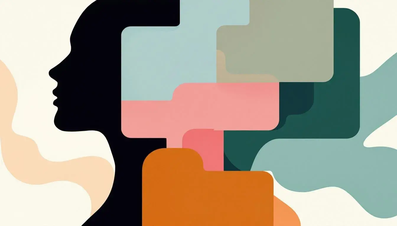
Untapped Potential: Unearthing the Least Used Style to apply Palette
· 5 min readColor is an invitation. It whispers of stories untold, feelings unexpressed, and visions waiting to be painted onto the canvas of our world. Often, we cling to familiar color combinations, neglecting the vast spectrum of possibilities that lie dormant, waiting for a spark of courage to ignite them. It's in these uncharted territories of color pairings that true innovation resides—a chance to redefine aesthetics and challenge conventional beauty. Imagine a world where the unexpected becomes the norm, where colors dance together in ways we never thought possible, creating atmospheres that are both arresting and deeply moving. This is not simply about decoration; it's about unlocking potential, both in design and in the way we perceive our surroundings. It is about pushing boundaries and discovering the extraordinary potential that lies in the less-traveled paths of the color wheel.
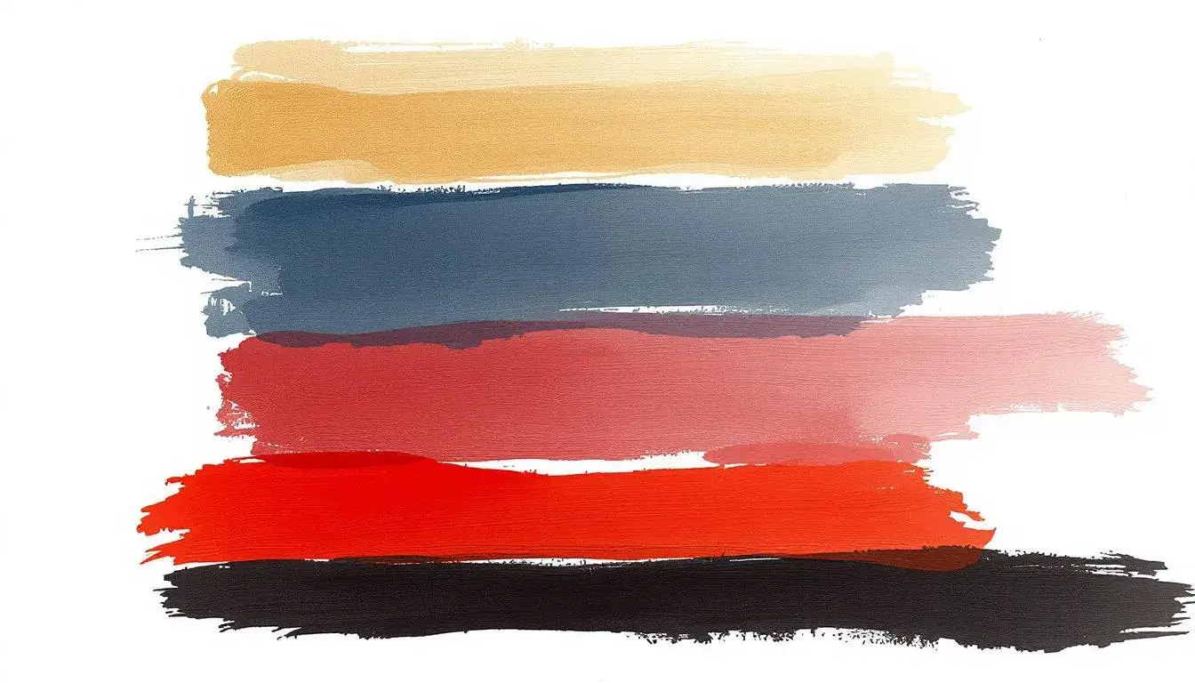
Stolen Sunset 🌇 presents a dramatic narrative. The palette feels almost cinematic, like the final moments of daylight exploding across the horizon. The interplay of a muted gold—Color 2—with the steely blue-gray—Color 4—creates a sophisticated tension, a study in contrasts. Adding to the drama, a deep, almost bruised crimson—Color 3—burns against the inky black—Color 1—evoking powerful emotions. It feels almost defiant, a refusal to fade quietly into the night. Imagine this palette applied to the interior of a speakeasy, its walls steeped in shadows, punctuated by flashes of daring artwork highlighted by strategic light. The effect would be seductive yet dangerous, a hidden world of secrets and illicit pleasures. Instead of simply decorating a space, Stolen Sunset 🌇 crafts an experience. This palette defies easy categorization, it's neither overtly feminine nor strictly masculine, but rather exists in the space between, offering a chance to explore uncharted emotional depths.
Earthy Teal 🌊 offers a serene escape, a visual balm for the weary soul. Imagine mist rolling across a forest floor, the gentle sound of water lapping against the shore. This palette whispers of hushed mornings and quiet contemplation. The gentle Off-White dances with the pale Dusty Gray, creating a soft backdrop against which the main players take center stage. The Teal Green evokes memories of serene ocean scapes, while the deep Forest Green hints at something wilder, a touch untamed. Finally, the Dark Charcoal offers a grounding presence. Envision these colors dressing the walls of a yoga studio, instantly transporting the space to a calming sanctuary. The palette is not about bold statements but rather about understated elegance and a connection to the natural world. It is a style of quiet sophistication, perfect for those who seek beauty in simplicity and find solace in the rhythms of nature. It does not shout; it invites you to listen.
Earthy Vibrance ☘️ pulses with life and speaks of renewal. The Pale Turquoise feels light and airy like the first breath of spring. The Light Moss Green adds a touch of whimsy, like sunlight filtering through leaves. As the eye travels across the palette, the Deep Teal appears, offering a grounding contrast, reminiscent of deep forests. The final two colors, Dark Green and Dark Forest, conjure images of verdant landscapes teeming with unseen life. Picture these colours in a modern restaurant interior, offset by natural materials, creating a space that celebrates the earth's bounty. This palette would be best suited to a space that values a sense of vitality and seeks an aesthetic that is both grounded and uplifting. It is a celebration of life's simple pleasures, an invitation to breathe deeply and find joy in the everyday. It is an echo of the forest, calling us back to our roots.
Mentor Palette 🧑🎨 exudes confidence, the measured hues whispering of both wisdom and authority. The light Off White creates a sense of quiet sophistication, while the Teal Green feels invigorating, adding a touch of refreshing energy. It then transitions to the Slate Blue, offering a depth of vision and an air of contemplation. Then comes the Mauve Rose. grounding warmth, before resolving with the Charcoal Brown completing overall vision. Imagine this palette dressing a sleek, open-plan office space, adding splashes of personality to an otherwise stark environment. The effect would be both professional and deeply inviting, a space where both creativity and productivity are fostered. It is not a style of ostentatious grandstanding, but one of quiet competence and assuredness. It is a space with a subtle and calm approach, offering a sense of trust and reliability.
Earthy Elegance ☘️ suggests timeless grace. The Off White whispers of understated sophistication, a blank canvas ready to be transformed. The Dusty Gray adds a hint of mystery, like a hidden pathway waiting to be discovered. The Light Brown brings with it a touch of soft and inviting comfort, while the Burnt Sienna hints at something richer. To complete it all, add the Dark Teal Green, grounding the palette, giving it depth. These colors are like the notes of a classical symphony, each playing its part to create something beautiful. Picture this palette in an intimate cocktail lounge, all smooth jazz and subtle lighting, where stories are whispered and dreams take flight. It welcomes with a gentle warmth, offering a sense of peace and contemplation. This is a style that celebrates refinement and speaks to a longing for beauty in its most pure form.
The journey through these five palettes is an invitation to step outside our comfort zones and embrace the unexpected. From the dramatic depths of Stolen Sunset 🌇 to the serene tranquility of Earthy Teal 🌊, each palette offers a unique path to unlock potential. Earthy Vibrance ☘️ injects a lively spirit, while Mentor Palette 🧑🎨 instills confidence, and Earthy Elegance ☘️ exudes timeless grace. By choosing the less traveled road, exploring colors and styles we often overlook, we not only create more compelling designs, but we also open ourselves up to new ways of feeling and experiencing the world. As we embrace the untapped potential of color pairings, we invite novelty into our world. This is how we can inspire joy, spark imagination, and ultimately, create a world that is both beautiful and genuinely unique.