'%3e%3cpath%20fill-rule='evenodd'%20clip-rule='evenodd'%20d='M51.1303%2019.2492C50.7278%2019.913%2050.1346%2020.4426%2049.3508%2020.838C48.5669%2021.2335%2047.6172%2021.4312%2046.5014%2021.4312C44.8208%2021.4312%2043.4367%2021.0216%2042.3492%2020.2025C41.2617%2019.3833%2040.6686%2018.2394%2040.5697%2016.7706H44.4253C44.4818%2017.3355%2044.6831%2017.7804%2045.0291%2018.1052C45.3751%2018.43%2045.8164%2018.5924%2046.3531%2018.5924C46.8192%2018.5924%2047.1864%2018.4653%2047.4547%2018.2111C47.7231%2017.9569%2047.8572%2017.618%2047.8572%2017.1943C47.8572%2016.8129%2047.7337%2016.4952%2047.4865%2016.241C47.2393%2015.9867%2046.9322%2015.7784%2046.565%2015.616C46.1978%2015.4536%2045.6893%2015.2594%2045.0397%2015.0334C44.0934%2014.7086%2043.3202%2014.3944%2042.72%2014.0907C42.1197%2013.7871%2041.6042%2013.3351%2041.1735%2012.7349C40.7427%2012.1347%2040.5273%2011.3544%2040.5273%2010.394C40.5273%209.50418%2040.7533%208.73448%2041.2053%208.08481C41.6572%207.43515%2042.2821%206.93731%2043.0801%206.5913C43.8781%206.24528%2044.7925%206.07227%2045.8235%206.07227C47.49%206.07227%2048.8141%206.46771%2049.7956%207.25861C50.7772%208.04951%2051.3315%209.13698%2051.4586%2010.5211H47.5395C47.4689%2010.0268%2047.2888%209.63483%2046.9993%209.3453C46.7097%209.05578%2046.3178%208.91102%2045.8235%208.91102C45.3998%208.91102%2045.0573%209.024%2044.7961%209.24997C44.5348%209.47594%2044.4041%209.80783%2044.4041%2010.2457C44.4041%2010.5988%2044.5207%2010.8989%2044.7537%2011.146C44.9867%2011.3932%2045.2798%2011.5944%2045.6328%2011.7498C45.9859%2011.9052%2046.4944%2012.1029%2047.1581%2012.343C48.1185%2012.6678%2048.9023%2012.9891%2049.5096%2013.3069C50.1169%2013.6246%2050.6395%2014.0872%2051.0773%2014.6945C51.5151%2015.3018%2051.734%2016.0927%2051.734%2017.0672C51.734%2017.8581%2051.5328%2018.5854%2051.1303%2019.2492ZM59.0242%206.3053V21.2829H55.4016V6.3053H59.0242ZM73.9409%206.3053V9.18642H69.8734V21.2829H66.2296V9.18642H62.2046V6.3053H73.9409ZM80.7438%209.18642V12.3218H85.8069V15.0546H80.7438V18.3806H86.4425V21.2829H77.1212V6.3053H86.4425V9.18642H80.7438ZM99.667%2016.0291V21.2829H96.0444V6.3053H101.913C103.692%206.3053%20105.048%206.74665%20105.98%207.62934C106.912%208.51204%20107.378%209.7019%20107.378%2011.199C107.378%2012.1311%20107.17%2012.9609%20106.753%2013.6882C106.337%2014.4155%20105.719%2014.9875%20104.9%2015.4042C104.08%2015.8208%20103.085%2016.0291%20101.913%2016.0291H99.667ZM103.692%2011.199C103.692%209.8855%20102.965%209.22879%20101.51%209.22879H99.667V13.1268H101.51C102.965%2013.1268%20103.692%2012.4842%20103.692%2011.199ZM120.092%2018.5501H114.478L113.546%2021.2829H109.732L115.219%206.41123H119.393L124.879%2021.2829H121.024L120.092%2018.5501ZM119.16%2015.7961L117.295%2010.2881L115.41%2015.7961H119.16ZM131.555%2018.5077H136.385V21.2829H127.933V6.3053H131.555V18.5077ZM143.337%209.18642V12.3218H148.4V15.0546H143.337V18.3806H149.035V21.2829H139.714V6.3053H149.035V9.18642H143.337ZM163.507%206.3053V9.18642H159.44V21.2829H155.796V9.18642H151.771V6.3053H163.507ZM177.449%206.3053V9.18642H173.382V21.2829H169.738V9.18642H165.713V6.3053H177.449ZM184.252%209.18642V12.3218H189.315V15.0546H184.252V18.3806H189.951V21.2829H180.629V6.3053H189.951V9.18642H184.252Z'%20fill='%23EEF0ED'/%3e%3cmask%20id='mask0_3101_7327'%20style='mask-type:alpha'%20maskUnits='userSpaceOnUse'%20x='0'%20y='0'%20width='27'%20height='28'%3e%3cpath%20d='M23.8328%200.759766H2.64808C1.18559%200.759766%200%201.94535%200%203.40785V24.5925C0%2026.055%201.18559%2027.2406%202.64808%2027.2406H23.8328C25.2952%2027.2406%2026.4808%2026.055%2026.4808%2024.5925V3.40785C26.4808%201.94535%2025.2952%200.759766%2023.8328%200.759766Z'%20fill='white'/%3e%3c/mask%3e%3cg%20mask='url(%23mask0_3101_7327)'%3e%3cpath%20d='M23.8328%200.759766H2.64808C1.18559%200.759766%200%201.94535%200%203.40785V24.5925C0%2026.055%201.18559%2027.2406%202.64808%2027.2406H23.8328C25.2952%2027.2406%2026.4808%2026.055%2026.4808%2024.5925V3.40785C26.4808%201.94535%2025.2952%200.759766%2023.8328%200.759766Z'%20fill='%23D8D8D8'/%3e%3cpath%20d='M13.2404%200.759766H0V14.0001H13.2404V0.759766Z'%20fill='%238C61FF'/%3e%3cpath%20d='M13.2404%2014H0V27.2404H13.2404V14Z'%20fill='%2336C3FE'/%3e%3cpath%20d='M26.4806%2014H13.2402V27.2404H26.4806V14Z'%20fill='%236592FE'/%3e%3cpath%20d='M26.4806%200.759766H13.2402V14.0002H26.4806V0.759766Z'%20fill='%236059F7'/%3e%3c/g%3e%3c/g%3e%3cdefs%3e%3cclipPath%20id='clip0_3101_7327'%3e%3crect%20width='190'%20height='28'%20fill='white'/%3e%3c/clipPath%3e%3c/defs%3e%3c/svg%3e)
'%3e%3cpath%20d='M23.8328%200.759521H2.64808C1.18559%200.759521%200%201.94511%200%203.40761V24.5923C0%2026.0548%201.18559%2027.2404%202.64808%2027.2404H23.8328C25.2952%2027.2404%2026.4808%2026.0548%2026.4808%2024.5923V3.40761C26.4808%201.94511%2025.2952%200.759521%2023.8328%200.759521Z'%20fill='%23D8D8D8'/%3e%3cpath%20d='M13.2404%200.759521H0V13.9999H13.2404V0.759521Z'%20fill='%238C61FF'/%3e%3cpath%20d='M13.2404%2013.9998H0V27.2402H13.2404V13.9998Z'%20fill='%2336C3FE'/%3e%3cpath%20d='M26.4809%2013.9998H13.2405V27.2402H26.4809V13.9998Z'%20fill='%236592FE'/%3e%3cpath%20d='M26.4809%200.759277H13.2405V13.9997H26.4809V0.759277Z'%20fill='%236059F7'/%3e%3c/g%3e%3c/svg%3e)
70s Library Color Palettes Meet Modern Cyber Design
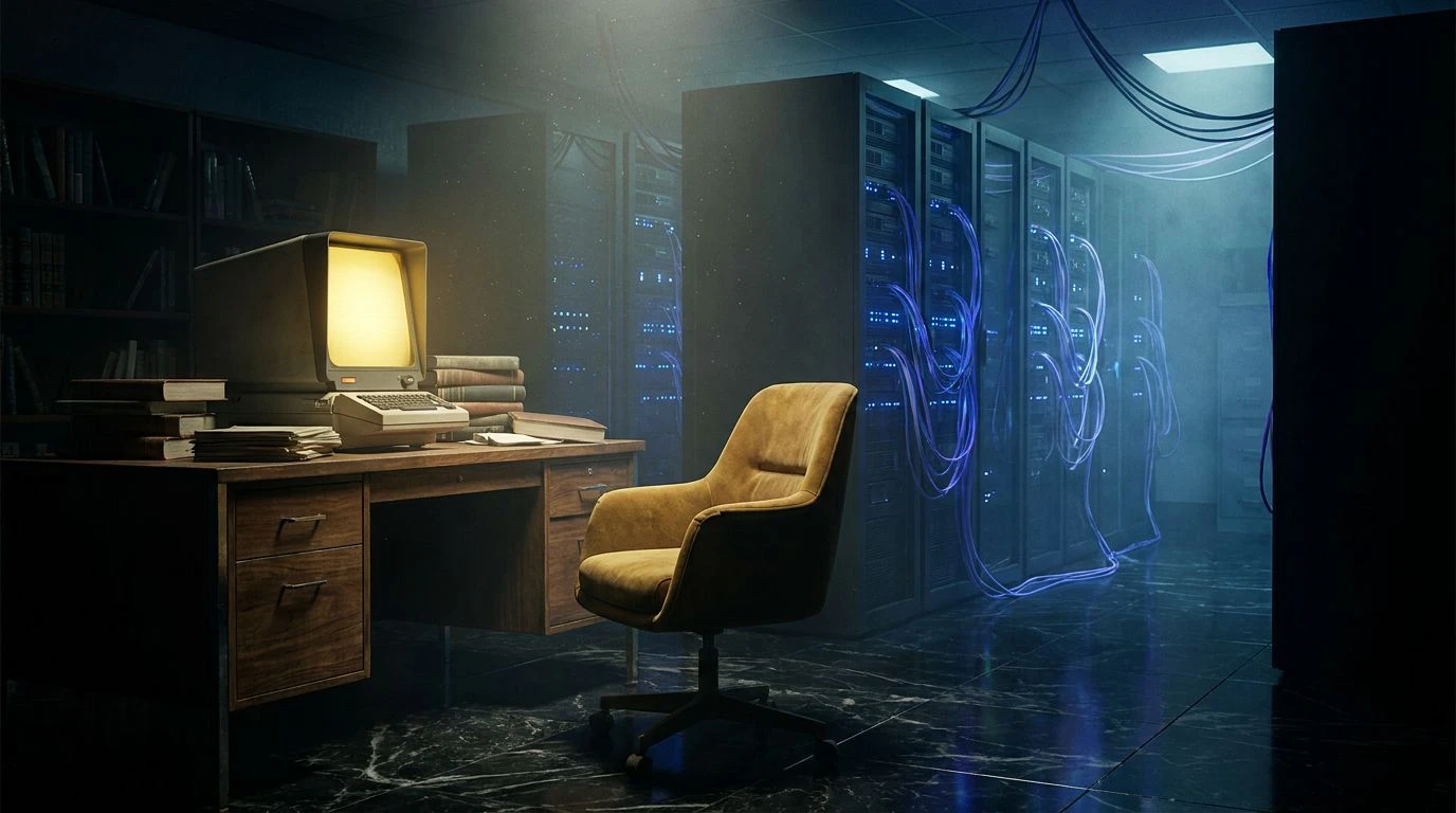
· 5 min readStepping into a heavily air-conditioned server farm often feels like entering a space isolated from time, dominated by the relentless hum of cooling fans and blinking LEDs. Yet, weaving the warm, tactile memory of a 1970s library into this highly sterile environment creates a striking visual tension. We are looking at the exact intersection where heavy walnut desks and mustard corduroy chairs meet the blinding, synthetic brightness of modern fiber-optic networks. This contrast marries grounded utility with fierce technological ambition. Instead of choosing between the comforting weight of the past and the cold efficiency of the future, balancing earthy browns against sharp, high-octane blues offers a spatial experience that feels simultaneously nostalgic and uncompromisingly modern. Moving through these spaces, you can practically smell the dusty paper and ozone in the same breath.
Analog Archive 💾
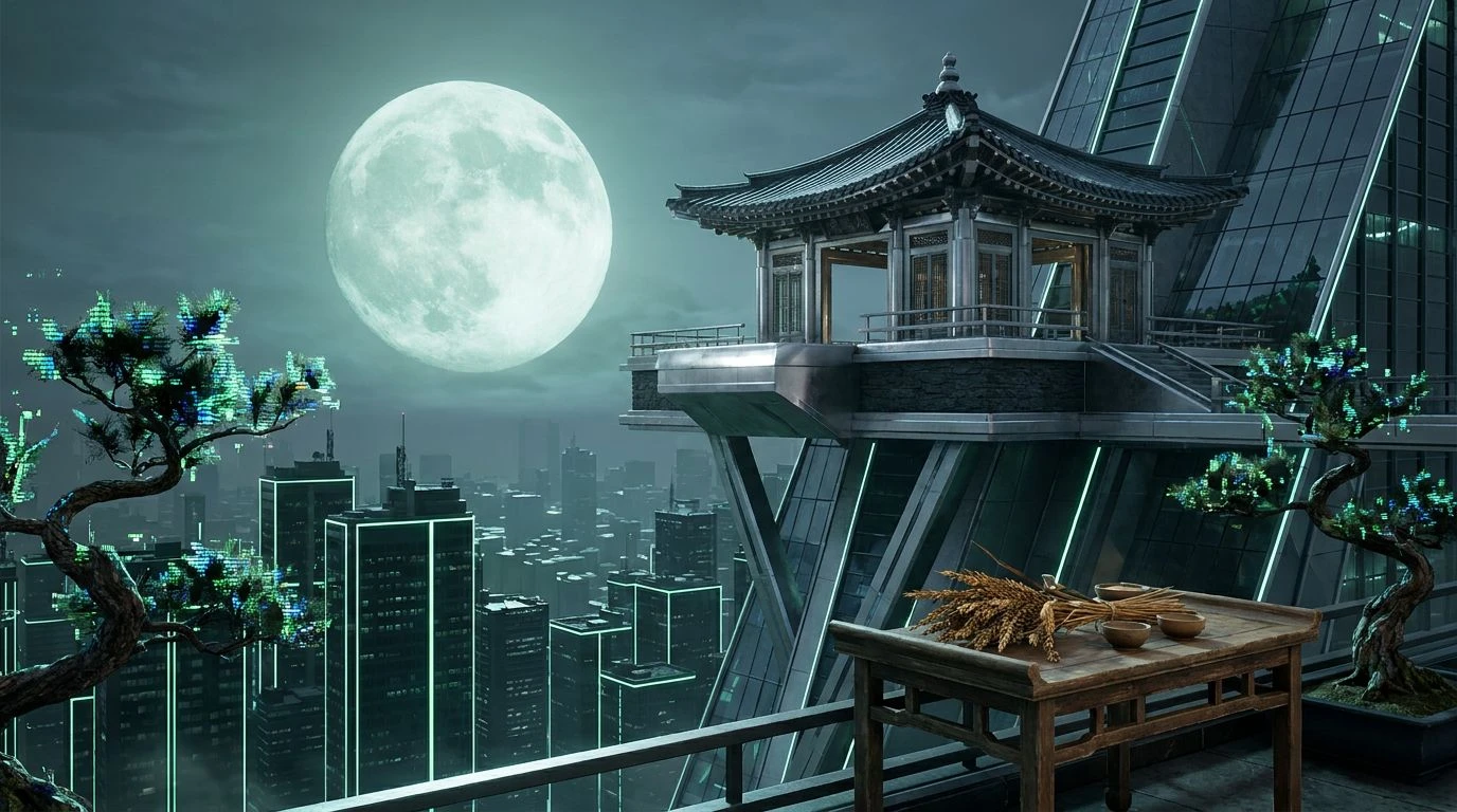
The transition between eras is immediately legible in Analog Archive. Here, heavy earth tones like Walnut Veneer and Mustard Upholstery ground the visual field, recalling the heavy brutalist architecture and wood-paneled study carrels of late twentieth-century civic buildings. By introducing Coolant Blue and Ethernet Sapphire, the atmosphere shifts abruptly toward an active logic board. The bright burst of Microfiche Yellow acts as a spatial highlight, piercing through the darker Deep Mainframe and Terminal Black like a standby light in a darkened room. Bringing this specific tension into interior spaces or digital interfaces grants a distinct mid-century weight to otherwise lightweight technological environments. It creates a space where a heavy cinder block wall might be lit entirely by strings of glowing blue diodes, pairing the sheer mass of architectural history with the weightless speed of cloud computing.
Cold Storage 🧊
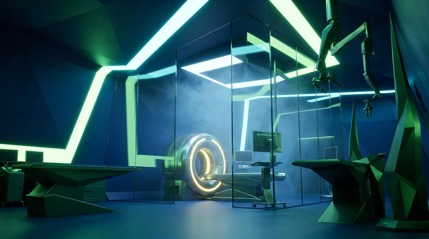
Shedding the heavy wood textures entirely, Cold Storage zeroes in on the most clinical, hyper-modern aspects of data retention. LED Cyan and High-Voltage Azure dominate the visual hierarchy, casting a cold, artificial light across Midnight Cabling and Obsidian Server. The inclusion of Frost Perspex adds a layer of translucency, mimicking the frosted glass partitions shielding high-security server racks. In practice, this color grouping strips away the comfort of the 1970s reading room, transforming the library concept into pure data architecture. Instead of thumbing through physical card catalogs, users are navigating an endlessly sprawling, cryogenically cooled database. Translating this into spatial design yields rooms bathed in shadow and neon, where the temperature practically drops just by looking at the walls, offering a stark, highly utilitarian approach to navigating information systems today.
Halogen Reading Room 💡
There is an undeniable starkness to Halogen Reading Room, heavily relying on the greyscale spectrum from Fluorescent Glare down to Dust Jacket Black. Brushed Aluminum and Steel Shelving form a rigid, unyielding infrastructure, recalling metal bookshelves packed tight with bound periodicals under flickering overhead lights. However, the sudden introduction of Electric Blue Glow alongside Synthetic Ultramarine punctures this monochromatic severity with extreme prejudice. These highly artificial blues act as a visual shock to the system, much like an exposed fiber-optic line running straight through a concrete floor. For designers, applying this strict juxtaposition works exceptionally well in transitional spaces, such as corridors or lobby entryways, where visitors step from a mundane, analog world directly into a highly charged, humming digital sanctuary. The tension relies entirely on keeping the grey tones perfectly neutral so the colored light can completely dominate the visual field.
Corrupted Microfilm 📼
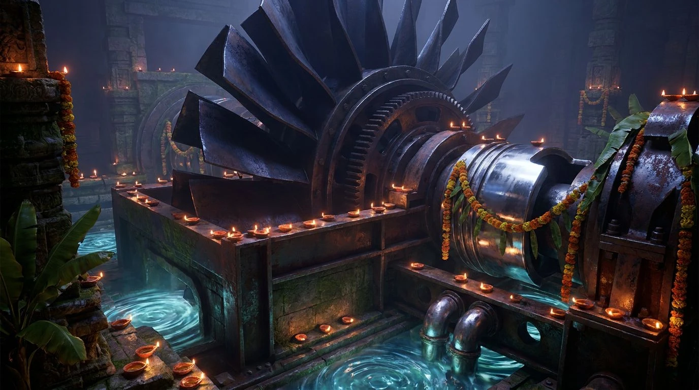
Corrupted Microfilm introduces a sense of decay and thermal fatigue into the pristine server environment. The transition from Blank Page down to the heavy Graphite Shadow establishes a familiar, almost bureaucratic atmosphere tied directly to the quiet predictability of government filing cabinets and microfilm readers. Yet, the clash between System Error Cyan and Overheated Circuit forces a confrontational dialogue between completely opposing temperatures. The muted coral acts as a warning beacon, a physical indicator of failing hardware or an overworked processor caught inside an enclosed rack. Framing these colors against an Inky Dark background allows designers to play with the idea of interrupted signals or fragmented memories. The application works brilliantly for editorial layouts or exhibition designs that try to capture the exact moment a physical archive fails, documenting the fragile, sometimes violent transition from paper records to digitized, server-hosted ghosts.
Terrazzo and Tech 🕰️
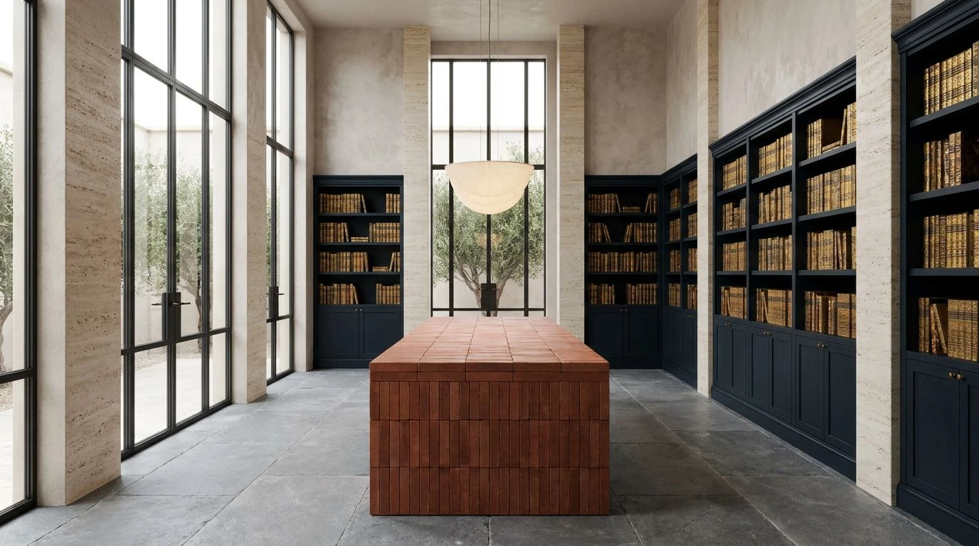
Spanning the widest visual range, Terrazzo and Tech builds an environment that feels lived-in, deeply textured, and slightly chaotic. Materials like Smoked Oak and Faded Linoleum establish a firm, undeniable link to 1970s institutional architecture, complete with scuffed floors and heavy wooden banisters. Anchoring these incredibly organic, dated tones against the hyper-specific glow of Phosphor Green and Cable Casing Blue generates a peculiar anachronism. A bright pop of Desk Lamp Yellow alongside pristine White Noise further complicates the room, ensuring the eye never fully settles into one specific decade. Implementing these colors in styling or set design paints a picture of a forgotten university basement that has been haphazardly retrofitted into a rogue cryptocurrency mining operation. The sheer variety forces an honest dialogue between the dust-covered past and the heavily wired present, celebrating utility in its most raw, unpolished form.
Exploring this specific intersection of eras proves that historical weight and modern velocity do not actually need to cancel each other out. Pulling the tactile, earthy browns of 1970s furnishings into a space dominated by sharp, synthetic networks reveals an unexpected comfort within our most sterile environments. Navigating these contrasting tones offers spatial designers and art directors a highly effective toolkit for telling stories about memory, technology, and preservation. Giving digital environments a sense of physical weight grounds our interactions, proving that the future of design might just require looking backward, dragging the heavy wooden furniture of the past straight into the freezing server room.