'%3e%3cpath%20fill-rule='evenodd'%20clip-rule='evenodd'%20d='M51.1303%2019.2492C50.7278%2019.913%2050.1346%2020.4426%2049.3508%2020.838C48.5669%2021.2335%2047.6172%2021.4312%2046.5014%2021.4312C44.8208%2021.4312%2043.4367%2021.0216%2042.3492%2020.2025C41.2617%2019.3833%2040.6686%2018.2394%2040.5697%2016.7706H44.4253C44.4818%2017.3355%2044.6831%2017.7804%2045.0291%2018.1052C45.3751%2018.43%2045.8164%2018.5924%2046.3531%2018.5924C46.8192%2018.5924%2047.1864%2018.4653%2047.4547%2018.2111C47.7231%2017.9569%2047.8572%2017.618%2047.8572%2017.1943C47.8572%2016.8129%2047.7337%2016.4952%2047.4865%2016.241C47.2393%2015.9867%2046.9322%2015.7784%2046.565%2015.616C46.1978%2015.4536%2045.6893%2015.2594%2045.0397%2015.0334C44.0934%2014.7086%2043.3202%2014.3944%2042.72%2014.0907C42.1197%2013.7871%2041.6042%2013.3351%2041.1735%2012.7349C40.7427%2012.1347%2040.5273%2011.3544%2040.5273%2010.394C40.5273%209.50418%2040.7533%208.73448%2041.2053%208.08481C41.6572%207.43515%2042.2821%206.93731%2043.0801%206.5913C43.8781%206.24528%2044.7925%206.07227%2045.8235%206.07227C47.49%206.07227%2048.8141%206.46771%2049.7956%207.25861C50.7772%208.04951%2051.3315%209.13698%2051.4586%2010.5211H47.5395C47.4689%2010.0268%2047.2888%209.63483%2046.9993%209.3453C46.7097%209.05578%2046.3178%208.91102%2045.8235%208.91102C45.3998%208.91102%2045.0573%209.024%2044.7961%209.24997C44.5348%209.47594%2044.4041%209.80783%2044.4041%2010.2457C44.4041%2010.5988%2044.5207%2010.8989%2044.7537%2011.146C44.9867%2011.3932%2045.2798%2011.5944%2045.6328%2011.7498C45.9859%2011.9052%2046.4944%2012.1029%2047.1581%2012.343C48.1185%2012.6678%2048.9023%2012.9891%2049.5096%2013.3069C50.1169%2013.6246%2050.6395%2014.0872%2051.0773%2014.6945C51.5151%2015.3018%2051.734%2016.0927%2051.734%2017.0672C51.734%2017.8581%2051.5328%2018.5854%2051.1303%2019.2492ZM59.0242%206.3053V21.2829H55.4016V6.3053H59.0242ZM73.9409%206.3053V9.18642H69.8734V21.2829H66.2296V9.18642H62.2046V6.3053H73.9409ZM80.7438%209.18642V12.3218H85.8069V15.0546H80.7438V18.3806H86.4425V21.2829H77.1212V6.3053H86.4425V9.18642H80.7438ZM99.667%2016.0291V21.2829H96.0444V6.3053H101.913C103.692%206.3053%20105.048%206.74665%20105.98%207.62934C106.912%208.51204%20107.378%209.7019%20107.378%2011.199C107.378%2012.1311%20107.17%2012.9609%20106.753%2013.6882C106.337%2014.4155%20105.719%2014.9875%20104.9%2015.4042C104.08%2015.8208%20103.085%2016.0291%20101.913%2016.0291H99.667ZM103.692%2011.199C103.692%209.8855%20102.965%209.22879%20101.51%209.22879H99.667V13.1268H101.51C102.965%2013.1268%20103.692%2012.4842%20103.692%2011.199ZM120.092%2018.5501H114.478L113.546%2021.2829H109.732L115.219%206.41123H119.393L124.879%2021.2829H121.024L120.092%2018.5501ZM119.16%2015.7961L117.295%2010.2881L115.41%2015.7961H119.16ZM131.555%2018.5077H136.385V21.2829H127.933V6.3053H131.555V18.5077ZM143.337%209.18642V12.3218H148.4V15.0546H143.337V18.3806H149.035V21.2829H139.714V6.3053H149.035V9.18642H143.337ZM163.507%206.3053V9.18642H159.44V21.2829H155.796V9.18642H151.771V6.3053H163.507ZM177.449%206.3053V9.18642H173.382V21.2829H169.738V9.18642H165.713V6.3053H177.449ZM184.252%209.18642V12.3218H189.315V15.0546H184.252V18.3806H189.951V21.2829H180.629V6.3053H189.951V9.18642H184.252Z'%20fill='%23EEF0ED'/%3e%3cmask%20id='mask0_3101_7327'%20style='mask-type:alpha'%20maskUnits='userSpaceOnUse'%20x='0'%20y='0'%20width='27'%20height='28'%3e%3cpath%20d='M23.8328%200.759766H2.64808C1.18559%200.759766%200%201.94535%200%203.40785V24.5925C0%2026.055%201.18559%2027.2406%202.64808%2027.2406H23.8328C25.2952%2027.2406%2026.4808%2026.055%2026.4808%2024.5925V3.40785C26.4808%201.94535%2025.2952%200.759766%2023.8328%200.759766Z'%20fill='white'/%3e%3c/mask%3e%3cg%20mask='url(%23mask0_3101_7327)'%3e%3cpath%20d='M23.8328%200.759766H2.64808C1.18559%200.759766%200%201.94535%200%203.40785V24.5925C0%2026.055%201.18559%2027.2406%202.64808%2027.2406H23.8328C25.2952%2027.2406%2026.4808%2026.055%2026.4808%2024.5925V3.40785C26.4808%201.94535%2025.2952%200.759766%2023.8328%200.759766Z'%20fill='%23D8D8D8'/%3e%3cpath%20d='M13.2404%200.759766H0V14.0001H13.2404V0.759766Z'%20fill='%238C61FF'/%3e%3cpath%20d='M13.2404%2014H0V27.2404H13.2404V14Z'%20fill='%2336C3FE'/%3e%3cpath%20d='M26.4806%2014H13.2402V27.2404H26.4806V14Z'%20fill='%236592FE'/%3e%3cpath%20d='M26.4806%200.759766H13.2402V14.0002H26.4806V0.759766Z'%20fill='%236059F7'/%3e%3c/g%3e%3c/g%3e%3cdefs%3e%3cclipPath%20id='clip0_3101_7327'%3e%3crect%20width='190'%20height='28'%20fill='white'/%3e%3c/clipPath%3e%3c/defs%3e%3c/svg%3e)
'%3e%3cpath%20d='M23.8328%200.759521H2.64808C1.18559%200.759521%200%201.94511%200%203.40761V24.5923C0%2026.0548%201.18559%2027.2404%202.64808%2027.2404H23.8328C25.2952%2027.2404%2026.4808%2026.0548%2026.4808%2024.5923V3.40761C26.4808%201.94511%2025.2952%200.759521%2023.8328%200.759521Z'%20fill='%23D8D8D8'/%3e%3cpath%20d='M13.2404%200.759521H0V13.9999H13.2404V0.759521Z'%20fill='%238C61FF'/%3e%3cpath%20d='M13.2404%2013.9998H0V27.2402H13.2404V13.9998Z'%20fill='%2336C3FE'/%3e%3cpath%20d='M26.4809%2013.9998H13.2405V27.2402H26.4809V13.9998Z'%20fill='%236592FE'/%3e%3cpath%20d='M26.4809%200.759277H13.2405V13.9997H26.4809V0.759277Z'%20fill='%236059F7'/%3e%3c/g%3e%3c/svg%3e)
Calm Startup Offices with Mid-Century Blue Color Palettes
· 5 min readThere is a distinct, panic-inducing odor to modern startup culture. It usually smells like overpriced cold brew, whiteboard markers, and the desperate sweat of yet another quarterly pivot. When a workspace relies on neon bean bags and primary-colored slides to project energy, it only advertises its profound lack of stability. Enter the mid-century yacht club aesthetic. A room anchored by dusty blues, weathered whites, and the unbothered quiet of canvas sails offers an immediate antidote to the frantic pace of the tech sector. These tones do not scream for attention or demand immediate disruption. Rather, they suggest that leadership has been here before, the revenue streams are steady, and there is absolutely no need to panic. Transporting the leisurely, salt-sprayed confidence of a 1950s regatta straight into the boardroom provides an architectural tranquilizer. It replaces tech-bro anxiety with the steady, measured breathing of old money on a Tuesday afternoon.
Brass Binnacle 🧭
Navigating a newly formed tech company through consecutive funding rounds often feels like sailing blindly into a storm. Brass Binnacle presents an authoritative anchor against this precise sort of modern madness. It anchors the room with Tarnished Brass and Overcast Deck, grounding the hyperactive startup energy in materials that look like they have survived decades of salt and wind. When paired with the sudden, sharp clarity of Electric Wake and Regatta Blue, the palette feels optimistic but incredibly controlled. The darker tones, Deep Keel and Midnight Watch, offer a quiet gravity that silences the room when necessary, while Fog Horn Slate sits firmly in the background, absorbing the frantic chatter of nervous developers. Using these shades in a communal workspace instantly lowers the collective heart rate. It tells the engineering team that leadership possesses a chart, knows the prevailing winds, and will not capsize the enterprise before Friday.
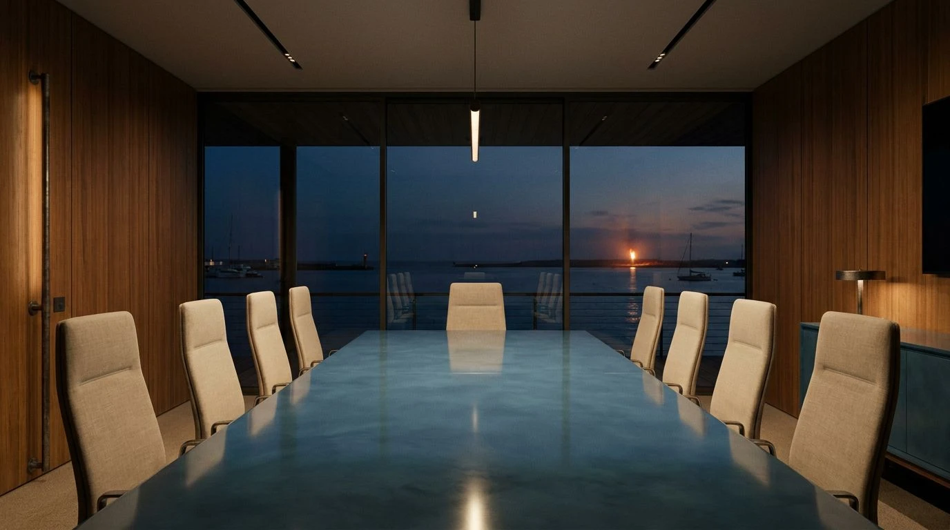
Hyannis Port Leisure ⛵
Nothing diffuses the existential dread of a missed product launch quite like a room wrapped in Hyannis Port Leisure. This specific collection of tones practically hands you a highball glass and tells you to take the rest of the afternoon off. Azure Nostalgia and Faded Canvas do the heavy lifting here, washing over a frenetic sales floor with the calming authority of a perfectly tailored linen suit. It directly combats the blinding cortisol-spiking white lights of open-plan offices. When Commodore Blue and Ocean Trench are introduced as grounding accents, they provide sudden structural weight, telling panicked project managers that the adults have finally entered the room. The lighter splashes of Summer Sky, Windbreaker Cyan, and Salt Washed Denim inject an unhurried, coastal optimism into the environment. It is the visual equivalent of an out-of-office autoreply during the first week of August, granting stressed founders the permission to breathe, sip something iced, and approach their venture with an air of aristocratic detachment.
Spinnaker Warning 🚩
The danger of any fast-paced technological venture is the tendency to move fast and break entirely the wrong things. Spinnaker Warning offers a masterclass in establishing boundaries without raising your voice. The stark brilliance of Pressed Linen against the warm, grounded quiet of Sunbaked Teak creates a space that feels distinctly deliberate and scrubbed clean of unnecessary distractions. It provides a visual pause. Yet, the real psychological control comes from the aggressive punctuation of Distress Flare. When deployed against the austere backdrop of Admiralty Black and Weathered Stanchion, this sharp red acts as an unmistakable signal of authority. It is less of an alarm and more of a firm, unwavering directive from a seasoned captain. This combination works exceptionally well in spaces where critical decisions occur, stripping away the noise of a chaotic startup and replacing it with crisp, unmistakable clarity. Your investors will naturally assume you have everything entirely handled.
Varnished Mahogany 🛥️
There is a particular brand of faux-optimism in modern corporate spaces that relies on aggressive neon signs demanding that employees crush it. Varnished Mahogany takes the opposite route, offering a deeply nostalgic comfort that actually encourages genuine human thought. Old Mahogany and Crisp Sailcloth immediately establish an atmosphere of permanence, suggesting that the company is built out of heavy, expensive wood rather than cheap venture capital. Against this rich, shadowy backdrop composed of Midnight Oil and Squall Line Grey, the sudden introduction of Sou’wester Yellow and Pale Lemonade feels like a brilliant beam of sunlight breaking through an afternoon squall. Instead of shouting, these sunny accents softly suggest that a brighter quarter is just on the horizon. The entire arrangement wraps around the nervous energy of a young workforce, exchanging their high-strung panic for the measured, pipe-smoking confidence of a seasoned yachtsman reviewing tide charts.
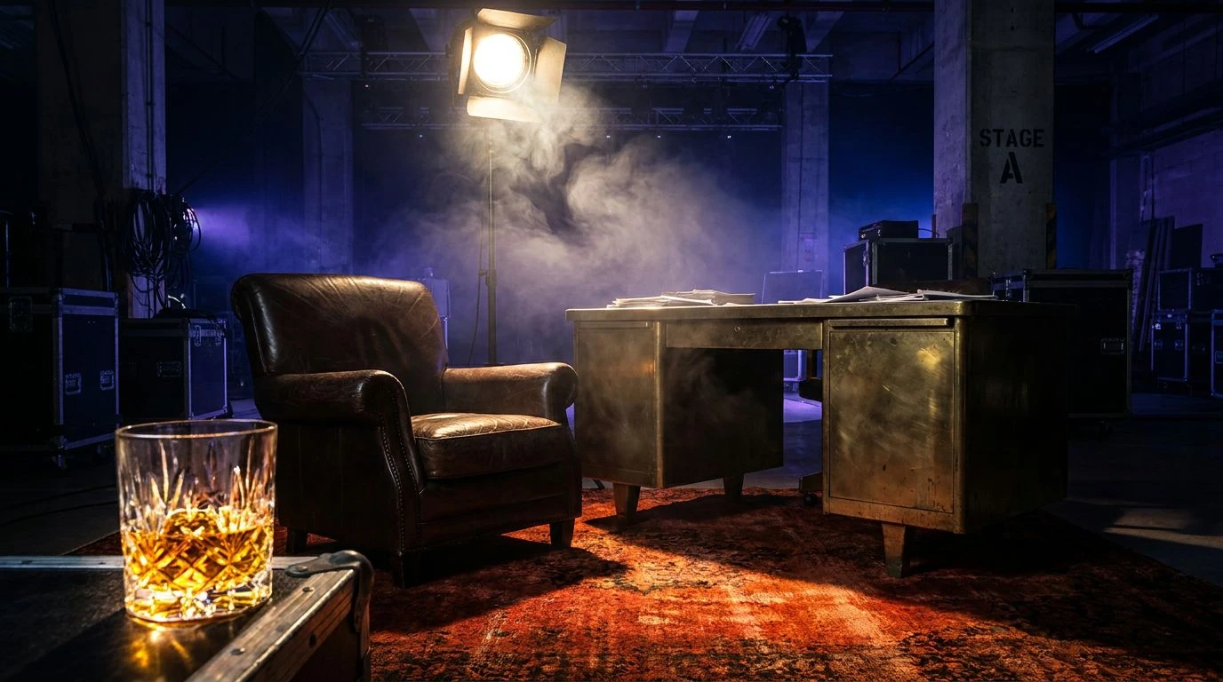
Mariana Boardroom ⚓
Serious money demands serious surroundings. When a fledgling company transitions from a scrappy garage operation into a legitimate enterprise, the pastel playground aesthetic must be cast overboard. Mariana Boardroom is the visual representation of that final, sobering graduation. Submerged in the profound depths of Sovereign Navy, Ink Spill, and Abyss Black, this palette drowns out the trivial squabbles of middle management. The suffocating weight of these dark tones is beautifully negotiated by the inclusion of Gulf Stream and Royal Burgee, which bring just enough oxygen to the surface to keep the atmosphere from turning entirely bleak. Meanwhile, Shipyard Iron and Twilight Swell maintain an impenetrable, icy professionalism. Implementing this exact arrangement in the executive suite sends heavily coded signals to visiting clients. It communicates that your operation has stopped playing in the shallow waters and is now perfectly comfortable navigating the cold, ruthless deep.
Returning to the muted, salt-washed visual language of mid-century leisure presents a highly effective strategy for domesticating the wild, unkempt energy of modern enterprise. These color arrangements prove that true authority never begs for attention with fluorescent lighting or artificial playfulness. By wrapping notoriously stressful work environments in faded maritime tones and sharp canvas whites, organizations project a profound, quiet wealth that commands immediate respect. It forces the frantic pace of contemporary commerce to slow down to a gentlemanly knot, proving that an atmosphere anchored in historical calm will always outlast the fleeting desperation of current trends.