'%3e%3cpath%20fill-rule='evenodd'%20clip-rule='evenodd'%20d='M51.1303%2019.2492C50.7278%2019.913%2050.1346%2020.4426%2049.3508%2020.838C48.5669%2021.2335%2047.6172%2021.4312%2046.5014%2021.4312C44.8208%2021.4312%2043.4367%2021.0216%2042.3492%2020.2025C41.2617%2019.3833%2040.6686%2018.2394%2040.5697%2016.7706H44.4253C44.4818%2017.3355%2044.6831%2017.7804%2045.0291%2018.1052C45.3751%2018.43%2045.8164%2018.5924%2046.3531%2018.5924C46.8192%2018.5924%2047.1864%2018.4653%2047.4547%2018.2111C47.7231%2017.9569%2047.8572%2017.618%2047.8572%2017.1943C47.8572%2016.8129%2047.7337%2016.4952%2047.4865%2016.241C47.2393%2015.9867%2046.9322%2015.7784%2046.565%2015.616C46.1978%2015.4536%2045.6893%2015.2594%2045.0397%2015.0334C44.0934%2014.7086%2043.3202%2014.3944%2042.72%2014.0907C42.1197%2013.7871%2041.6042%2013.3351%2041.1735%2012.7349C40.7427%2012.1347%2040.5273%2011.3544%2040.5273%2010.394C40.5273%209.50418%2040.7533%208.73448%2041.2053%208.08481C41.6572%207.43515%2042.2821%206.93731%2043.0801%206.5913C43.8781%206.24528%2044.7925%206.07227%2045.8235%206.07227C47.49%206.07227%2048.8141%206.46771%2049.7956%207.25861C50.7772%208.04951%2051.3315%209.13698%2051.4586%2010.5211H47.5395C47.4689%2010.0268%2047.2888%209.63483%2046.9993%209.3453C46.7097%209.05578%2046.3178%208.91102%2045.8235%208.91102C45.3998%208.91102%2045.0573%209.024%2044.7961%209.24997C44.5348%209.47594%2044.4041%209.80783%2044.4041%2010.2457C44.4041%2010.5988%2044.5207%2010.8989%2044.7537%2011.146C44.9867%2011.3932%2045.2798%2011.5944%2045.6328%2011.7498C45.9859%2011.9052%2046.4944%2012.1029%2047.1581%2012.343C48.1185%2012.6678%2048.9023%2012.9891%2049.5096%2013.3069C50.1169%2013.6246%2050.6395%2014.0872%2051.0773%2014.6945C51.5151%2015.3018%2051.734%2016.0927%2051.734%2017.0672C51.734%2017.8581%2051.5328%2018.5854%2051.1303%2019.2492ZM59.0242%206.3053V21.2829H55.4016V6.3053H59.0242ZM73.9409%206.3053V9.18642H69.8734V21.2829H66.2296V9.18642H62.2046V6.3053H73.9409ZM80.7438%209.18642V12.3218H85.8069V15.0546H80.7438V18.3806H86.4425V21.2829H77.1212V6.3053H86.4425V9.18642H80.7438ZM99.667%2016.0291V21.2829H96.0444V6.3053H101.913C103.692%206.3053%20105.048%206.74665%20105.98%207.62934C106.912%208.51204%20107.378%209.7019%20107.378%2011.199C107.378%2012.1311%20107.17%2012.9609%20106.753%2013.6882C106.337%2014.4155%20105.719%2014.9875%20104.9%2015.4042C104.08%2015.8208%20103.085%2016.0291%20101.913%2016.0291H99.667ZM103.692%2011.199C103.692%209.8855%20102.965%209.22879%20101.51%209.22879H99.667V13.1268H101.51C102.965%2013.1268%20103.692%2012.4842%20103.692%2011.199ZM120.092%2018.5501H114.478L113.546%2021.2829H109.732L115.219%206.41123H119.393L124.879%2021.2829H121.024L120.092%2018.5501ZM119.16%2015.7961L117.295%2010.2881L115.41%2015.7961H119.16ZM131.555%2018.5077H136.385V21.2829H127.933V6.3053H131.555V18.5077ZM143.337%209.18642V12.3218H148.4V15.0546H143.337V18.3806H149.035V21.2829H139.714V6.3053H149.035V9.18642H143.337ZM163.507%206.3053V9.18642H159.44V21.2829H155.796V9.18642H151.771V6.3053H163.507ZM177.449%206.3053V9.18642H173.382V21.2829H169.738V9.18642H165.713V6.3053H177.449ZM184.252%209.18642V12.3218H189.315V15.0546H184.252V18.3806H189.951V21.2829H180.629V6.3053H189.951V9.18642H184.252Z'%20fill='%23EEF0ED'/%3e%3cmask%20id='mask0_3101_7327'%20style='mask-type:alpha'%20maskUnits='userSpaceOnUse'%20x='0'%20y='0'%20width='27'%20height='28'%3e%3cpath%20d='M23.8328%200.759766H2.64808C1.18559%200.759766%200%201.94535%200%203.40785V24.5925C0%2026.055%201.18559%2027.2406%202.64808%2027.2406H23.8328C25.2952%2027.2406%2026.4808%2026.055%2026.4808%2024.5925V3.40785C26.4808%201.94535%2025.2952%200.759766%2023.8328%200.759766Z'%20fill='white'/%3e%3c/mask%3e%3cg%20mask='url(%23mask0_3101_7327)'%3e%3cpath%20d='M23.8328%200.759766H2.64808C1.18559%200.759766%200%201.94535%200%203.40785V24.5925C0%2026.055%201.18559%2027.2406%202.64808%2027.2406H23.8328C25.2952%2027.2406%2026.4808%2026.055%2026.4808%2024.5925V3.40785C26.4808%201.94535%2025.2952%200.759766%2023.8328%200.759766Z'%20fill='%23D8D8D8'/%3e%3cpath%20d='M13.2404%200.759766H0V14.0001H13.2404V0.759766Z'%20fill='%238C61FF'/%3e%3cpath%20d='M13.2404%2014H0V27.2404H13.2404V14Z'%20fill='%2336C3FE'/%3e%3cpath%20d='M26.4806%2014H13.2402V27.2404H26.4806V14Z'%20fill='%236592FE'/%3e%3cpath%20d='M26.4806%200.759766H13.2402V14.0002H26.4806V0.759766Z'%20fill='%236059F7'/%3e%3c/g%3e%3c/g%3e%3cdefs%3e%3cclipPath%20id='clip0_3101_7327'%3e%3crect%20width='190'%20height='28'%20fill='white'/%3e%3c/clipPath%3e%3c/defs%3e%3c/svg%3e)
'%3e%3cpath%20d='M23.8328%200.759521H2.64808C1.18559%200.759521%200%201.94511%200%203.40761V24.5923C0%2026.0548%201.18559%2027.2404%202.64808%2027.2404H23.8328C25.2952%2027.2404%2026.4808%2026.0548%2026.4808%2024.5923V3.40761C26.4808%201.94511%2025.2952%200.759521%2023.8328%200.759521Z'%20fill='%23D8D8D8'/%3e%3cpath%20d='M13.2404%200.759521H0V13.9999H13.2404V0.759521Z'%20fill='%238C61FF'/%3e%3cpath%20d='M13.2404%2013.9998H0V27.2402H13.2404V13.9998Z'%20fill='%2336C3FE'/%3e%3cpath%20d='M26.4809%2013.9998H13.2405V27.2402H26.4809V13.9998Z'%20fill='%236592FE'/%3e%3cpath%20d='M26.4809%200.759277H13.2405V13.9997H26.4809V0.759277Z'%20fill='%236059F7'/%3e%3c/g%3e%3c/svg%3e)
Mid-Century Design Color Palettes for Sophisticated Brands
· 4 min readModern athletic identity has become an exhausting visual arms race. For decades, the aesthetic vocabulary of competition has relied heavily on aggressive typography, blinding neons, and hyper-masculine motifs designed to intimidate or shock rather than inspire endurance. Yet as visual fatigue sets in, a quieter, more sophisticated movement has begun to reframe how we view athleticism. By returning to the drafting tables of mid-century illustration, designers are finding relief in a balanced, dual-temperature aesthetic. This approach pairs the cool professionalism of temperate slate greys with the inviting warmth of golden yellows. The result is an atmosphere that feels competitive but not unapproachable, signaling a return to sportsmanship over sheer intimidation.
Mid-Century Stadium 🏟️
Mid-Century Stadium establishes a foundation of visual neutrality and calm authority through its careful distribution of cool and warm tones. By pairing Charcoal Slate and Midnight Navy against the striking warmth of Goldenrod and Vintage Mustard, this collection replicates the inviting geometry of vintage athletic posters. The inclusion of Bleacher White keeps the composition airy, while Poolside Cyan and Pennant Blue provide a disciplined, athletic energy that avoids the loud, confrontational neons of contemporary sportswear. Here, rivalry is framed as a sophisticated pursuit. Aesthetically, it places the observer in an era where design relied on proportion and restraint rather than sheer volume.
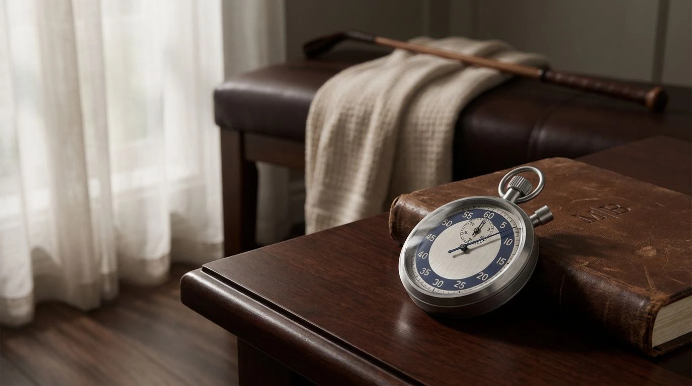
Leather and Liniment ⚾
The palette Leather and Liniment recalls the tactile memories of early professional leagues, bridging the gap between historical reverence and modern clarity. Aluminum Slate and Umpire Black anchor the identity, offering a stoic, reliable backdrop that permits the richer colors to breathe. The introduction of Worn Leather, Varsity Orange, and Sunlit Pitch injects a natural warmth, reminiscent of afternoon doubleheaders and sun-baked clay. To prevent the arrangement from feeling overly nostalgic or heavy, Clubroom Teal introduces a crisp, cooling element, and Pure White delivers essential spatial relief. This precise calibration of temperature communicates stamina and tradition, offering a visual retreat from the high-octane color floods that currently dominate the athletic sector.
Deco Athletics 🎯
Deco Athletics navigates a compelling line between stoic professionalism and sudden bursts of kinetic energy. The sequence builds its credibility upon the quiet strength of Track Grey, Slate Shadow, and Carbon Grip, forming an architectural base that feels entirely serious and remarkably composed. Against this sober backdrop, Medalist Gold introduces a classic mark of achievement, yet it is the sudden arrival of Neon Sweat and Marathon Crimson that captures attention. These bright tones act as measured flashes of adrenaline, tightly controlled by the surrounding greys. Rather than overwhelming the viewer with constant visual noise, this arrangement isolates the moments of peak intensity, proving that athletic vigor can still be effectively communicated with measured precision.
Sunday Fairway ⛳
With an approach that borders on the genuinely pastoral, Sunday Fairway captures the quiet contemplation of endurance sports. The combination of Clubhouse White and Pavement Grey establishes an expansive, unhurried background that invites focus rather than distraction. Ash Wood adds an earthy, grounding element to the structure, recalling the natural materials of early sporting equipment. The deliberate use of Tournament Gold and Turf Green serves as the primary visual engine here, striking a careful balance between natural environment and human achievement. This selection refuses to rely on the high-contrast aesthetics of modern gym culture. It speaks instead to the refined, strategic nature of competition, prioritizing clear thinking and long-term stamina.
Classic Competitor 🥇
Providing a measured revision of the traditional patriotic sports palette, Classic Competitor relies strictly on mid-century color logic to convey authority. Stadium Black and Concrete Tier define the structural boundaries of the collection, supported closely by the soft neutrality of Grey Flannel. These heavy, serious tones ensure that the subsequent colors are received as deliberate accents rather than overpowering floods. Championship Blue and Slate Jersey offer a restrained, dignified interpretation of team loyalty, while Chalk Line provides necessary negative space. The careful addition of Rivalry Red gives a final point of action. By leaning into these tempered shades, the identity maintains an atmosphere of prestigious competition, entirely side-stepping the visual fatigue of contemporary branding.
Moving away from the visual hostility of modern athletic marketing requires a deliberate commitment to color theory and historical awareness. By returning to the dual-temperature logic of mid-century aesthetics, organizations can communicate strength without resorting to visual exhaustion. The thoughtful application of cool slate greys and warm, inviting yellows proves that professionalism and competitive spirit need not rely on intimidation. Ultimately, these carefully calibrated palettes offer a welcome reprieve, allowing sports branding to regain its sophistication, clarity, and enduring appeal.