'%3e%3cpath%20fill-rule='evenodd'%20clip-rule='evenodd'%20d='M51.1303%2019.2492C50.7278%2019.913%2050.1346%2020.4426%2049.3508%2020.838C48.5669%2021.2335%2047.6172%2021.4312%2046.5014%2021.4312C44.8208%2021.4312%2043.4367%2021.0216%2042.3492%2020.2025C41.2617%2019.3833%2040.6686%2018.2394%2040.5697%2016.7706H44.4253C44.4818%2017.3355%2044.6831%2017.7804%2045.0291%2018.1052C45.3751%2018.43%2045.8164%2018.5924%2046.3531%2018.5924C46.8192%2018.5924%2047.1864%2018.4653%2047.4547%2018.2111C47.7231%2017.9569%2047.8572%2017.618%2047.8572%2017.1943C47.8572%2016.8129%2047.7337%2016.4952%2047.4865%2016.241C47.2393%2015.9867%2046.9322%2015.7784%2046.565%2015.616C46.1978%2015.4536%2045.6893%2015.2594%2045.0397%2015.0334C44.0934%2014.7086%2043.3202%2014.3944%2042.72%2014.0907C42.1197%2013.7871%2041.6042%2013.3351%2041.1735%2012.7349C40.7427%2012.1347%2040.5273%2011.3544%2040.5273%2010.394C40.5273%209.50418%2040.7533%208.73448%2041.2053%208.08481C41.6572%207.43515%2042.2821%206.93731%2043.0801%206.5913C43.8781%206.24528%2044.7925%206.07227%2045.8235%206.07227C47.49%206.07227%2048.8141%206.46771%2049.7956%207.25861C50.7772%208.04951%2051.3315%209.13698%2051.4586%2010.5211H47.5395C47.4689%2010.0268%2047.2888%209.63483%2046.9993%209.3453C46.7097%209.05578%2046.3178%208.91102%2045.8235%208.91102C45.3998%208.91102%2045.0573%209.024%2044.7961%209.24997C44.5348%209.47594%2044.4041%209.80783%2044.4041%2010.2457C44.4041%2010.5988%2044.5207%2010.8989%2044.7537%2011.146C44.9867%2011.3932%2045.2798%2011.5944%2045.6328%2011.7498C45.9859%2011.9052%2046.4944%2012.1029%2047.1581%2012.343C48.1185%2012.6678%2048.9023%2012.9891%2049.5096%2013.3069C50.1169%2013.6246%2050.6395%2014.0872%2051.0773%2014.6945C51.5151%2015.3018%2051.734%2016.0927%2051.734%2017.0672C51.734%2017.8581%2051.5328%2018.5854%2051.1303%2019.2492ZM59.0242%206.3053V21.2829H55.4016V6.3053H59.0242ZM73.9409%206.3053V9.18642H69.8734V21.2829H66.2296V9.18642H62.2046V6.3053H73.9409ZM80.7438%209.18642V12.3218H85.8069V15.0546H80.7438V18.3806H86.4425V21.2829H77.1212V6.3053H86.4425V9.18642H80.7438ZM99.667%2016.0291V21.2829H96.0444V6.3053H101.913C103.692%206.3053%20105.048%206.74665%20105.98%207.62934C106.912%208.51204%20107.378%209.7019%20107.378%2011.199C107.378%2012.1311%20107.17%2012.9609%20106.753%2013.6882C106.337%2014.4155%20105.719%2014.9875%20104.9%2015.4042C104.08%2015.8208%20103.085%2016.0291%20101.913%2016.0291H99.667ZM103.692%2011.199C103.692%209.8855%20102.965%209.22879%20101.51%209.22879H99.667V13.1268H101.51C102.965%2013.1268%20103.692%2012.4842%20103.692%2011.199ZM120.092%2018.5501H114.478L113.546%2021.2829H109.732L115.219%206.41123H119.393L124.879%2021.2829H121.024L120.092%2018.5501ZM119.16%2015.7961L117.295%2010.2881L115.41%2015.7961H119.16ZM131.555%2018.5077H136.385V21.2829H127.933V6.3053H131.555V18.5077ZM143.337%209.18642V12.3218H148.4V15.0546H143.337V18.3806H149.035V21.2829H139.714V6.3053H149.035V9.18642H143.337ZM163.507%206.3053V9.18642H159.44V21.2829H155.796V9.18642H151.771V6.3053H163.507ZM177.449%206.3053V9.18642H173.382V21.2829H169.738V9.18642H165.713V6.3053H177.449ZM184.252%209.18642V12.3218H189.315V15.0546H184.252V18.3806H189.951V21.2829H180.629V6.3053H189.951V9.18642H184.252Z'%20fill='%23EEF0ED'/%3e%3cmask%20id='mask0_3101_7327'%20style='mask-type:alpha'%20maskUnits='userSpaceOnUse'%20x='0'%20y='0'%20width='27'%20height='28'%3e%3cpath%20d='M23.8328%200.759766H2.64808C1.18559%200.759766%200%201.94535%200%203.40785V24.5925C0%2026.055%201.18559%2027.2406%202.64808%2027.2406H23.8328C25.2952%2027.2406%2026.4808%2026.055%2026.4808%2024.5925V3.40785C26.4808%201.94535%2025.2952%200.759766%2023.8328%200.759766Z'%20fill='white'/%3e%3c/mask%3e%3cg%20mask='url(%23mask0_3101_7327)'%3e%3cpath%20d='M23.8328%200.759766H2.64808C1.18559%200.759766%200%201.94535%200%203.40785V24.5925C0%2026.055%201.18559%2027.2406%202.64808%2027.2406H23.8328C25.2952%2027.2406%2026.4808%2026.055%2026.4808%2024.5925V3.40785C26.4808%201.94535%2025.2952%200.759766%2023.8328%200.759766Z'%20fill='%23D8D8D8'/%3e%3cpath%20d='M13.2404%200.759766H0V14.0001H13.2404V0.759766Z'%20fill='%238C61FF'/%3e%3cpath%20d='M13.2404%2014H0V27.2404H13.2404V14Z'%20fill='%2336C3FE'/%3e%3cpath%20d='M26.4806%2014H13.2402V27.2404H26.4806V14Z'%20fill='%236592FE'/%3e%3cpath%20d='M26.4806%200.759766H13.2402V14.0002H26.4806V0.759766Z'%20fill='%236059F7'/%3e%3c/g%3e%3c/g%3e%3cdefs%3e%3cclipPath%20id='clip0_3101_7327'%3e%3crect%20width='190'%20height='28'%20fill='white'/%3e%3c/clipPath%3e%3c/defs%3e%3c/svg%3e)
'%3e%3cpath%20d='M23.8328%200.759521H2.64808C1.18559%200.759521%200%201.94511%200%203.40761V24.5923C0%2026.0548%201.18559%2027.2404%202.64808%2027.2404H23.8328C25.2952%2027.2404%2026.4808%2026.0548%2026.4808%2024.5923V3.40761C26.4808%201.94511%2025.2952%200.759521%2023.8328%200.759521Z'%20fill='%23D8D8D8'/%3e%3cpath%20d='M13.2404%200.759521H0V13.9999H13.2404V0.759521Z'%20fill='%238C61FF'/%3e%3cpath%20d='M13.2404%2013.9998H0V27.2402H13.2404V13.9998Z'%20fill='%2336C3FE'/%3e%3cpath%20d='M26.4809%2013.9998H13.2405V27.2402H26.4809V13.9998Z'%20fill='%236592FE'/%3e%3cpath%20d='M26.4809%200.759277H13.2405V13.9997H26.4809V0.759277Z'%20fill='%236059F7'/%3e%3c/g%3e%3c/svg%3e)
Neon Lime Color Palettes: Bold Design for Modern Activism
18 Mar 2026 · 5 min readWe have long draped the business of saving the world in the linens of mourning. There is a hushed propriety to traditional charity, a muted beige apology that suggests asking for help requires a performance of humility and silence. But the glaciers are cracking with a sound like thunder, and the forests burn with a heat that demands more than whispers. To dress ecological survival in somber tones is to admit defeat before the engagement even begins. We require a visual language that screams of life, not death. The era of the politely sad pamphlet is over; we are entering the age of radical visibility. By wielding colors that sear the retina—neons that hum with electric voltage and blacks as deep as the ocean floor—we signal that growth is not merely a delicate hope, but a formidable, unstoppable force. This is not about being palatable; it is about being impossible to ignore.
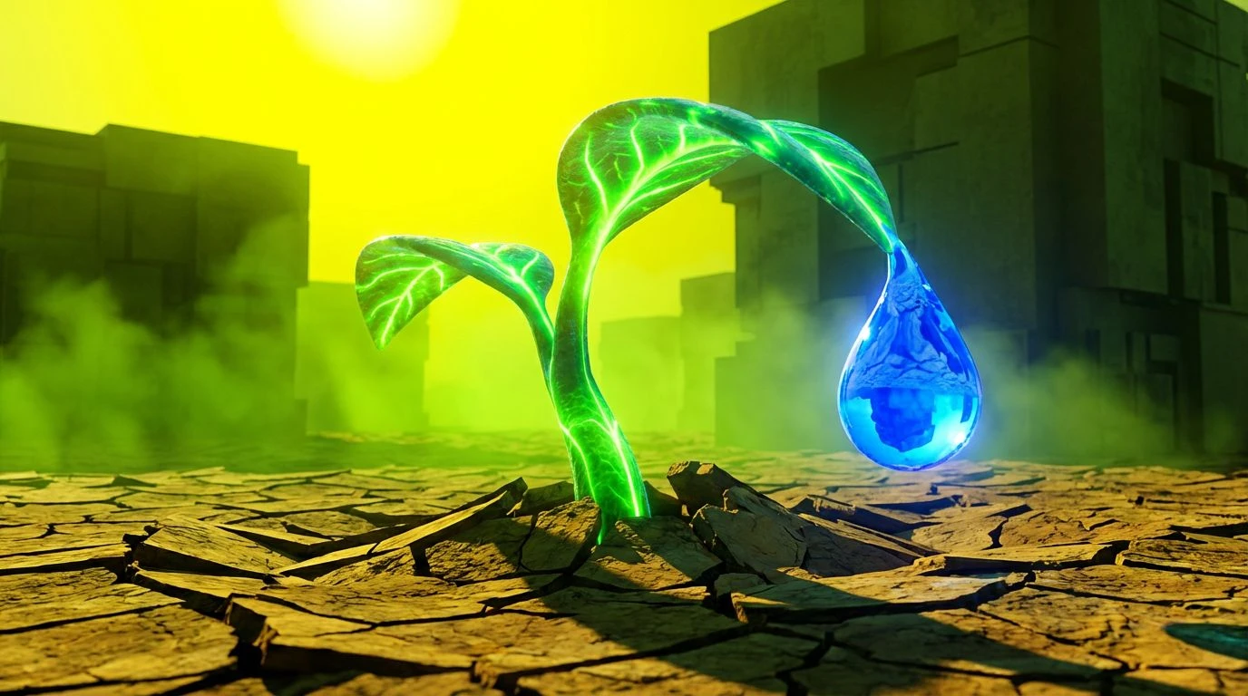
Voltage in the Undergrowth ⚡
There is a violent optimism in the way Radioactive Sprout clashes against the tired neutrality of Dried Husk. This grouping refuses the sepia-toned nostalgia often assigned to nature conservation, rejecting the idea that the earth is merely a fragile antique to be preserved behind glass. Instead, the piercing gaze of Cobalt Shock and Acid Sun suggests a mutation, a reclaiming of space that feels wild and unmanaged. It is the visual equivalent of a thunderstorm breaking a long drought—chaotic, frightening, and absolutely necessary. The darkness of Moss Shadow does not offer rest; it offers contrast, allowing the brighter hues to slice through the noise of apathy. This is the look of an organization that has stopped asking for permission to exist and started demanding the space to thrive.
The Architect’s Urgent Draft 📐
Cleanliness often masquerades as silence, but here, the sterility of Blank Page and Concrete Dust serves as a launchpad for alarm. The sudden intrusion of Warning Siren into a grayscale reality creates a friction that commands the eye to stop scanning and start reading. This arrangement speaks of infrastructure and truth; the heavy weight of Void Ink provides an unshakeable ground for the piercing clarity of Ozone Layer. It transforms the chaotic subject of climate crisis into a matter of precise, undeniable engineering. There is no room for clutter here, only the stark difference between fact and fiction. It suits a narrative that presents ecological survival not as a romantic ideal, but as a rigid structural necessity that we ignore at our peril.
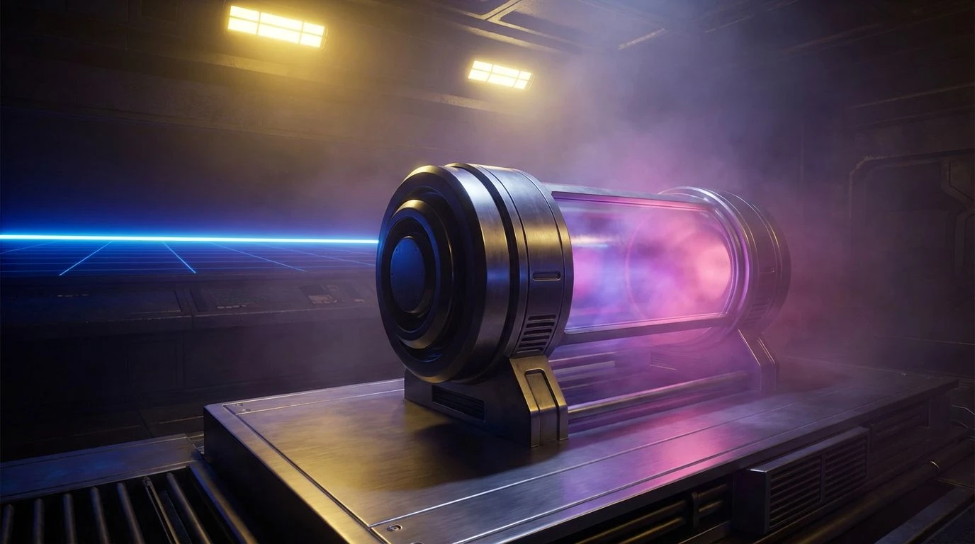
Glitch Garden Protocol 👾
This spectrum feels like a transmission from a future where technology and botany have formed a strange, unbreakable alliance. The softness of Steel Girder and Storm Cloud acts as a canvas for the rebellious graffiti of Sulphur Flash and Synthetic Orchid. It rejects the dichotomy between the digital world and the natural one, suggesting instead that our tools are the vines through which we climb. The vibrancy here is undeniably artificial, yet it points toward organic goals. It frames the non-profit mission not as a return to a pre-industrial Eden, but as a forward sprint into a high-tech biophilia. The aesthetic captures the chaotic energy of a system rebooting, perfectly suited for movements that disrupt the status quo with the unapologetic volume of a punk rock chord.
Bioluminescent Uprising 🌌
Deep beneath the canopy or the waves, life glows with a terrifying luminance. This grouping channels that hidden, alien power. The interplay between Nightshade Root and the blinding Laser Vine creates a sense of dangerous beauty, shifting the narrative from "saving the poor earth" to "fearing the powerful earth." The cool, stinging bite of Electric Tide and Mint Foam washes away the dust of traditional environmentalism, replacing it with something slick and nocturnal. It feels immersive, surrounding the viewer with the sensory overload of a midnight jungle that is awake and watching. By using colors that seem to emit their own light, an organization projects an internal power source, a relentless drive that does not depend on the sun to shine.
Rapid Response Growth 🧪
Speed is the defining characteristic here. The greens do not unfurl slowly; they strike with the immediacy of Matrix Code and Spring Laser. Balanced against the industrial indifference of Sterling Fog, the sudden burst of Emergency Flare acts as a punctuation mark in a sentence written about survival. This is the color of adaptation, of biological hazards turned into biological advantages. It evokes the imagery of laboratory warning signs and new shoots pushing through rusted metal. The mood is alert and agile, discarding the slow, lumbering aesthetics of the past for a visual identity that feels capable of outrunning the crisis. It tells the observer that the time for contemplation has ended, and the time for reaction is instantaneous.
To adopt these saturations is to make a specific promise: we are not here to mourn the earth but to shock it back into rhythm. The shift from quiet earth tones to radioactive vibrancy changes the observer's heartbeat. It reframes the non-profit sector from a destination for pity into a command center for revolution. When we stop restricting our visual voices to the library whispers of the past, we open a channel for a louder, more muscular form of hope. The authority of black grounds us, but the anarchy of neon propels us forward. In this chromatic rebellion, we find that the most respectful way to honor a dying world is not to dress for its funeral, but to wear the blinding colors of its resurrection.