'%3e%3cpath%20fill-rule='evenodd'%20clip-rule='evenodd'%20d='M51.1303%2019.2492C50.7278%2019.913%2050.1346%2020.4426%2049.3508%2020.838C48.5669%2021.2335%2047.6172%2021.4312%2046.5014%2021.4312C44.8208%2021.4312%2043.4367%2021.0216%2042.3492%2020.2025C41.2617%2019.3833%2040.6686%2018.2394%2040.5697%2016.7706H44.4253C44.4818%2017.3355%2044.6831%2017.7804%2045.0291%2018.1052C45.3751%2018.43%2045.8164%2018.5924%2046.3531%2018.5924C46.8192%2018.5924%2047.1864%2018.4653%2047.4547%2018.2111C47.7231%2017.9569%2047.8572%2017.618%2047.8572%2017.1943C47.8572%2016.8129%2047.7337%2016.4952%2047.4865%2016.241C47.2393%2015.9867%2046.9322%2015.7784%2046.565%2015.616C46.1978%2015.4536%2045.6893%2015.2594%2045.0397%2015.0334C44.0934%2014.7086%2043.3202%2014.3944%2042.72%2014.0907C42.1197%2013.7871%2041.6042%2013.3351%2041.1735%2012.7349C40.7427%2012.1347%2040.5273%2011.3544%2040.5273%2010.394C40.5273%209.50418%2040.7533%208.73448%2041.2053%208.08481C41.6572%207.43515%2042.2821%206.93731%2043.0801%206.5913C43.8781%206.24528%2044.7925%206.07227%2045.8235%206.07227C47.49%206.07227%2048.8141%206.46771%2049.7956%207.25861C50.7772%208.04951%2051.3315%209.13698%2051.4586%2010.5211H47.5395C47.4689%2010.0268%2047.2888%209.63483%2046.9993%209.3453C46.7097%209.05578%2046.3178%208.91102%2045.8235%208.91102C45.3998%208.91102%2045.0573%209.024%2044.7961%209.24997C44.5348%209.47594%2044.4041%209.80783%2044.4041%2010.2457C44.4041%2010.5988%2044.5207%2010.8989%2044.7537%2011.146C44.9867%2011.3932%2045.2798%2011.5944%2045.6328%2011.7498C45.9859%2011.9052%2046.4944%2012.1029%2047.1581%2012.343C48.1185%2012.6678%2048.9023%2012.9891%2049.5096%2013.3069C50.1169%2013.6246%2050.6395%2014.0872%2051.0773%2014.6945C51.5151%2015.3018%2051.734%2016.0927%2051.734%2017.0672C51.734%2017.8581%2051.5328%2018.5854%2051.1303%2019.2492ZM59.0242%206.3053V21.2829H55.4016V6.3053H59.0242ZM73.9409%206.3053V9.18642H69.8734V21.2829H66.2296V9.18642H62.2046V6.3053H73.9409ZM80.7438%209.18642V12.3218H85.8069V15.0546H80.7438V18.3806H86.4425V21.2829H77.1212V6.3053H86.4425V9.18642H80.7438ZM99.667%2016.0291V21.2829H96.0444V6.3053H101.913C103.692%206.3053%20105.048%206.74665%20105.98%207.62934C106.912%208.51204%20107.378%209.7019%20107.378%2011.199C107.378%2012.1311%20107.17%2012.9609%20106.753%2013.6882C106.337%2014.4155%20105.719%2014.9875%20104.9%2015.4042C104.08%2015.8208%20103.085%2016.0291%20101.913%2016.0291H99.667ZM103.692%2011.199C103.692%209.8855%20102.965%209.22879%20101.51%209.22879H99.667V13.1268H101.51C102.965%2013.1268%20103.692%2012.4842%20103.692%2011.199ZM120.092%2018.5501H114.478L113.546%2021.2829H109.732L115.219%206.41123H119.393L124.879%2021.2829H121.024L120.092%2018.5501ZM119.16%2015.7961L117.295%2010.2881L115.41%2015.7961H119.16ZM131.555%2018.5077H136.385V21.2829H127.933V6.3053H131.555V18.5077ZM143.337%209.18642V12.3218H148.4V15.0546H143.337V18.3806H149.035V21.2829H139.714V6.3053H149.035V9.18642H143.337ZM163.507%206.3053V9.18642H159.44V21.2829H155.796V9.18642H151.771V6.3053H163.507ZM177.449%206.3053V9.18642H173.382V21.2829H169.738V9.18642H165.713V6.3053H177.449ZM184.252%209.18642V12.3218H189.315V15.0546H184.252V18.3806H189.951V21.2829H180.629V6.3053H189.951V9.18642H184.252Z'%20fill='%23EEF0ED'/%3e%3cmask%20id='mask0_3101_7327'%20style='mask-type:alpha'%20maskUnits='userSpaceOnUse'%20x='0'%20y='0'%20width='27'%20height='28'%3e%3cpath%20d='M23.8328%200.759766H2.64808C1.18559%200.759766%200%201.94535%200%203.40785V24.5925C0%2026.055%201.18559%2027.2406%202.64808%2027.2406H23.8328C25.2952%2027.2406%2026.4808%2026.055%2026.4808%2024.5925V3.40785C26.4808%201.94535%2025.2952%200.759766%2023.8328%200.759766Z'%20fill='white'/%3e%3c/mask%3e%3cg%20mask='url(%23mask0_3101_7327)'%3e%3cpath%20d='M23.8328%200.759766H2.64808C1.18559%200.759766%200%201.94535%200%203.40785V24.5925C0%2026.055%201.18559%2027.2406%202.64808%2027.2406H23.8328C25.2952%2027.2406%2026.4808%2026.055%2026.4808%2024.5925V3.40785C26.4808%201.94535%2025.2952%200.759766%2023.8328%200.759766Z'%20fill='%23D8D8D8'/%3e%3cpath%20d='M13.2404%200.759766H0V14.0001H13.2404V0.759766Z'%20fill='%238C61FF'/%3e%3cpath%20d='M13.2404%2014H0V27.2404H13.2404V14Z'%20fill='%2336C3FE'/%3e%3cpath%20d='M26.4806%2014H13.2402V27.2404H26.4806V14Z'%20fill='%236592FE'/%3e%3cpath%20d='M26.4806%200.759766H13.2402V14.0002H26.4806V0.759766Z'%20fill='%236059F7'/%3e%3c/g%3e%3c/g%3e%3cdefs%3e%3cclipPath%20id='clip0_3101_7327'%3e%3crect%20width='190'%20height='28'%20fill='white'/%3e%3c/clipPath%3e%3c/defs%3e%3c/svg%3e)
'%3e%3cpath%20d='M23.8328%200.759521H2.64808C1.18559%200.759521%200%201.94511%200%203.40761V24.5923C0%2026.0548%201.18559%2027.2404%202.64808%2027.2404H23.8328C25.2952%2027.2404%2026.4808%2026.0548%2026.4808%2024.5923V3.40761C26.4808%201.94511%2025.2952%200.759521%2023.8328%200.759521Z'%20fill='%23D8D8D8'/%3e%3cpath%20d='M13.2404%200.759521H0V13.9999H13.2404V0.759521Z'%20fill='%238C61FF'/%3e%3cpath%20d='M13.2404%2013.9998H0V27.2402H13.2404V13.9998Z'%20fill='%2336C3FE'/%3e%3cpath%20d='M26.4809%2013.9998H13.2405V27.2402H26.4809V13.9998Z'%20fill='%236592FE'/%3e%3cpath%20d='M26.4809%200.759277H13.2405V13.9997H26.4809V0.759277Z'%20fill='%236059F7'/%3e%3c/g%3e%3c/svg%3e)
Seoul Color Palettes: Traditional Obangsaek Urban Design
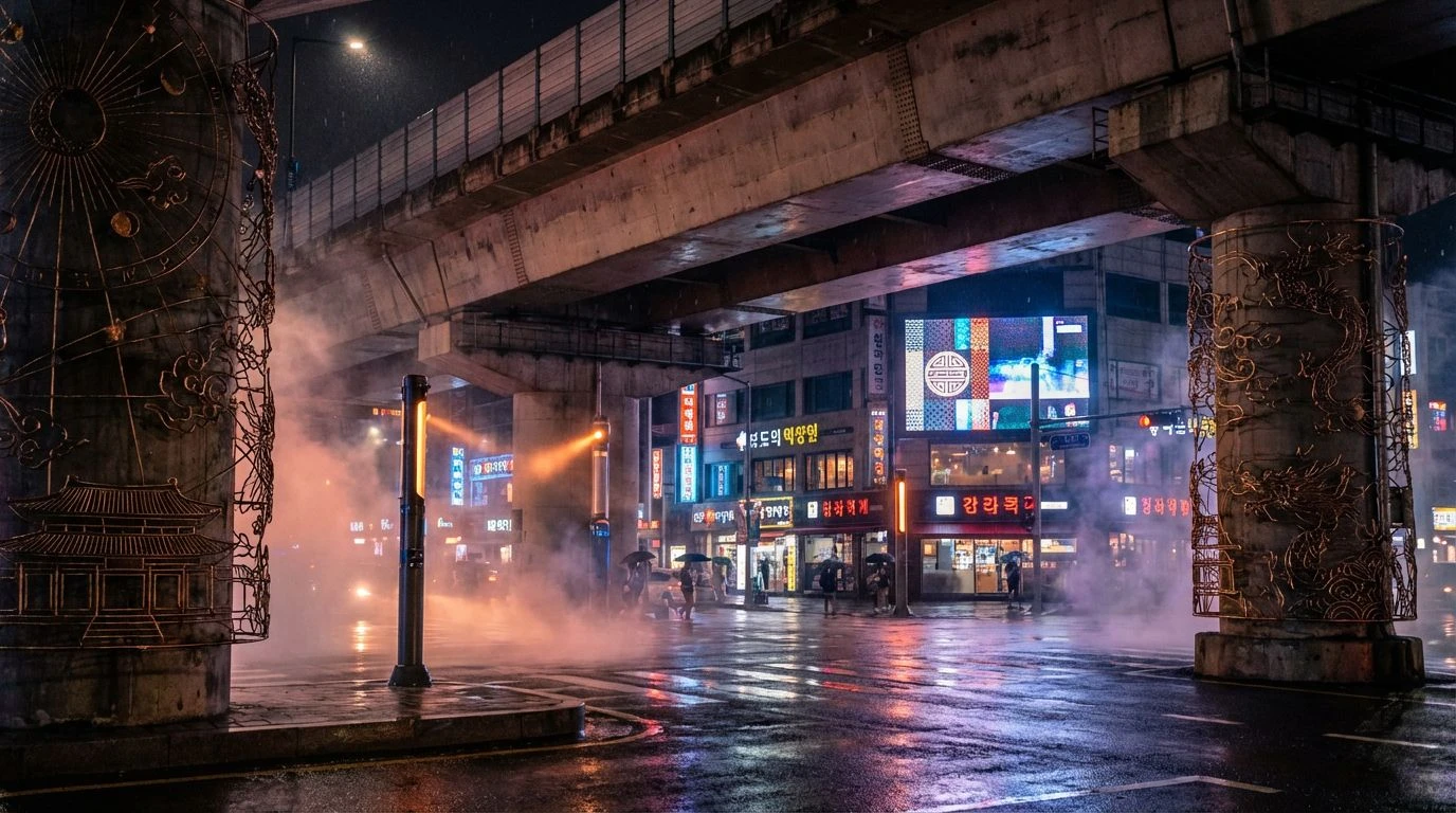
18 Mar 2026 · 5 min readIn the sprawling urban expanse of Seoul, the visual experience is often defined by a rigorous negotiation between the grey functionality of modern infrastructure and the specific, high-frequency wavelengths of history. The concept of Obangsaek is not merely an artistic choice but a diagram of the universe, assigning specific hues to cardinal directions and elements. When observing the city today, one notices how these five primary colors—blue, red, yellow, white, and black—act as optical anchors. They cut through the visual noise of concrete and steel, engaging the eye’s photoreceptors with a primitive, elemental urgency. To understand these palettes is to look at how light interacts with surface and symbol, creating a physiological response that grounds the viewer in a specific spatial and temporal reality. This is color theory applied to the pedestrian experience, where ancient cosmology meets the physics of urban light.
Joseon Earth 🏯
The visual weight of this arrangement relies on the interaction between high-reflectance areas like Glazed Ceramic and the dense, light-absorbing qualities of Aged Pine Timber. In an urban setting, this mimics the experience of entering a temple ground where the overwhelming grey of the city yields to organic, pigment-based hues. Philosophically, the presence of Ginkgo Leaf yellow provides a peak in luminance that draws the foveal focus, acting as a central anchor similar to the element of Earth in traditional cosmology. The inclusion of Pigment Blue creates a phenomenon known as simultaneous contrast when placed against the warm Burnished Bronze, making the structural elements of a building appear more distinct to the observer. It represents a grounding equilibrium, where the biological soothing effect of Mossy Eaves counters the starkness of stone, allowing the eye to rest even in a dense metropolis.
Glass Apex 🏙️
This selection captures the verticality of Seoul, where the sky creates a backdrop for the built environment. Scientific observation of this grouping reveals the dominance of short-wavelength blues, from Stratosphere Blue to Steel Reflection, which mimics the effect of Rayleigh scattering seen in the atmosphere and mirrored in glass skyscrapers. The sudden interruption of Palace Crimson acts as a visual shock, effectively stimulating the autonomic nervous system much like a warning signal or a ceremonial marker. This specific red, historically associated with fire and protection, advances visually while the cool atmospheric tones recede, creating a profound sense of depth. It illustrates the optical hierarchy of the city: vast fields of cool, reflective surfaces punctuated by deliberate, high-energy interventions of traditional red.
Cardinal Signal 🧭
High contrast defines this array, utilizing the extreme limits of the grayscale to frame chromatic information. The juxtaposition of Pure Gesso (representing metal and west) against Soot Black (representing water and north) maximizes dynamic range, allowing the eye to detect edges and shapes with minimal effort. This binary foundation supports the clarity of Cinnabar Seal and Dancheong Yellow, colors that correspond to specific wavelengths typically used for signaling due to their high visibility. In a cognitive sense, this grouping reduces visual ambiguity. The inclusion of Spring Shoot and Oxidized Copper introduces a mid-frequency green that bridges the gap between the artificial and the natural. It functions as a graphic interface for the city, where color is used not for decoration but for defining boundaries and directing movement through complex spaces.
Silk Spectrum 🎎
Light diffusion plays a critical role here, distinguishing these tones from the flat opacity of paints. The perception of colors such as Azalea Pink and Rice Paper changes based on surface texture, mimicking the way silk fibers scatter light to create a soft, iridescent sheen. This phenomenon softens the transition between hues, reducing eye strain associated with high-saturation environments. The presence of Mustard Pigment and Crimson Dye connects to the distinct color-mixing practices of traditional dyeing, where organic sources create complex spectral profiles. In modern applications, this reduction in chroma invites a slower, more contemplative visual scanning. It reflects the quieter, interior spaces of the culture, suggesting a psychological retreat from the high-decibel visual output of the exterior streetscape.
Electric Dynasty 🏮
The physics of additive color mixing governs this collection, representing the shift from reflected sunlight to emitted artificial light. Neon Vermilion and LED Cobalt are not merely pigments but radiant energy sources that stimulate the retina with high intensity. Against the low-reflectance background of Pavement Dark, these luminous colors appear to vibrate, a psychophysical effect caused by the high contrast and saturation levels. This mirrors the nocturnal transformation of the city, where the five cardinal colors are reinterpreted through fluorescence and incandescence. The warmth of Streetlight Peach balances the sterile cool of Digital Periwinkle, replicating the spectral distribution of mixed urban lighting. It captures the energy of the night market, where the biological need for orientation is met by the hum of electricity rather than the position of the sun.
The persistence of these five cardinal colors across centuries suggests that they appeal to something fundamental in human visual processing. Whether found in the pigment of a restored palace or the diode of a subway display, these specific slices of the visible spectrum provide necessary orientation in a chaotic environment. They offer a method of organizing visual information that prioritizes contrast and elemental association. By examining these combinations, we see that the transition from traditional pigments to modern luminescence creates a continuum rather than a disruption. The eye adapts to the changing medium—from silk and wood to glass and electricity—but the psychological weight of the colors remains constant. Seoul demonstrates that preserving a color heritage is not about freezing time, but about recognizing which wavelengths continue to signal meaning effectively to the human brain.