'%3e%3cpath%20fill-rule='evenodd'%20clip-rule='evenodd'%20d='M51.1303%2019.2492C50.7278%2019.913%2050.1346%2020.4426%2049.3508%2020.838C48.5669%2021.2335%2047.6172%2021.4312%2046.5014%2021.4312C44.8208%2021.4312%2043.4367%2021.0216%2042.3492%2020.2025C41.2617%2019.3833%2040.6686%2018.2394%2040.5697%2016.7706H44.4253C44.4818%2017.3355%2044.6831%2017.7804%2045.0291%2018.1052C45.3751%2018.43%2045.8164%2018.5924%2046.3531%2018.5924C46.8192%2018.5924%2047.1864%2018.4653%2047.4547%2018.2111C47.7231%2017.9569%2047.8572%2017.618%2047.8572%2017.1943C47.8572%2016.8129%2047.7337%2016.4952%2047.4865%2016.241C47.2393%2015.9867%2046.9322%2015.7784%2046.565%2015.616C46.1978%2015.4536%2045.6893%2015.2594%2045.0397%2015.0334C44.0934%2014.7086%2043.3202%2014.3944%2042.72%2014.0907C42.1197%2013.7871%2041.6042%2013.3351%2041.1735%2012.7349C40.7427%2012.1347%2040.5273%2011.3544%2040.5273%2010.394C40.5273%209.50418%2040.7533%208.73448%2041.2053%208.08481C41.6572%207.43515%2042.2821%206.93731%2043.0801%206.5913C43.8781%206.24528%2044.7925%206.07227%2045.8235%206.07227C47.49%206.07227%2048.8141%206.46771%2049.7956%207.25861C50.7772%208.04951%2051.3315%209.13698%2051.4586%2010.5211H47.5395C47.4689%2010.0268%2047.2888%209.63483%2046.9993%209.3453C46.7097%209.05578%2046.3178%208.91102%2045.8235%208.91102C45.3998%208.91102%2045.0573%209.024%2044.7961%209.24997C44.5348%209.47594%2044.4041%209.80783%2044.4041%2010.2457C44.4041%2010.5988%2044.5207%2010.8989%2044.7537%2011.146C44.9867%2011.3932%2045.2798%2011.5944%2045.6328%2011.7498C45.9859%2011.9052%2046.4944%2012.1029%2047.1581%2012.343C48.1185%2012.6678%2048.9023%2012.9891%2049.5096%2013.3069C50.1169%2013.6246%2050.6395%2014.0872%2051.0773%2014.6945C51.5151%2015.3018%2051.734%2016.0927%2051.734%2017.0672C51.734%2017.8581%2051.5328%2018.5854%2051.1303%2019.2492ZM59.0242%206.3053V21.2829H55.4016V6.3053H59.0242ZM73.9409%206.3053V9.18642H69.8734V21.2829H66.2296V9.18642H62.2046V6.3053H73.9409ZM80.7438%209.18642V12.3218H85.8069V15.0546H80.7438V18.3806H86.4425V21.2829H77.1212V6.3053H86.4425V9.18642H80.7438ZM99.667%2016.0291V21.2829H96.0444V6.3053H101.913C103.692%206.3053%20105.048%206.74665%20105.98%207.62934C106.912%208.51204%20107.378%209.7019%20107.378%2011.199C107.378%2012.1311%20107.17%2012.9609%20106.753%2013.6882C106.337%2014.4155%20105.719%2014.9875%20104.9%2015.4042C104.08%2015.8208%20103.085%2016.0291%20101.913%2016.0291H99.667ZM103.692%2011.199C103.692%209.8855%20102.965%209.22879%20101.51%209.22879H99.667V13.1268H101.51C102.965%2013.1268%20103.692%2012.4842%20103.692%2011.199ZM120.092%2018.5501H114.478L113.546%2021.2829H109.732L115.219%206.41123H119.393L124.879%2021.2829H121.024L120.092%2018.5501ZM119.16%2015.7961L117.295%2010.2881L115.41%2015.7961H119.16ZM131.555%2018.5077H136.385V21.2829H127.933V6.3053H131.555V18.5077ZM143.337%209.18642V12.3218H148.4V15.0546H143.337V18.3806H149.035V21.2829H139.714V6.3053H149.035V9.18642H143.337ZM163.507%206.3053V9.18642H159.44V21.2829H155.796V9.18642H151.771V6.3053H163.507ZM177.449%206.3053V9.18642H173.382V21.2829H169.738V9.18642H165.713V6.3053H177.449ZM184.252%209.18642V12.3218H189.315V15.0546H184.252V18.3806H189.951V21.2829H180.629V6.3053H189.951V9.18642H184.252Z'%20fill='%23EEF0ED'/%3e%3cmask%20id='mask0_3101_7327'%20style='mask-type:alpha'%20maskUnits='userSpaceOnUse'%20x='0'%20y='0'%20width='27'%20height='28'%3e%3cpath%20d='M23.8328%200.759766H2.64808C1.18559%200.759766%200%201.94535%200%203.40785V24.5925C0%2026.055%201.18559%2027.2406%202.64808%2027.2406H23.8328C25.2952%2027.2406%2026.4808%2026.055%2026.4808%2024.5925V3.40785C26.4808%201.94535%2025.2952%200.759766%2023.8328%200.759766Z'%20fill='white'/%3e%3c/mask%3e%3cg%20mask='url(%23mask0_3101_7327)'%3e%3cpath%20d='M23.8328%200.759766H2.64808C1.18559%200.759766%200%201.94535%200%203.40785V24.5925C0%2026.055%201.18559%2027.2406%202.64808%2027.2406H23.8328C25.2952%2027.2406%2026.4808%2026.055%2026.4808%2024.5925V3.40785C26.4808%201.94535%2025.2952%200.759766%2023.8328%200.759766Z'%20fill='%23D8D8D8'/%3e%3cpath%20d='M13.2404%200.759766H0V14.0001H13.2404V0.759766Z'%20fill='%238C61FF'/%3e%3cpath%20d='M13.2404%2014H0V27.2404H13.2404V14Z'%20fill='%2336C3FE'/%3e%3cpath%20d='M26.4806%2014H13.2402V27.2404H26.4806V14Z'%20fill='%236592FE'/%3e%3cpath%20d='M26.4806%200.759766H13.2402V14.0002H26.4806V0.759766Z'%20fill='%236059F7'/%3e%3c/g%3e%3c/g%3e%3cdefs%3e%3cclipPath%20id='clip0_3101_7327'%3e%3crect%20width='190'%20height='28'%20fill='white'/%3e%3c/clipPath%3e%3c/defs%3e%3c/svg%3e)
'%3e%3cpath%20d='M23.8328%200.759521H2.64808C1.18559%200.759521%200%201.94511%200%203.40761V24.5923C0%2026.0548%201.18559%2027.2404%202.64808%2027.2404H23.8328C25.2952%2027.2404%2026.4808%2026.0548%2026.4808%2024.5923V3.40761C26.4808%201.94511%2025.2952%200.759521%2023.8328%200.759521Z'%20fill='%23D8D8D8'/%3e%3cpath%20d='M13.2404%200.759521H0V13.9999H13.2404V0.759521Z'%20fill='%238C61FF'/%3e%3cpath%20d='M13.2404%2013.9998H0V27.2402H13.2404V13.9998Z'%20fill='%2336C3FE'/%3e%3cpath%20d='M26.4809%2013.9998H13.2405V27.2402H26.4809V13.9998Z'%20fill='%236592FE'/%3e%3cpath%20d='M26.4809%200.759277H13.2405V13.9997H26.4809V0.759277Z'%20fill='%236059F7'/%3e%3c/g%3e%3c/svg%3e)

Synthwave Color Palette: Redefining Design in Wellness Apps
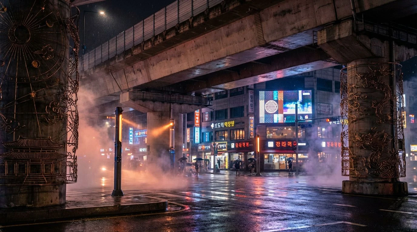
18 Mar 2026 · 6 min readFor years, the visual language of digital wellness has relied on a predictable vocabulary: muted sage, whisper-thin sans-serifs, and stock photography of stacked stones. The assumption has always been that to find peace in an application, the user must be visually transported out of their device and into a simulated forest. However, a shifting current in interface design suggests that grounding might not only come from mimicking nature but from acknowledging the machine itself. By adopting the saturated, high-contrast aesthetics of 1980s synthwave, developers are exploring a counter-intuitive avenue for tranquility. This is not the quiet of a library, but the rhythmic, humming solitude of a night drive. It relies on the psychological weight of nostalgia—specifically the retro-futurism of the early electronic era—to create a digital sanctuary. The hazy glow of heavy purples and cyan does not pretend to be organic material; instead, it offers a distinct form of transcendence, one that feels honest to the medium of the screen and grants permission to find spirituality within the electric grid.
Digital Mirage 🏜️
There is a surprising structural integrity to Digital Mirage, largely because it refuses to commit solely to the neon tropes of the genre. By anchoring the arrangement with Void Black and the surprisingly earthy tones of Faded Sunlight and Mossy Circuitry, the palette creates a visual tension that mirrors the meditation experience itself—the struggle to find stillness amidst noise. The presence of Deep Mainframe and electric Lavender introduces the expected technological hum, yet they are tempered by the darker, brooding undertones of Dark Berry Data. In a user interface, this combination functions uniquely: the gold and olive suggest a fading memory of the physical world, while the purples and pinks offer a bridge to digital transcendence. It suggests a landscape where the sun has just set over a silicon valley, offering a somatic reassurance that is neither wholly artificial nor entirely natural. This ambiguity allows the user to rest in the in-between, a space often sought in mindfulness practices but rarely represented visually.
Arcade Zen 🕹️
At first glance, the intensity of Arcade Zen seems antithetical to relaxation, shouting with the urgency of a coin-operated cabinet demanding attention. However, when applied to breathwork or focus-based applications, these colors operate on the principle of the flow state—that zone of total immersion generic to both gaming and deep meditation. The stark contrast between Hyper-Violet and High Score Yellow forces the eye to focus, eliminating peripheral distractions. It captures the singular concentration of the arcade era, where the world outside the screen ceases to matter. Laser Beam Blue and Arcade Rose do not soothe in the traditional sense; they mesmerize. They convert the chaotic energy of the mind into a single channel of visual input. For a user seeking to drown out the clutter of modern life, the sheer confidence of this palette provides a sturdy, unwavering focal point, transforming the screen into a mandala of electric light.
Midnight Highway 🛣️
The romanticism of the lonely driver navigating a grid of city lights is central to the synthwave mythos, and Midnight Highway translates this narrative into a tool for emotional regulation. The gradient from Asphalt Night to the piercing clarity of Tail Light Red mimics the visual rhythm of moving through a darkening landscape. This procession of colors—anchored by the substantial weight of Cobalt Engine and Neon Iris—suggests forward momentum without the anxiety of arrival. It frames meditation as a journey rather than a static pose. The inclusion of Soft Glitch and Retro Magenta adds a layer of tenderness to the otherwise cool arrangement, preventing the interface from feeling sterile. It paints the meditation session as a solitary cruise through a dreamscape, allowing the user to feel protected by the dark blues while guided by the warmth of the reds and pinks. It is solitude re-imagined as a luxury rather than a burden.
Cyber Spirit 🔮
Cyber Spirit offers the most direct interpretation of digital transcendentalism, utilizing the spectral qualities of Turquoise Grid and Astral Violet to suggest an environment free from gravity. The deep, heavy foundation of Deep Space Indigo provides the necessary grounding, effectively acting as the silence behind the noise. What makes this grouping particularly sophisticated is the inclusion of Dusty Motherboard, a muted, fleshy tone that disrupts the seamless perfection of the blues and purples. This distinct addition reminds the user of the human element behind the code. System Error Red acts not as a warning, but as a necessary spark of life, a heartbeat within the ether. When utilized in a wellness context, these hues suggest that the digital realm has its own form of divinity, a 'ghost in the machine' that can be communed with. It encourages a dissociation that is controlled and purposeful, lifting the user out of the mundane and into a space of pure, illuminated thought.
Analog Dream 📼
There is a profound softness to Analog Dream that speaks to the imperfections of memory. Unlike the sharp, high-definition clarity of modern interfaces, this selection relies on the washed-out charm of Faded Denim and Static Grey to lower the user's cognitive load. It mimics the visual texture of a worn VHS tape, where the blacks are never truly black and the colors bleed into one another. Muted Signal and Magenta Tape provide a warmth that feels lived-in and accessible, stripping away the intimidating sterility often associated with high-tech wellness tools. This palette argues that perfection is not a requirement for peace. By presenting colors that feel slightly eroded by time, the interface gives the user permission to be imperfect as well. It creates an atmosphere of forgiveness and slow time, countering the high-speed demands of the notification economy with a visual language that feels deliberately paused and rewound.
The decision to move away from the organic minimalism that dominates the wellness sector represents more than a stylistic pivot; it acknowledges a generational shift in how we define safe spaces. For many, the soft hum of hardware and the glow of a CRT monitor hold a comfort equal to that of a natural landscape. By utilizing these specific chromatic arrangements—where electric blues cut through heavy violets—designers accept the reality of the digital mediation rather than apologizing for it. This aesthetic admits that the phone is not a window to the woods, but a portal to a different kind of interiority. In embracing the artificiality of these hues, the user is not tricked into thinking they are elsewhere. Instead, they are grounded firmly in the present moment, accepting the screen for what it is while finding stillness in the deep, saturated interplay of light and dark. The result is a meditation practice that feels less like a retreat to a nonexistent primitive past and more like an acceptance of a complex, illuminated future.