'%3e%3cpath%20fill-rule='evenodd'%20clip-rule='evenodd'%20d='M51.1303%2019.2492C50.7278%2019.913%2050.1346%2020.4426%2049.3508%2020.838C48.5669%2021.2335%2047.6172%2021.4312%2046.5014%2021.4312C44.8208%2021.4312%2043.4367%2021.0216%2042.3492%2020.2025C41.2617%2019.3833%2040.6686%2018.2394%2040.5697%2016.7706H44.4253C44.4818%2017.3355%2044.6831%2017.7804%2045.0291%2018.1052C45.3751%2018.43%2045.8164%2018.5924%2046.3531%2018.5924C46.8192%2018.5924%2047.1864%2018.4653%2047.4547%2018.2111C47.7231%2017.9569%2047.8572%2017.618%2047.8572%2017.1943C47.8572%2016.8129%2047.7337%2016.4952%2047.4865%2016.241C47.2393%2015.9867%2046.9322%2015.7784%2046.565%2015.616C46.1978%2015.4536%2045.6893%2015.2594%2045.0397%2015.0334C44.0934%2014.7086%2043.3202%2014.3944%2042.72%2014.0907C42.1197%2013.7871%2041.6042%2013.3351%2041.1735%2012.7349C40.7427%2012.1347%2040.5273%2011.3544%2040.5273%2010.394C40.5273%209.50418%2040.7533%208.73448%2041.2053%208.08481C41.6572%207.43515%2042.2821%206.93731%2043.0801%206.5913C43.8781%206.24528%2044.7925%206.07227%2045.8235%206.07227C47.49%206.07227%2048.8141%206.46771%2049.7956%207.25861C50.7772%208.04951%2051.3315%209.13698%2051.4586%2010.5211H47.5395C47.4689%2010.0268%2047.2888%209.63483%2046.9993%209.3453C46.7097%209.05578%2046.3178%208.91102%2045.8235%208.91102C45.3998%208.91102%2045.0573%209.024%2044.7961%209.24997C44.5348%209.47594%2044.4041%209.80783%2044.4041%2010.2457C44.4041%2010.5988%2044.5207%2010.8989%2044.7537%2011.146C44.9867%2011.3932%2045.2798%2011.5944%2045.6328%2011.7498C45.9859%2011.9052%2046.4944%2012.1029%2047.1581%2012.343C48.1185%2012.6678%2048.9023%2012.9891%2049.5096%2013.3069C50.1169%2013.6246%2050.6395%2014.0872%2051.0773%2014.6945C51.5151%2015.3018%2051.734%2016.0927%2051.734%2017.0672C51.734%2017.8581%2051.5328%2018.5854%2051.1303%2019.2492ZM59.0242%206.3053V21.2829H55.4016V6.3053H59.0242ZM73.9409%206.3053V9.18642H69.8734V21.2829H66.2296V9.18642H62.2046V6.3053H73.9409ZM80.7438%209.18642V12.3218H85.8069V15.0546H80.7438V18.3806H86.4425V21.2829H77.1212V6.3053H86.4425V9.18642H80.7438ZM99.667%2016.0291V21.2829H96.0444V6.3053H101.913C103.692%206.3053%20105.048%206.74665%20105.98%207.62934C106.912%208.51204%20107.378%209.7019%20107.378%2011.199C107.378%2012.1311%20107.17%2012.9609%20106.753%2013.6882C106.337%2014.4155%20105.719%2014.9875%20104.9%2015.4042C104.08%2015.8208%20103.085%2016.0291%20101.913%2016.0291H99.667ZM103.692%2011.199C103.692%209.8855%20102.965%209.22879%20101.51%209.22879H99.667V13.1268H101.51C102.965%2013.1268%20103.692%2012.4842%20103.692%2011.199ZM120.092%2018.5501H114.478L113.546%2021.2829H109.732L115.219%206.41123H119.393L124.879%2021.2829H121.024L120.092%2018.5501ZM119.16%2015.7961L117.295%2010.2881L115.41%2015.7961H119.16ZM131.555%2018.5077H136.385V21.2829H127.933V6.3053H131.555V18.5077ZM143.337%209.18642V12.3218H148.4V15.0546H143.337V18.3806H149.035V21.2829H139.714V6.3053H149.035V9.18642H143.337ZM163.507%206.3053V9.18642H159.44V21.2829H155.796V9.18642H151.771V6.3053H163.507ZM177.449%206.3053V9.18642H173.382V21.2829H169.738V9.18642H165.713V6.3053H177.449ZM184.252%209.18642V12.3218H189.315V15.0546H184.252V18.3806H189.951V21.2829H180.629V6.3053H189.951V9.18642H184.252Z'%20fill='%23EEF0ED'/%3e%3cmask%20id='mask0_3101_7327'%20style='mask-type:alpha'%20maskUnits='userSpaceOnUse'%20x='0'%20y='0'%20width='27'%20height='28'%3e%3cpath%20d='M23.8328%200.759766H2.64808C1.18559%200.759766%200%201.94535%200%203.40785V24.5925C0%2026.055%201.18559%2027.2406%202.64808%2027.2406H23.8328C25.2952%2027.2406%2026.4808%2026.055%2026.4808%2024.5925V3.40785C26.4808%201.94535%2025.2952%200.759766%2023.8328%200.759766Z'%20fill='white'/%3e%3c/mask%3e%3cg%20mask='url(%23mask0_3101_7327)'%3e%3cpath%20d='M23.8328%200.759766H2.64808C1.18559%200.759766%200%201.94535%200%203.40785V24.5925C0%2026.055%201.18559%2027.2406%202.64808%2027.2406H23.8328C25.2952%2027.2406%2026.4808%2026.055%2026.4808%2024.5925V3.40785C26.4808%201.94535%2025.2952%200.759766%2023.8328%200.759766Z'%20fill='%23D8D8D8'/%3e%3cpath%20d='M13.2404%200.759766H0V14.0001H13.2404V0.759766Z'%20fill='%238C61FF'/%3e%3cpath%20d='M13.2404%2014H0V27.2404H13.2404V14Z'%20fill='%2336C3FE'/%3e%3cpath%20d='M26.4806%2014H13.2402V27.2404H26.4806V14Z'%20fill='%236592FE'/%3e%3cpath%20d='M26.4806%200.759766H13.2402V14.0002H26.4806V0.759766Z'%20fill='%236059F7'/%3e%3c/g%3e%3c/g%3e%3cdefs%3e%3cclipPath%20id='clip0_3101_7327'%3e%3crect%20width='190'%20height='28'%20fill='white'/%3e%3c/clipPath%3e%3c/defs%3e%3c/svg%3e)
'%3e%3cpath%20d='M23.8328%200.759521H2.64808C1.18559%200.759521%200%201.94511%200%203.40761V24.5923C0%2026.0548%201.18559%2027.2404%202.64808%2027.2404H23.8328C25.2952%2027.2404%2026.4808%2026.0548%2026.4808%2024.5923V3.40761C26.4808%201.94511%2025.2952%200.759521%2023.8328%200.759521Z'%20fill='%23D8D8D8'/%3e%3cpath%20d='M13.2404%200.759521H0V13.9999H13.2404V0.759521Z'%20fill='%238C61FF'/%3e%3cpath%20d='M13.2404%2013.9998H0V27.2402H13.2404V13.9998Z'%20fill='%2336C3FE'/%3e%3cpath%20d='M26.4809%2013.9998H13.2405V27.2402H26.4809V13.9998Z'%20fill='%236592FE'/%3e%3cpath%20d='M26.4809%200.759277H13.2405V13.9997H26.4809V0.759277Z'%20fill='%236059F7'/%3e%3c/g%3e%3c/svg%3e)
Industrial Color Palettes: Humanizing Technical Design
17 Mar 2026 · 5 min readFor decades, the visual language of heavy industry and software utility has been defined by a stark, uncompromising coldness. The assumption was that serious work required a serious lack of comfort—that a dashboard controlling logistics or manufacturing must look as rigid as the steel beams it monitors. Yet, as the boundaries between professional workspaces and personal environments blur, a question arises: why must technical rigidity preclude human warmth? The sensory distance between a clamorous factory floor and the quieter, aromatic welcome of a neighborhood bakery is vast, yet the operator in the control room seeks the same clarity and ease found in their daily life. By introducing organic pigments like terracotta and sage into the brutalist greys of industrial design, we observe a shift in user experience. This is not merely about decoration; it is about cognitive ergonomics. Warmth reduces the friction of complex tasks, suggesting that reliability need not feel sterile, and that the tools of trade can offer an invitation rather than just a command.
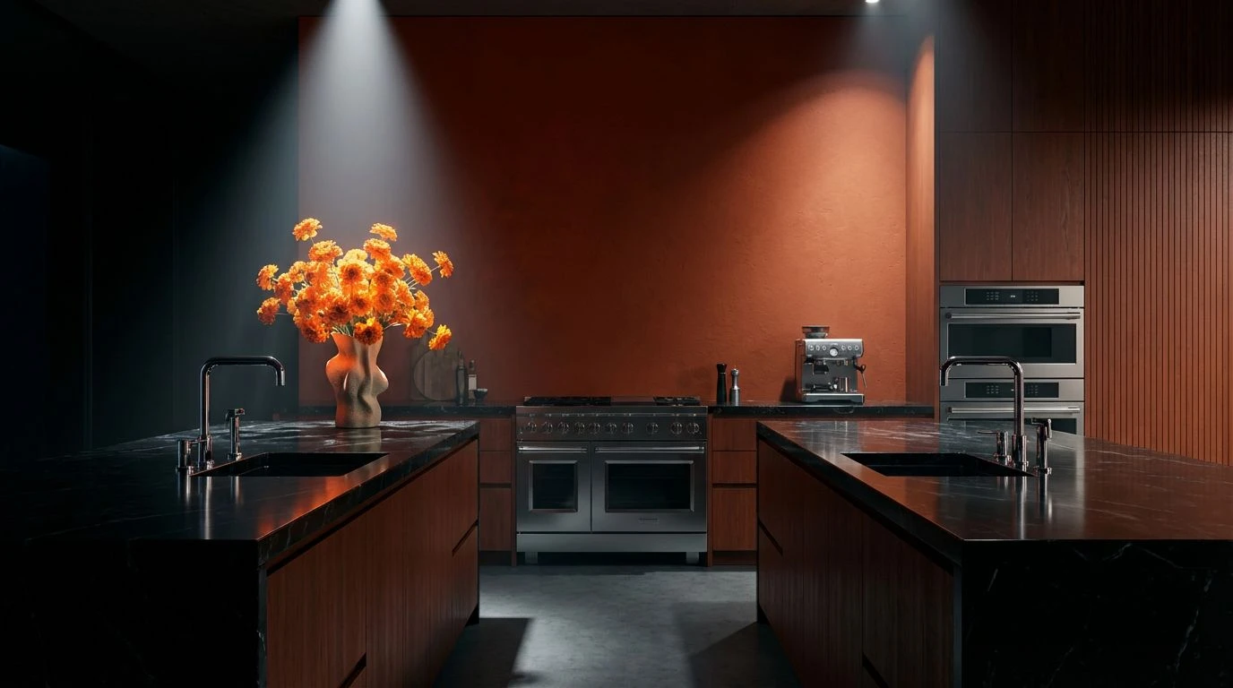
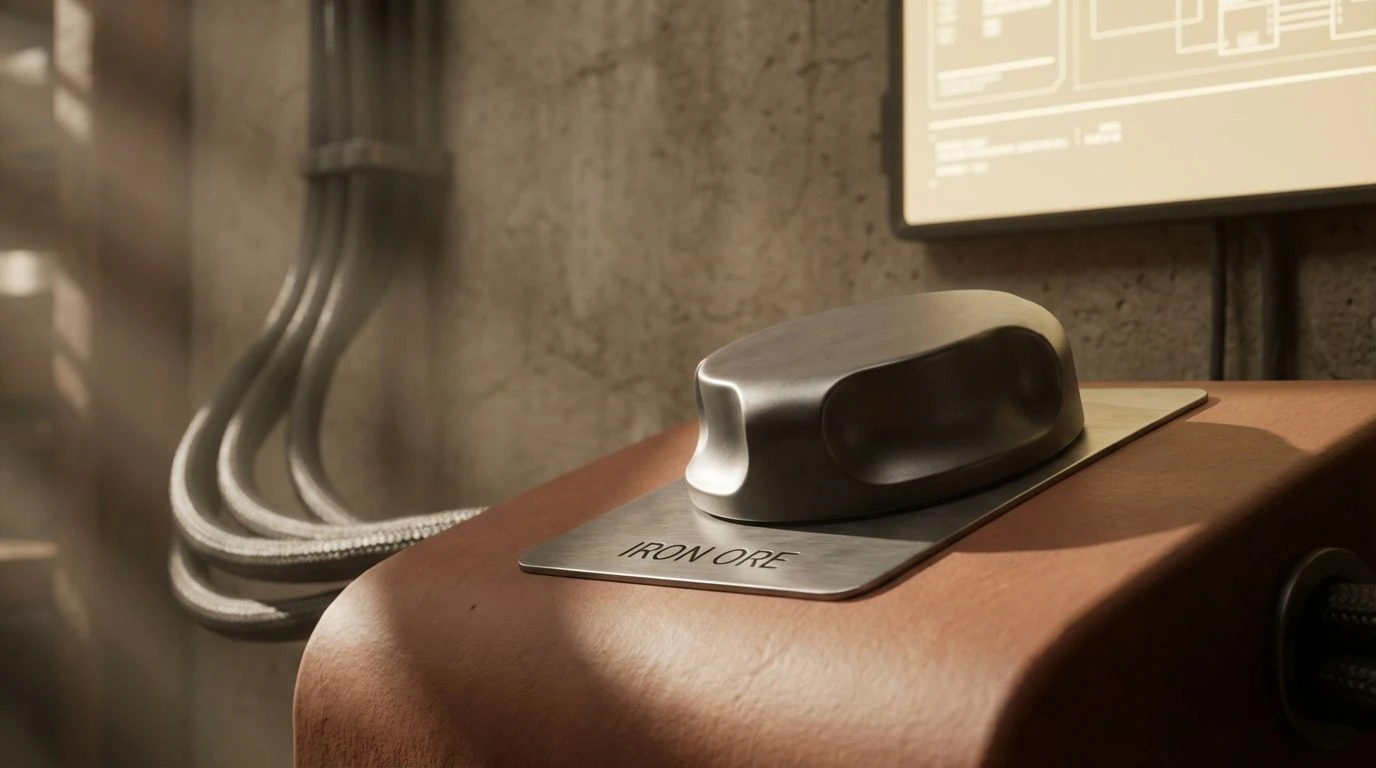
Architectural Baked Earth 🧱
In the rigorous environment of B2B platforms, the dominance of greyscale often leads to visual fatigue. Here, the foundation relies on the sturdy interaction between Iron Ore and Concrete Mist, establishing a grid that mimics the predictable structure of a blueprint or a warehouse floor. However, the introduction of Fired Clay disrupts this monotony without compromising the serious nature of the interface. This reddish-brown hue acts as a focal point, directing attention to critical alerts or primary actions with the familiarity of brickwork rather than the alarm of a standard firetruck red. It suggests a building material rather than a warning sign. The Drafting Paper white provides a softened background that reduces the glare typical of high-contrast monitors, allowing the Asphalt text to stand out clearly. The result is a dashboard that feels engineered yet habitable, akin to a well-lit architect’s studio.
Harvested Logistics 🚜
This selection bridges the gap between agricultural machinery and technical oversight. The Midnight Grease and Steel Plate tones provide the necessary weight for data density, creating a dark, immersive background often preferred by engineers for long-term monitoring. Against this shadow, the Safety Green functions as a precise indicator of status—active, flowing, functional—drawing from the vivid visibility vests seen on job sites but refined for a screen. The warmth comes from the interplay of Aged Leather and Sunset Oxide, which soften the sterile nature of the dark mode aesthetic. These earth tones remind the user that the end result of this machinery is often tangible and organic. It suits platforms where raw materials are tracked, connecting the digital twin back to the physical commodity in a way that feels grounded and robust.
Mid-Century Fabrication 🏭
There is a distinct nod to the functional color coding of 1950s manufacturing floors in this collection. It implies a system where every pipe and lever has a designated hue for safety and efficiency. Molten Copper and Heavy Industry Blue offer a classic complementary relationship, perfect for distinguishing between input and output metrics on a complex dashboard. The inclusion of Technical Chartreuse provides a rare, electric highlight that cuts through the neutral background of Canteen and Graphite, ideal for real-time data spikes or notifications. The Unbleached Linen softens the overall contrast, preventing the interface from looking too starkly monochromatic. This palette suggests a complex system that is under control, invoking the confidence of established engineering firms where innovation is built upon decades of proven reliability.
Analog Terminals 📟
Borrowing from the aesthetic of early computing and retro-industrial control panels, this grouping focuses on low-saturation usability. The Deep Current and Switchboard Grey create a low-light environment that feels private and secure, much like the atmosphere of a server room or a quiet artisanal kitchen after hours. The muted Indicator Red and Brass Fitting colors do not shout for attention; instead, they simulate the glow of incandescent pilot lights. This restraint makes the palette exceptionally suited for software used in dim lighting conditions or for prolonged periods. The Sulfur tone offers a unique, slightly acidic highlight that differentiates secondary information without competing with the primary red. It creates an interface that feels established and enduring, prioritizing long-term readability over flashy, momentary engagement, respecting the expertise of the professional user.
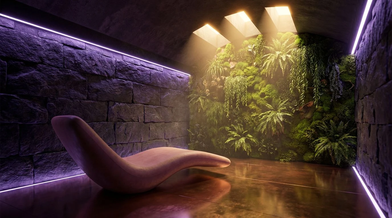
Botanical Steel 🌿
This combination arguably offers the most direct answer to the challenge of merging industrial utility with a welcoming atmosphere. The starkness of Obsidian provides a modern, sleek canvas, but the sterility is immediately counteracted by Deep Spruce and Dusty Brick. The greens here are not the neon of digital alerts but the shades of dried herbs and evergreen forests, bringing a sense of calm oxygenation to the screen. Apothecary Glass serves as a sophisticated teal highlight, offering a cooler, cleaner alternative to standard corporate blues. Polished Chrome acts as the neutral mediator, separating sections without adding visual weight. The overall effect is comparable to a modern industrial loft where steel beams are softened by indoor plants and terra cotta pots—a space that is undoubtedly constructed for function but designed for living.
The adoption of these specific color arrangements marks a departure from the era of purely clinical interface design. By looking at these thoughtful combinations, we see that the authority of technical systems is not diminished by the presence of organic warmth; rather, it is made more accessible. The terracotta grounds the eye, offering a visual anchor that feels substantial, while the sage and deep greens provide a restorative counterpoint to the high-alert demands of monitoring screens. This approach treats the professional user not as a component of the system but as a human operator deserving of an environment that sustains focus without inducing fatigue. As digital platforms continue to govern physical infrastructure, the choice to humanize the screen becomes a functional imperative. A tool that feels approachable is used more effectively, proving that there is distinct utility in preventing the digital workspace from feeling entirely like a machine.