'%3e%3cpath%20fill-rule='evenodd'%20clip-rule='evenodd'%20d='M51.1303%2019.2492C50.7278%2019.913%2050.1346%2020.4426%2049.3508%2020.838C48.5669%2021.2335%2047.6172%2021.4312%2046.5014%2021.4312C44.8208%2021.4312%2043.4367%2021.0216%2042.3492%2020.2025C41.2617%2019.3833%2040.6686%2018.2394%2040.5697%2016.7706H44.4253C44.4818%2017.3355%2044.6831%2017.7804%2045.0291%2018.1052C45.3751%2018.43%2045.8164%2018.5924%2046.3531%2018.5924C46.8192%2018.5924%2047.1864%2018.4653%2047.4547%2018.2111C47.7231%2017.9569%2047.8572%2017.618%2047.8572%2017.1943C47.8572%2016.8129%2047.7337%2016.4952%2047.4865%2016.241C47.2393%2015.9867%2046.9322%2015.7784%2046.565%2015.616C46.1978%2015.4536%2045.6893%2015.2594%2045.0397%2015.0334C44.0934%2014.7086%2043.3202%2014.3944%2042.72%2014.0907C42.1197%2013.7871%2041.6042%2013.3351%2041.1735%2012.7349C40.7427%2012.1347%2040.5273%2011.3544%2040.5273%2010.394C40.5273%209.50418%2040.7533%208.73448%2041.2053%208.08481C41.6572%207.43515%2042.2821%206.93731%2043.0801%206.5913C43.8781%206.24528%2044.7925%206.07227%2045.8235%206.07227C47.49%206.07227%2048.8141%206.46771%2049.7956%207.25861C50.7772%208.04951%2051.3315%209.13698%2051.4586%2010.5211H47.5395C47.4689%2010.0268%2047.2888%209.63483%2046.9993%209.3453C46.7097%209.05578%2046.3178%208.91102%2045.8235%208.91102C45.3998%208.91102%2045.0573%209.024%2044.7961%209.24997C44.5348%209.47594%2044.4041%209.80783%2044.4041%2010.2457C44.4041%2010.5988%2044.5207%2010.8989%2044.7537%2011.146C44.9867%2011.3932%2045.2798%2011.5944%2045.6328%2011.7498C45.9859%2011.9052%2046.4944%2012.1029%2047.1581%2012.343C48.1185%2012.6678%2048.9023%2012.9891%2049.5096%2013.3069C50.1169%2013.6246%2050.6395%2014.0872%2051.0773%2014.6945C51.5151%2015.3018%2051.734%2016.0927%2051.734%2017.0672C51.734%2017.8581%2051.5328%2018.5854%2051.1303%2019.2492ZM59.0242%206.3053V21.2829H55.4016V6.3053H59.0242ZM73.9409%206.3053V9.18642H69.8734V21.2829H66.2296V9.18642H62.2046V6.3053H73.9409ZM80.7438%209.18642V12.3218H85.8069V15.0546H80.7438V18.3806H86.4425V21.2829H77.1212V6.3053H86.4425V9.18642H80.7438ZM99.667%2016.0291V21.2829H96.0444V6.3053H101.913C103.692%206.3053%20105.048%206.74665%20105.98%207.62934C106.912%208.51204%20107.378%209.7019%20107.378%2011.199C107.378%2012.1311%20107.17%2012.9609%20106.753%2013.6882C106.337%2014.4155%20105.719%2014.9875%20104.9%2015.4042C104.08%2015.8208%20103.085%2016.0291%20101.913%2016.0291H99.667ZM103.692%2011.199C103.692%209.8855%20102.965%209.22879%20101.51%209.22879H99.667V13.1268H101.51C102.965%2013.1268%20103.692%2012.4842%20103.692%2011.199ZM120.092%2018.5501H114.478L113.546%2021.2829H109.732L115.219%206.41123H119.393L124.879%2021.2829H121.024L120.092%2018.5501ZM119.16%2015.7961L117.295%2010.2881L115.41%2015.7961H119.16ZM131.555%2018.5077H136.385V21.2829H127.933V6.3053H131.555V18.5077ZM143.337%209.18642V12.3218H148.4V15.0546H143.337V18.3806H149.035V21.2829H139.714V6.3053H149.035V9.18642H143.337ZM163.507%206.3053V9.18642H159.44V21.2829H155.796V9.18642H151.771V6.3053H163.507ZM177.449%206.3053V9.18642H173.382V21.2829H169.738V9.18642H165.713V6.3053H177.449ZM184.252%209.18642V12.3218H189.315V15.0546H184.252V18.3806H189.951V21.2829H180.629V6.3053H189.951V9.18642H184.252Z'%20fill='%23EEF0ED'/%3e%3cmask%20id='mask0_3101_7327'%20style='mask-type:alpha'%20maskUnits='userSpaceOnUse'%20x='0'%20y='0'%20width='27'%20height='28'%3e%3cpath%20d='M23.8328%200.759766H2.64808C1.18559%200.759766%200%201.94535%200%203.40785V24.5925C0%2026.055%201.18559%2027.2406%202.64808%2027.2406H23.8328C25.2952%2027.2406%2026.4808%2026.055%2026.4808%2024.5925V3.40785C26.4808%201.94535%2025.2952%200.759766%2023.8328%200.759766Z'%20fill='white'/%3e%3c/mask%3e%3cg%20mask='url(%23mask0_3101_7327)'%3e%3cpath%20d='M23.8328%200.759766H2.64808C1.18559%200.759766%200%201.94535%200%203.40785V24.5925C0%2026.055%201.18559%2027.2406%202.64808%2027.2406H23.8328C25.2952%2027.2406%2026.4808%2026.055%2026.4808%2024.5925V3.40785C26.4808%201.94535%2025.2952%200.759766%2023.8328%200.759766Z'%20fill='%23D8D8D8'/%3e%3cpath%20d='M13.2404%200.759766H0V14.0001H13.2404V0.759766Z'%20fill='%238C61FF'/%3e%3cpath%20d='M13.2404%2014H0V27.2404H13.2404V14Z'%20fill='%2336C3FE'/%3e%3cpath%20d='M26.4806%2014H13.2402V27.2404H26.4806V14Z'%20fill='%236592FE'/%3e%3cpath%20d='M26.4806%200.759766H13.2402V14.0002H26.4806V0.759766Z'%20fill='%236059F7'/%3e%3c/g%3e%3c/g%3e%3cdefs%3e%3cclipPath%20id='clip0_3101_7327'%3e%3crect%20width='190'%20height='28'%20fill='white'/%3e%3c/clipPath%3e%3c/defs%3e%3c/svg%3e)
'%3e%3cpath%20d='M23.8328%200.759521H2.64808C1.18559%200.759521%200%201.94511%200%203.40761V24.5923C0%2026.0548%201.18559%2027.2404%202.64808%2027.2404H23.8328C25.2952%2027.2404%2026.4808%2026.0548%2026.4808%2024.5923V3.40761C26.4808%201.94511%2025.2952%200.759521%2023.8328%200.759521Z'%20fill='%23D8D8D8'/%3e%3cpath%20d='M13.2404%200.759521H0V13.9999H13.2404V0.759521Z'%20fill='%238C61FF'/%3e%3cpath%20d='M13.2404%2013.9998H0V27.2402H13.2404V13.9998Z'%20fill='%2336C3FE'/%3e%3cpath%20d='M26.4809%2013.9998H13.2405V27.2402H26.4809V13.9998Z'%20fill='%236592FE'/%3e%3cpath%20d='M26.4809%200.759277H13.2405V13.9997H26.4809V0.759277Z'%20fill='%236059F7'/%3e%3c/g%3e%3c/svg%3e)
Deep Purple Color Palettes: A New Era of Luxury Wellness
16 Mar 2026 · 5 min readFor decades, the wellness industry operated under a singular visual assumption: that white equals clean. The clinical aesthetic, borrowed from medical facilities, relied on high-luminance surfaces to signal hygiene and sterility. However, a significant departure is occurring in the architecture of restoration. Designers are moving toward the opposite end of the spectrum, employing lower light reflectance values to trigger a different biological response. The shift from stark, clinical whites to deep, saturated hues exploits the physics of light absorption to alter spatial perception. By reducing the volume of photons hitting the retina, these darker environments simulate the protective cover of night or the safety of a secluded shelter, effectively lowering cortisol levels. This transition is not merely decorative but rooted in evolutionary psychology; whereas bright light demands alertness and scanning, the 'royal' spectrums of violet and gold signal a resource-rich environment where vigilance is no longer required.
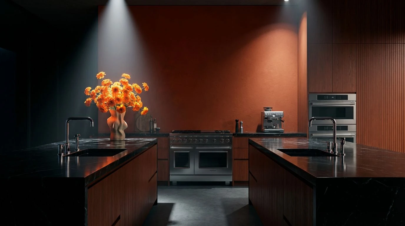
Obsidian & Ember 👑
This configuration explores the impact of high-contrast anchoring. The dominance of Midnight Ink creates a near-total absorption of light, functioning—much like a sensory deprivation tank—to minimize visual noise. Against this void, the localized intensity of Scarlet Pulse and Crown Gold mimics the behavior of embers or precious metals found in geologic darkness. Physiologically, the eye is drawn to these warm, long-wavelength stimuli, allowing the surrounding darkness to recede into the periphery. In a spa setting focused on prestige, this stark usage of chiaroscuro directs the guest’s focus entirely inward, stripping away the trivial distractions of the outside world through the sheer weight of the darker tones.
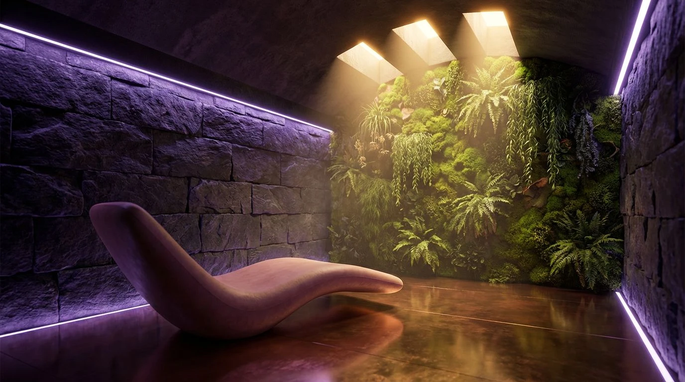
Majestic Frequency 🔮
Here we observe the direct application of the 'royal violet' phenomenon. Historically, the dyes required to produce Royal Velvet and Cardinal Blood were extracted from the predatory Murex snail, a labor-intensive process that made the pigment more valuable than gold. This palette leverages that ancestral association with scarcity. The deep purples (Royal Velvet) possess the shortest wavelengths in the visible spectrum, often appearing to recede physically in space, which expands the perceived volume of a room while simultaneously making it feel enclosed and intimate. When paired with the high specular reflection of Sunken Treasure, the brain registers a combination of rarity and wealth. This creates a sedating effect, as the low-luminance purples absorb aggressive light, leaving only the warm, metallic glint to guide the eye.
Equilibrium State 🌀
While dark purple signals imperial exclusivity, this assembly employs a different mechanism for sophistication: geological grounding. The presence of Cobalt Surge introduces a distinct cooling sensation, offsetting the warmth of Copper Earth. Visual systems process these blue-heavy tones as receding, much like the horizon or deep water, which can lower blood pressure and heart rate. In the context of luxury wellness, this palette acts as a bridge between the clinical and the opulent. It avoids the starkness of pure white but retains a certain naturalism found in mineral deposits. The metallic yellow of Canary Light serves as the stimulating variable, ensuring the environment remains comprised of active luxury rather than passive neutrality.
Opulent Spectrum 🦚
This grouping demonstrates the interaction between split-complementary wavelengths. By placing Amethyst Prism against Jade Current and Saffron Gleam, the visual field is filled with a complex richness that mimics the iridescence found in avian plumage or oxidized minerals. This complexity engages the brain's pattern-recognition capabilities without causing fatigue. The inclusion of Amethyst Prism provides the necessary prestige marker, signaling the 'royal' theme, while the green-leaning Jade Current introduces a biophilic element. This suggests a restorative connection to nature, but a nature that is cultivated and manicured rather than wild. It creates an atmosphere where the guest feels suspended in a finely curated exhibit of color.
Shadowed Gold 🕯️
Human vision adapts differently to scotopic (low light) conditions, and this palette takes full advantage of that adaptation. The marriage of Absolute Dark and Deep Forest creates a 'nocturnal biophilia'—the sense of being protected by a dense canopy at twilight. Unlike the demanding energy of bright daylight greens, Deep Forest absorbs illumination, contributing to a sense of silence and solitude. The inclusion of Burnished Bronze and Pale Champagne provides the necessary warmth to prevent the space from feeling subterranean. These metallic hues reflect light in a way that mimics candlelight, activating the parasympathetic nervous system and encouraging the physiological release of tension associated with the end of the solar day.
The transition from reflective sterility to absorptive opacity marks a maturing understanding of environmental psychology. By manipulating wavelengths—prioritizing the short-wave rarity of violet and the specular reflection of metallic tones—designers act as architects of the autonomic nervous system. These color configurations do more than decorate; they facilitate a metabolic downshift, moving the occupant from a state of alert surveillance to one of deep restoration. As the wellness sector continues to investigate the impact of visual stimuli on recovery, the use of substantial, heavy pigments offers a method to induce relaxation through sensory regulation. The perceived weight of these colors provides a psychological anchor, proving that the perception of luxury is inextricably linked to the biological need for a protected, resource-laden sanctuary.