'%3e%3cpath%20fill-rule='evenodd'%20clip-rule='evenodd'%20d='M51.1303%2019.2492C50.7278%2019.913%2050.1346%2020.4426%2049.3508%2020.838C48.5669%2021.2335%2047.6172%2021.4312%2046.5014%2021.4312C44.8208%2021.4312%2043.4367%2021.0216%2042.3492%2020.2025C41.2617%2019.3833%2040.6686%2018.2394%2040.5697%2016.7706H44.4253C44.4818%2017.3355%2044.6831%2017.7804%2045.0291%2018.1052C45.3751%2018.43%2045.8164%2018.5924%2046.3531%2018.5924C46.8192%2018.5924%2047.1864%2018.4653%2047.4547%2018.2111C47.7231%2017.9569%2047.8572%2017.618%2047.8572%2017.1943C47.8572%2016.8129%2047.7337%2016.4952%2047.4865%2016.241C47.2393%2015.9867%2046.9322%2015.7784%2046.565%2015.616C46.1978%2015.4536%2045.6893%2015.2594%2045.0397%2015.0334C44.0934%2014.7086%2043.3202%2014.3944%2042.72%2014.0907C42.1197%2013.7871%2041.6042%2013.3351%2041.1735%2012.7349C40.7427%2012.1347%2040.5273%2011.3544%2040.5273%2010.394C40.5273%209.50418%2040.7533%208.73448%2041.2053%208.08481C41.6572%207.43515%2042.2821%206.93731%2043.0801%206.5913C43.8781%206.24528%2044.7925%206.07227%2045.8235%206.07227C47.49%206.07227%2048.8141%206.46771%2049.7956%207.25861C50.7772%208.04951%2051.3315%209.13698%2051.4586%2010.5211H47.5395C47.4689%2010.0268%2047.2888%209.63483%2046.9993%209.3453C46.7097%209.05578%2046.3178%208.91102%2045.8235%208.91102C45.3998%208.91102%2045.0573%209.024%2044.7961%209.24997C44.5348%209.47594%2044.4041%209.80783%2044.4041%2010.2457C44.4041%2010.5988%2044.5207%2010.8989%2044.7537%2011.146C44.9867%2011.3932%2045.2798%2011.5944%2045.6328%2011.7498C45.9859%2011.9052%2046.4944%2012.1029%2047.1581%2012.343C48.1185%2012.6678%2048.9023%2012.9891%2049.5096%2013.3069C50.1169%2013.6246%2050.6395%2014.0872%2051.0773%2014.6945C51.5151%2015.3018%2051.734%2016.0927%2051.734%2017.0672C51.734%2017.8581%2051.5328%2018.5854%2051.1303%2019.2492ZM59.0242%206.3053V21.2829H55.4016V6.3053H59.0242ZM73.9409%206.3053V9.18642H69.8734V21.2829H66.2296V9.18642H62.2046V6.3053H73.9409ZM80.7438%209.18642V12.3218H85.8069V15.0546H80.7438V18.3806H86.4425V21.2829H77.1212V6.3053H86.4425V9.18642H80.7438ZM99.667%2016.0291V21.2829H96.0444V6.3053H101.913C103.692%206.3053%20105.048%206.74665%20105.98%207.62934C106.912%208.51204%20107.378%209.7019%20107.378%2011.199C107.378%2012.1311%20107.17%2012.9609%20106.753%2013.6882C106.337%2014.4155%20105.719%2014.9875%20104.9%2015.4042C104.08%2015.8208%20103.085%2016.0291%20101.913%2016.0291H99.667ZM103.692%2011.199C103.692%209.8855%20102.965%209.22879%20101.51%209.22879H99.667V13.1268H101.51C102.965%2013.1268%20103.692%2012.4842%20103.692%2011.199ZM120.092%2018.5501H114.478L113.546%2021.2829H109.732L115.219%206.41123H119.393L124.879%2021.2829H121.024L120.092%2018.5501ZM119.16%2015.7961L117.295%2010.2881L115.41%2015.7961H119.16ZM131.555%2018.5077H136.385V21.2829H127.933V6.3053H131.555V18.5077ZM143.337%209.18642V12.3218H148.4V15.0546H143.337V18.3806H149.035V21.2829H139.714V6.3053H149.035V9.18642H143.337ZM163.507%206.3053V9.18642H159.44V21.2829H155.796V9.18642H151.771V6.3053H163.507ZM177.449%206.3053V9.18642H173.382V21.2829H169.738V9.18642H165.713V6.3053H177.449ZM184.252%209.18642V12.3218H189.315V15.0546H184.252V18.3806H189.951V21.2829H180.629V6.3053H189.951V9.18642H184.252Z'%20fill='%23EEF0ED'/%3e%3cmask%20id='mask0_3101_7327'%20style='mask-type:alpha'%20maskUnits='userSpaceOnUse'%20x='0'%20y='0'%20width='27'%20height='28'%3e%3cpath%20d='M23.8328%200.759766H2.64808C1.18559%200.759766%200%201.94535%200%203.40785V24.5925C0%2026.055%201.18559%2027.2406%202.64808%2027.2406H23.8328C25.2952%2027.2406%2026.4808%2026.055%2026.4808%2024.5925V3.40785C26.4808%201.94535%2025.2952%200.759766%2023.8328%200.759766Z'%20fill='white'/%3e%3c/mask%3e%3cg%20mask='url(%23mask0_3101_7327)'%3e%3cpath%20d='M23.8328%200.759766H2.64808C1.18559%200.759766%200%201.94535%200%203.40785V24.5925C0%2026.055%201.18559%2027.2406%202.64808%2027.2406H23.8328C25.2952%2027.2406%2026.4808%2026.055%2026.4808%2024.5925V3.40785C26.4808%201.94535%2025.2952%200.759766%2023.8328%200.759766Z'%20fill='%23D8D8D8'/%3e%3cpath%20d='M13.2404%200.759766H0V14.0001H13.2404V0.759766Z'%20fill='%238C61FF'/%3e%3cpath%20d='M13.2404%2014H0V27.2404H13.2404V14Z'%20fill='%2336C3FE'/%3e%3cpath%20d='M26.4806%2014H13.2402V27.2404H26.4806V14Z'%20fill='%236592FE'/%3e%3cpath%20d='M26.4806%200.759766H13.2402V14.0002H26.4806V0.759766Z'%20fill='%236059F7'/%3e%3c/g%3e%3c/g%3e%3cdefs%3e%3cclipPath%20id='clip0_3101_7327'%3e%3crect%20width='190'%20height='28'%20fill='white'/%3e%3c/clipPath%3e%3c/defs%3e%3c/svg%3e)
'%3e%3cpath%20d='M23.8328%200.759521H2.64808C1.18559%200.759521%200%201.94511%200%203.40761V24.5923C0%2026.0548%201.18559%2027.2404%202.64808%2027.2404H23.8328C25.2952%2027.2404%2026.4808%2026.0548%2026.4808%2024.5923V3.40761C26.4808%201.94511%2025.2952%200.759521%2023.8328%200.759521Z'%20fill='%23D8D8D8'/%3e%3cpath%20d='M13.2404%200.759521H0V13.9999H13.2404V0.759521Z'%20fill='%238C61FF'/%3e%3cpath%20d='M13.2404%2013.9998H0V27.2402H13.2404V13.9998Z'%20fill='%2336C3FE'/%3e%3cpath%20d='M26.4809%2013.9998H13.2405V27.2402H26.4809V13.9998Z'%20fill='%236592FE'/%3e%3cpath%20d='M26.4809%200.759277H13.2405V13.9997H26.4809V0.759277Z'%20fill='%236059F7'/%3e%3c/g%3e%3c/svg%3e)
Rainforest Color Palettes for Modern Sustainable Design
15 Mar 2026 · 5 min readFor years, the visual language of environmentalism felt trapped in a singular, sanitized loop: leaf icons, white backgrounds, and a hesitant, polite shade of lime. But the forest itself is rarely polite, and it is never monochromatic. To build credibility in a sector crowded with skepticism, new ventures are looking downward, past the canopy and into the understory. Here, the light struggles to touch the ground, creating deep, enveloping shadows that suggest permanence and complexity rather than superficial engagement. We are witnessing a departure from the aesthetic of the brochure and a movement toward the aesthetic of the biome. By embracing the heavy, saturated darkness of the rainforest floor and piercing it with the electric luminance of cyan and gold, designers signal a capability that goes beyond mere promise. This is where reliability meets the cutting edge—a visual argument that a company is as grounded as an ancient root system and as sharp as a laser measuring carbon uptake.
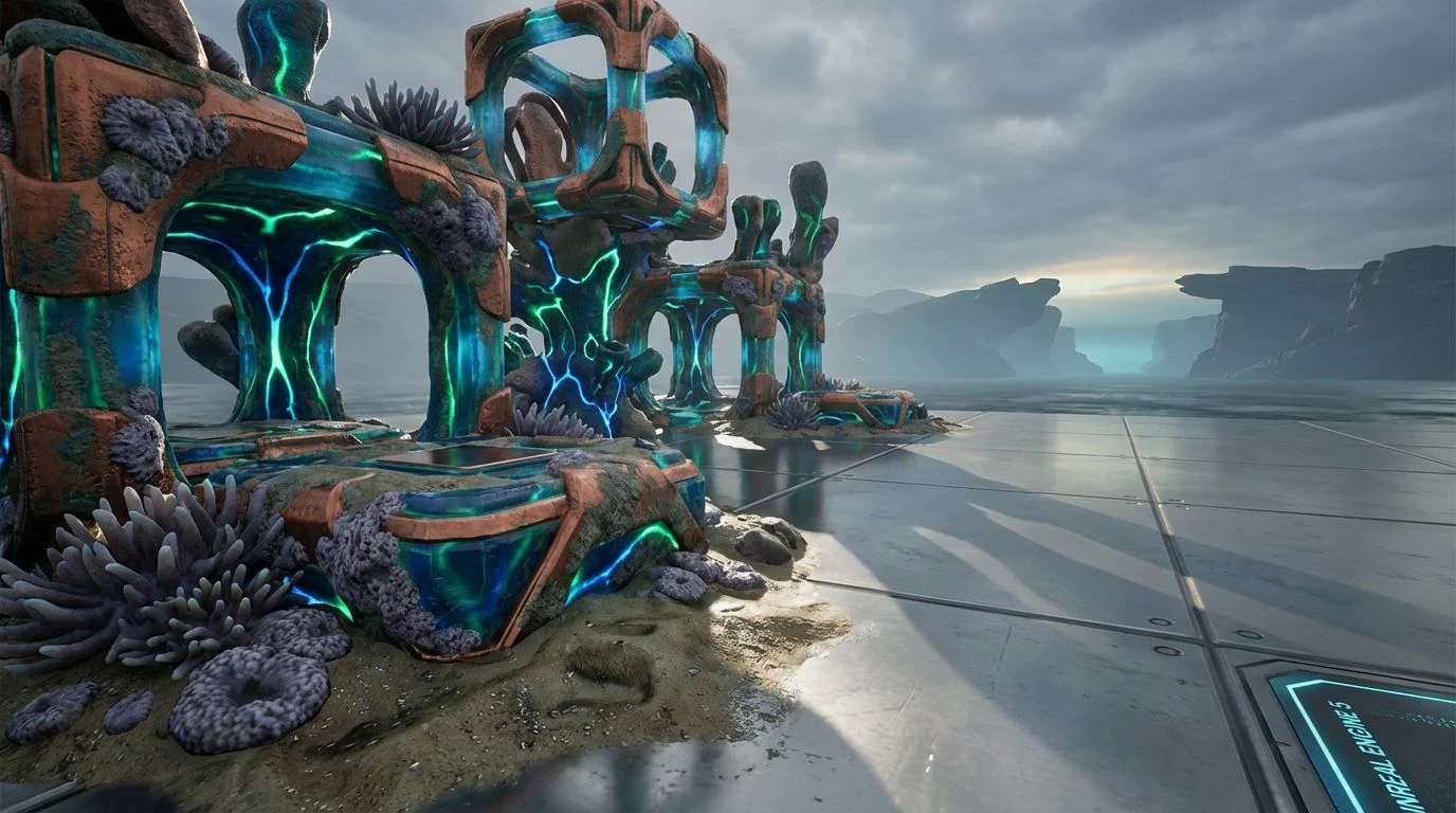
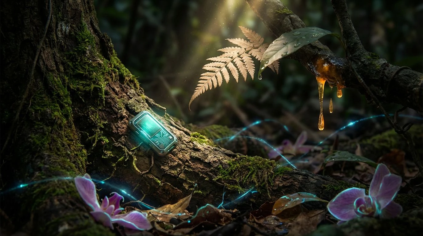
Bioluminescent Circuitry ⚡
This arrangement vibrates with the frenetic energy of a jungle waking up after a storm. It captures the precise moment where biological life intersects with the artificial, creating a tension that feels distinctly modern. The heavy, dark greens provide a theater for the more volatile hues to perform. That piercing electric blue and the startling violet—the Digital Orchid—act as interruptions, shocks to the system that suggest high-speed data transfer occurring amidst the foliage. It is not a peaceful scene; it is an active one. The golden tones prevent the look from becoming too cold or scientific, grounding the viewer in warmth before the neon greens and blues pull them back into the abstraction of software. This is the visual signature of a company that monitors living systems in real-time, bridging the gap between the chaotic indifference of nature and the ordered logic of the machine.
The Silent Reservoir 💧
Quiet authority defines this selection. It mimics the stillness of standing water in a high-altitude reserve, where the air is thin and every sound carries for miles. The darker tones, bordering on absolute black and navy, offer a solemn backdrop that speaks of serious intent. There is no frivolity here, only the measured reliability of hydrology and engineering. The lighter blues do not drift away; they are anchored by the heavy slate and moss, creating a sense of balance that feels architectural. Such a combination suits an endeavor focused on water purification or long-term infrastructure, where trust is the primary currency. By avoiding high-saturation screaming, the colors compel the viewer to lean in, suggesting that the solutions offered are transparent, cool to the touch, and fundamentally essential to survival.
Understory Light 🌿
Here, we find the humidity of the forest trapped in color. The air hangs heavy, thick with the scent of wet earth and decay that precedes new growth. The golden yellow is not the bright sun of the open desert, but a filtered beam breaking through layers of leaves to strike the forest floor. The greens range from the murky depths of a peat bog to the sharp, sudden brightness of a living creature hiding in the brush. This palette rejects the sterile purity often associated with clean tech in favor of something messier and more honest. It acknowledges that true sustainability involves getting one's hands dirty. It fits a narrative of regeneration, suitable for ventures dealing in soil health or agriculture, where the beauty lies not in the shine of the laboratory, but in the richness of the loam.
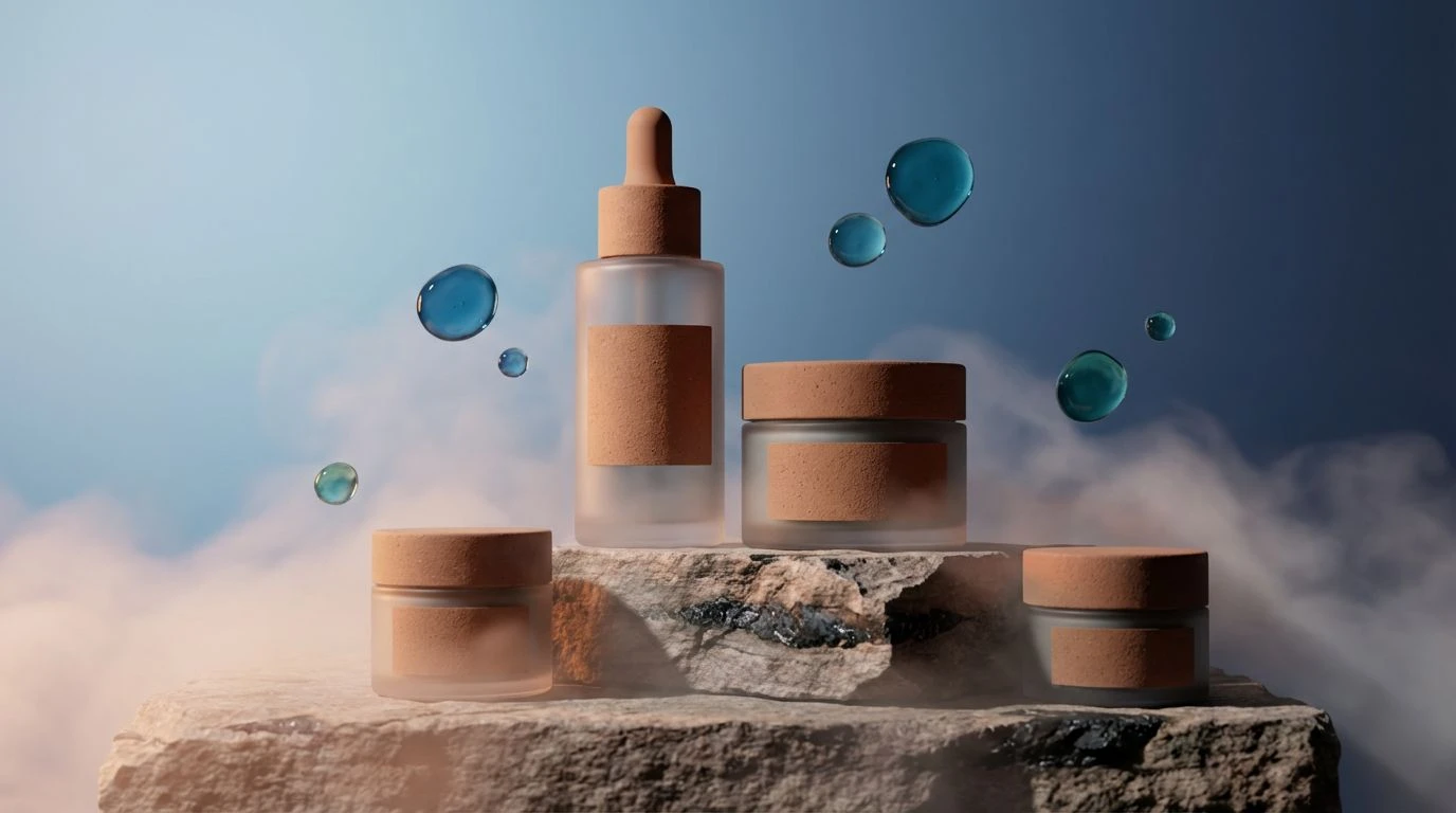
Coastal Root System 🌊
The transition from land to sea is never a hard line; it is a gradient of salt, sand, and vegetation. This collection walks that boundary, utilizing the comforting neutrality of warm beige and brown to establish a foundation of stability. These are the colors of driftwood and dried earth, materials that have weathered the elements and remained. Against this reliable background, the sudden appearance of the jade and harbor blues feels like a breath of fresh air, a promise of clean oceans and restored habitats. It avoids the aggressive neon of pure tech, opting instead for a sophisticated, tactile quality. One can almost feel the grain of the wood and the coolness of the water. It projects an image of a company that is restorative rather than disruptive, one that seeks to heal the environment by understanding its oldest rhythms.
The Solar Interface ☀️
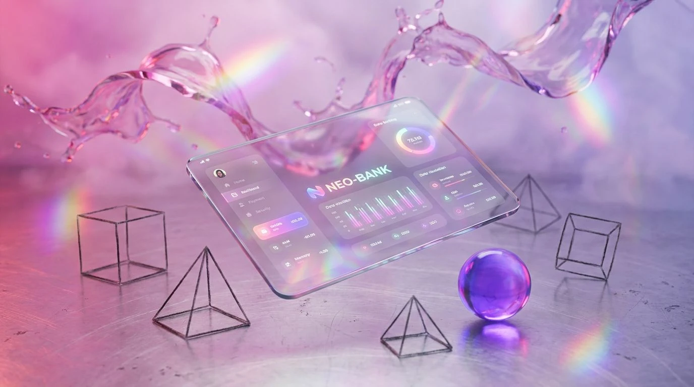
Clarity is the objective here. The stark separation between the blinding white background and the void-like black text invites the eye to read, to measure, and to understand. It creates a dashboard for the planet. The natural tones of cardboard and coffee serve as a humble, physical base, reminding the user of the material world, while the primary spikes of yellow, green, and cyan act as data points. They are the indicators on a control panel, signaling efficiency and optimizations. This is the language of the interface, where complex environmental data is distilled into actionable insights. It feels precise, calculated, and urgent. The design does not mimic nature so much as it organizes it, making it perfect for platforms that track emissions or manage energy grids, where the user needs immediate, legible truth amidst the noise.
The shift toward these denser, more demanding spectrums marks a maturation in how we visualize the future of the planet. We have moved past the era where suggesting care for the earth meant simply lightening the mood. The gravity of the climate challenge demands a palette that carries weight, one that acknowledges the mud, the deep water, and the blinding intensity of the sun. These collections do not ask for attention; they command it through contrast and depth. They remind us that the mechanisms of survival are intricate, involving both the darkness of soil and the clarity of the sky. When a startup wraps its identity in these heavy greens and piercing cyans, it tells a story of durability. It suggests that the technology being built is not a fleeting trend, but a permanent infrastructure, woven into the tangled, beautiful, and critical machinery of the world.