'%3e%3cpath%20fill-rule='evenodd'%20clip-rule='evenodd'%20d='M51.1303%2019.2492C50.7278%2019.913%2050.1346%2020.4426%2049.3508%2020.838C48.5669%2021.2335%2047.6172%2021.4312%2046.5014%2021.4312C44.8208%2021.4312%2043.4367%2021.0216%2042.3492%2020.2025C41.2617%2019.3833%2040.6686%2018.2394%2040.5697%2016.7706H44.4253C44.4818%2017.3355%2044.6831%2017.7804%2045.0291%2018.1052C45.3751%2018.43%2045.8164%2018.5924%2046.3531%2018.5924C46.8192%2018.5924%2047.1864%2018.4653%2047.4547%2018.2111C47.7231%2017.9569%2047.8572%2017.618%2047.8572%2017.1943C47.8572%2016.8129%2047.7337%2016.4952%2047.4865%2016.241C47.2393%2015.9867%2046.9322%2015.7784%2046.565%2015.616C46.1978%2015.4536%2045.6893%2015.2594%2045.0397%2015.0334C44.0934%2014.7086%2043.3202%2014.3944%2042.72%2014.0907C42.1197%2013.7871%2041.6042%2013.3351%2041.1735%2012.7349C40.7427%2012.1347%2040.5273%2011.3544%2040.5273%2010.394C40.5273%209.50418%2040.7533%208.73448%2041.2053%208.08481C41.6572%207.43515%2042.2821%206.93731%2043.0801%206.5913C43.8781%206.24528%2044.7925%206.07227%2045.8235%206.07227C47.49%206.07227%2048.8141%206.46771%2049.7956%207.25861C50.7772%208.04951%2051.3315%209.13698%2051.4586%2010.5211H47.5395C47.4689%2010.0268%2047.2888%209.63483%2046.9993%209.3453C46.7097%209.05578%2046.3178%208.91102%2045.8235%208.91102C45.3998%208.91102%2045.0573%209.024%2044.7961%209.24997C44.5348%209.47594%2044.4041%209.80783%2044.4041%2010.2457C44.4041%2010.5988%2044.5207%2010.8989%2044.7537%2011.146C44.9867%2011.3932%2045.2798%2011.5944%2045.6328%2011.7498C45.9859%2011.9052%2046.4944%2012.1029%2047.1581%2012.343C48.1185%2012.6678%2048.9023%2012.9891%2049.5096%2013.3069C50.1169%2013.6246%2050.6395%2014.0872%2051.0773%2014.6945C51.5151%2015.3018%2051.734%2016.0927%2051.734%2017.0672C51.734%2017.8581%2051.5328%2018.5854%2051.1303%2019.2492ZM59.0242%206.3053V21.2829H55.4016V6.3053H59.0242ZM73.9409%206.3053V9.18642H69.8734V21.2829H66.2296V9.18642H62.2046V6.3053H73.9409ZM80.7438%209.18642V12.3218H85.8069V15.0546H80.7438V18.3806H86.4425V21.2829H77.1212V6.3053H86.4425V9.18642H80.7438ZM99.667%2016.0291V21.2829H96.0444V6.3053H101.913C103.692%206.3053%20105.048%206.74665%20105.98%207.62934C106.912%208.51204%20107.378%209.7019%20107.378%2011.199C107.378%2012.1311%20107.17%2012.9609%20106.753%2013.6882C106.337%2014.4155%20105.719%2014.9875%20104.9%2015.4042C104.08%2015.8208%20103.085%2016.0291%20101.913%2016.0291H99.667ZM103.692%2011.199C103.692%209.8855%20102.965%209.22879%20101.51%209.22879H99.667V13.1268H101.51C102.965%2013.1268%20103.692%2012.4842%20103.692%2011.199ZM120.092%2018.5501H114.478L113.546%2021.2829H109.732L115.219%206.41123H119.393L124.879%2021.2829H121.024L120.092%2018.5501ZM119.16%2015.7961L117.295%2010.2881L115.41%2015.7961H119.16ZM131.555%2018.5077H136.385V21.2829H127.933V6.3053H131.555V18.5077ZM143.337%209.18642V12.3218H148.4V15.0546H143.337V18.3806H149.035V21.2829H139.714V6.3053H149.035V9.18642H143.337ZM163.507%206.3053V9.18642H159.44V21.2829H155.796V9.18642H151.771V6.3053H163.507ZM177.449%206.3053V9.18642H173.382V21.2829H169.738V9.18642H165.713V6.3053H177.449ZM184.252%209.18642V12.3218H189.315V15.0546H184.252V18.3806H189.951V21.2829H180.629V6.3053H189.951V9.18642H184.252Z'%20fill='%23EEF0ED'/%3e%3cmask%20id='mask0_3101_7327'%20style='mask-type:alpha'%20maskUnits='userSpaceOnUse'%20x='0'%20y='0'%20width='27'%20height='28'%3e%3cpath%20d='M23.8328%200.759766H2.64808C1.18559%200.759766%200%201.94535%200%203.40785V24.5925C0%2026.055%201.18559%2027.2406%202.64808%2027.2406H23.8328C25.2952%2027.2406%2026.4808%2026.055%2026.4808%2024.5925V3.40785C26.4808%201.94535%2025.2952%200.759766%2023.8328%200.759766Z'%20fill='white'/%3e%3c/mask%3e%3cg%20mask='url(%23mask0_3101_7327)'%3e%3cpath%20d='M23.8328%200.759766H2.64808C1.18559%200.759766%200%201.94535%200%203.40785V24.5925C0%2026.055%201.18559%2027.2406%202.64808%2027.2406H23.8328C25.2952%2027.2406%2026.4808%2026.055%2026.4808%2024.5925V3.40785C26.4808%201.94535%2025.2952%200.759766%2023.8328%200.759766Z'%20fill='%23D8D8D8'/%3e%3cpath%20d='M13.2404%200.759766H0V14.0001H13.2404V0.759766Z'%20fill='%238C61FF'/%3e%3cpath%20d='M13.2404%2014H0V27.2404H13.2404V14Z'%20fill='%2336C3FE'/%3e%3cpath%20d='M26.4806%2014H13.2402V27.2404H26.4806V14Z'%20fill='%236592FE'/%3e%3cpath%20d='M26.4806%200.759766H13.2402V14.0002H26.4806V0.759766Z'%20fill='%236059F7'/%3e%3c/g%3e%3c/g%3e%3cdefs%3e%3cclipPath%20id='clip0_3101_7327'%3e%3crect%20width='190'%20height='28'%20fill='white'/%3e%3c/clipPath%3e%3c/defs%3e%3c/svg%3e)
'%3e%3cpath%20d='M23.8328%200.759521H2.64808C1.18559%200.759521%200%201.94511%200%203.40761V24.5923C0%2026.0548%201.18559%2027.2404%202.64808%2027.2404H23.8328C25.2952%2027.2404%2026.4808%2026.0548%2026.4808%2024.5923V3.40761C26.4808%201.94511%2025.2952%200.759521%2023.8328%200.759521Z'%20fill='%23D8D8D8'/%3e%3cpath%20d='M13.2404%200.759521H0V13.9999H13.2404V0.759521Z'%20fill='%238C61FF'/%3e%3cpath%20d='M13.2404%2013.9998H0V27.2402H13.2404V13.9998Z'%20fill='%2336C3FE'/%3e%3cpath%20d='M26.4809%2013.9998H13.2405V27.2402H26.4809V13.9998Z'%20fill='%236592FE'/%3e%3cpath%20d='M26.4809%200.759277H13.2405V13.9997H26.4809V0.759277Z'%20fill='%236059F7'/%3e%3c/g%3e%3c/svg%3e)
Gen Z Fintech Design: Bold Color Palettes for High Trust
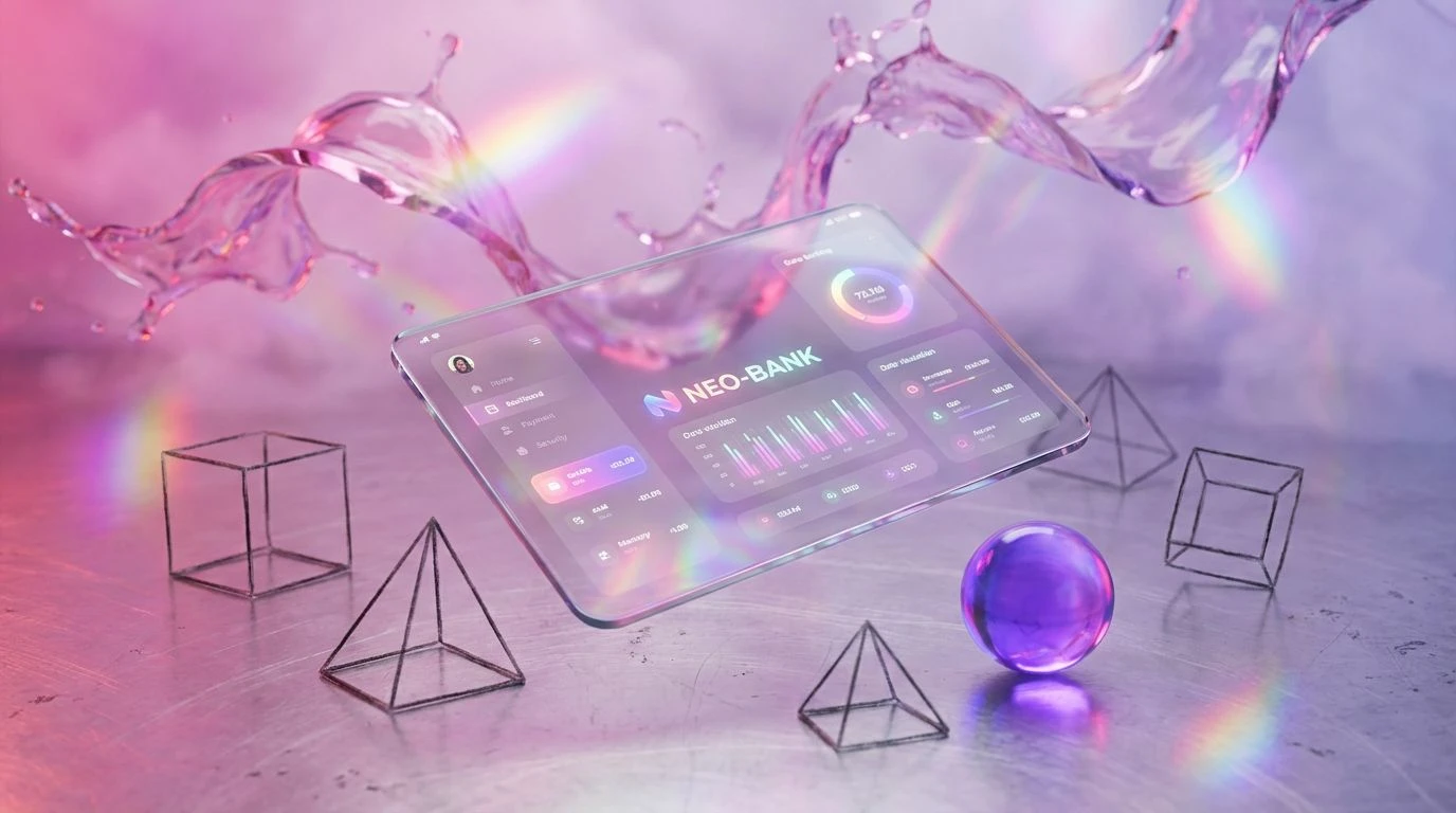
15 Mar 2026 · 4 min readBanking interfaces have historically relied on the visual equivalent of a firm handshake and a navy suit, prioritizing safety over personality. But for a user base that grew up customizing every pixel of their digital existence, that standard corporate restraint feels detached, even suspicious. We are witnessing a shift where high-voltage hues function as markers of transparency rather than frivolity. When an app swaps institutional drab for electric intensity, it signals that it understands the speed and fluidity of the modern economy. It suggests that managing assets is not a chore to be dreaded but a dynamic part of daily life, compatible with the visual language of social platforms and streaming services. Color becomes a mechanism to transform a passive obligation into an active, energized lifestyle choice.
Cybernetic Sunburst ⚡
The interplay between Solar Flare and Glitch Turquoise creates a vibrating visual tension that demands immediate attention. Rather than soothing the user into passivity, this combination acts as a stimulant, urging action and engagement. The deep grounding of Midnight Server and Concrete Interface provides just enough structure to prevent the brights from becoming overwhelming, anchoring the experience in a sleek, dark-mode usability. It feels reminiscent of high-performance sports HUDs or retro-arcade leaderboards. By applying Vitamin C to call-to-action buttons against the Slate Shadow background, interfaces can guide the eye explosively, transforming transaction approvals from mundane clicks into satisfying digital events.
Pixels & Punk 👾
There is a distinct rebellious streak running through this selection. The pairing of Aluminum Housing with the intense shock of Acid Berry creates a brute-force contrast often found in underground zine culture or experimental web Brutalism. It rejects the soft, friendly rounded corners of the last decade's tech design in favor of something sharper and more urgent. Electric Violet and Plastic Fuchsia act as disruptive elements that break grid layouts, perfect for highlighting unexpected financial wins or savings milestones. This aesthetic refuses to be polite; it treats financial literacy as a raw, unfiltered conversation. It frames money management as a bold act of self-expression rather than a secretive, dusty obligation.
Dopamine Loop 🍬
Unapologetically saturated, this range relies on the sheer optical weight of Laser Raspberry and Virtual Violet to dominate the screen. It moves entirely away from the masculine-coded aesthetics of traditional trading floors, embracing a hyper-pop sensibility that feels closer to a rhythm game than a ledger. The gradients possible between Shocking Rose and Neon Flamingo offer a fluid, constantly shifting background that mimics the endless scroll of content consumption. This is visual gamification at its peak; every notification or interaction feels like a reward. It effectively reframes the daunting task of budgeting into a series of achievable, brightly colored levels to be beaten, keeping the user hooked through pure visual pleasure.
Glitch Garden 🛹
This arrangement hits the retina with the blunt force of streetwear branding or a packed sticker wall. High-Vis Yellow and Terminal Green are practical, industrial signals used here to denote growth and movement, stripping away the pretension of serif fonts and beige backgrounds. The inclusion of Void Black and Static Grey gives the brighter tones a stark canvas, making data points pop with aggressive clarity. It suggests a tool that is utilitarian but customized for the heavy user—someone who treats their finances with the same obsession they apply to curating their sneaker rotation. It is loud, legible, and completely divorced from the quiet, carpeted halls of old-world banking imagery.
Sorbet Interface 🍧
While others scream, this selection slices through the noise with a sharp, editorial crispness. The combination of Infrared Orange against a vast Blank Canvas creates a sense of focused breathing room, while Spearmint Data adds a cool, refreshing counterpoint to the warmth. It feels less like a utility and more like a lifestyle publication. The Brutalist Concrete provides a raw texture that prevents the Pale Coral from feeling too delicate. This aesthetic works perfectly for investment platforms that want to strip away the clutter and panic of the market, presenting complex information with a clarity that feels almost architectural. It frames financial health as a form of modern minimalism—clean, intentional, and clutter-free.
Moving away from safety-first blues toward these electrified spectrums disrupts the expectation that money must be boring to be serious. These palettes prove that credibility does not require a lack of character. By adopting the visual vernacular of the internet—glitch, neon, brutalism, and editorial pop—fintech tools align themselves with the actual lived reality of their users. It is an acknowledgment that financial literacy finds its strongest foothold not in intimidation, but in accessibility and delight. When an interface mirrors the energy of the world enticing Gen Z to spend, it becomes a far more effective tool for teaching them how to save, turning the anxiety of checking a balance into a moment of genuine visual engagement.