'%3e%3cpath%20fill-rule='evenodd'%20clip-rule='evenodd'%20d='M51.1303%2019.2492C50.7278%2019.913%2050.1346%2020.4426%2049.3508%2020.838C48.5669%2021.2335%2047.6172%2021.4312%2046.5014%2021.4312C44.8208%2021.4312%2043.4367%2021.0216%2042.3492%2020.2025C41.2617%2019.3833%2040.6686%2018.2394%2040.5697%2016.7706H44.4253C44.4818%2017.3355%2044.6831%2017.7804%2045.0291%2018.1052C45.3751%2018.43%2045.8164%2018.5924%2046.3531%2018.5924C46.8192%2018.5924%2047.1864%2018.4653%2047.4547%2018.2111C47.7231%2017.9569%2047.8572%2017.618%2047.8572%2017.1943C47.8572%2016.8129%2047.7337%2016.4952%2047.4865%2016.241C47.2393%2015.9867%2046.9322%2015.7784%2046.565%2015.616C46.1978%2015.4536%2045.6893%2015.2594%2045.0397%2015.0334C44.0934%2014.7086%2043.3202%2014.3944%2042.72%2014.0907C42.1197%2013.7871%2041.6042%2013.3351%2041.1735%2012.7349C40.7427%2012.1347%2040.5273%2011.3544%2040.5273%2010.394C40.5273%209.50418%2040.7533%208.73448%2041.2053%208.08481C41.6572%207.43515%2042.2821%206.93731%2043.0801%206.5913C43.8781%206.24528%2044.7925%206.07227%2045.8235%206.07227C47.49%206.07227%2048.8141%206.46771%2049.7956%207.25861C50.7772%208.04951%2051.3315%209.13698%2051.4586%2010.5211H47.5395C47.4689%2010.0268%2047.2888%209.63483%2046.9993%209.3453C46.7097%209.05578%2046.3178%208.91102%2045.8235%208.91102C45.3998%208.91102%2045.0573%209.024%2044.7961%209.24997C44.5348%209.47594%2044.4041%209.80783%2044.4041%2010.2457C44.4041%2010.5988%2044.5207%2010.8989%2044.7537%2011.146C44.9867%2011.3932%2045.2798%2011.5944%2045.6328%2011.7498C45.9859%2011.9052%2046.4944%2012.1029%2047.1581%2012.343C48.1185%2012.6678%2048.9023%2012.9891%2049.5096%2013.3069C50.1169%2013.6246%2050.6395%2014.0872%2051.0773%2014.6945C51.5151%2015.3018%2051.734%2016.0927%2051.734%2017.0672C51.734%2017.8581%2051.5328%2018.5854%2051.1303%2019.2492ZM59.0242%206.3053V21.2829H55.4016V6.3053H59.0242ZM73.9409%206.3053V9.18642H69.8734V21.2829H66.2296V9.18642H62.2046V6.3053H73.9409ZM80.7438%209.18642V12.3218H85.8069V15.0546H80.7438V18.3806H86.4425V21.2829H77.1212V6.3053H86.4425V9.18642H80.7438ZM99.667%2016.0291V21.2829H96.0444V6.3053H101.913C103.692%206.3053%20105.048%206.74665%20105.98%207.62934C106.912%208.51204%20107.378%209.7019%20107.378%2011.199C107.378%2012.1311%20107.17%2012.9609%20106.753%2013.6882C106.337%2014.4155%20105.719%2014.9875%20104.9%2015.4042C104.08%2015.8208%20103.085%2016.0291%20101.913%2016.0291H99.667ZM103.692%2011.199C103.692%209.8855%20102.965%209.22879%20101.51%209.22879H99.667V13.1268H101.51C102.965%2013.1268%20103.692%2012.4842%20103.692%2011.199ZM120.092%2018.5501H114.478L113.546%2021.2829H109.732L115.219%206.41123H119.393L124.879%2021.2829H121.024L120.092%2018.5501ZM119.16%2015.7961L117.295%2010.2881L115.41%2015.7961H119.16ZM131.555%2018.5077H136.385V21.2829H127.933V6.3053H131.555V18.5077ZM143.337%209.18642V12.3218H148.4V15.0546H143.337V18.3806H149.035V21.2829H139.714V6.3053H149.035V9.18642H143.337ZM163.507%206.3053V9.18642H159.44V21.2829H155.796V9.18642H151.771V6.3053H163.507ZM177.449%206.3053V9.18642H173.382V21.2829H169.738V9.18642H165.713V6.3053H177.449ZM184.252%209.18642V12.3218H189.315V15.0546H184.252V18.3806H189.951V21.2829H180.629V6.3053H189.951V9.18642H184.252Z'%20fill='%23EEF0ED'/%3e%3cmask%20id='mask0_3101_7327'%20style='mask-type:alpha'%20maskUnits='userSpaceOnUse'%20x='0'%20y='0'%20width='27'%20height='28'%3e%3cpath%20d='M23.8328%200.759766H2.64808C1.18559%200.759766%200%201.94535%200%203.40785V24.5925C0%2026.055%201.18559%2027.2406%202.64808%2027.2406H23.8328C25.2952%2027.2406%2026.4808%2026.055%2026.4808%2024.5925V3.40785C26.4808%201.94535%2025.2952%200.759766%2023.8328%200.759766Z'%20fill='white'/%3e%3c/mask%3e%3cg%20mask='url(%23mask0_3101_7327)'%3e%3cpath%20d='M23.8328%200.759766H2.64808C1.18559%200.759766%200%201.94535%200%203.40785V24.5925C0%2026.055%201.18559%2027.2406%202.64808%2027.2406H23.8328C25.2952%2027.2406%2026.4808%2026.055%2026.4808%2024.5925V3.40785C26.4808%201.94535%2025.2952%200.759766%2023.8328%200.759766Z'%20fill='%23D8D8D8'/%3e%3cpath%20d='M13.2404%200.759766H0V14.0001H13.2404V0.759766Z'%20fill='%238C61FF'/%3e%3cpath%20d='M13.2404%2014H0V27.2404H13.2404V14Z'%20fill='%2336C3FE'/%3e%3cpath%20d='M26.4806%2014H13.2402V27.2404H26.4806V14Z'%20fill='%236592FE'/%3e%3cpath%20d='M26.4806%200.759766H13.2402V14.0002H26.4806V0.759766Z'%20fill='%236059F7'/%3e%3c/g%3e%3c/g%3e%3cdefs%3e%3cclipPath%20id='clip0_3101_7327'%3e%3crect%20width='190'%20height='28'%20fill='white'/%3e%3c/clipPath%3e%3c/defs%3e%3c/svg%3e)
'%3e%3cpath%20d='M23.8328%200.759521H2.64808C1.18559%200.759521%200%201.94511%200%203.40761V24.5923C0%2026.0548%201.18559%2027.2404%202.64808%2027.2404H23.8328C25.2952%2027.2404%2026.4808%2026.0548%2026.4808%2024.5923V3.40761C26.4808%201.94511%2025.2952%200.759521%2023.8328%200.759521Z'%20fill='%23D8D8D8'/%3e%3cpath%20d='M13.2404%200.759521H0V13.9999H13.2404V0.759521Z'%20fill='%238C61FF'/%3e%3cpath%20d='M13.2404%2013.9998H0V27.2402H13.2404V13.9998Z'%20fill='%2336C3FE'/%3e%3cpath%20d='M26.4809%2013.9998H13.2405V27.2402H26.4809V13.9998Z'%20fill='%236592FE'/%3e%3cpath%20d='M26.4809%200.759277H13.2405V13.9997H26.4809V0.759277Z'%20fill='%236059F7'/%3e%3c/g%3e%3c/svg%3e)
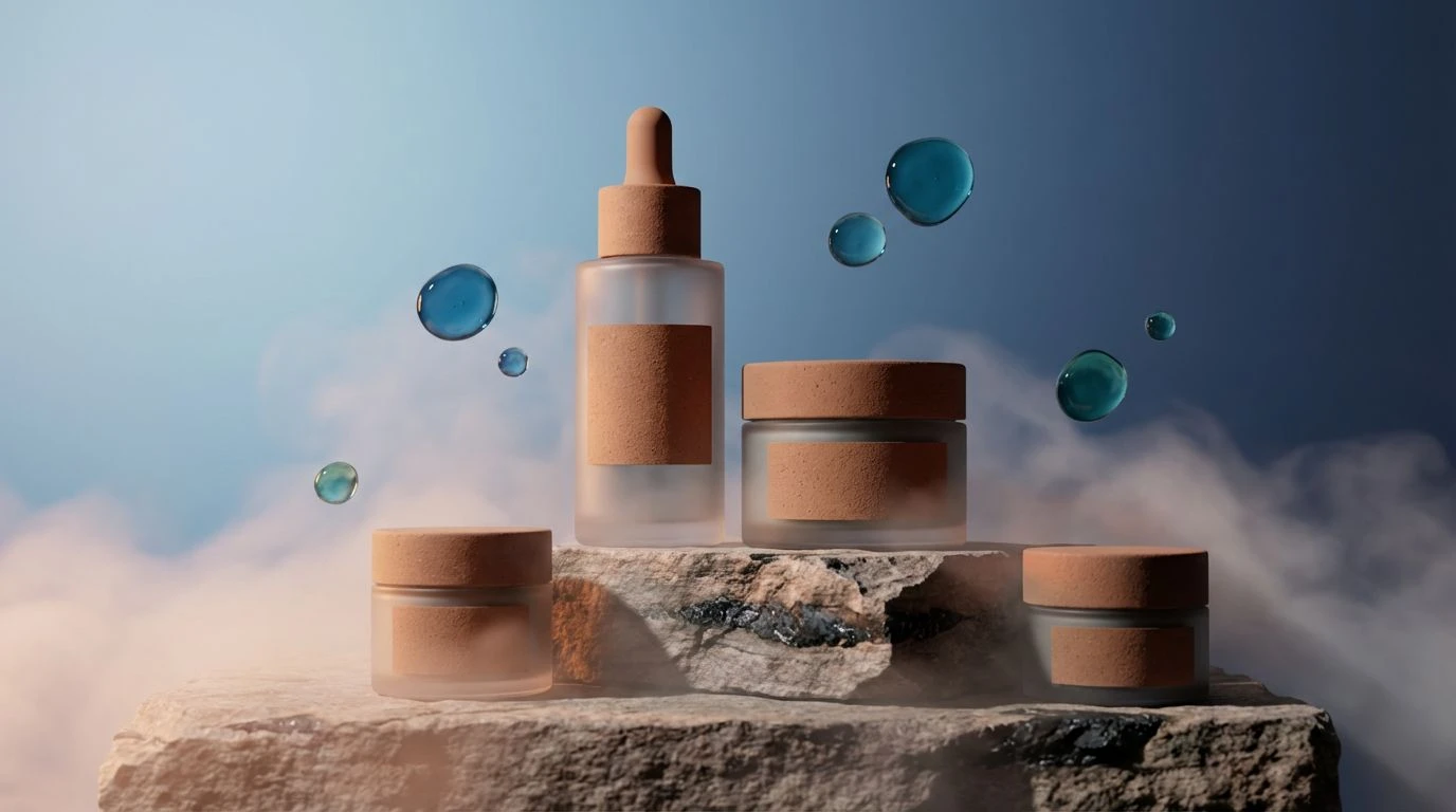
7 Dusty Orange & Slate Blue Color Palettes for Skincare
14 Mar 2026 · 5 min readThe era of hyper-glossy, purely aspirational beauty branding is receding. In its place, a quieter, more substantial aesthetic has emerged, driven by a consumer base that prioritizes ingredient efficacy over packaging meant solely for shelf appeal. For modern luxury skincare, particularly brands positioning themselves as organic yet scientifically rigorous, the visual language must walk a fine line. It requires the warmth of the earth to signal natural origins and the cool precision of clinical expertise to promise results. This specific interplay of oxidized orange tones and stabilizing slate blues offers a sophisticated answer to that challenge. It moves beyond the predictable greens of early eco-beauty, establishing a dialogue between the rawness of clay and the reliability of refined mineral pigments. This is about grounding the product in reality while maintaining the elevation expected of a luxury price point. The colors serve as a visual shorthand for compassion and competence.
Mineral & Marigold 🧖♀️
Consider the stark interaction between the expansive Porcelain White and the sharp punctuation of Crushed Clementine. This arrangement suggests a brand that favors transparency—literally and metaphorically—over mystique. The dominant grays, specifically Brushed Aluminum and Slate Graphite, provide an industrial, sterile backdrop often associated with high-tech laboratories. Yet, the inclusion of that specific orange prevents the visual field from feeling cold or inaccessible. It acts as a reminder of the botanical source material, likely vitamin C or citrus extracts, contained within the bottle. By anchoring these brighter hues with Obsidian and Glacial Blue, the overall effect remains serious. It speaks to a consumer who reads every line of an ingredient list and respects a design that feels editorial and sparse rather than cluttered or overly decorated.
Clay & Currents 🌊
Here, the balance shifts toward the elemental. The presence of Sandstone Beige and Sun-Dried Terra Cotta immediately places the viewer in a landscape of raw materials, suggesting harvesting and craft. Unlike the sharper contrasts of more industrial themes, this selection uses the mid-tones of Weathered Slate to bridge the gap between the warmth of the earth and the cool intellect of the blues. The gradient from Morning Sky to Midnight Ocean creates a vertical depth, mimicking the transitions found in nature—like a shoreline meeting deep water. This combination works exceptionally well for products emphasizing hydration and restoration. It avoids the sterility of pure white packaging, instead opting for a tactile, approachable quality that suggests the product inside is gentle, curative, and derived from sustainable sources without sacrificing the polish of high-end design.
The Minimalist Serum 🥣
Reduction is a powerful tool in luxury branding. This grouping strips away the excess, relying on a monochromatic grayscale foundation that ranges from Laboratory White to Ink Black to convey absolute purity. In this context, the solitary inclusion of Hyacinth Blue functions as a focal point of trust. It is the color of medical scrubs and sterile environments, signaling safety and scientifically backed formulation. Without the warming influence of orange or brown, the mood is decidedly clinical and precise. This aesthetic appeals to a specific demographic seeking dermatological authority rather than spa-like relaxation. It implies that the product is potent and concentrated. The heavy reliance on Sterling Mist and Charcoal Dust creates a "no-nonsense" atmosphere, suggesting that the brand spends its resources on the formulation rather than trying to charm the consumer with unnecessary warmth.
Midnight Apothecary 🌑
Depth often equates to potency in the human psyche. By committing entirely to the lower register of the spectrum, this assembly of Royal Velvet and Abyssal Navy creates a sense of gravitas. It recalls the glass jars of Victorian apothecaries, designed to protect volatile ingredients from light. This is not a palette for a morning cleanser but for overnight treatments and concentrated serums. The absence of light neutrals or warm accents establishes a heavy, serious mood. It suggests a professional integrity that does not need to shout. The subtle variation between Aegean Depth and Iron Shadow adds just enough texture to prevent the visual from becoming a void. For a luxury brand, this darkness communicates exclusivity and a quiet confidence in the product’s results, targeting a user who treats skincare as a disciplined, serious ritual.
Oceanic Clarity 💧
Complexity in color often mirrors the complexity of a biological system. This expansive selection, moving from the lightness of Arctic Melt to the density of Deep Water, captures the fluidity necessary for a brand emphasizing hydration and renewal. The inclusion of Foggy Harbor and Twilight Shale introduces a geological element, grounding the aquatic tones so they do not feel flighty or merely decorative. It suggests a formulation that utilizes marine biology or mineral-rich waters. The interaction between the vibrant Pacific Blue and the muted distinctness of Storm Cloud creates a rhythm that feels active yet controlled. It fits a narrative of "active integrity"—products that work dynamically with the skin’s barrier. The aesthetic is neither purely natural nor purely synthetic but sits comfortably in the middle, representing the best of green biotechnology.
Navigating the visual landscape of modern luxury beauty requires abandoning the binary choice between the "natural" look of unbleached paper and the "scientific" look of sterile chrome. These combinations demonstrate that authority and approachability are not mutually exclusive. By utilizing the tension between warm, terrestrial tones and cool, stabilizing slates, brands can communicate a narrative of holistic science. Whether through the stark minimalism of high-contrast grays or the deep, protective embrace of navy, color becomes a precise tool for signaling intent. For the discerning millennial consumer, these palettes validate the investment in high-end organic skincare, proving that a product can be grounded in nature while adhering to the highest standards of professional efficacy. The result is a visual identity that feels honest, substantial, and unmistakably premium.