'%3e%3cpath%20fill-rule='evenodd'%20clip-rule='evenodd'%20d='M51.1303%2019.2492C50.7278%2019.913%2050.1346%2020.4426%2049.3508%2020.838C48.5669%2021.2335%2047.6172%2021.4312%2046.5014%2021.4312C44.8208%2021.4312%2043.4367%2021.0216%2042.3492%2020.2025C41.2617%2019.3833%2040.6686%2018.2394%2040.5697%2016.7706H44.4253C44.4818%2017.3355%2044.6831%2017.7804%2045.0291%2018.1052C45.3751%2018.43%2045.8164%2018.5924%2046.3531%2018.5924C46.8192%2018.5924%2047.1864%2018.4653%2047.4547%2018.2111C47.7231%2017.9569%2047.8572%2017.618%2047.8572%2017.1943C47.8572%2016.8129%2047.7337%2016.4952%2047.4865%2016.241C47.2393%2015.9867%2046.9322%2015.7784%2046.565%2015.616C46.1978%2015.4536%2045.6893%2015.2594%2045.0397%2015.0334C44.0934%2014.7086%2043.3202%2014.3944%2042.72%2014.0907C42.1197%2013.7871%2041.6042%2013.3351%2041.1735%2012.7349C40.7427%2012.1347%2040.5273%2011.3544%2040.5273%2010.394C40.5273%209.50418%2040.7533%208.73448%2041.2053%208.08481C41.6572%207.43515%2042.2821%206.93731%2043.0801%206.5913C43.8781%206.24528%2044.7925%206.07227%2045.8235%206.07227C47.49%206.07227%2048.8141%206.46771%2049.7956%207.25861C50.7772%208.04951%2051.3315%209.13698%2051.4586%2010.5211H47.5395C47.4689%2010.0268%2047.2888%209.63483%2046.9993%209.3453C46.7097%209.05578%2046.3178%208.91102%2045.8235%208.91102C45.3998%208.91102%2045.0573%209.024%2044.7961%209.24997C44.5348%209.47594%2044.4041%209.80783%2044.4041%2010.2457C44.4041%2010.5988%2044.5207%2010.8989%2044.7537%2011.146C44.9867%2011.3932%2045.2798%2011.5944%2045.6328%2011.7498C45.9859%2011.9052%2046.4944%2012.1029%2047.1581%2012.343C48.1185%2012.6678%2048.9023%2012.9891%2049.5096%2013.3069C50.1169%2013.6246%2050.6395%2014.0872%2051.0773%2014.6945C51.5151%2015.3018%2051.734%2016.0927%2051.734%2017.0672C51.734%2017.8581%2051.5328%2018.5854%2051.1303%2019.2492ZM59.0242%206.3053V21.2829H55.4016V6.3053H59.0242ZM73.9409%206.3053V9.18642H69.8734V21.2829H66.2296V9.18642H62.2046V6.3053H73.9409ZM80.7438%209.18642V12.3218H85.8069V15.0546H80.7438V18.3806H86.4425V21.2829H77.1212V6.3053H86.4425V9.18642H80.7438ZM99.667%2016.0291V21.2829H96.0444V6.3053H101.913C103.692%206.3053%20105.048%206.74665%20105.98%207.62934C106.912%208.51204%20107.378%209.7019%20107.378%2011.199C107.378%2012.1311%20107.17%2012.9609%20106.753%2013.6882C106.337%2014.4155%20105.719%2014.9875%20104.9%2015.4042C104.08%2015.8208%20103.085%2016.0291%20101.913%2016.0291H99.667ZM103.692%2011.199C103.692%209.8855%20102.965%209.22879%20101.51%209.22879H99.667V13.1268H101.51C102.965%2013.1268%20103.692%2012.4842%20103.692%2011.199ZM120.092%2018.5501H114.478L113.546%2021.2829H109.732L115.219%206.41123H119.393L124.879%2021.2829H121.024L120.092%2018.5501ZM119.16%2015.7961L117.295%2010.2881L115.41%2015.7961H119.16ZM131.555%2018.5077H136.385V21.2829H127.933V6.3053H131.555V18.5077ZM143.337%209.18642V12.3218H148.4V15.0546H143.337V18.3806H149.035V21.2829H139.714V6.3053H149.035V9.18642H143.337ZM163.507%206.3053V9.18642H159.44V21.2829H155.796V9.18642H151.771V6.3053H163.507ZM177.449%206.3053V9.18642H173.382V21.2829H169.738V9.18642H165.713V6.3053H177.449ZM184.252%209.18642V12.3218H189.315V15.0546H184.252V18.3806H189.951V21.2829H180.629V6.3053H189.951V9.18642H184.252Z'%20fill='%23EEF0ED'/%3e%3cmask%20id='mask0_3101_7327'%20style='mask-type:alpha'%20maskUnits='userSpaceOnUse'%20x='0'%20y='0'%20width='27'%20height='28'%3e%3cpath%20d='M23.8328%200.759766H2.64808C1.18559%200.759766%200%201.94535%200%203.40785V24.5925C0%2026.055%201.18559%2027.2406%202.64808%2027.2406H23.8328C25.2952%2027.2406%2026.4808%2026.055%2026.4808%2024.5925V3.40785C26.4808%201.94535%2025.2952%200.759766%2023.8328%200.759766Z'%20fill='white'/%3e%3c/mask%3e%3cg%20mask='url(%23mask0_3101_7327)'%3e%3cpath%20d='M23.8328%200.759766H2.64808C1.18559%200.759766%200%201.94535%200%203.40785V24.5925C0%2026.055%201.18559%2027.2406%202.64808%2027.2406H23.8328C25.2952%2027.2406%2026.4808%2026.055%2026.4808%2024.5925V3.40785C26.4808%201.94535%2025.2952%200.759766%2023.8328%200.759766Z'%20fill='%23D8D8D8'/%3e%3cpath%20d='M13.2404%200.759766H0V14.0001H13.2404V0.759766Z'%20fill='%238C61FF'/%3e%3cpath%20d='M13.2404%2014H0V27.2404H13.2404V14Z'%20fill='%2336C3FE'/%3e%3cpath%20d='M26.4806%2014H13.2402V27.2404H26.4806V14Z'%20fill='%236592FE'/%3e%3cpath%20d='M26.4806%200.759766H13.2402V14.0002H26.4806V0.759766Z'%20fill='%236059F7'/%3e%3c/g%3e%3c/g%3e%3cdefs%3e%3cclipPath%20id='clip0_3101_7327'%3e%3crect%20width='190'%20height='28'%20fill='white'/%3e%3c/clipPath%3e%3c/defs%3e%3c/svg%3e)
'%3e%3cpath%20d='M23.8328%200.759521H2.64808C1.18559%200.759521%200%201.94511%200%203.40761V24.5923C0%2026.0548%201.18559%2027.2404%202.64808%2027.2404H23.8328C25.2952%2027.2404%2026.4808%2026.0548%2026.4808%2024.5923V3.40761C26.4808%201.94511%2025.2952%200.759521%2023.8328%200.759521Z'%20fill='%23D8D8D8'/%3e%3cpath%20d='M13.2404%200.759521H0V13.9999H13.2404V0.759521Z'%20fill='%238C61FF'/%3e%3cpath%20d='M13.2404%2013.9998H0V27.2402H13.2404V13.9998Z'%20fill='%2336C3FE'/%3e%3cpath%20d='M26.4809%2013.9998H13.2405V27.2402H26.4809V13.9998Z'%20fill='%236592FE'/%3e%3cpath%20d='M26.4809%200.759277H13.2405V13.9997H26.4809V0.759277Z'%20fill='%236059F7'/%3e%3c/g%3e%3c/svg%3e)
Modern Color Palettes for Innovative Agrifood Branding
13 Mar 2026 · 5 min readImagine the scent of wet soil mingling with the sterile, static-charged air of a server room. This is the new frontier where agriculture sheds its burlap sacks for sleek interfaces, yet somehow retains the memory of the harvest. We often assume that to signal 'innovation' in the agrifood sector, one must drown the visuals in shocking, radioactive limes. But the true visual language of this revolution is far more sophisticated. It explores the tension between the ancient and the instant, the tactile grain of the earth and the slick glass of a tablet. It is about convincing the eye that a heritage tomato and a blockchain ledger belong in the same sentence. When we look beyond the cliché of neon green, we find a spectrum of colors that capture the heat of the sun, the cool detachment of data, and the deep, muddy reality of growth. These palettes do not merely decorate; they tell the story of food that is grown by nature but optimized by code.
Root & Circuitry 🌰
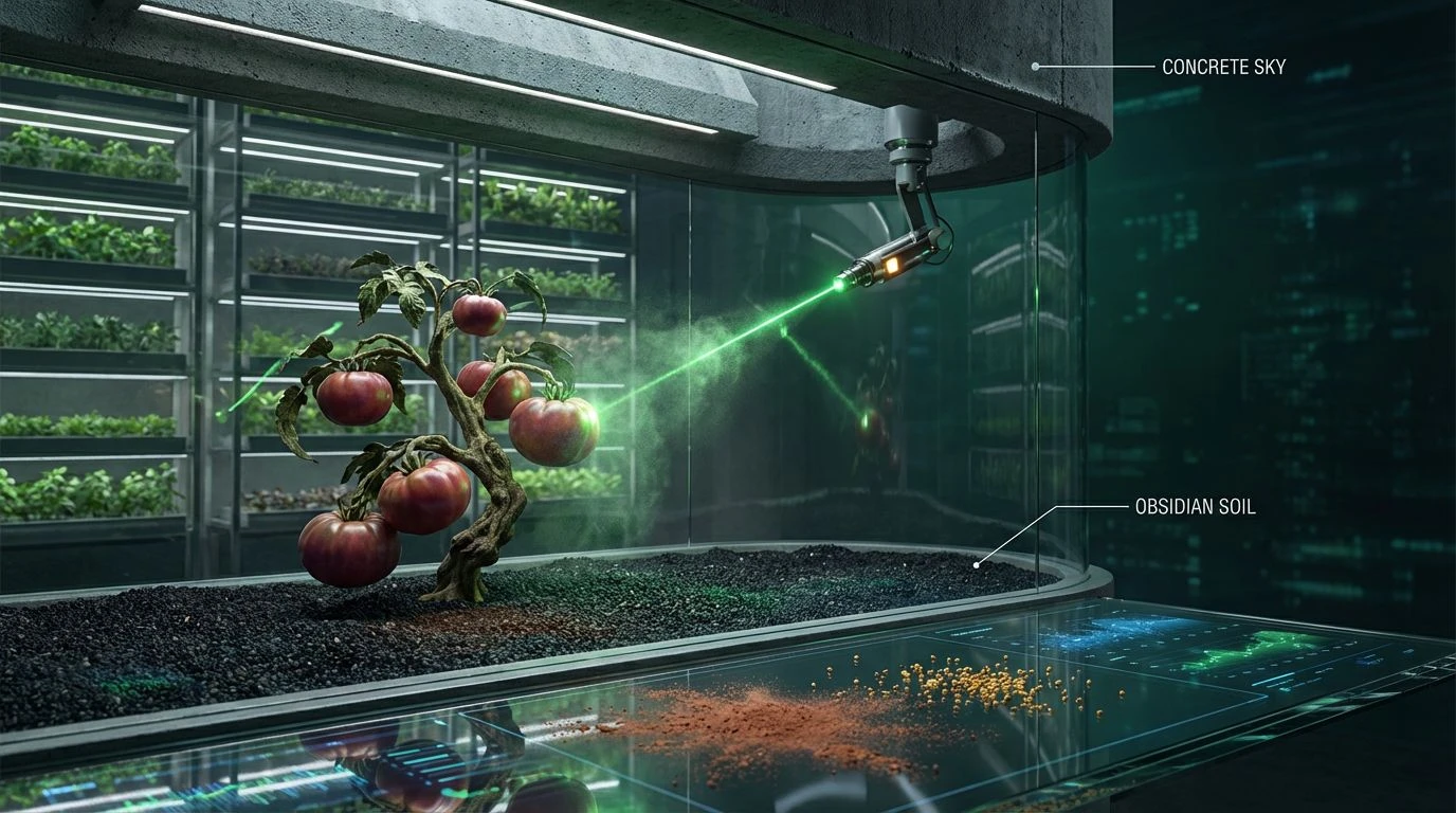
There is a muscular tension in this arrangement, a grappling match between the ancient and the artificial. The grounding force of Obsidian Soil provides a heavy, rich base, allowing the shocks of Electric Lagoon to pierce through like fiber-optic cables buried in a field. It captures the very essence of modern agrifood: the mud on the boots and the drone in the sky. Clay Dust and Harvest Gold offer a tactile, warming comfort, reminding the viewer of autumnal yields and sun-baked earth, but they are immediately modernized—almost startled—by the presence of Verdant Laser. This is not the passive green of a rolling hill; it is the active, monitoring green of a status light. The resulting atmosphere is one of rugged capability. It suggests a brand that is unafraid to get its hands dirty but possesses the digital literacy to rewrite the rules of the harvest.
Cybernetic Orchard 🍇
This is not your grandfather's farm; this is agriculture grown under the hum of ultraviolet lamps and vertical thinking. The audacity of placing Neon Petal and Hyperlink Blue alongside the grounded Espresso Loam creates a visual friction that feels entirely electric. It evokes the sensory experience of a hydroponic lab where berries grow in zero-gravity conditions, suspended in a reality that is half-organic, half-synthetic. The Olive Drab and Sandstone Interface attempt to keep the peace, acting as the neutral ground, but they are overwhelmed by the sheer voltage of the accents. This palette speaks to the absolute disruption of the food system. It is aggressive, playful, and deeply synthetic, perfectly suited for alternative proteins or lab-grown delicacies that refuse to apologize for their scientific origins. It is the taste of the future, sweet and slightly strange.
Solar Hydroponic ☀️
A softer, more breathable approach to the tech-agrarian dialogue plays out here. The starkness of a Clean Slate background allows the organic warmth of Rust Ambition to breathe, stripping away the heavy contrasts for something airier and more health-conscious. It feels like a glass-walled startup office in mid-morning, filled with light and optimism. The greens here—Acidic Lime and Biosynthetic Leaf—are punchy but not radioactive; they feel like chlorophyll viewed under a microscope, bright with life and potential. This selection moves away from the heavy machinery of farming and focuses on the output: fresh, clean, optimized nutrition. It suggests transparency and lightness, making it ideal for consumer-facing apps that track carbon footprints or deliver farm-to-table boxes. It is the color of clarity, wellness, and a gentle, sunny efficiency.
Terra Algorithm 🧱
There is a distinct architectural quality here, where the raw materials of Fertile Earth and Cinnamon Data build a foundation that is undeniably human and historical. Yet, the introduction of Mint Display and Teal Processor changes the temperature of the room completely. It evokes the feeling of a smart home system installed within an ancient adobe structure—a cooling, medicinal calm washing over the heat of baked clay. The Coral Sensor adds a flash of urgency, a heartbeat monitor amidst the geology. This grouping does not scream 'tech' but rather whispers it. It suggests intelligence woven into the fabric of the everyday. It is sophisticated and muted, avoiding the garish in favor of the curated. This is for the brand that wants to appear established and wise, utilizing technology not as a gimmick, but as a seamless, cooling layer over traditional practices.
Heirloom Interface 🌿
A return to something regal, almost quiet in its power. The depth of Midnight Carbon suggests the fertile darkness of night or deep compost, while Mustard Seed offers a promise of prosperity and old-world yield. The innovation here is subtle, found in the pairing of these heritage tones with the slick, medicinal coolness of Virtual Sage. It feels like skimming through a leather-bound botanical almanac that has been digitized for a high-resolution screen. The Ivory Screen provides the negative space needed for these heavy, luxurious colors to exist without feeling cluttered. This aesthetic rejects the chaotic energy of the startup garage for the boardroom of an agricultural conglomerate that has vast resources. It communicates stability, legacy, and a kind of serious, high-stakes growth where mistakes are not an option and precision is the only currency.
The assumption that high-tech agriculture demands a high-vis aesthetic is dismantling before our eyes. We see now that the most compelling visual identities are those that dare to be quiet, tactile, and deeply rooted in the soil they seek to monitor. From the shock of electric blues cutting through loam to the regal silence of deep pine paired with gold, these combinations prove that innovation possesses a diverse wardrobe. It is no longer about slapping a coat of futuristic paint over a rustic barn. It is about finding the precise temperature where the warmth of the harvest meets the cool clarity of the algorithm. By embracing these complex, sometimes jarring, sometimes harmonious relationships between color families, brands can communicate a future of food that is as respectful of its origins as it is ambitious about its evolution.