'%3e%3cpath%20fill-rule='evenodd'%20clip-rule='evenodd'%20d='M51.1303%2019.2492C50.7278%2019.913%2050.1346%2020.4426%2049.3508%2020.838C48.5669%2021.2335%2047.6172%2021.4312%2046.5014%2021.4312C44.8208%2021.4312%2043.4367%2021.0216%2042.3492%2020.2025C41.2617%2019.3833%2040.6686%2018.2394%2040.5697%2016.7706H44.4253C44.4818%2017.3355%2044.6831%2017.7804%2045.0291%2018.1052C45.3751%2018.43%2045.8164%2018.5924%2046.3531%2018.5924C46.8192%2018.5924%2047.1864%2018.4653%2047.4547%2018.2111C47.7231%2017.9569%2047.8572%2017.618%2047.8572%2017.1943C47.8572%2016.8129%2047.7337%2016.4952%2047.4865%2016.241C47.2393%2015.9867%2046.9322%2015.7784%2046.565%2015.616C46.1978%2015.4536%2045.6893%2015.2594%2045.0397%2015.0334C44.0934%2014.7086%2043.3202%2014.3944%2042.72%2014.0907C42.1197%2013.7871%2041.6042%2013.3351%2041.1735%2012.7349C40.7427%2012.1347%2040.5273%2011.3544%2040.5273%2010.394C40.5273%209.50418%2040.7533%208.73448%2041.2053%208.08481C41.6572%207.43515%2042.2821%206.93731%2043.0801%206.5913C43.8781%206.24528%2044.7925%206.07227%2045.8235%206.07227C47.49%206.07227%2048.8141%206.46771%2049.7956%207.25861C50.7772%208.04951%2051.3315%209.13698%2051.4586%2010.5211H47.5395C47.4689%2010.0268%2047.2888%209.63483%2046.9993%209.3453C46.7097%209.05578%2046.3178%208.91102%2045.8235%208.91102C45.3998%208.91102%2045.0573%209.024%2044.7961%209.24997C44.5348%209.47594%2044.4041%209.80783%2044.4041%2010.2457C44.4041%2010.5988%2044.5207%2010.8989%2044.7537%2011.146C44.9867%2011.3932%2045.2798%2011.5944%2045.6328%2011.7498C45.9859%2011.9052%2046.4944%2012.1029%2047.1581%2012.343C48.1185%2012.6678%2048.9023%2012.9891%2049.5096%2013.3069C50.1169%2013.6246%2050.6395%2014.0872%2051.0773%2014.6945C51.5151%2015.3018%2051.734%2016.0927%2051.734%2017.0672C51.734%2017.8581%2051.5328%2018.5854%2051.1303%2019.2492ZM59.0242%206.3053V21.2829H55.4016V6.3053H59.0242ZM73.9409%206.3053V9.18642H69.8734V21.2829H66.2296V9.18642H62.2046V6.3053H73.9409ZM80.7438%209.18642V12.3218H85.8069V15.0546H80.7438V18.3806H86.4425V21.2829H77.1212V6.3053H86.4425V9.18642H80.7438ZM99.667%2016.0291V21.2829H96.0444V6.3053H101.913C103.692%206.3053%20105.048%206.74665%20105.98%207.62934C106.912%208.51204%20107.378%209.7019%20107.378%2011.199C107.378%2012.1311%20107.17%2012.9609%20106.753%2013.6882C106.337%2014.4155%20105.719%2014.9875%20104.9%2015.4042C104.08%2015.8208%20103.085%2016.0291%20101.913%2016.0291H99.667ZM103.692%2011.199C103.692%209.8855%20102.965%209.22879%20101.51%209.22879H99.667V13.1268H101.51C102.965%2013.1268%20103.692%2012.4842%20103.692%2011.199ZM120.092%2018.5501H114.478L113.546%2021.2829H109.732L115.219%206.41123H119.393L124.879%2021.2829H121.024L120.092%2018.5501ZM119.16%2015.7961L117.295%2010.2881L115.41%2015.7961H119.16ZM131.555%2018.5077H136.385V21.2829H127.933V6.3053H131.555V18.5077ZM143.337%209.18642V12.3218H148.4V15.0546H143.337V18.3806H149.035V21.2829H139.714V6.3053H149.035V9.18642H143.337ZM163.507%206.3053V9.18642H159.44V21.2829H155.796V9.18642H151.771V6.3053H163.507ZM177.449%206.3053V9.18642H173.382V21.2829H169.738V9.18642H165.713V6.3053H177.449ZM184.252%209.18642V12.3218H189.315V15.0546H184.252V18.3806H189.951V21.2829H180.629V6.3053H189.951V9.18642H184.252Z'%20fill='%23EEF0ED'/%3e%3cmask%20id='mask0_3101_7327'%20style='mask-type:alpha'%20maskUnits='userSpaceOnUse'%20x='0'%20y='0'%20width='27'%20height='28'%3e%3cpath%20d='M23.8328%200.759766H2.64808C1.18559%200.759766%200%201.94535%200%203.40785V24.5925C0%2026.055%201.18559%2027.2406%202.64808%2027.2406H23.8328C25.2952%2027.2406%2026.4808%2026.055%2026.4808%2024.5925V3.40785C26.4808%201.94535%2025.2952%200.759766%2023.8328%200.759766Z'%20fill='white'/%3e%3c/mask%3e%3cg%20mask='url(%23mask0_3101_7327)'%3e%3cpath%20d='M23.8328%200.759766H2.64808C1.18559%200.759766%200%201.94535%200%203.40785V24.5925C0%2026.055%201.18559%2027.2406%202.64808%2027.2406H23.8328C25.2952%2027.2406%2026.4808%2026.055%2026.4808%2024.5925V3.40785C26.4808%201.94535%2025.2952%200.759766%2023.8328%200.759766Z'%20fill='%23D8D8D8'/%3e%3cpath%20d='M13.2404%200.759766H0V14.0001H13.2404V0.759766Z'%20fill='%238C61FF'/%3e%3cpath%20d='M13.2404%2014H0V27.2404H13.2404V14Z'%20fill='%2336C3FE'/%3e%3cpath%20d='M26.4806%2014H13.2402V27.2404H26.4806V14Z'%20fill='%236592FE'/%3e%3cpath%20d='M26.4806%200.759766H13.2402V14.0002H26.4806V0.759766Z'%20fill='%236059F7'/%3e%3c/g%3e%3c/g%3e%3cdefs%3e%3cclipPath%20id='clip0_3101_7327'%3e%3crect%20width='190'%20height='28'%20fill='white'/%3e%3c/clipPath%3e%3c/defs%3e%3c/svg%3e)
'%3e%3cpath%20d='M23.8328%200.759521H2.64808C1.18559%200.759521%200%201.94511%200%203.40761V24.5923C0%2026.0548%201.18559%2027.2404%202.64808%2027.2404H23.8328C25.2952%2027.2404%2026.4808%2026.0548%2026.4808%2024.5923V3.40761C26.4808%201.94511%2025.2952%200.759521%2023.8328%200.759521Z'%20fill='%23D8D8D8'/%3e%3cpath%20d='M13.2404%200.759521H0V13.9999H13.2404V0.759521Z'%20fill='%238C61FF'/%3e%3cpath%20d='M13.2404%2013.9998H0V27.2402H13.2404V13.9998Z'%20fill='%2336C3FE'/%3e%3cpath%20d='M26.4809%2013.9998H13.2405V27.2402H26.4809V13.9998Z'%20fill='%236592FE'/%3e%3cpath%20d='M26.4809%200.759277H13.2405V13.9997H26.4809V0.759277Z'%20fill='%236059F7'/%3e%3c/g%3e%3c/svg%3e)
Cobalt and Carbon Color Palettes for Luxury UI Design
13 Mar 2026 · 5 min readThere is a specific heaviness to the air in a room where two grandmasters sit across from one another. It is not the silence of a library, which is passive, but the silence of a predator waiting in tall grass. The visual language of this tension is rarely technicolor. It is composed of absolute values—the stark determinism of carbon, the intellectual clarity of cobalt. When we translate this atmosphere into a digital interface or a design system, we are not simply choosing colors; we are curating a mood of expensive concentration. The combination suggests high stakes without shouting. It implies that the user, like the player, is engaged in serious work where logic reigns supreme and every pixel, like every pawn, occupies its square for a definitive reason. The result is a visual experience that feels both architecturally sound and intellectually distinct.
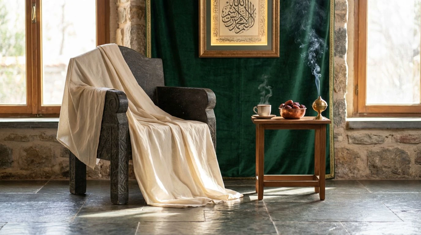
The Grandmaster’s Study 🥃
There is a surprising warmth hidden in the cold logic of competitive play, usually found in the peripheral details—the varnish of the table or the amber glow of a drink left untouched. This selection captures that specific atmosphere where the industrial greys of the mind meet the tactile reality of the room. The inclusion of the whisky and brass tones disrupts the expected monotony of the blues, offering a glimpse of the human element behind the calculation. It suggests a user interface that respects tradition while demanding modern interaction. The lighter blues function not as mere decoration but as indicators of active thought, piercing through the heavier, fog-like greys. It is a scheme for those who appreciate that even the coldest strategies have a human origin, grounding the electric energy of the blue highlights in something earthy and tangible.
The Clock Ticks Down ⏲️
Anxiety has a color, and in this arrangement, it arrives in the form of a solitary, urgent orange flare against a backdrop of unyielding monochrome. This is the visual equivalent of the final ten seconds on a blitz clock. The spectrum here is wide, stretching from a blinding white to a near-total void, creating a high-contrast environment where readability is non-negotiable. The blues here are sharper, more clinical, acting as the steady hand of logic trying to defuse the panic suggested by that single hot tone. It speaks to environments where information density is high and user attention must be directed with surgical precision. There is no room for ambiguity here; the stark separation between the dark carbon tones and the bright highlights forces the eye to travel exactly where the designer intends, much like a forced mate sequence on the board.
The Machine Opponent 🤖
Stripping away the organic warmth entirely, we shift into the realm of pure computation. This is the aesthetic of the engine—the invisible, flawless adversary that calculates a million moves per second. The interplay is strictly between the light and the void, with the blues shifting toward a synthetic violet that feels entirely manufactured. It is clean to the point of being sterile, evocative of server rooms and polished glass. By removing any trace of earth tones, the palette achieves a level of sophistication that feels futuristic rather than heritage-based. It suits a context where the user expects flawless performance and zero friction. The heavy greys anchor the floating, ethereal nature of the cyan, providing a gravity that keeps the interface from feeling too ephemeral or flighty.
Quiet Contemplation 🌫️
Here the drama recedes, replaced by the steady, rhythmic breathing of the middle game. The stark blacks are softened, and the aggressive neons are traded for a dependable, workmanlike blue that suggests reliability rather than flash. It is the color of a fresh shirt or a clear sky seen through an office window—unobtrusive and calm. This arrangement is perfect for long-form reading or technical journals where the reader must remain in the ecosystem for hours without fatigue. The gradients of grey allow for a soft hierarchy, organizing information without the shouting match of high contrast. It is the visual equivalent of patience, allowing content to sit comfortably on the screen. The single blue tone acts as a polite guide rather than a rigorous instructor, leading the user through the experience with a gentle, confident hand.
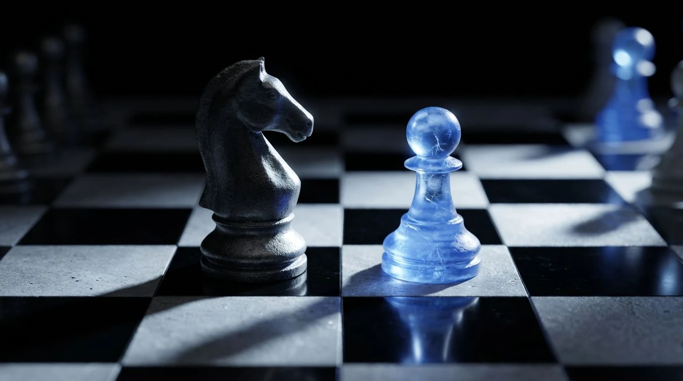
The Final Move ♟️
The endgame requires the elimination of all distinct variables until only the essential truth remains. This grouping achieves exactly that by narrowing the chromatic range to its most potent elements. The grey tones are cooler here, devoid of drift, serving as a strict scaffolding for the solitary, piercing blue. This is the moment of checkmate—absolute, decisive, and undeniable. It projects an authority that is difficult to manufacture with warmer or more varied schemes. In a digital product, this level of restraint implies confidence; the interface does not need to dazzle with variety because its core function is undeniable. The black is heavy and grounding, providing a foundation that makes the blue vibrate with intensity. It is sophisticated not because of what is added, but because of what has been ruthlessly edited out.
The journey across these variations illustrates that serenity is rarely a natural occurrence; it is a constructed state. By manipulating the ratios of deep carbon and vivid cobalt, we move from the tension of the ticking clock to the silence of the final victory. These palettes do not merely decorate a space; they define the terms of engagement. They permit a user experience that feels expensive and focused, proving that the most powerful design choice is often the one that whispers rather than screams. In the end, the marriage of dark neutrals and intelligent blues creates a digital landscape where clarity is the only currency that matters, leaving the viewer with a lasting impression of controlled power.