'%3e%3cpath%20fill-rule='evenodd'%20clip-rule='evenodd'%20d='M51.1303%2019.2492C50.7278%2019.913%2050.1346%2020.4426%2049.3508%2020.838C48.5669%2021.2335%2047.6172%2021.4312%2046.5014%2021.4312C44.8208%2021.4312%2043.4367%2021.0216%2042.3492%2020.2025C41.2617%2019.3833%2040.6686%2018.2394%2040.5697%2016.7706H44.4253C44.4818%2017.3355%2044.6831%2017.7804%2045.0291%2018.1052C45.3751%2018.43%2045.8164%2018.5924%2046.3531%2018.5924C46.8192%2018.5924%2047.1864%2018.4653%2047.4547%2018.2111C47.7231%2017.9569%2047.8572%2017.618%2047.8572%2017.1943C47.8572%2016.8129%2047.7337%2016.4952%2047.4865%2016.241C47.2393%2015.9867%2046.9322%2015.7784%2046.565%2015.616C46.1978%2015.4536%2045.6893%2015.2594%2045.0397%2015.0334C44.0934%2014.7086%2043.3202%2014.3944%2042.72%2014.0907C42.1197%2013.7871%2041.6042%2013.3351%2041.1735%2012.7349C40.7427%2012.1347%2040.5273%2011.3544%2040.5273%2010.394C40.5273%209.50418%2040.7533%208.73448%2041.2053%208.08481C41.6572%207.43515%2042.2821%206.93731%2043.0801%206.5913C43.8781%206.24528%2044.7925%206.07227%2045.8235%206.07227C47.49%206.07227%2048.8141%206.46771%2049.7956%207.25861C50.7772%208.04951%2051.3315%209.13698%2051.4586%2010.5211H47.5395C47.4689%2010.0268%2047.2888%209.63483%2046.9993%209.3453C46.7097%209.05578%2046.3178%208.91102%2045.8235%208.91102C45.3998%208.91102%2045.0573%209.024%2044.7961%209.24997C44.5348%209.47594%2044.4041%209.80783%2044.4041%2010.2457C44.4041%2010.5988%2044.5207%2010.8989%2044.7537%2011.146C44.9867%2011.3932%2045.2798%2011.5944%2045.6328%2011.7498C45.9859%2011.9052%2046.4944%2012.1029%2047.1581%2012.343C48.1185%2012.6678%2048.9023%2012.9891%2049.5096%2013.3069C50.1169%2013.6246%2050.6395%2014.0872%2051.0773%2014.6945C51.5151%2015.3018%2051.734%2016.0927%2051.734%2017.0672C51.734%2017.8581%2051.5328%2018.5854%2051.1303%2019.2492ZM59.0242%206.3053V21.2829H55.4016V6.3053H59.0242ZM73.9409%206.3053V9.18642H69.8734V21.2829H66.2296V9.18642H62.2046V6.3053H73.9409ZM80.7438%209.18642V12.3218H85.8069V15.0546H80.7438V18.3806H86.4425V21.2829H77.1212V6.3053H86.4425V9.18642H80.7438ZM99.667%2016.0291V21.2829H96.0444V6.3053H101.913C103.692%206.3053%20105.048%206.74665%20105.98%207.62934C106.912%208.51204%20107.378%209.7019%20107.378%2011.199C107.378%2012.1311%20107.17%2012.9609%20106.753%2013.6882C106.337%2014.4155%20105.719%2014.9875%20104.9%2015.4042C104.08%2015.8208%20103.085%2016.0291%20101.913%2016.0291H99.667ZM103.692%2011.199C103.692%209.8855%20102.965%209.22879%20101.51%209.22879H99.667V13.1268H101.51C102.965%2013.1268%20103.692%2012.4842%20103.692%2011.199ZM120.092%2018.5501H114.478L113.546%2021.2829H109.732L115.219%206.41123H119.393L124.879%2021.2829H121.024L120.092%2018.5501ZM119.16%2015.7961L117.295%2010.2881L115.41%2015.7961H119.16ZM131.555%2018.5077H136.385V21.2829H127.933V6.3053H131.555V18.5077ZM143.337%209.18642V12.3218H148.4V15.0546H143.337V18.3806H149.035V21.2829H139.714V6.3053H149.035V9.18642H143.337ZM163.507%206.3053V9.18642H159.44V21.2829H155.796V9.18642H151.771V6.3053H163.507ZM177.449%206.3053V9.18642H173.382V21.2829H169.738V9.18642H165.713V6.3053H177.449ZM184.252%209.18642V12.3218H189.315V15.0546H184.252V18.3806H189.951V21.2829H180.629V6.3053H189.951V9.18642H184.252Z'%20fill='%23EEF0ED'/%3e%3cmask%20id='mask0_3101_7327'%20style='mask-type:alpha'%20maskUnits='userSpaceOnUse'%20x='0'%20y='0'%20width='27'%20height='28'%3e%3cpath%20d='M23.8328%200.759766H2.64808C1.18559%200.759766%200%201.94535%200%203.40785V24.5925C0%2026.055%201.18559%2027.2406%202.64808%2027.2406H23.8328C25.2952%2027.2406%2026.4808%2026.055%2026.4808%2024.5925V3.40785C26.4808%201.94535%2025.2952%200.759766%2023.8328%200.759766Z'%20fill='white'/%3e%3c/mask%3e%3cg%20mask='url(%23mask0_3101_7327)'%3e%3cpath%20d='M23.8328%200.759766H2.64808C1.18559%200.759766%200%201.94535%200%203.40785V24.5925C0%2026.055%201.18559%2027.2406%202.64808%2027.2406H23.8328C25.2952%2027.2406%2026.4808%2026.055%2026.4808%2024.5925V3.40785C26.4808%201.94535%2025.2952%200.759766%2023.8328%200.759766Z'%20fill='%23D8D8D8'/%3e%3cpath%20d='M13.2404%200.759766H0V14.0001H13.2404V0.759766Z'%20fill='%238C61FF'/%3e%3cpath%20d='M13.2404%2014H0V27.2404H13.2404V14Z'%20fill='%2336C3FE'/%3e%3cpath%20d='M26.4806%2014H13.2402V27.2404H26.4806V14Z'%20fill='%236592FE'/%3e%3cpath%20d='M26.4806%200.759766H13.2402V14.0002H26.4806V0.759766Z'%20fill='%236059F7'/%3e%3c/g%3e%3c/g%3e%3cdefs%3e%3cclipPath%20id='clip0_3101_7327'%3e%3crect%20width='190'%20height='28'%20fill='white'/%3e%3c/clipPath%3e%3c/defs%3e%3c/svg%3e)
'%3e%3cpath%20d='M23.8328%200.759521H2.64808C1.18559%200.759521%200%201.94511%200%203.40761V24.5923C0%2026.0548%201.18559%2027.2404%202.64808%2027.2404H23.8328C25.2952%2027.2404%2026.4808%2026.0548%2026.4808%2024.5923V3.40761C26.4808%201.94511%2025.2952%200.759521%2023.8328%200.759521Z'%20fill='%23D8D8D8'/%3e%3cpath%20d='M13.2404%200.759521H0V13.9999H13.2404V0.759521Z'%20fill='%238C61FF'/%3e%3cpath%20d='M13.2404%2013.9998H0V27.2402H13.2404V13.9998Z'%20fill='%2336C3FE'/%3e%3cpath%20d='M26.4809%2013.9998H13.2405V27.2402H26.4809V13.9998Z'%20fill='%236592FE'/%3e%3cpath%20d='M26.4809%200.759277H13.2405V13.9997H26.4809V0.759277Z'%20fill='%236059F7'/%3e%3c/g%3e%3c/svg%3e)
Fintech Color Palettes: From Corporate Blue to Deep Teal
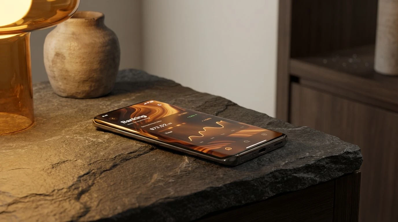
10 Mar 2026 · 5 min readTo open a banking application was once to step into a sterilized clinic, a place of icy blues and rigid grids where the pulse of one’s livelihood was measured in clinical detachment. Yet, the modern financial psyche is fraught, vibrating with a silent panic that cold austerity only exasperates. In response, the digital ledger seeks a new language, one borrowed from the silence of old-growth forests and the warmth of sun-cured earth. This is not merely a cosmetic shift but a quiet admission that our relationship with wealth requires the grounding influence of the natural world. By trading the corporate necktie for the textured unevenness of nature, these interfaces offer a visual exhale. They suggest that money is not a separate, hostile entity but a resource as organic as water or soil, capable of growth, requiring stewardship, and possessing its own quiet, steady rhythm.
Sun-Baked Ledger 🏺
There is a softness here that recalls the feeling of unglazed pottery in the hand. Sun-Baked Ledger rejects the urgency of red alerts and high-contrast warnings, favoring instead the slow warmth of a desert morning. The interaction between Raw Clay and River Slate creates a visual dialogue where financial data feels less like a judgment and more like a collection of artifacts. Porcelain Fog provides a gentle expanse, a breathing room where numbers can sit without crowding the mind. This scheme is particularly adept for savings platforms or long-term investment apps where the goal is patience rather than impulse. It frames wealth as something molded over time, baked by persistence and warmed by the steady accumulation of days.
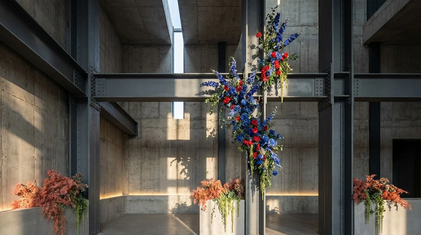
Canopy Currency 🌲
Imagine the light filtering through dense leaves, dappled and alive. Canopy Currency captures that specific complexity, balancing the grounded neutrality of Volcanic Ash with the sudden, vital spark of Spring Moss. Here, the screen becomes a terrarium. The inclusion of Sedona Red acts not as an alarm, but as the color of ripe fruit or autumn leaves—a signal of change rather than danger. Pacific Depth offers a profound stillness, a visual anchor that stabilizes the brighter elements. This arrangement suits mobile banking interfaces that seek to transform daily transactions into a natural lifecycle, suggesting that expenditure and income are merely the respiration of a healthy ecosystem.
Fiscal Horizon 🏔️
Clean air and high altitude define this assembly. Fiscal Horizon strips away the superfluous, leaving only the stark beauty of a mountain pass. The contrast between Glacial Sheet and Redwood Bark is sharp, providing legible, confident boundaries for user data. It feels precise without being mechanical. Arctic Pool introduces a coolness that is refreshing rather than freezing, a splash of water that wakes the eyes. This palette works exceptionally well for dashboards requiring high clarity—complex trading views or mortgage trackers—where the user needs to feel a sense of sturdy, elemental support. The mood is one of quiet capability, like a well-built cabin standing firm against the wind.
Nocturnal Growth 🌿
Nature does not cease its work when the sun goes down. Nocturnal Growth explores the bioluminescent quality of the forest floor at night, set against the rich emptiness of Void Soil. This dark-mode aesthetic is sophisticated and mysterious, turning the act of checking a balance into a private, almost secretive ritual. The sharp luminosity of Fern Sprout and Mint Light against the black background mimics the way phosphorescent fungi cling to decaying wood, suggesting value found in unexpected places. It appeals to a younger, more digital-native demographic, perhaps for crypto-wallets or neo-banks, where the user experience is designed to feel like navigating a futuristic, yet undeniably organic, wilderness.
Stone & Soil 🪨
Radical in its restraint, Stone & Soil relies on texture and silence. The severe reduction of hues forces the eye to rest on the single moment of warmth provided by Fox Fur. This is the aesthetic of a Japanese rock garden—deliberate, sparse, and deeply calming. By removing the noise of the spectrum, the interface declares that nothing is hidden. Obsidian and Iron Ore provide the weight of ink on paper, a nod to the traditional solidity of ledgers, while the singular terracotta tone bridges the gap to the modern desire for human connection. It fits a premium wealth management service, where the absence of clutter signifies the ultimate luxury: a clear mind.
The movement away from the sterile reflex of corporate blue marks a maturation in how digital products converse with human emotion. By adopting the palette of the understory and the canyon, financial tools stop shouting and begin to listen. These colors do not promise instant riches or manic growth; instead, they offer the durability of stone and the renewal of seasons. The user is no longer a technician manipulating abstract data points but a gardener tending to a slow-growing landscape. In this visual shift, the screen becomes less of a barrier and more of a sanctuary, proving that even in the precise, numerical world of finance, the most reassuring aesthetic is one that remembers the earth from which all value ultimately springs.