'%3e%3cpath%20fill-rule='evenodd'%20clip-rule='evenodd'%20d='M51.1303%2019.2492C50.7278%2019.913%2050.1346%2020.4426%2049.3508%2020.838C48.5669%2021.2335%2047.6172%2021.4312%2046.5014%2021.4312C44.8208%2021.4312%2043.4367%2021.0216%2042.3492%2020.2025C41.2617%2019.3833%2040.6686%2018.2394%2040.5697%2016.7706H44.4253C44.4818%2017.3355%2044.6831%2017.7804%2045.0291%2018.1052C45.3751%2018.43%2045.8164%2018.5924%2046.3531%2018.5924C46.8192%2018.5924%2047.1864%2018.4653%2047.4547%2018.2111C47.7231%2017.9569%2047.8572%2017.618%2047.8572%2017.1943C47.8572%2016.8129%2047.7337%2016.4952%2047.4865%2016.241C47.2393%2015.9867%2046.9322%2015.7784%2046.565%2015.616C46.1978%2015.4536%2045.6893%2015.2594%2045.0397%2015.0334C44.0934%2014.7086%2043.3202%2014.3944%2042.72%2014.0907C42.1197%2013.7871%2041.6042%2013.3351%2041.1735%2012.7349C40.7427%2012.1347%2040.5273%2011.3544%2040.5273%2010.394C40.5273%209.50418%2040.7533%208.73448%2041.2053%208.08481C41.6572%207.43515%2042.2821%206.93731%2043.0801%206.5913C43.8781%206.24528%2044.7925%206.07227%2045.8235%206.07227C47.49%206.07227%2048.8141%206.46771%2049.7956%207.25861C50.7772%208.04951%2051.3315%209.13698%2051.4586%2010.5211H47.5395C47.4689%2010.0268%2047.2888%209.63483%2046.9993%209.3453C46.7097%209.05578%2046.3178%208.91102%2045.8235%208.91102C45.3998%208.91102%2045.0573%209.024%2044.7961%209.24997C44.5348%209.47594%2044.4041%209.80783%2044.4041%2010.2457C44.4041%2010.5988%2044.5207%2010.8989%2044.7537%2011.146C44.9867%2011.3932%2045.2798%2011.5944%2045.6328%2011.7498C45.9859%2011.9052%2046.4944%2012.1029%2047.1581%2012.343C48.1185%2012.6678%2048.9023%2012.9891%2049.5096%2013.3069C50.1169%2013.6246%2050.6395%2014.0872%2051.0773%2014.6945C51.5151%2015.3018%2051.734%2016.0927%2051.734%2017.0672C51.734%2017.8581%2051.5328%2018.5854%2051.1303%2019.2492ZM59.0242%206.3053V21.2829H55.4016V6.3053H59.0242ZM73.9409%206.3053V9.18642H69.8734V21.2829H66.2296V9.18642H62.2046V6.3053H73.9409ZM80.7438%209.18642V12.3218H85.8069V15.0546H80.7438V18.3806H86.4425V21.2829H77.1212V6.3053H86.4425V9.18642H80.7438ZM99.667%2016.0291V21.2829H96.0444V6.3053H101.913C103.692%206.3053%20105.048%206.74665%20105.98%207.62934C106.912%208.51204%20107.378%209.7019%20107.378%2011.199C107.378%2012.1311%20107.17%2012.9609%20106.753%2013.6882C106.337%2014.4155%20105.719%2014.9875%20104.9%2015.4042C104.08%2015.8208%20103.085%2016.0291%20101.913%2016.0291H99.667ZM103.692%2011.199C103.692%209.8855%20102.965%209.22879%20101.51%209.22879H99.667V13.1268H101.51C102.965%2013.1268%20103.692%2012.4842%20103.692%2011.199ZM120.092%2018.5501H114.478L113.546%2021.2829H109.732L115.219%206.41123H119.393L124.879%2021.2829H121.024L120.092%2018.5501ZM119.16%2015.7961L117.295%2010.2881L115.41%2015.7961H119.16ZM131.555%2018.5077H136.385V21.2829H127.933V6.3053H131.555V18.5077ZM143.337%209.18642V12.3218H148.4V15.0546H143.337V18.3806H149.035V21.2829H139.714V6.3053H149.035V9.18642H143.337ZM163.507%206.3053V9.18642H159.44V21.2829H155.796V9.18642H151.771V6.3053H163.507ZM177.449%206.3053V9.18642H173.382V21.2829H169.738V9.18642H165.713V6.3053H177.449ZM184.252%209.18642V12.3218H189.315V15.0546H184.252V18.3806H189.951V21.2829H180.629V6.3053H189.951V9.18642H184.252Z'%20fill='%23EEF0ED'/%3e%3cmask%20id='mask0_3101_7327'%20style='mask-type:alpha'%20maskUnits='userSpaceOnUse'%20x='0'%20y='0'%20width='27'%20height='28'%3e%3cpath%20d='M23.8328%200.759766H2.64808C1.18559%200.759766%200%201.94535%200%203.40785V24.5925C0%2026.055%201.18559%2027.2406%202.64808%2027.2406H23.8328C25.2952%2027.2406%2026.4808%2026.055%2026.4808%2024.5925V3.40785C26.4808%201.94535%2025.2952%200.759766%2023.8328%200.759766Z'%20fill='white'/%3e%3c/mask%3e%3cg%20mask='url(%23mask0_3101_7327)'%3e%3cpath%20d='M23.8328%200.759766H2.64808C1.18559%200.759766%200%201.94535%200%203.40785V24.5925C0%2026.055%201.18559%2027.2406%202.64808%2027.2406H23.8328C25.2952%2027.2406%2026.4808%2026.055%2026.4808%2024.5925V3.40785C26.4808%201.94535%2025.2952%200.759766%2023.8328%200.759766Z'%20fill='%23D8D8D8'/%3e%3cpath%20d='M13.2404%200.759766H0V14.0001H13.2404V0.759766Z'%20fill='%238C61FF'/%3e%3cpath%20d='M13.2404%2014H0V27.2404H13.2404V14Z'%20fill='%2336C3FE'/%3e%3cpath%20d='M26.4806%2014H13.2402V27.2404H26.4806V14Z'%20fill='%236592FE'/%3e%3cpath%20d='M26.4806%200.759766H13.2402V14.0002H26.4806V0.759766Z'%20fill='%236059F7'/%3e%3c/g%3e%3c/g%3e%3cdefs%3e%3cclipPath%20id='clip0_3101_7327'%3e%3crect%20width='190'%20height='28'%20fill='white'/%3e%3c/clipPath%3e%3c/defs%3e%3c/svg%3e)
'%3e%3cpath%20d='M23.8328%200.759521H2.64808C1.18559%200.759521%200%201.94511%200%203.40761V24.5923C0%2026.0548%201.18559%2027.2404%202.64808%2027.2404H23.8328C25.2952%2027.2404%2026.4808%2026.0548%2026.4808%2024.5923V3.40761C26.4808%201.94511%2025.2952%200.759521%2023.8328%200.759521Z'%20fill='%23D8D8D8'/%3e%3cpath%20d='M13.2404%200.759521H0V13.9999H13.2404V0.759521Z'%20fill='%238C61FF'/%3e%3cpath%20d='M13.2404%2013.9998H0V27.2402H13.2404V13.9998Z'%20fill='%2336C3FE'/%3e%3cpath%20d='M26.4809%2013.9998H13.2405V27.2402H26.4809V13.9998Z'%20fill='%236592FE'/%3e%3cpath%20d='M26.4809%200.759277H13.2405V13.9997H26.4809V0.759277Z'%20fill='%236059F7'/%3e%3c/g%3e%3c/svg%3e)

Sophisticated Charcoal & Greige Color Palettes for Decor
10 Mar 2026 · 5 min readThere is a curious alchemy in stripping the Big Top of its candy-apple redness. We are accustomed to the sensory assault of the carnival—the sticky sweetness of the concession stand and the garish clash of primaries. Yet, when one dampens the lights and introduces the sober dignity of charcoal and the inscrutable chic of greige, the performance shifts from a family outing to something decidedly more noir. It is no longer about the spectacle of the impossible; it becomes a study in texture and silhouette. This is where high-end design intersects with the sawdust ring, trading plastic sequins for heavy velvets and swapping the manic energy of a festival for the hushed reverence of a gallery opening. By dialing down the saturation, we allow the materials—polished stone, worn leather, thick drapery—to narrate the story.
The Acrobat’s Powder Room 🎭
This selection feels like a backstage secret, a nod to the strange mix of eras that lurks behind the heavy curtain. It captures the moment the stage lights hit a puff of powder, grounded by the serious weight of Midnight Velvet. The interplay here avoids the chaos of traditional clown motley, opting instead for a curated disarray. Antique Tassel and Faded Plum suggest a history, a narrative of faded glamour that money cannot simply buy, but must inherit. It brings the circus into the boutique hotel lobby—a touch of the theatric, certainly, but tempered by the grounding presence of dark charcoal. It is playful without being juvenile, perfect for spaces that require a hint of narrative without screaming for attention.
Harlequin’s Daydream 🎪
While ostensibly bright, there is a distinct acidity to colors like Lemon Zest and Granny Smith that prevents them from drifting into the nursery. When viewed through the lens of elite performance, these are not the dominant hues of the tent, but the fleeting afterimages left by a trapeze artist soaring through a dark void. They function as shocks of electricity against a hypothetical grey backdrop. This assembly challenges the notion that high-end necessarily means drab; rather, it suggests that color should be applied with the precision of a scalpel. It captures the festival spirit but distills it into something sharp, modern, and perhaps a little dangerous—the visual equivalent of a high-wire act performed without a net.
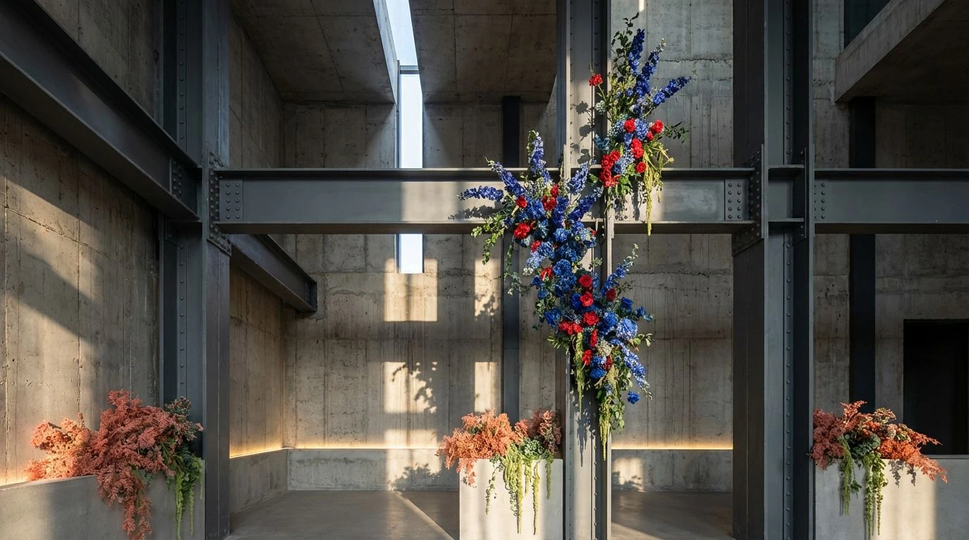
Concrete & Coral Dust 🗿
Here we arrive at the thesis statement of the dark luxury aesthetic. The dominance of Vantablack Void and Graphite Sketch offers a brutalist foundation, stripping away the noise to let the physicality of the performance take centre stage. The inclusion of Sunset Blush provides just enough warmth to prevent the look from feeling clinical, acting like a solitary spotlight on a slab of concrete. It calls to mind the feeling of a contemporary art installation where the circus performer is treated as a living sculpture. The mood is stark, uncompromising, and deeply atmospheric, relying on the tension between the harshness of the greys and the fleeting softness of the pink to hold the viewer’s gaze.
The Ringmaster’s Private Study 🕯️
This grouping introduces a necessary opulence to the monochrome base. By introducing Gilded Cage and Aged Bronze to the established greige and charcoal foundation, the atmosphere shifts from industrial to imperial. It speaks of heavy velvet ropes and the exclusivity of a private viewing. The gold here is not shiny or cheap; it is old, weighty, and serious. It suggests that the circus has grown up and moved into a heritage building. The drama comes not from loud noises, but from the deep shadows cast by Slate Shadow and the sudden, arresting glint of metal. It is theatricality refined for an audience that prefers champagne to soda.
Minimalist Menagerie 🐆
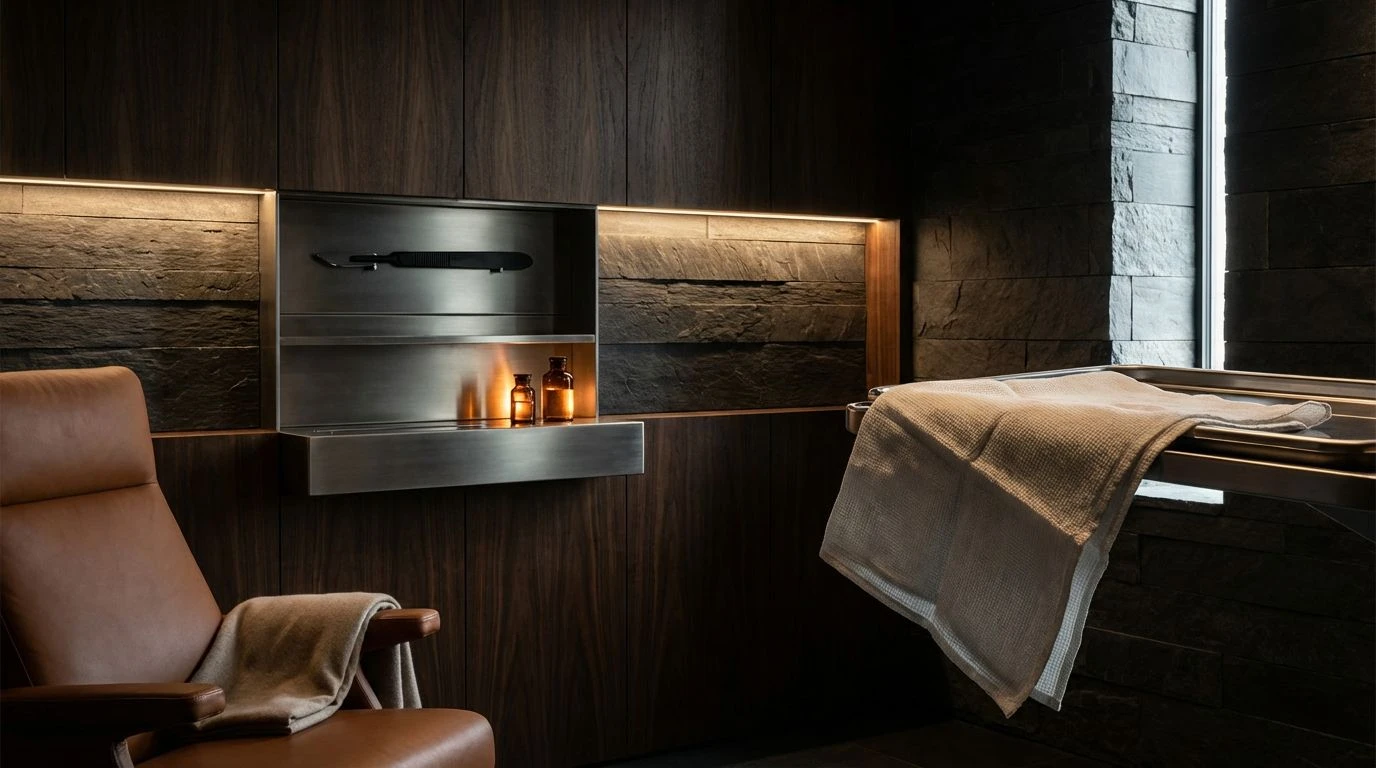
There is a raw, tactile quality to this arrangement that moves away from the synthetic and towards the organic. The combination of Onyx Stone and Saddle Leather implies a return to the roots of performance—muscle, earth, and discipline. It eschews the artificial entirely. This palette argues that true luxury lies in truthful materials. The grey here, Foggy Morning, is not merely a lack of color but a texture in itself, soft and diffusing. It creates a space where the spectacle is grounded in reality, reminiscent of polished stone floors and artisanal craftsmanship. It turns the circus into a meditative experience, stripping away the razzle-dazzle until only the essential beauty of movement remains.
Ultimately, the transition from the manic energy of the fairground to the brooding elegance of these palettes redefines what we consider spectacle. By dimming the lights and embracing the silence of greige and charcoal, the circus ceases to be a nostalgic throwback and enters the realm of contemporary art. It is a reminder that restriction often breeds the most compelling creativity. These colours do not shout; they whisper, drawing the observer in closer to inspect the details of velvet grains and stone textures. It is a visual language that respects the intelligence of the audience, proving that even the wildest festival energy can be tamed into something breathlessly sophisticated.