'%3e%3cpath%20fill-rule='evenodd'%20clip-rule='evenodd'%20d='M51.1303%2019.2492C50.7278%2019.913%2050.1346%2020.4426%2049.3508%2020.838C48.5669%2021.2335%2047.6172%2021.4312%2046.5014%2021.4312C44.8208%2021.4312%2043.4367%2021.0216%2042.3492%2020.2025C41.2617%2019.3833%2040.6686%2018.2394%2040.5697%2016.7706H44.4253C44.4818%2017.3355%2044.6831%2017.7804%2045.0291%2018.1052C45.3751%2018.43%2045.8164%2018.5924%2046.3531%2018.5924C46.8192%2018.5924%2047.1864%2018.4653%2047.4547%2018.2111C47.7231%2017.9569%2047.8572%2017.618%2047.8572%2017.1943C47.8572%2016.8129%2047.7337%2016.4952%2047.4865%2016.241C47.2393%2015.9867%2046.9322%2015.7784%2046.565%2015.616C46.1978%2015.4536%2045.6893%2015.2594%2045.0397%2015.0334C44.0934%2014.7086%2043.3202%2014.3944%2042.72%2014.0907C42.1197%2013.7871%2041.6042%2013.3351%2041.1735%2012.7349C40.7427%2012.1347%2040.5273%2011.3544%2040.5273%2010.394C40.5273%209.50418%2040.7533%208.73448%2041.2053%208.08481C41.6572%207.43515%2042.2821%206.93731%2043.0801%206.5913C43.8781%206.24528%2044.7925%206.07227%2045.8235%206.07227C47.49%206.07227%2048.8141%206.46771%2049.7956%207.25861C50.7772%208.04951%2051.3315%209.13698%2051.4586%2010.5211H47.5395C47.4689%2010.0268%2047.2888%209.63483%2046.9993%209.3453C46.7097%209.05578%2046.3178%208.91102%2045.8235%208.91102C45.3998%208.91102%2045.0573%209.024%2044.7961%209.24997C44.5348%209.47594%2044.4041%209.80783%2044.4041%2010.2457C44.4041%2010.5988%2044.5207%2010.8989%2044.7537%2011.146C44.9867%2011.3932%2045.2798%2011.5944%2045.6328%2011.7498C45.9859%2011.9052%2046.4944%2012.1029%2047.1581%2012.343C48.1185%2012.6678%2048.9023%2012.9891%2049.5096%2013.3069C50.1169%2013.6246%2050.6395%2014.0872%2051.0773%2014.6945C51.5151%2015.3018%2051.734%2016.0927%2051.734%2017.0672C51.734%2017.8581%2051.5328%2018.5854%2051.1303%2019.2492ZM59.0242%206.3053V21.2829H55.4016V6.3053H59.0242ZM73.9409%206.3053V9.18642H69.8734V21.2829H66.2296V9.18642H62.2046V6.3053H73.9409ZM80.7438%209.18642V12.3218H85.8069V15.0546H80.7438V18.3806H86.4425V21.2829H77.1212V6.3053H86.4425V9.18642H80.7438ZM99.667%2016.0291V21.2829H96.0444V6.3053H101.913C103.692%206.3053%20105.048%206.74665%20105.98%207.62934C106.912%208.51204%20107.378%209.7019%20107.378%2011.199C107.378%2012.1311%20107.17%2012.9609%20106.753%2013.6882C106.337%2014.4155%20105.719%2014.9875%20104.9%2015.4042C104.08%2015.8208%20103.085%2016.0291%20101.913%2016.0291H99.667ZM103.692%2011.199C103.692%209.8855%20102.965%209.22879%20101.51%209.22879H99.667V13.1268H101.51C102.965%2013.1268%20103.692%2012.4842%20103.692%2011.199ZM120.092%2018.5501H114.478L113.546%2021.2829H109.732L115.219%206.41123H119.393L124.879%2021.2829H121.024L120.092%2018.5501ZM119.16%2015.7961L117.295%2010.2881L115.41%2015.7961H119.16ZM131.555%2018.5077H136.385V21.2829H127.933V6.3053H131.555V18.5077ZM143.337%209.18642V12.3218H148.4V15.0546H143.337V18.3806H149.035V21.2829H139.714V6.3053H149.035V9.18642H143.337ZM163.507%206.3053V9.18642H159.44V21.2829H155.796V9.18642H151.771V6.3053H163.507ZM177.449%206.3053V9.18642H173.382V21.2829H169.738V9.18642H165.713V6.3053H177.449ZM184.252%209.18642V12.3218H189.315V15.0546H184.252V18.3806H189.951V21.2829H180.629V6.3053H189.951V9.18642H184.252Z'%20fill='%23EEF0ED'/%3e%3cmask%20id='mask0_3101_7327'%20style='mask-type:alpha'%20maskUnits='userSpaceOnUse'%20x='0'%20y='0'%20width='27'%20height='28'%3e%3cpath%20d='M23.8328%200.759766H2.64808C1.18559%200.759766%200%201.94535%200%203.40785V24.5925C0%2026.055%201.18559%2027.2406%202.64808%2027.2406H23.8328C25.2952%2027.2406%2026.4808%2026.055%2026.4808%2024.5925V3.40785C26.4808%201.94535%2025.2952%200.759766%2023.8328%200.759766Z'%20fill='white'/%3e%3c/mask%3e%3cg%20mask='url(%23mask0_3101_7327)'%3e%3cpath%20d='M23.8328%200.759766H2.64808C1.18559%200.759766%200%201.94535%200%203.40785V24.5925C0%2026.055%201.18559%2027.2406%202.64808%2027.2406H23.8328C25.2952%2027.2406%2026.4808%2026.055%2026.4808%2024.5925V3.40785C26.4808%201.94535%2025.2952%200.759766%2023.8328%200.759766Z'%20fill='%23D8D8D8'/%3e%3cpath%20d='M13.2404%200.759766H0V14.0001H13.2404V0.759766Z'%20fill='%238C61FF'/%3e%3cpath%20d='M13.2404%2014H0V27.2404H13.2404V14Z'%20fill='%2336C3FE'/%3e%3cpath%20d='M26.4806%2014H13.2402V27.2404H26.4806V14Z'%20fill='%236592FE'/%3e%3cpath%20d='M26.4806%200.759766H13.2402V14.0002H26.4806V0.759766Z'%20fill='%236059F7'/%3e%3c/g%3e%3c/g%3e%3cdefs%3e%3cclipPath%20id='clip0_3101_7327'%3e%3crect%20width='190'%20height='28'%20fill='white'/%3e%3c/clipPath%3e%3c/defs%3e%3c/svg%3e)
'%3e%3cpath%20d='M23.8328%200.759521H2.64808C1.18559%200.759521%200%201.94511%200%203.40761V24.5923C0%2026.0548%201.18559%2027.2404%202.64808%2027.2404H23.8328C25.2952%2027.2404%2026.4808%2026.0548%2026.4808%2024.5923V3.40761C26.4808%201.94511%2025.2952%200.759521%2023.8328%200.759521Z'%20fill='%23D8D8D8'/%3e%3cpath%20d='M13.2404%200.759521H0V13.9999H13.2404V0.759521Z'%20fill='%238C61FF'/%3e%3cpath%20d='M13.2404%2013.9998H0V27.2402H13.2404V13.9998Z'%20fill='%2336C3FE'/%3e%3cpath%20d='M26.4809%2013.9998H13.2405V27.2402H26.4809V13.9998Z'%20fill='%236592FE'/%3e%3cpath%20d='M26.4809%200.759277H13.2405V13.9997H26.4809V0.759277Z'%20fill='%236059F7'/%3e%3c/g%3e%3c/svg%3e)
Indigo and Concrete: A Brutalist Color Palette Study
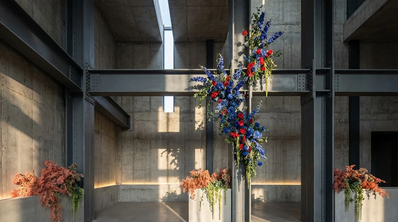
10 Mar 2026 · 6 min readThe human visual cortex is evolutionarily calibrated to detect the vibrant, chaotic signals of biology—the green of foliage, the warning red of berries, the deep purples of ripe fruit. When we transpose these signals onto the rigid, rectilinear canvas of brutalist architecture, we engage in a compelling perceptual experiment. The concept of the Brutalist Florist is not merely an aesthetic choice; it is a study in material physics and optical contrast. By placing the ephemeral fragility of deep indigo botanicals against the permanent, light-absorbing textures of raw concrete and cold steel, we force the eye to work harder. The brain must reconcile the soft, organic curves of nature with the harsh, uncompromising geometry of industrial construction. This juxtaposition relies heavily on the interplay of low-luminance hues and muted brightness, creating an atmosphere that feels grounded and substantial. In this environment, color does not scream for attention; rather, it occupies space with a quiet, confident density, mimicking the heavy materials it accompanies.
Industrial Iris 🕸️
The perception of depth in this arrangement relies heavily on the behavior of short-wavelength light found in Electric Indigo and Faded Gentian. When placed against the achromatic solidity of Weathered Cement and Rebar Grey, these botanical blues recede visually, creating a phantom depth often associated with twilight or deep water. This receding effect stands in stark opposition to the flat, opaque nature of the grey tones, effectively mimicking the experience of seeing a vibrant flower grow from a crack in a paved surface. The inclusion of Dried Roseblood serves as a disruption trigger; biology often uses red as a signal of maturity or decay. Here, it acts as a bruised accent against the cold neutrality of Limitstone Dust. The overall impact is one of resilience. The darkness of Midnight Soot anchors the lighter concrete tones, ensuring the environment feels substantial and permanent, while the indigo elements provide a sophisticated, almost electric biological counterpoint that prevents the monochromatic dominance from feeling sterile.
Oxidized Bloom 🥀
In this configuration, the visual cortex is stimulated not by harmony, but by the abrupt disruption of the grayscale continuum. The base tones of Abyss and Structural Steel suggest a total absence of light or the dense opacity of manufactured stone, establishing a somber and serious weight. Into this void, the introduction of Poppy Alert and Dusty Coral functions much like a biological signal—a warning or a mating display in nature—but transplanted into an urban grid. The presence of Patina Green is particularly significant; perceptually, it bridges the gap between the organic and the inorganic, reminiscent of copper oxidation. This links the floral elements to the industrial ones through the chemistry of weathering. The palette manages to feel distinctively edgy because the brightness of the red is heavily dampened by the surrounding shadows of Granite Shadow. It suggests a narrative of life clinging to a very harsh, light-starved environment, resulting in a display that feels serious, urgent, and undeniably constructed.
Photosynthesis in Concrete 🌿
The relationship between organic life and sterile environments is tested here through high-contrast luminosity. Clinical White and Ash Tablet provide a high-albedo background, reflecting light with an intensity that typically washes out subtle textures. This simulates the harsh, unyielding glare of a laboratory or a sun-bleached plaza. However, the introduction of Chlorophyll and Loam creates a grounding effect, pulling the visual center of gravity downward. Our eyes are evolutionarily trained to find comfort in green and brown hues, equating them with safety and resources. By isolating these colors against a backdrop of Slate Monolith, the palette highlights the geometric abstraction of the stem and soil against the wall. The green does not blend; it stands apart as a distinct entity, emphasizing the 'Florist' aspect of the theme. The simplicity here speaks to a modern, minimalist scientific approach, where the raw material is presented without adulteration. It captures the very moment a sprout breaks the surface of an artificial landscape.
Blueprint Botany 🏗️
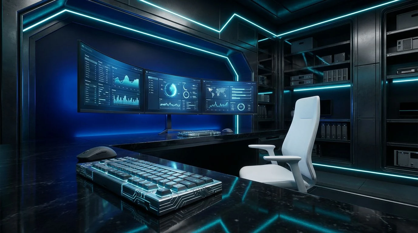
Monochromacy dominates this spectrum, challenging the viewer to find distinction within a narrow band of luminance. The transition from the absolute darkness of Void to the reflective lightness of Vapor mimics the way light filters through the skeletal remains of an unfinished skyscraper. The singularity of color—Steel Petal—is barely distinguishable from the grays surrounding it, suggesting a botanical element that has adapted to thrive in a low-light, high-metal environment. This particular shade of blue sits on the border of grey, requiring the observer to look closely to identify the pigment. This demands a slower, more deliberate visual processing speed. It is the color of architectural glass reflecting a cloudy sky, or a flower viewed through heavy fog. The palette effectively communicates professionalism through its restraint. It refuses to dazzle with saturation, instead relying on the textured interplay between Galvanized Grey and Asphalt to convey a sense of grit, endurance, and quiet authority.
Dormant Infrastructure 🏢
This configuration explores the aesthetics of senescence, where both the biological and the architectural appear past their prime. The hues of Withered Peony and Sepia Fog suggest desiccation, the point at which a flower loses its turgor pressure and begins to crumble. This fragility stands in contradiction to the unyielding nature of Obsidian and Pavement, yet they share a muted tonal range that links them. The eye perceives these colors as sharing the same dusty atmosphere, implying that the steel and the petals have existed in the same space for a long duration. The Silver Frame tone acts as a metallic highlight, catching the light in a way that suggests a hard, polished surface amidst the matte textures of the pinks and greys. This palette moves away from the 'fresh' associations of floristry and embraces the beauty of the dried and preserved. It conveys an atmosphere that is soft despite its industrial components, proving that even concrete can appear gentle under the right lighting conditions.
Observation of these chromatic arrangements suggests that the power of the Brutalist Florist theme lies in the physics of opposition. We find that the perceived delicacy of organic elements is directly proportional to the harshness of their surroundings. The deep indigos and muted teals do not merely sit atop the greys of concrete and steel; they interact with them, altering our perception of weight and temperature within a space. This study confirms that professionalism and 'grit' are not mutually exclusive but can exist in a state of dynamic equilibrium. By effectively managing the ratio of industrial suppression to biological expression, these palettes create environments that feel simultaneously built to last and fleetingly alive. The result is a visual experience that feels honest, stripping away the superfluous to reveal the raw interaction between the world we build and the world that grows.