'%3e%3cpath%20fill-rule='evenodd'%20clip-rule='evenodd'%20d='M51.1303%2019.2492C50.7278%2019.913%2050.1346%2020.4426%2049.3508%2020.838C48.5669%2021.2335%2047.6172%2021.4312%2046.5014%2021.4312C44.8208%2021.4312%2043.4367%2021.0216%2042.3492%2020.2025C41.2617%2019.3833%2040.6686%2018.2394%2040.5697%2016.7706H44.4253C44.4818%2017.3355%2044.6831%2017.7804%2045.0291%2018.1052C45.3751%2018.43%2045.8164%2018.5924%2046.3531%2018.5924C46.8192%2018.5924%2047.1864%2018.4653%2047.4547%2018.2111C47.7231%2017.9569%2047.8572%2017.618%2047.8572%2017.1943C47.8572%2016.8129%2047.7337%2016.4952%2047.4865%2016.241C47.2393%2015.9867%2046.9322%2015.7784%2046.565%2015.616C46.1978%2015.4536%2045.6893%2015.2594%2045.0397%2015.0334C44.0934%2014.7086%2043.3202%2014.3944%2042.72%2014.0907C42.1197%2013.7871%2041.6042%2013.3351%2041.1735%2012.7349C40.7427%2012.1347%2040.5273%2011.3544%2040.5273%2010.394C40.5273%209.50418%2040.7533%208.73448%2041.2053%208.08481C41.6572%207.43515%2042.2821%206.93731%2043.0801%206.5913C43.8781%206.24528%2044.7925%206.07227%2045.8235%206.07227C47.49%206.07227%2048.8141%206.46771%2049.7956%207.25861C50.7772%208.04951%2051.3315%209.13698%2051.4586%2010.5211H47.5395C47.4689%2010.0268%2047.2888%209.63483%2046.9993%209.3453C46.7097%209.05578%2046.3178%208.91102%2045.8235%208.91102C45.3998%208.91102%2045.0573%209.024%2044.7961%209.24997C44.5348%209.47594%2044.4041%209.80783%2044.4041%2010.2457C44.4041%2010.5988%2044.5207%2010.8989%2044.7537%2011.146C44.9867%2011.3932%2045.2798%2011.5944%2045.6328%2011.7498C45.9859%2011.9052%2046.4944%2012.1029%2047.1581%2012.343C48.1185%2012.6678%2048.9023%2012.9891%2049.5096%2013.3069C50.1169%2013.6246%2050.6395%2014.0872%2051.0773%2014.6945C51.5151%2015.3018%2051.734%2016.0927%2051.734%2017.0672C51.734%2017.8581%2051.5328%2018.5854%2051.1303%2019.2492ZM59.0242%206.3053V21.2829H55.4016V6.3053H59.0242ZM73.9409%206.3053V9.18642H69.8734V21.2829H66.2296V9.18642H62.2046V6.3053H73.9409ZM80.7438%209.18642V12.3218H85.8069V15.0546H80.7438V18.3806H86.4425V21.2829H77.1212V6.3053H86.4425V9.18642H80.7438ZM99.667%2016.0291V21.2829H96.0444V6.3053H101.913C103.692%206.3053%20105.048%206.74665%20105.98%207.62934C106.912%208.51204%20107.378%209.7019%20107.378%2011.199C107.378%2012.1311%20107.17%2012.9609%20106.753%2013.6882C106.337%2014.4155%20105.719%2014.9875%20104.9%2015.4042C104.08%2015.8208%20103.085%2016.0291%20101.913%2016.0291H99.667ZM103.692%2011.199C103.692%209.8855%20102.965%209.22879%20101.51%209.22879H99.667V13.1268H101.51C102.965%2013.1268%20103.692%2012.4842%20103.692%2011.199ZM120.092%2018.5501H114.478L113.546%2021.2829H109.732L115.219%206.41123H119.393L124.879%2021.2829H121.024L120.092%2018.5501ZM119.16%2015.7961L117.295%2010.2881L115.41%2015.7961H119.16ZM131.555%2018.5077H136.385V21.2829H127.933V6.3053H131.555V18.5077ZM143.337%209.18642V12.3218H148.4V15.0546H143.337V18.3806H149.035V21.2829H139.714V6.3053H149.035V9.18642H143.337ZM163.507%206.3053V9.18642H159.44V21.2829H155.796V9.18642H151.771V6.3053H163.507ZM177.449%206.3053V9.18642H173.382V21.2829H169.738V9.18642H165.713V6.3053H177.449ZM184.252%209.18642V12.3218H189.315V15.0546H184.252V18.3806H189.951V21.2829H180.629V6.3053H189.951V9.18642H184.252Z'%20fill='%23EEF0ED'/%3e%3cmask%20id='mask0_3101_7327'%20style='mask-type:alpha'%20maskUnits='userSpaceOnUse'%20x='0'%20y='0'%20width='27'%20height='28'%3e%3cpath%20d='M23.8328%200.759766H2.64808C1.18559%200.759766%200%201.94535%200%203.40785V24.5925C0%2026.055%201.18559%2027.2406%202.64808%2027.2406H23.8328C25.2952%2027.2406%2026.4808%2026.055%2026.4808%2024.5925V3.40785C26.4808%201.94535%2025.2952%200.759766%2023.8328%200.759766Z'%20fill='white'/%3e%3c/mask%3e%3cg%20mask='url(%23mask0_3101_7327)'%3e%3cpath%20d='M23.8328%200.759766H2.64808C1.18559%200.759766%200%201.94535%200%203.40785V24.5925C0%2026.055%201.18559%2027.2406%202.64808%2027.2406H23.8328C25.2952%2027.2406%2026.4808%2026.055%2026.4808%2024.5925V3.40785C26.4808%201.94535%2025.2952%200.759766%2023.8328%200.759766Z'%20fill='%23D8D8D8'/%3e%3cpath%20d='M13.2404%200.759766H0V14.0001H13.2404V0.759766Z'%20fill='%238C61FF'/%3e%3cpath%20d='M13.2404%2014H0V27.2404H13.2404V14Z'%20fill='%2336C3FE'/%3e%3cpath%20d='M26.4806%2014H13.2402V27.2404H26.4806V14Z'%20fill='%236592FE'/%3e%3cpath%20d='M26.4806%200.759766H13.2402V14.0002H26.4806V0.759766Z'%20fill='%236059F7'/%3e%3c/g%3e%3c/g%3e%3cdefs%3e%3cclipPath%20id='clip0_3101_7327'%3e%3crect%20width='190'%20height='28'%20fill='white'/%3e%3c/clipPath%3e%3c/defs%3e%3c/svg%3e)
'%3e%3cpath%20d='M23.8328%200.759521H2.64808C1.18559%200.759521%200%201.94511%200%203.40761V24.5923C0%2026.0548%201.18559%2027.2404%202.64808%2027.2404H23.8328C25.2952%2027.2404%2026.4808%2026.0548%2026.4808%2024.5923V3.40761C26.4808%201.94511%2025.2952%200.759521%2023.8328%200.759521Z'%20fill='%23D8D8D8'/%3e%3cpath%20d='M13.2404%200.759521H0V13.9999H13.2404V0.759521Z'%20fill='%238C61FF'/%3e%3cpath%20d='M13.2404%2013.9998H0V27.2402H13.2404V13.9998Z'%20fill='%2336C3FE'/%3e%3cpath%20d='M26.4809%2013.9998H13.2405V27.2402H26.4809V13.9998Z'%20fill='%236592FE'/%3e%3cpath%20d='M26.4809%200.759277H13.2405V13.9997H26.4809V0.759277Z'%20fill='%236059F7'/%3e%3c/g%3e%3c/svg%3e)
Deep Green & Charcoal Color Palettes for Luxury Design
7 Mar 2026 · 6 min readThere is a distinct shift in the atmosphere once the festive tinsel is packed away and the year properly begins. We move from the chaotic generosity of the holidays into a period that demands structure, intent, and a certain kind of visual gravity. The arrival of the Emerald Ruler theme suggests that authority does not require a crown, but rather a connection to the ground beneath us. Deep greens and muddy charcoals are not merely aesthetic choices; they are a rejection of flighty trends in favor of permanence. We are seeing a move toward brands that want to appear established before they have even launched, using the psychological weight of heavy charcoals and the biological imperative of verdant greens to suggest they own the land they stand on. It is luxury stripped of gold plating, replaced by the far more expensive signifiers of time, silence, and old growth forests. This is the palette of the boardroom that looks out into the woods, signaling a sovereign who is as concerned with endurance as they are with dominion.
Concrete & Ivy 🏛️
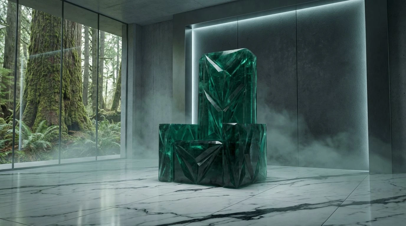
The relationship between Marble White and the severe depth of Void Black usually suggests a cold, sterilized clinical environment, yet the introduction of Sovereign Emerald changes the conversation entirely. It feels like a mid-century office block overtaken by aggressive ivy—nature asserting its dominance over the man-made. The inclusion of Glacial Sage offers strictly necessary breathing room, preventing the high contrast from becoming exhausting to the eye. This arrangement speaks to a brand that manages resources with cool detachment. It commands respect not through shouting, but through a terrifyingly organized visual system. You look at these tones and understand that mistakes will not be tolerated, but growth, represented by the verdant accents, is inevitable. It is the visual equivalent of a perfectly tailored wool coat worn in a glass elevator—impeccably modern but armed with a touch of organic unpredictability.
Forest Governance 🌲
If the previous selection was a curated garden, this is the deep, unchecked taiga. Boardroom Pine and Midnight Loam create a density that is almost opaque, swallowing light rather than reflecting it. This is where the concept of luxury sustainability stops being a marketing tagline and becomes a visual philosophy. The sheer weight of Obsidian Soil anchors the brighter Digital Moss, preventing it from feeling like a cheap tech startup. Instead, the brighter greens act as bioluminescent signals in a dark wood. It suits the entity that affects the background of our lives—financial institutions pivoting to carbon capture, or heritage brands realising their archives are their greatest asset. The mood is serious, dense, and remarkably silent, reminiscent of the hushed atmosphere found in places of high worship or high finance. It commands the viewer to lower their voice.
The Minimalist Monarch ♟️
Here we find the specific warmth requested by the sovereign mandate. The combination of intense charcoal, represented here by Espresso Charcoal, and the softness of Cashmere Sand creates a friction that feels incredibly expensive. It is the color of unbleached paper stock and heavy ink. By stripping away chroma, we are left with pure value and texture. Gallery Wall provides a clean backdrop, but it is the relationship between the dark earth tones that does the heavy lifting. This grouping suggests a ruler who does not need to wear the royal colors because everyone already knows who is in charge. It creates a space of absolute calm, the kind of quiet that costs a fortune to maintain in a city. It feels historic yet entirely present, perfect for communicating a legacy that does not need to raise its voice to be heard. It is the warmth of a library fire in a stone room.
Regalia Remixed 👑
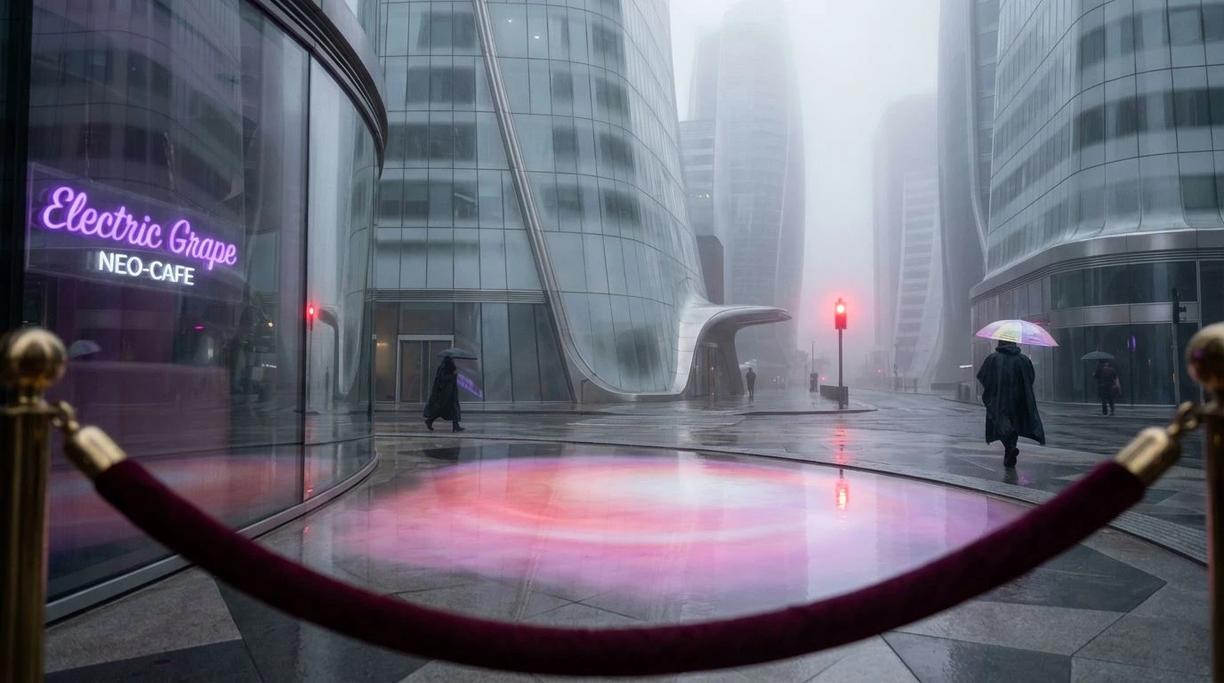
We cannot entirely escape the history of regalia, and here the classic signals of power are re-examined for a skeptical audience. Imperial Crimson and Gilded Coin are the traditional trappings of the throne, yet they are hemmed in by the utilitarian grittiness of Urban Pavement. This is not the pomp of a coronation; it is the reality of governance. The darkness of Midnight Uniform grounds the flashes of red and gold, making them feel like earned medals rather than inherited jewels. It creates an atmosphere of active leadership rather than passive reigning. This is for the brand that acknowledges tradition but refuses to be trapped by it, using the flashes of Gilded Coin to draw the eye while the grey scale does the actual work. It feels urban, restless, and undeniably authoritative, suited for a ruler who still walks the streets rather than watching from a balcony.
Silicon Sovereign 💠
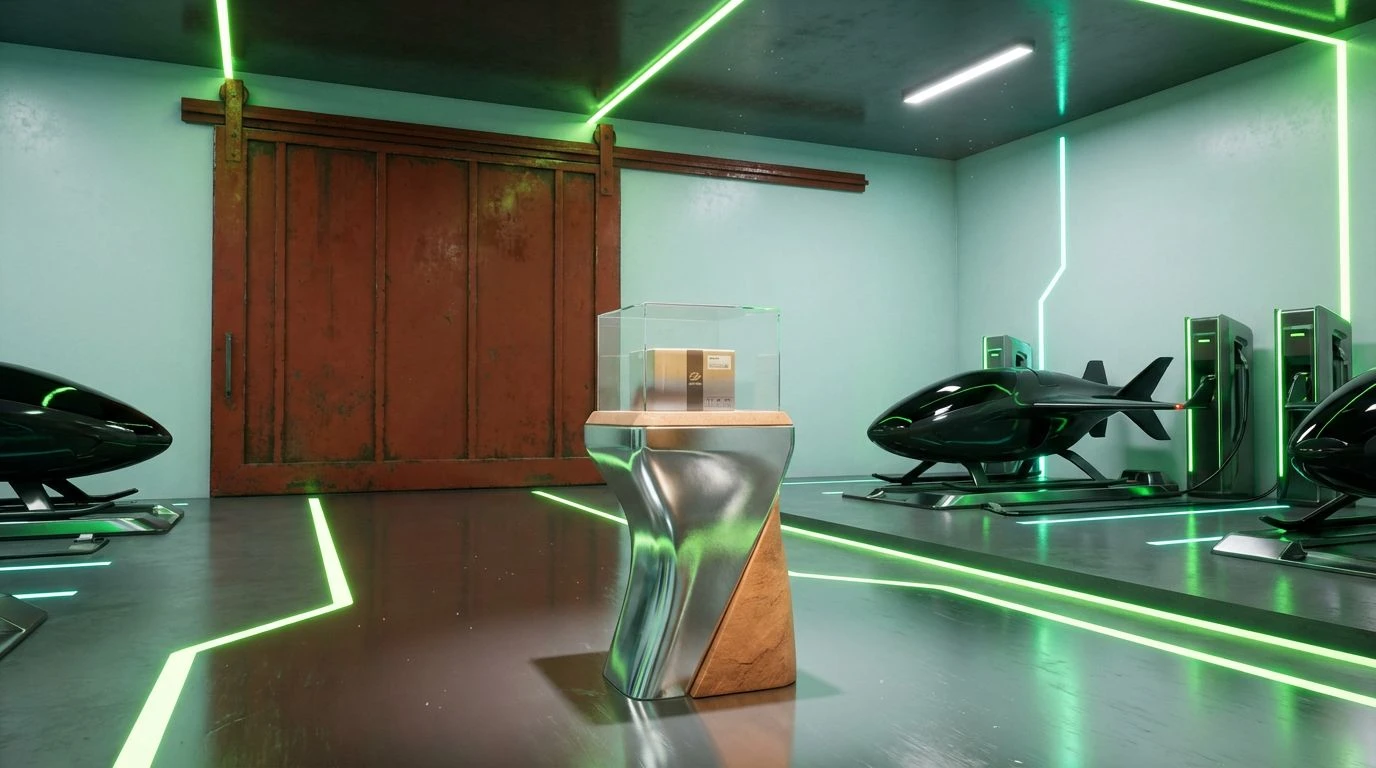
A departure into the cool logic of the future, where Venture Blue disrupts the expected natural order. The narrative here shifts from the old forest to the new laboratory. Deep Sea Cable and Matte Black provide the necessary seriousness—the charcoal element of the sovereign requirement—but the introduction of Startup Mint suggests that this ruler is algorithmically elected. It feels crisp, engineered, and hygienic. While other combinations rely on the warmth of soil, this relies on the clarity of glass and screen. It fits the narrative of a new sovereign who rules through data rather than decree. The mood is alert and highly reactive, suitable for environments where speed is the ultimate currency, yet the dark anchors ensure it never feels fleeting or temporary. It frames sustainability as an engineering challenge to be solved, rather than a garden to be tended.
Collectively, these arrangements signal a departure from the frantic, high-saturation attention seeking of the recent past. The Emerald Ruler dictates a return to substance, where the weight of a color is more important than its brightness. The combination of sustainable ideology and luxury presentation demands a specific kind of restraint; you cannot shout about quiet power. Whether through the density of forest tones or the starkness of architectural greys, the message remains consistent. We are witnessing a visual language that prioritizes longevity over virality, aligning perfectly with a post-holiday desire for meaning and order. These shades do not ask for attention; they simply wait for you to notice them, confident that you eventually will. The true sovereign does not chase the subject, but rather creates the gravity that pulls everything else into orbit.