'%3e%3cpath%20fill-rule='evenodd'%20clip-rule='evenodd'%20d='M51.1303%2019.2492C50.7278%2019.913%2050.1346%2020.4426%2049.3508%2020.838C48.5669%2021.2335%2047.6172%2021.4312%2046.5014%2021.4312C44.8208%2021.4312%2043.4367%2021.0216%2042.3492%2020.2025C41.2617%2019.3833%2040.6686%2018.2394%2040.5697%2016.7706H44.4253C44.4818%2017.3355%2044.6831%2017.7804%2045.0291%2018.1052C45.3751%2018.43%2045.8164%2018.5924%2046.3531%2018.5924C46.8192%2018.5924%2047.1864%2018.4653%2047.4547%2018.2111C47.7231%2017.9569%2047.8572%2017.618%2047.8572%2017.1943C47.8572%2016.8129%2047.7337%2016.4952%2047.4865%2016.241C47.2393%2015.9867%2046.9322%2015.7784%2046.565%2015.616C46.1978%2015.4536%2045.6893%2015.2594%2045.0397%2015.0334C44.0934%2014.7086%2043.3202%2014.3944%2042.72%2014.0907C42.1197%2013.7871%2041.6042%2013.3351%2041.1735%2012.7349C40.7427%2012.1347%2040.5273%2011.3544%2040.5273%2010.394C40.5273%209.50418%2040.7533%208.73448%2041.2053%208.08481C41.6572%207.43515%2042.2821%206.93731%2043.0801%206.5913C43.8781%206.24528%2044.7925%206.07227%2045.8235%206.07227C47.49%206.07227%2048.8141%206.46771%2049.7956%207.25861C50.7772%208.04951%2051.3315%209.13698%2051.4586%2010.5211H47.5395C47.4689%2010.0268%2047.2888%209.63483%2046.9993%209.3453C46.7097%209.05578%2046.3178%208.91102%2045.8235%208.91102C45.3998%208.91102%2045.0573%209.024%2044.7961%209.24997C44.5348%209.47594%2044.4041%209.80783%2044.4041%2010.2457C44.4041%2010.5988%2044.5207%2010.8989%2044.7537%2011.146C44.9867%2011.3932%2045.2798%2011.5944%2045.6328%2011.7498C45.9859%2011.9052%2046.4944%2012.1029%2047.1581%2012.343C48.1185%2012.6678%2048.9023%2012.9891%2049.5096%2013.3069C50.1169%2013.6246%2050.6395%2014.0872%2051.0773%2014.6945C51.5151%2015.3018%2051.734%2016.0927%2051.734%2017.0672C51.734%2017.8581%2051.5328%2018.5854%2051.1303%2019.2492ZM59.0242%206.3053V21.2829H55.4016V6.3053H59.0242ZM73.9409%206.3053V9.18642H69.8734V21.2829H66.2296V9.18642H62.2046V6.3053H73.9409ZM80.7438%209.18642V12.3218H85.8069V15.0546H80.7438V18.3806H86.4425V21.2829H77.1212V6.3053H86.4425V9.18642H80.7438ZM99.667%2016.0291V21.2829H96.0444V6.3053H101.913C103.692%206.3053%20105.048%206.74665%20105.98%207.62934C106.912%208.51204%20107.378%209.7019%20107.378%2011.199C107.378%2012.1311%20107.17%2012.9609%20106.753%2013.6882C106.337%2014.4155%20105.719%2014.9875%20104.9%2015.4042C104.08%2015.8208%20103.085%2016.0291%20101.913%2016.0291H99.667ZM103.692%2011.199C103.692%209.8855%20102.965%209.22879%20101.51%209.22879H99.667V13.1268H101.51C102.965%2013.1268%20103.692%2012.4842%20103.692%2011.199ZM120.092%2018.5501H114.478L113.546%2021.2829H109.732L115.219%206.41123H119.393L124.879%2021.2829H121.024L120.092%2018.5501ZM119.16%2015.7961L117.295%2010.2881L115.41%2015.7961H119.16ZM131.555%2018.5077H136.385V21.2829H127.933V6.3053H131.555V18.5077ZM143.337%209.18642V12.3218H148.4V15.0546H143.337V18.3806H149.035V21.2829H139.714V6.3053H149.035V9.18642H143.337ZM163.507%206.3053V9.18642H159.44V21.2829H155.796V9.18642H151.771V6.3053H163.507ZM177.449%206.3053V9.18642H173.382V21.2829H169.738V9.18642H165.713V6.3053H177.449ZM184.252%209.18642V12.3218H189.315V15.0546H184.252V18.3806H189.951V21.2829H180.629V6.3053H189.951V9.18642H184.252Z'%20fill='%23EEF0ED'/%3e%3cmask%20id='mask0_3101_7327'%20style='mask-type:alpha'%20maskUnits='userSpaceOnUse'%20x='0'%20y='0'%20width='27'%20height='28'%3e%3cpath%20d='M23.8328%200.759766H2.64808C1.18559%200.759766%200%201.94535%200%203.40785V24.5925C0%2026.055%201.18559%2027.2406%202.64808%2027.2406H23.8328C25.2952%2027.2406%2026.4808%2026.055%2026.4808%2024.5925V3.40785C26.4808%201.94535%2025.2952%200.759766%2023.8328%200.759766Z'%20fill='white'/%3e%3c/mask%3e%3cg%20mask='url(%23mask0_3101_7327)'%3e%3cpath%20d='M23.8328%200.759766H2.64808C1.18559%200.759766%200%201.94535%200%203.40785V24.5925C0%2026.055%201.18559%2027.2406%202.64808%2027.2406H23.8328C25.2952%2027.2406%2026.4808%2026.055%2026.4808%2024.5925V3.40785C26.4808%201.94535%2025.2952%200.759766%2023.8328%200.759766Z'%20fill='%23D8D8D8'/%3e%3cpath%20d='M13.2404%200.759766H0V14.0001H13.2404V0.759766Z'%20fill='%238C61FF'/%3e%3cpath%20d='M13.2404%2014H0V27.2404H13.2404V14Z'%20fill='%2336C3FE'/%3e%3cpath%20d='M26.4806%2014H13.2402V27.2404H26.4806V14Z'%20fill='%236592FE'/%3e%3cpath%20d='M26.4806%200.759766H13.2402V14.0002H26.4806V0.759766Z'%20fill='%236059F7'/%3e%3c/g%3e%3c/g%3e%3cdefs%3e%3cclipPath%20id='clip0_3101_7327'%3e%3crect%20width='190'%20height='28'%20fill='white'/%3e%3c/clipPath%3e%3c/defs%3e%3c/svg%3e)
'%3e%3cpath%20d='M23.8328%200.759521H2.64808C1.18559%200.759521%200%201.94511%200%203.40761V24.5923C0%2026.0548%201.18559%2027.2404%202.64808%2027.2404H23.8328C25.2952%2027.2404%2026.4808%2026.0548%2026.4808%2024.5923V3.40761C26.4808%201.94511%2025.2952%200.759521%2023.8328%200.759521Z'%20fill='%23D8D8D8'/%3e%3cpath%20d='M13.2404%200.759521H0V13.9999H13.2404V0.759521Z'%20fill='%238C61FF'/%3e%3cpath%20d='M13.2404%2013.9998H0V27.2402H13.2404V13.9998Z'%20fill='%2336C3FE'/%3e%3cpath%20d='M26.4809%2013.9998H13.2405V27.2402H26.4809V13.9998Z'%20fill='%236592FE'/%3e%3cpath%20d='M26.4809%200.759277H13.2405V13.9997H26.4809V0.759277Z'%20fill='%236059F7'/%3e%3c/g%3e%3c/svg%3e)
Terracotta Red Color Palette: Industrial High Fashion Design
5 Mar 2026 · 5 min readThere is something almost perverse about the fashion world’s sudden infatuation with the imperfect. We spent decades polishing surfaces until they gleamed like digital screens, only to turn around and seek the tactile reassurance of rust. This isn't just about colour; it is a rejection of the sterile. The terracotta red here isn't the wholesome clay of a Tuscan villa, but the jagged, oxidised edge of a steel beam in a forgotten warehouse. It suggests a history, a narrative of exposure to the elements, repurposed for the severe silhouettes of Parisian minimalism. When we look at this convergence, we are seeing the elite claiming the aesthetic of the obsolete. It creates a tension that is palpable, asking the wearer to hold the weight of industrial decay within the precise, frantic stitching of haute couture.
Brutalist Oxidisation 🏗️
Imagine a frantic sketch on a napkin, rendered in stark graphite and sudden, violent strokes of burnt sienna. This arrangement speaks to the architect who wears nothing but Issey Miyake. It is fundamentally urban, relying on the sheer cliff-face of grey and black to make that singular moment of copper sing. It does not apologize for its harshness. Rather, it treats the industrial decay as a brooch pinned to a lapel of grey wool. The white is not pure; it is the colour of plaster before the paint arrives, suggesting a work in progress that never intends to finish. This is the uniform of the creative director standing in an empty loft, deciding which wall to knock down. It forces the eye to accept the raw imperfection of the rust tone as the only source of warmth in a landscape made entirely of cold, hard facts.
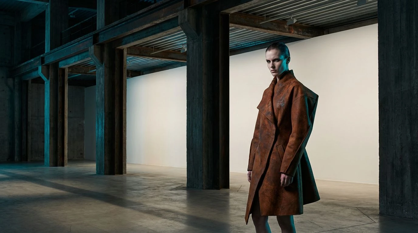
Atelier Clay 🏺
Here we find a softer approach to the industrial thesis, moving away from the construction site and into the studio. The contrast between the obsidian depths and the stark white background creates a vast, empty room, generating a vacuum where the organic warms occupy the space with sculptural authority. It feels tactile, like touching raw linen draped over a black steel frame. The warmth here is curatorial, a deliberate placement of an ancient, fired object within a hyper-modern gallery. It whispers of old-world craftsmanship surviving inside the void of contemporary design. There is a specific kind of silence in this group of colours, the kind found in high-end boutiques where the clothes are spaced three feet apart. It manages to look expensive without trying, relying on the muted, earthy tones to ground the severe monochromatics.
Molten Runway 🔥
Subtle is not the word we are looking for. This is a gradient of temperature, a thermal camera capturing the heat escaping from a ventilation shaft. By layering these varying intensities of red and orange against a soot-stained backdrop, the result is aggressive yet strangely comforting. It mimics the visual overload of a furnace, yet contained within the strict lines of a tailored coat. It is for the brave, or perhaps the cold, offering a visual fireplace that burns with a clean, smokeless intensity. It argues that there is elegance in combustion. The progression from the dark, blood-like reds to the pale apricot offers a sense of movement, like metal cooling down or heating up. It transforms the human silhouette into something kinetic, a walking chemical reaction that refuses to fade into the background noise of the city.
Ceramic Shock ⚡
Most minimalists would stop at the browns and creams, satisfied with a safe, earthy neutrality. But the intrusion of that shrill, chemical blue changes the conversation entirely. It looks like a copper pipe oxidising in real-time, or perhaps a plastic tarp caught on a brick wall. This is fashion that refuses to be merely "natural." The blue acts as a jarring reminder of the artificial, a synthetic stripe painting over the organic rust. It creates a tension that keeps the eye moving, preventing the viewer from settling into a comfortable, pastoral daze. The lighter tones provide a canvas, but the drama lies in the fight between the grounded leather hues and that unapologetic, piercing cyan. It feels distinctly modern, an acknowledgment that our landscape is a mess of earth and electricity, and we might as well wear it.
Petrol & Patina 🛢️
There is a distinct heaviness here, a gravity that pulls the viewer down into a plush, dimly lit interior. The interplay between the reddish-brown and that deep, mysterious petrol blue suggests the library of a very expensive, very eccentric architect. It feels dusty in the most expensive way possible, calling to mind the smell of old paper and leather seats in a vintage sports car. This is not the bright rust of decay, but the preserved patina of age, protected behind glass. It speaks to a sophistication that values the passage of time, provided it looks good under moody lighting. The near-black and grey provide a shadowing effect, creating a mood that is serious, perhaps a bit brooding, but undeniably stylish. It creates a space where comfort meets intellect, wrapped in the texture of wool and velvet.
Ultimately, bringing the aesthetics of the scrap yard into the salon involves more than just a palette swap. It requires a fundamental shift in how we value texture and age. These combinations prove that the sleekness of high fashion needs the grit of reality to truly ground it. We are seeing a dialogue between the temporary nature of trends and the enduring, corrosive power of the elements. It is a reminder that even the most structured garment is material at its base, subject to the same laws of entropy as the steel girders that hold up the roof. The Rusty Runway suggests that true sophistication is no longer about looking new; it is about looking like you have survived the fire and turned the ashes into something wearable.