'%3e%3cpath%20fill-rule='evenodd'%20clip-rule='evenodd'%20d='M51.1303%2019.2492C50.7278%2019.913%2050.1346%2020.4426%2049.3508%2020.838C48.5669%2021.2335%2047.6172%2021.4312%2046.5014%2021.4312C44.8208%2021.4312%2043.4367%2021.0216%2042.3492%2020.2025C41.2617%2019.3833%2040.6686%2018.2394%2040.5697%2016.7706H44.4253C44.4818%2017.3355%2044.6831%2017.7804%2045.0291%2018.1052C45.3751%2018.43%2045.8164%2018.5924%2046.3531%2018.5924C46.8192%2018.5924%2047.1864%2018.4653%2047.4547%2018.2111C47.7231%2017.9569%2047.8572%2017.618%2047.8572%2017.1943C47.8572%2016.8129%2047.7337%2016.4952%2047.4865%2016.241C47.2393%2015.9867%2046.9322%2015.7784%2046.565%2015.616C46.1978%2015.4536%2045.6893%2015.2594%2045.0397%2015.0334C44.0934%2014.7086%2043.3202%2014.3944%2042.72%2014.0907C42.1197%2013.7871%2041.6042%2013.3351%2041.1735%2012.7349C40.7427%2012.1347%2040.5273%2011.3544%2040.5273%2010.394C40.5273%209.50418%2040.7533%208.73448%2041.2053%208.08481C41.6572%207.43515%2042.2821%206.93731%2043.0801%206.5913C43.8781%206.24528%2044.7925%206.07227%2045.8235%206.07227C47.49%206.07227%2048.8141%206.46771%2049.7956%207.25861C50.7772%208.04951%2051.3315%209.13698%2051.4586%2010.5211H47.5395C47.4689%2010.0268%2047.2888%209.63483%2046.9993%209.3453C46.7097%209.05578%2046.3178%208.91102%2045.8235%208.91102C45.3998%208.91102%2045.0573%209.024%2044.7961%209.24997C44.5348%209.47594%2044.4041%209.80783%2044.4041%2010.2457C44.4041%2010.5988%2044.5207%2010.8989%2044.7537%2011.146C44.9867%2011.3932%2045.2798%2011.5944%2045.6328%2011.7498C45.9859%2011.9052%2046.4944%2012.1029%2047.1581%2012.343C48.1185%2012.6678%2048.9023%2012.9891%2049.5096%2013.3069C50.1169%2013.6246%2050.6395%2014.0872%2051.0773%2014.6945C51.5151%2015.3018%2051.734%2016.0927%2051.734%2017.0672C51.734%2017.8581%2051.5328%2018.5854%2051.1303%2019.2492ZM59.0242%206.3053V21.2829H55.4016V6.3053H59.0242ZM73.9409%206.3053V9.18642H69.8734V21.2829H66.2296V9.18642H62.2046V6.3053H73.9409ZM80.7438%209.18642V12.3218H85.8069V15.0546H80.7438V18.3806H86.4425V21.2829H77.1212V6.3053H86.4425V9.18642H80.7438ZM99.667%2016.0291V21.2829H96.0444V6.3053H101.913C103.692%206.3053%20105.048%206.74665%20105.98%207.62934C106.912%208.51204%20107.378%209.7019%20107.378%2011.199C107.378%2012.1311%20107.17%2012.9609%20106.753%2013.6882C106.337%2014.4155%20105.719%2014.9875%20104.9%2015.4042C104.08%2015.8208%20103.085%2016.0291%20101.913%2016.0291H99.667ZM103.692%2011.199C103.692%209.8855%20102.965%209.22879%20101.51%209.22879H99.667V13.1268H101.51C102.965%2013.1268%20103.692%2012.4842%20103.692%2011.199ZM120.092%2018.5501H114.478L113.546%2021.2829H109.732L115.219%206.41123H119.393L124.879%2021.2829H121.024L120.092%2018.5501ZM119.16%2015.7961L117.295%2010.2881L115.41%2015.7961H119.16ZM131.555%2018.5077H136.385V21.2829H127.933V6.3053H131.555V18.5077ZM143.337%209.18642V12.3218H148.4V15.0546H143.337V18.3806H149.035V21.2829H139.714V6.3053H149.035V9.18642H143.337ZM163.507%206.3053V9.18642H159.44V21.2829H155.796V9.18642H151.771V6.3053H163.507ZM177.449%206.3053V9.18642H173.382V21.2829H169.738V9.18642H165.713V6.3053H177.449ZM184.252%209.18642V12.3218H189.315V15.0546H184.252V18.3806H189.951V21.2829H180.629V6.3053H189.951V9.18642H184.252Z'%20fill='%23EEF0ED'/%3e%3cmask%20id='mask0_3101_7327'%20style='mask-type:alpha'%20maskUnits='userSpaceOnUse'%20x='0'%20y='0'%20width='27'%20height='28'%3e%3cpath%20d='M23.8328%200.759766H2.64808C1.18559%200.759766%200%201.94535%200%203.40785V24.5925C0%2026.055%201.18559%2027.2406%202.64808%2027.2406H23.8328C25.2952%2027.2406%2026.4808%2026.055%2026.4808%2024.5925V3.40785C26.4808%201.94535%2025.2952%200.759766%2023.8328%200.759766Z'%20fill='white'/%3e%3c/mask%3e%3cg%20mask='url(%23mask0_3101_7327)'%3e%3cpath%20d='M23.8328%200.759766H2.64808C1.18559%200.759766%200%201.94535%200%203.40785V24.5925C0%2026.055%201.18559%2027.2406%202.64808%2027.2406H23.8328C25.2952%2027.2406%2026.4808%2026.055%2026.4808%2024.5925V3.40785C26.4808%201.94535%2025.2952%200.759766%2023.8328%200.759766Z'%20fill='%23D8D8D8'/%3e%3cpath%20d='M13.2404%200.759766H0V14.0001H13.2404V0.759766Z'%20fill='%238C61FF'/%3e%3cpath%20d='M13.2404%2014H0V27.2404H13.2404V14Z'%20fill='%2336C3FE'/%3e%3cpath%20d='M26.4806%2014H13.2402V27.2404H26.4806V14Z'%20fill='%236592FE'/%3e%3cpath%20d='M26.4806%200.759766H13.2402V14.0002H26.4806V0.759766Z'%20fill='%236059F7'/%3e%3c/g%3e%3c/g%3e%3cdefs%3e%3cclipPath%20id='clip0_3101_7327'%3e%3crect%20width='190'%20height='28'%20fill='white'/%3e%3c/clipPath%3e%3c/defs%3e%3c/svg%3e)
'%3e%3cpath%20d='M23.8328%200.759521H2.64808C1.18559%200.759521%200%201.94511%200%203.40761V24.5923C0%2026.0548%201.18559%2027.2404%202.64808%2027.2404H23.8328C25.2952%2027.2404%2026.4808%2026.0548%2026.4808%2024.5923V3.40761C26.4808%201.94511%2025.2952%200.759521%2023.8328%200.759521Z'%20fill='%23D8D8D8'/%3e%3cpath%20d='M13.2404%200.759521H0V13.9999H13.2404V0.759521Z'%20fill='%238C61FF'/%3e%3cpath%20d='M13.2404%2013.9998H0V27.2402H13.2404V13.9998Z'%20fill='%2336C3FE'/%3e%3cpath%20d='M26.4809%2013.9998H13.2405V27.2402H26.4809V13.9998Z'%20fill='%236592FE'/%3e%3cpath%20d='M26.4809%200.759277H13.2405V13.9997H26.4809V0.759277Z'%20fill='%236059F7'/%3e%3c/g%3e%3c/svg%3e)
Mexican Heritage Color Palettes for Modern Fintech Design
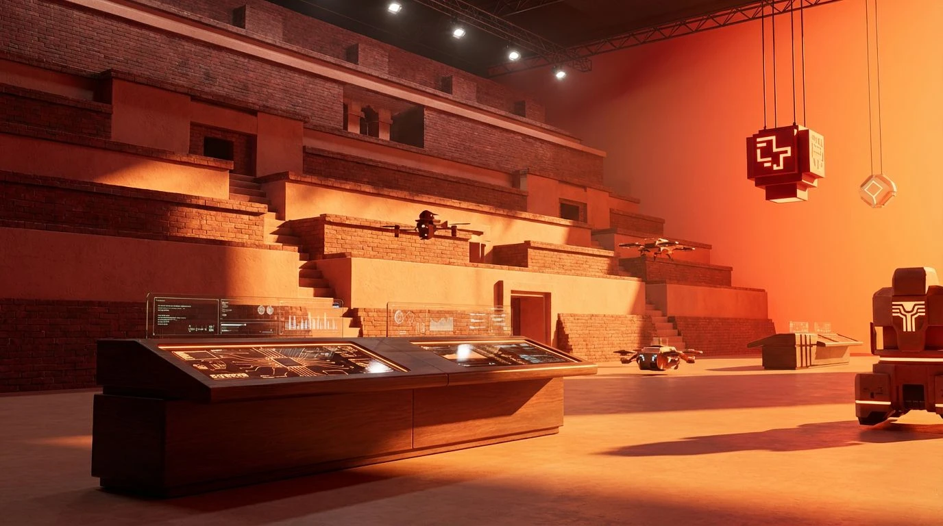
4 Mar 2026 · 6 min readModern finance interfaces often suffer from a clinical sterility, leaning too heavily on cold blues and austere greys to signal security. But there is a shift happening—a movement towards warmth and tangible heritage that grounds digital transactions in something real. By borrowing from the architectural legacy of Mexico, specifically the pigmented stucco of heavy masonry and the deep functionality of artisanal textiles, designers can create logistics platforms that feel both efficient and human. The visual language of trust is evolving from purely algorithmic to something steeped in history. We see a landscape where the reliability of ancient masonry informs the stability of blockchain ledgers. It is an exploration of how the vibrant, sun-drenched palettes of Mesoamerica can rewrite the visual code of efficiency, proving that serious data handling does not require a lack of soul.
Adobe Wireframe 🧱
This collection speaks to the foundational elements of construction, stripping away the neon glare of typical tech aesthetics in favor of something more geological. It brings to mind the quiet strength of rammed earth walls found in Oaxaca, translating that physical stability into digital user interfaces. When dealing with complex logistical data or high-stakes financial transfers, a sense of calm is necessary. The interplay between Dusty Rose and Raw Umber suggests a user experience that is supportive rather than demanding, reducing the cognitive load often associated with dashboard management. It frames the screen not as a void of information, but as a surface of digital parchment. Designers might use these tones to soften the edges of hard data visualization, allowing the more vibrant Persimmon Glaze to act as a gentle guide for navigation rather than a blaring alarm. It is the color of longevity, implying that the systems built here are designed to last as long as the stone temples that inspired them.
Coded Marigold 🏵️
Energy pulses through this selection, capturing the frenetic yet organized chaos of a bustling market square. It is the visual equivalent of instantaneous transactions and rapid delivery networks. In a fintech context, these hues are not for the timid; they command attention and drive decision-making. The sheer heat of Chili Red and Habanero pushes the interface forward, ideal for high-priority alerts or the moment a shipment reaches its final destination. Rather than signaling danger, this spectrum utilizes the cultural association of warmth and life found in Mexican festivities to denote active, successful processes. It feels alive and urgent. By grounding these intense oranges with the darker Oxblood Brick, the aesthetic avoids becoming frivolous. It retains a serious, grounded authority while celebrating the speed of modern commerce. This serves as a reminder that efficiency can be passionate, and that the tools we use to manage global movement can carry the same vitality as the goods being transported.
Talavera Terminal 🚛
Here we find the most direct translation of the prompt, bridging the gap between industrial utility and folkloric vibrancy. The stark contrast of Asphalt and Pure White lays a clean, legible foundation typical of rigorous software design, but the disruption comes from the bold inclusion of Cobalt Link and Oaxacan Gold. It recalls the specific blue-and-white ceramics of Puebla set against the yellow caution lines of a logistics warehouse. This combination builds an environment of high-contrast legibility, crucial for scanning tracking numbers or reviewing investment portfolios on small screens. The blue anchors the design in established notions of corporate security, while the solar flare of Canary Yellow injects a distinctly Latin American optimism and visibility. It transforms a standard spreadsheet view into a dashboard that feels architectural and distinct. This is suited for the heavy-lifting side of software—backends, admin panels, and logistics trackers—where clarity is paramount, but cultural identity refuses to be muted by the grayscale status quo.
Copper Ledger 🏜️
There is a luxurious warmth to this gradient that moves beyond simple flat color into something metallic and tactile. It evokes the feeling of worked leather and hammered copper, materials that age beautifully and suggest enduring value. For independent banking apps or heritage-focused supply chains, this monochromatic run offers a sophisticated alternative to the cold blues of traditional banking. The progression from the deep Adobe Shadow to the bright Vivid Tangelo creates a natural hierarchy, allowing designers to layer information intuitively without introducing jarring contrast. It feels organic, like the light changing over the Sierra Madre during the late afternoon. This aesthetic builds a narrative of wealth that is tied to resources and land rather than abstract numbers. It invites the user to view their assets as something substantial and cultivated. The result is a digital environment that feels bespoke and crafted, elevating routine logistical checks into moments of quiet, golden appreciation.
Cenote Interface 💻
Cleanliness and expansive negative space define this grouping, mirroring the stark walls of modern Mexican architecture punctuated by deliberate strokes of color. The deep, refreshing Cenote Blue cuts through the warmth of Coral Dust and Terracotta Pot like water in a canyon, offering a focal point of absolute clarity. This is the most versatile palette for consumer-facing mobile applications where trust is established through simplicity. The heavy grounding of Midnight Ink and Coffee Bean ensures that typography remains razor-sharp against the Blank Canvas, adhering to accessibility standards while refusing to be boring. It suggests transparency in business—nothing is hidden in the shadows. The unexpected combination of the aquatic blue with the dry, earthy oranges creates a dynamic tension that keeps the eye engaged without fatigue. It balances the 'microchip' aspect of precise, cool technology with the 'heritage' aspect of warm, baked earth, resulting in an interface that feels both futuristic and ancient in the same breath.
Analyzing these combinations reveals a powerful truth about the future of digital product design: regional identity is a functional asset, not just a decorative layer. By moving away from the globalized, sterile standards of corporate software, we discover that the specific hues of Mexican heritage—from baked earth to brilliant ceramics—offer a new vocabulary for reliability. These colors do more than just prettify a screen; they communicate durability, energy, and clarity. Whether through the grounding nature of warm clays or the decisive action of electric blues, this approach humanizes the cold logic of fintech and logistics. It reminds us that behind every digital ledger and shipping container, there is human intent and cultural history. Designers who embrace this warmth will build systems that are not only efficient to use but are also pleasant to inhabit, proving that the most advanced interfaces are those that remember where they came from.