'%3e%3cpath%20fill-rule='evenodd'%20clip-rule='evenodd'%20d='M51.1303%2019.2492C50.7278%2019.913%2050.1346%2020.4426%2049.3508%2020.838C48.5669%2021.2335%2047.6172%2021.4312%2046.5014%2021.4312C44.8208%2021.4312%2043.4367%2021.0216%2042.3492%2020.2025C41.2617%2019.3833%2040.6686%2018.2394%2040.5697%2016.7706H44.4253C44.4818%2017.3355%2044.6831%2017.7804%2045.0291%2018.1052C45.3751%2018.43%2045.8164%2018.5924%2046.3531%2018.5924C46.8192%2018.5924%2047.1864%2018.4653%2047.4547%2018.2111C47.7231%2017.9569%2047.8572%2017.618%2047.8572%2017.1943C47.8572%2016.8129%2047.7337%2016.4952%2047.4865%2016.241C47.2393%2015.9867%2046.9322%2015.7784%2046.565%2015.616C46.1978%2015.4536%2045.6893%2015.2594%2045.0397%2015.0334C44.0934%2014.7086%2043.3202%2014.3944%2042.72%2014.0907C42.1197%2013.7871%2041.6042%2013.3351%2041.1735%2012.7349C40.7427%2012.1347%2040.5273%2011.3544%2040.5273%2010.394C40.5273%209.50418%2040.7533%208.73448%2041.2053%208.08481C41.6572%207.43515%2042.2821%206.93731%2043.0801%206.5913C43.8781%206.24528%2044.7925%206.07227%2045.8235%206.07227C47.49%206.07227%2048.8141%206.46771%2049.7956%207.25861C50.7772%208.04951%2051.3315%209.13698%2051.4586%2010.5211H47.5395C47.4689%2010.0268%2047.2888%209.63483%2046.9993%209.3453C46.7097%209.05578%2046.3178%208.91102%2045.8235%208.91102C45.3998%208.91102%2045.0573%209.024%2044.7961%209.24997C44.5348%209.47594%2044.4041%209.80783%2044.4041%2010.2457C44.4041%2010.5988%2044.5207%2010.8989%2044.7537%2011.146C44.9867%2011.3932%2045.2798%2011.5944%2045.6328%2011.7498C45.9859%2011.9052%2046.4944%2012.1029%2047.1581%2012.343C48.1185%2012.6678%2048.9023%2012.9891%2049.5096%2013.3069C50.1169%2013.6246%2050.6395%2014.0872%2051.0773%2014.6945C51.5151%2015.3018%2051.734%2016.0927%2051.734%2017.0672C51.734%2017.8581%2051.5328%2018.5854%2051.1303%2019.2492ZM59.0242%206.3053V21.2829H55.4016V6.3053H59.0242ZM73.9409%206.3053V9.18642H69.8734V21.2829H66.2296V9.18642H62.2046V6.3053H73.9409ZM80.7438%209.18642V12.3218H85.8069V15.0546H80.7438V18.3806H86.4425V21.2829H77.1212V6.3053H86.4425V9.18642H80.7438ZM99.667%2016.0291V21.2829H96.0444V6.3053H101.913C103.692%206.3053%20105.048%206.74665%20105.98%207.62934C106.912%208.51204%20107.378%209.7019%20107.378%2011.199C107.378%2012.1311%20107.17%2012.9609%20106.753%2013.6882C106.337%2014.4155%20105.719%2014.9875%20104.9%2015.4042C104.08%2015.8208%20103.085%2016.0291%20101.913%2016.0291H99.667ZM103.692%2011.199C103.692%209.8855%20102.965%209.22879%20101.51%209.22879H99.667V13.1268H101.51C102.965%2013.1268%20103.692%2012.4842%20103.692%2011.199ZM120.092%2018.5501H114.478L113.546%2021.2829H109.732L115.219%206.41123H119.393L124.879%2021.2829H121.024L120.092%2018.5501ZM119.16%2015.7961L117.295%2010.2881L115.41%2015.7961H119.16ZM131.555%2018.5077H136.385V21.2829H127.933V6.3053H131.555V18.5077ZM143.337%209.18642V12.3218H148.4V15.0546H143.337V18.3806H149.035V21.2829H139.714V6.3053H149.035V9.18642H143.337ZM163.507%206.3053V9.18642H159.44V21.2829H155.796V9.18642H151.771V6.3053H163.507ZM177.449%206.3053V9.18642H173.382V21.2829H169.738V9.18642H165.713V6.3053H177.449ZM184.252%209.18642V12.3218H189.315V15.0546H184.252V18.3806H189.951V21.2829H180.629V6.3053H189.951V9.18642H184.252Z'%20fill='%23EEF0ED'/%3e%3cmask%20id='mask0_3101_7327'%20style='mask-type:alpha'%20maskUnits='userSpaceOnUse'%20x='0'%20y='0'%20width='27'%20height='28'%3e%3cpath%20d='M23.8328%200.759766H2.64808C1.18559%200.759766%200%201.94535%200%203.40785V24.5925C0%2026.055%201.18559%2027.2406%202.64808%2027.2406H23.8328C25.2952%2027.2406%2026.4808%2026.055%2026.4808%2024.5925V3.40785C26.4808%201.94535%2025.2952%200.759766%2023.8328%200.759766Z'%20fill='white'/%3e%3c/mask%3e%3cg%20mask='url(%23mask0_3101_7327)'%3e%3cpath%20d='M23.8328%200.759766H2.64808C1.18559%200.759766%200%201.94535%200%203.40785V24.5925C0%2026.055%201.18559%2027.2406%202.64808%2027.2406H23.8328C25.2952%2027.2406%2026.4808%2026.055%2026.4808%2024.5925V3.40785C26.4808%201.94535%2025.2952%200.759766%2023.8328%200.759766Z'%20fill='%23D8D8D8'/%3e%3cpath%20d='M13.2404%200.759766H0V14.0001H13.2404V0.759766Z'%20fill='%238C61FF'/%3e%3cpath%20d='M13.2404%2014H0V27.2404H13.2404V14Z'%20fill='%2336C3FE'/%3e%3cpath%20d='M26.4806%2014H13.2402V27.2404H26.4806V14Z'%20fill='%236592FE'/%3e%3cpath%20d='M26.4806%200.759766H13.2402V14.0002H26.4806V0.759766Z'%20fill='%236059F7'/%3e%3c/g%3e%3c/g%3e%3cdefs%3e%3cclipPath%20id='clip0_3101_7327'%3e%3crect%20width='190'%20height='28'%20fill='white'/%3e%3c/clipPath%3e%3c/defs%3e%3c/svg%3e)
'%3e%3cpath%20d='M23.8328%200.759521H2.64808C1.18559%200.759521%200%201.94511%200%203.40761V24.5923C0%2026.0548%201.18559%2027.2404%202.64808%2027.2404H23.8328C25.2952%2027.2404%2026.4808%2026.0548%2026.4808%2024.5923V3.40761C26.4808%201.94511%2025.2952%200.759521%2023.8328%200.759521Z'%20fill='%23D8D8D8'/%3e%3cpath%20d='M13.2404%200.759521H0V13.9999H13.2404V0.759521Z'%20fill='%238C61FF'/%3e%3cpath%20d='M13.2404%2013.9998H0V27.2402H13.2404V13.9998Z'%20fill='%2336C3FE'/%3e%3cpath%20d='M26.4809%2013.9998H13.2405V27.2402H26.4809V13.9998Z'%20fill='%236592FE'/%3e%3cpath%20d='M26.4809%200.759277H13.2405V13.9997H26.4809V0.759277Z'%20fill='%236059F7'/%3e%3c/g%3e%3c/svg%3e)
Data Visualization Color Palettes: Dark Academic Design
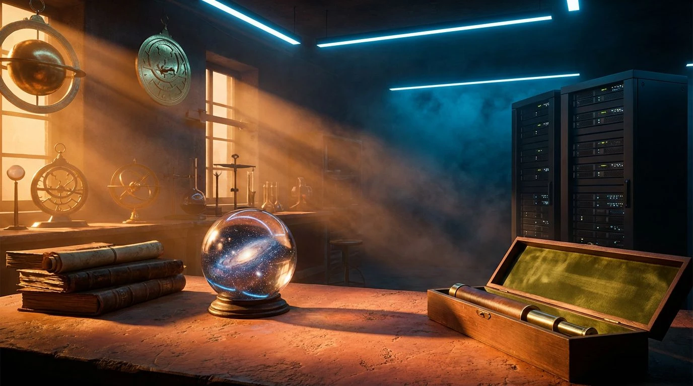
4 Mar 2026 · 6 min readThere is a strange overlap between the ancient star-gazer and the modern data analyst. Both stare into the void looking for patterns, hoping the chaos will arrange itself into a prediction. When we design for this intersection—let us call it 'ancient data science'—we walk a tightrope between the warmth of amber candlelight and the cold precision of charcoal server racks. It is not about slapping a zodiac wheel on a spreadsheet; it is about acknowledging that looking up at the night sky feels remarkably similar to staring at a vast, unstructured dataset. The colors we choose for such a dashboard must carry the weight of centuries without smelling of dust. They need to function with the sharpness of a query language while retaining the hum of something slightly unknowable. This is where divinity meets functionality, in a visual language that respects both the heavy leather-bound tome and the high-resolution screen.
Celestial Ledger 📜
Consider the distinct weight of this selection. It does not shy away from the theatrical. You have Tyrian Plum and Void Violet doing the heavy lifting, creating a background that feels dense, almost velvety, like the sky just after sunset when it is too dark to see the clouds but too bright for the deep stars. Against this, Antique Gold and Parchment do not merely sit; they strike out, demanding attention for critical metrics. It recalls the illuminated manuscripts where gold leaf was applied not for decoration, but to signify importance. In a tool meant for serious calculation, this scheme prevents the experience from feeling sterile. It suggests that the numbers being crunched have a lineage. The shock of Crimson Ink acts as an alert, a breach in the calm, ensuring that however deep a user sinks into the mysticism of the interface, errors or outliers remain visible, sharp, and impossible to ignore.
Kepler’s Desk 🔭
Here we find something decidedly more grounded, smelling faintly of graphite and library stacks. The interplay between Stone Grey and Midnight Ink suggests the serious business of drafting, of chart-making before computers smoothed out the edges. It is functional in a way that recalls the industrial design of the mid-twentieth century—reliable, sturdy, and unconcerned with trends. Yet, the inclusion of Sun Chart and Burnished Brass adds a necessary warmth, a reminder that the subject matter deals with burning celestial bodies. Lapis Lazuli and Faded Denim offer a reliable structure, a colour-coding system for data visualization that prizes readability over flash. It is a palette for the harsh light of day, for the astrologer who treats their craft less like a séance and more like architecture. The sudden appearance of Signal Red cuts through the dust, offering a user interface warning system that feels utilitarian rather than alarmist.
Orbital Mechanics 🪐
This combination refuses to sit quietly in the background. It takes the typical expectation of 'professional navy' and muddies the water with Terracotta and Olive Grove. The result is surprisingly robust. It feels like the control panel of a 1970s spacecraft—analogue, tactile, and built to survive a crash. Solar Flare provides the necessary highlight, an amber phosphor glow against the darker, murkier tones. For an EdTech platform, this approach signals that learning is work, that it involves getting one's hands dirty in the data. Deep Ocean provides the anchor, keeping the text legible, but the overall impression is one of movement. It avoids the clinical sterility often found in modern analytics in favor of something more organic. It says that while the data might be digital, the human element—the observer—remains biologically flawed and vital to the interpretation.
Silicon Oracle 💾
If the previous choices looked to the past, this one stares excessively into a fibre-optic future. The contrast between Deep Space and Laser Cyan is high-speed, low-drag, perfectly suited for real-time analytics where information changes by the millisecond. It captures the aesthetic of the glowing screen in a dark room, the modern equivalent of the cave wall. Amber Warning and Pale Gold bridge the gap between the cautionary yellow of traffic signals and the gilded edges of tarot cards. It is sharp, perhaps a little aggressive, suited for environments where speed is the primary currency. Slate Interface and Steel Fog modulate the intensity, providing safe harbours for the eye to rest. This is data science stripped of romance, presented as pure electricity, yet the persistent amber tones prevent it from feeling entirely like a stock market ticker. It maintains a specific mystery, suggesting that the algorithm knows something you do not.
Frost & Firmament 🧊
We abandon the warmth of the earth entirely here for the detached perspective of the stratosphere. This is the view from a satellite, cold and omniscient. Deep Taiga and Mariana Blue create a gradient of depth that implies vast reserves of information, an ocean of data waiting to be queried. The use of Hyperlink Blue is a nod to the utilitarian nature of the web, keeping the interface familiar and navigable. However, the inclusion of Periwinkle Mist introduces a slight distortion, a milky haze that prevents the layout from becoming purely corporate. It is sophisticated in its restraint. There is no shouting here, no red alarms or golden promises. It suits a platform dedicated to the serious, dispassionate study of celestial positioning. It suggests that the answers are not given freely but must be extracted from the ice. It is professional, yes, but in the way a glacier is 'professional'—unyielding and inevitable.
Ultimately, the decision to paint a data tool in the shades of amber, charcoal, and deep waters changes the user's relationship with the truth on the screen. We are long past the era where 'professional' meant only monochromatic greys and flat blues. By bringing in the pigments of old maps and night skies, we invite the user to engage with complexity rather than just efficiency. These palettes suggest that while the math may be absolute, the interpretation is human. Whether through the retro-warmth of muffled golds or the precise chill of electric teals, the visual language acknowledges that we are dealing with forces—be they market trends or planetary alignments—that are larger than ourselves. It allows technology to feel less like a machine and more like an instrument, one that requires skill, intuition, and perhaps a little bit of reverence to play correctly.