'%3e%3cpath%20fill-rule='evenodd'%20clip-rule='evenodd'%20d='M51.1303%2019.2492C50.7278%2019.913%2050.1346%2020.4426%2049.3508%2020.838C48.5669%2021.2335%2047.6172%2021.4312%2046.5014%2021.4312C44.8208%2021.4312%2043.4367%2021.0216%2042.3492%2020.2025C41.2617%2019.3833%2040.6686%2018.2394%2040.5697%2016.7706H44.4253C44.4818%2017.3355%2044.6831%2017.7804%2045.0291%2018.1052C45.3751%2018.43%2045.8164%2018.5924%2046.3531%2018.5924C46.8192%2018.5924%2047.1864%2018.4653%2047.4547%2018.2111C47.7231%2017.9569%2047.8572%2017.618%2047.8572%2017.1943C47.8572%2016.8129%2047.7337%2016.4952%2047.4865%2016.241C47.2393%2015.9867%2046.9322%2015.7784%2046.565%2015.616C46.1978%2015.4536%2045.6893%2015.2594%2045.0397%2015.0334C44.0934%2014.7086%2043.3202%2014.3944%2042.72%2014.0907C42.1197%2013.7871%2041.6042%2013.3351%2041.1735%2012.7349C40.7427%2012.1347%2040.5273%2011.3544%2040.5273%2010.394C40.5273%209.50418%2040.7533%208.73448%2041.2053%208.08481C41.6572%207.43515%2042.2821%206.93731%2043.0801%206.5913C43.8781%206.24528%2044.7925%206.07227%2045.8235%206.07227C47.49%206.07227%2048.8141%206.46771%2049.7956%207.25861C50.7772%208.04951%2051.3315%209.13698%2051.4586%2010.5211H47.5395C47.4689%2010.0268%2047.2888%209.63483%2046.9993%209.3453C46.7097%209.05578%2046.3178%208.91102%2045.8235%208.91102C45.3998%208.91102%2045.0573%209.024%2044.7961%209.24997C44.5348%209.47594%2044.4041%209.80783%2044.4041%2010.2457C44.4041%2010.5988%2044.5207%2010.8989%2044.7537%2011.146C44.9867%2011.3932%2045.2798%2011.5944%2045.6328%2011.7498C45.9859%2011.9052%2046.4944%2012.1029%2047.1581%2012.343C48.1185%2012.6678%2048.9023%2012.9891%2049.5096%2013.3069C50.1169%2013.6246%2050.6395%2014.0872%2051.0773%2014.6945C51.5151%2015.3018%2051.734%2016.0927%2051.734%2017.0672C51.734%2017.8581%2051.5328%2018.5854%2051.1303%2019.2492ZM59.0242%206.3053V21.2829H55.4016V6.3053H59.0242ZM73.9409%206.3053V9.18642H69.8734V21.2829H66.2296V9.18642H62.2046V6.3053H73.9409ZM80.7438%209.18642V12.3218H85.8069V15.0546H80.7438V18.3806H86.4425V21.2829H77.1212V6.3053H86.4425V9.18642H80.7438ZM99.667%2016.0291V21.2829H96.0444V6.3053H101.913C103.692%206.3053%20105.048%206.74665%20105.98%207.62934C106.912%208.51204%20107.378%209.7019%20107.378%2011.199C107.378%2012.1311%20107.17%2012.9609%20106.753%2013.6882C106.337%2014.4155%20105.719%2014.9875%20104.9%2015.4042C104.08%2015.8208%20103.085%2016.0291%20101.913%2016.0291H99.667ZM103.692%2011.199C103.692%209.8855%20102.965%209.22879%20101.51%209.22879H99.667V13.1268H101.51C102.965%2013.1268%20103.692%2012.4842%20103.692%2011.199ZM120.092%2018.5501H114.478L113.546%2021.2829H109.732L115.219%206.41123H119.393L124.879%2021.2829H121.024L120.092%2018.5501ZM119.16%2015.7961L117.295%2010.2881L115.41%2015.7961H119.16ZM131.555%2018.5077H136.385V21.2829H127.933V6.3053H131.555V18.5077ZM143.337%209.18642V12.3218H148.4V15.0546H143.337V18.3806H149.035V21.2829H139.714V6.3053H149.035V9.18642H143.337ZM163.507%206.3053V9.18642H159.44V21.2829H155.796V9.18642H151.771V6.3053H163.507ZM177.449%206.3053V9.18642H173.382V21.2829H169.738V9.18642H165.713V6.3053H177.449ZM184.252%209.18642V12.3218H189.315V15.0546H184.252V18.3806H189.951V21.2829H180.629V6.3053H189.951V9.18642H184.252Z'%20fill='%23EEF0ED'/%3e%3cmask%20id='mask0_3101_7327'%20style='mask-type:alpha'%20maskUnits='userSpaceOnUse'%20x='0'%20y='0'%20width='27'%20height='28'%3e%3cpath%20d='M23.8328%200.759766H2.64808C1.18559%200.759766%200%201.94535%200%203.40785V24.5925C0%2026.055%201.18559%2027.2406%202.64808%2027.2406H23.8328C25.2952%2027.2406%2026.4808%2026.055%2026.4808%2024.5925V3.40785C26.4808%201.94535%2025.2952%200.759766%2023.8328%200.759766Z'%20fill='white'/%3e%3c/mask%3e%3cg%20mask='url(%23mask0_3101_7327)'%3e%3cpath%20d='M23.8328%200.759766H2.64808C1.18559%200.759766%200%201.94535%200%203.40785V24.5925C0%2026.055%201.18559%2027.2406%202.64808%2027.2406H23.8328C25.2952%2027.2406%2026.4808%2026.055%2026.4808%2024.5925V3.40785C26.4808%201.94535%2025.2952%200.759766%2023.8328%200.759766Z'%20fill='%23D8D8D8'/%3e%3cpath%20d='M13.2404%200.759766H0V14.0001H13.2404V0.759766Z'%20fill='%238C61FF'/%3e%3cpath%20d='M13.2404%2014H0V27.2404H13.2404V14Z'%20fill='%2336C3FE'/%3e%3cpath%20d='M26.4806%2014H13.2402V27.2404H26.4806V14Z'%20fill='%236592FE'/%3e%3cpath%20d='M26.4806%200.759766H13.2402V14.0002H26.4806V0.759766Z'%20fill='%236059F7'/%3e%3c/g%3e%3c/g%3e%3cdefs%3e%3cclipPath%20id='clip0_3101_7327'%3e%3crect%20width='190'%20height='28'%20fill='white'/%3e%3c/clipPath%3e%3c/defs%3e%3c/svg%3e)
'%3e%3cpath%20d='M23.8328%200.759521H2.64808C1.18559%200.759521%200%201.94511%200%203.40761V24.5923C0%2026.0548%201.18559%2027.2404%202.64808%2027.2404H23.8328C25.2952%2027.2404%2026.4808%2026.0548%2026.4808%2024.5923V3.40761C26.4808%201.94511%2025.2952%200.759521%2023.8328%200.759521Z'%20fill='%23D8D8D8'/%3e%3cpath%20d='M13.2404%200.759521H0V13.9999H13.2404V0.759521Z'%20fill='%238C61FF'/%3e%3cpath%20d='M13.2404%2013.9998H0V27.2402H13.2404V13.9998Z'%20fill='%2336C3FE'/%3e%3cpath%20d='M26.4809%2013.9998H13.2405V27.2402H26.4809V13.9998Z'%20fill='%236592FE'/%3e%3cpath%20d='M26.4809%200.759277H13.2405V13.9997H26.4809V0.759277Z'%20fill='%236059F7'/%3e%3c/g%3e%3c/svg%3e)
Modern Color Palettes: Graffiti Meets Minimalist Design
3 Mar 2026 · 5 min readThere is a particular, delicious irony in the collision of spray paint and sparkling wine. We often cordon off our aesthetic experiences into neat boxes: the hushed reverence of the gallery and the chaotic scrawl of the underpass. Yet, the concept of The Anarchist’s Ballroom challenges this segregation, dragging the raw, chemically pungent energy of street art into the curated silence of high-society minimalism. It is not merely about contrast, though the visual shock of neon against noir shadow is undeniable. Rather, this is an exploration of prestige hijacked by expression. We see the influence of anime realism—that hyper-specific attention to light hitting a wet surface—clashing with the flat, commodified planes of pop art. This is where the rebellious impulse of graffiti meets the tailored restraint of a tuxedo, creating a visual language that feels dangerous, expensive, and curiously inevitable in our modern landscape.
Concrete Jungle Etiquette 🏗️
This arrangement feels like looking at a sunset through the scaffolding of a half-finished luxury high-rise. The foundation is undeniably brutalist, built upon the heavy, unforgiving weight of Asphalt Void and Sidewalk Ash. These greys do not apologize; they simply exist as the canvas. Against this monochrome backdrop, Safety Hazard Orange and Burnt Terracotta arrive with the sudden violence of a warning sign or a fresh tag on an old wall. It establishes a mood of sophisticated decay, where the Faded Gilt suggests wealth that has grown tired of itself. The Oxidized Copper adds a layer of chemical weathering, perfect for an environment that wants to feel lived-in yet fiercely modern. Use this where you need the atmosphere to feel grounded in urban reality but elevated by a decisive, almost aggressive use of accent tones.
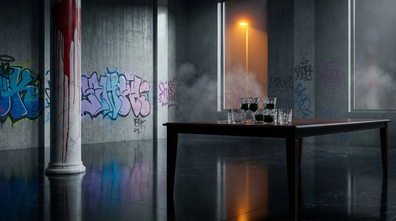
Tuxedo Vandalism 🤵
There is a terrifying cleanliness here, reminiscent of a pristine art gallery waiting for someone to spill a drink. Gallery White and Midnight Ink provide the high-contrast skeleton of the look, strictly adhering to the rules of black-tie minimalism. However, the narrative shifts with the introduction of Spiced Salmon and Champagne Tint. These warmer tones break the sterility, introducing a human, fleshy element that feels almost voyeuristic against the cold greyscale. It captures the tension of anime realism, where stark lines meet soft, organic lighting. This selection suits spaces that demand absolute rigor in design but secretly crave the imperfection of a warm body or a smudged fingerprint. It is cold, prestigious, and interrupted by a quiet, warm anarchy.
Subversive Deco 🍸
This is where the requested terracotta and teal narrative finds its most articulate expression, heavily influenced by a retro-future nostalgia. The interaction between Revolutionary Red and Deep Harbor creates a magnetic push-and-pull, evoking the feeling of a 1920s speakeasy reclaimed by 1980s street artists. Travertine Floor and Old Brass anchor the prestige element, reminding us of the architecture beneath the paint. Glacial Glass offers a highlight that mimics the reflection of city lights on rain-slicked pavement. It is a scheme for environments that want to project history and heritage, only to deface it with modern, confident saturation. The mood is intellectual but restless, like a philosopher holding a spray can.
Neon Noir Aristocracy 🚅
We move now into the realm of synthetic dreams and electric nightmares. This collection abandons natural light entirely in favor of the artificial glow of Anime Realism. Obsidian Floor dominates the shadows, allowing the aggressive brightness of High-Alert Red and Bubblegum Pop to sear the retina. It draws heavily from the pop art movement, where color is a commodity and a weapon. The inclusion of Hyperlink Blue provides a cold, technological counterpoint to the warmth of Sodium Streetlight. This is not a palette for relaxation; it is for stimulation. It fits a setting that seeks to mimic the sensory overload of Tokyo at midnight, filtered through the detached lens of high fashion. It is chaotic, yes, but curated with surgical precision.
Spray Can Sovereignty 👑
This final grouping captures the textural quality of layers—paint over brick, poster over paint, moss over poster. Royal Blue Ink commands attention, possessing a regality that justifies the 'High-Society' label, yet it is undercut by the prickly, sour presence of Acid Rain. It creates a visual dissonance that keeps the eye moving. Brick Dust and Aluminum Dull ground the experience in the physical city, preventing the brighter hues from floating away into pure abstraction. Abyssal Teal adds depth, a hidden corner in a brightly lit room. The mood here is one of creative destruction. It suits spaces that aim to feel established yet temporary, as if the art on the walls might change overnight. It represents the triumph of street-level aesthetics over the rigid permanence of traditional luxury.
The visual journey through these schemes suggests that luxury and vandalism are closer cousins than polite society might admit. Both require a certain arrogance, a claim over space and attention. By dragging the saturation of anime lighting and the irreverence of pop art into the realm of elite minimalism, we find a new kind of noir. It is not the noir of shadows alone, but of blinding highlights and deliberate discord. The Anarchist’s Ballroom does not ask for permission to exist; it simply tags the walls of the establishment with colors that refuse to be ignored. These palettes offer a blueprint for spaces that are as comfortable with a champagne flute as they are with a marker pen, proving that sophistication has largely become a matter of how well one manages chaos.