'%3e%3cpath%20fill-rule='evenodd'%20clip-rule='evenodd'%20d='M51.1303%2019.2492C50.7278%2019.913%2050.1346%2020.4426%2049.3508%2020.838C48.5669%2021.2335%2047.6172%2021.4312%2046.5014%2021.4312C44.8208%2021.4312%2043.4367%2021.0216%2042.3492%2020.2025C41.2617%2019.3833%2040.6686%2018.2394%2040.5697%2016.7706H44.4253C44.4818%2017.3355%2044.6831%2017.7804%2045.0291%2018.1052C45.3751%2018.43%2045.8164%2018.5924%2046.3531%2018.5924C46.8192%2018.5924%2047.1864%2018.4653%2047.4547%2018.2111C47.7231%2017.9569%2047.8572%2017.618%2047.8572%2017.1943C47.8572%2016.8129%2047.7337%2016.4952%2047.4865%2016.241C47.2393%2015.9867%2046.9322%2015.7784%2046.565%2015.616C46.1978%2015.4536%2045.6893%2015.2594%2045.0397%2015.0334C44.0934%2014.7086%2043.3202%2014.3944%2042.72%2014.0907C42.1197%2013.7871%2041.6042%2013.3351%2041.1735%2012.7349C40.7427%2012.1347%2040.5273%2011.3544%2040.5273%2010.394C40.5273%209.50418%2040.7533%208.73448%2041.2053%208.08481C41.6572%207.43515%2042.2821%206.93731%2043.0801%206.5913C43.8781%206.24528%2044.7925%206.07227%2045.8235%206.07227C47.49%206.07227%2048.8141%206.46771%2049.7956%207.25861C50.7772%208.04951%2051.3315%209.13698%2051.4586%2010.5211H47.5395C47.4689%2010.0268%2047.2888%209.63483%2046.9993%209.3453C46.7097%209.05578%2046.3178%208.91102%2045.8235%208.91102C45.3998%208.91102%2045.0573%209.024%2044.7961%209.24997C44.5348%209.47594%2044.4041%209.80783%2044.4041%2010.2457C44.4041%2010.5988%2044.5207%2010.8989%2044.7537%2011.146C44.9867%2011.3932%2045.2798%2011.5944%2045.6328%2011.7498C45.9859%2011.9052%2046.4944%2012.1029%2047.1581%2012.343C48.1185%2012.6678%2048.9023%2012.9891%2049.5096%2013.3069C50.1169%2013.6246%2050.6395%2014.0872%2051.0773%2014.6945C51.5151%2015.3018%2051.734%2016.0927%2051.734%2017.0672C51.734%2017.8581%2051.5328%2018.5854%2051.1303%2019.2492ZM59.0242%206.3053V21.2829H55.4016V6.3053H59.0242ZM73.9409%206.3053V9.18642H69.8734V21.2829H66.2296V9.18642H62.2046V6.3053H73.9409ZM80.7438%209.18642V12.3218H85.8069V15.0546H80.7438V18.3806H86.4425V21.2829H77.1212V6.3053H86.4425V9.18642H80.7438ZM99.667%2016.0291V21.2829H96.0444V6.3053H101.913C103.692%206.3053%20105.048%206.74665%20105.98%207.62934C106.912%208.51204%20107.378%209.7019%20107.378%2011.199C107.378%2012.1311%20107.17%2012.9609%20106.753%2013.6882C106.337%2014.4155%20105.719%2014.9875%20104.9%2015.4042C104.08%2015.8208%20103.085%2016.0291%20101.913%2016.0291H99.667ZM103.692%2011.199C103.692%209.8855%20102.965%209.22879%20101.51%209.22879H99.667V13.1268H101.51C102.965%2013.1268%20103.692%2012.4842%20103.692%2011.199ZM120.092%2018.5501H114.478L113.546%2021.2829H109.732L115.219%206.41123H119.393L124.879%2021.2829H121.024L120.092%2018.5501ZM119.16%2015.7961L117.295%2010.2881L115.41%2015.7961H119.16ZM131.555%2018.5077H136.385V21.2829H127.933V6.3053H131.555V18.5077ZM143.337%209.18642V12.3218H148.4V15.0546H143.337V18.3806H149.035V21.2829H139.714V6.3053H149.035V9.18642H143.337ZM163.507%206.3053V9.18642H159.44V21.2829H155.796V9.18642H151.771V6.3053H163.507ZM177.449%206.3053V9.18642H173.382V21.2829H169.738V9.18642H165.713V6.3053H177.449ZM184.252%209.18642V12.3218H189.315V15.0546H184.252V18.3806H189.951V21.2829H180.629V6.3053H189.951V9.18642H184.252Z'%20fill='%23EEF0ED'/%3e%3cmask%20id='mask0_3101_7327'%20style='mask-type:alpha'%20maskUnits='userSpaceOnUse'%20x='0'%20y='0'%20width='27'%20height='28'%3e%3cpath%20d='M23.8328%200.759766H2.64808C1.18559%200.759766%200%201.94535%200%203.40785V24.5925C0%2026.055%201.18559%2027.2406%202.64808%2027.2406H23.8328C25.2952%2027.2406%2026.4808%2026.055%2026.4808%2024.5925V3.40785C26.4808%201.94535%2025.2952%200.759766%2023.8328%200.759766Z'%20fill='white'/%3e%3c/mask%3e%3cg%20mask='url(%23mask0_3101_7327)'%3e%3cpath%20d='M23.8328%200.759766H2.64808C1.18559%200.759766%200%201.94535%200%203.40785V24.5925C0%2026.055%201.18559%2027.2406%202.64808%2027.2406H23.8328C25.2952%2027.2406%2026.4808%2026.055%2026.4808%2024.5925V3.40785C26.4808%201.94535%2025.2952%200.759766%2023.8328%200.759766Z'%20fill='%23D8D8D8'/%3e%3cpath%20d='M13.2404%200.759766H0V14.0001H13.2404V0.759766Z'%20fill='%238C61FF'/%3e%3cpath%20d='M13.2404%2014H0V27.2404H13.2404V14Z'%20fill='%2336C3FE'/%3e%3cpath%20d='M26.4806%2014H13.2402V27.2404H26.4806V14Z'%20fill='%236592FE'/%3e%3cpath%20d='M26.4806%200.759766H13.2402V14.0002H26.4806V0.759766Z'%20fill='%236059F7'/%3e%3c/g%3e%3c/g%3e%3cdefs%3e%3cclipPath%20id='clip0_3101_7327'%3e%3crect%20width='190'%20height='28'%20fill='white'/%3e%3c/clipPath%3e%3c/defs%3e%3c/svg%3e)
'%3e%3cpath%20d='M23.8328%200.759521H2.64808C1.18559%200.759521%200%201.94511%200%203.40761V24.5923C0%2026.0548%201.18559%2027.2404%202.64808%2027.2404H23.8328C25.2952%2027.2404%2026.4808%2026.0548%2026.4808%2024.5923V3.40761C26.4808%201.94511%2025.2952%200.759521%2023.8328%200.759521Z'%20fill='%23D8D8D8'/%3e%3cpath%20d='M13.2404%200.759521H0V13.9999H13.2404V0.759521Z'%20fill='%238C61FF'/%3e%3cpath%20d='M13.2404%2013.9998H0V27.2402H13.2404V13.9998Z'%20fill='%2336C3FE'/%3e%3cpath%20d='M26.4809%2013.9998H13.2405V27.2402H26.4809V13.9998Z'%20fill='%236592FE'/%3e%3cpath%20d='M26.4809%200.759277H13.2405V13.9997H26.4809V0.759277Z'%20fill='%236059F7'/%3e%3c/g%3e%3c/svg%3e)
Brutalist Color Palettes: Raw Concrete Meets Soft Pastels
2 Mar 2026 · 5 min readVisual perception often relies on expectation, yet the most arresting images frequently defy prediction. When we observe the stark, imposing weight of brutalist concrete placed alongside the delicate, ephemeral nature of French pastry, the brain registers a fascinating sensory conflict. This is not merely an aesthetic choice but a study in physical incongruity. The heavy, light-absorbing qualities of slate and aggregate provide a neutral, grounding anchor, allowing high-luminance tones like custard yellow or fondant pink to register with greater intensity. In the realm of artisanal food branding, this friction emphasizes the handmade nature of the product; the industrial backdrop serves to highlight the fragility and precision of the culinary art, creating a visual dialogue between the permanent and the edible. By stripping away ornamental noise in favor of raw architectural elements, the colors of the food itself become the primary actors on a minimalist stage.
Structural Glaze 🏗️
This array functions on the principle of isolation. The dominance of monochromatic, achromatic tones mimics the sensory experience of a raw construction site, where visual noise is minimized to reveal form. Within this stripped-back environment, the inclusion of Mechanic's Blue and Fig Compote acts as a sharp, attentional hook. In perceptual psychology, this is akin to the isolation effect, where an item that differs from its context is more likely to be remembered. For a patisserie brand, this suggests a space where the architecture retreats, forcing the eye to settle on specific, purposeful bursts of color that denote flavor or packaging. The starkness of the greys suggests sterility and precision, qualities highly valued in Modernist cooking, while the muted organic pink and electric blue offer a reprieve, suggesting that within this rigid structure, there is room for unexpected, intense flavor profiles.
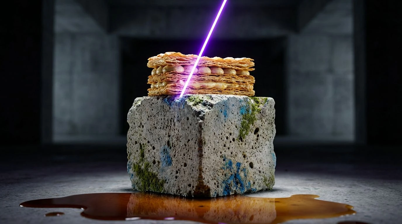
Thermal Aggregate 🧱
Here, the visual temperature shifts dramatically. While the grey anchor of Limestone remains to provide that necessary industrial link, the accompanying warm hues mimic the transformation of matter through heat. The brain interprets the spectrum from Meringue Cloud to Yolk and Oxidized Copper as indicators of caramelization and chemical change—the Maillard reaction translated into pigment. It bridges the gap between the cold, touchable texture of concrete countertops and the warmth of a convection oven. By balancing the cool neutrality of the grey against the high-energy wavelengths of orange and red, the palette creates a biological signal of sustenance. It implies a bakery where the environment might be austere, but the product is fundamentally comforting, utilizing color constancy to promise warmth even in a cold setting. This generates a feeling of shelter and production.
Cocoa Monolith 🗿
Light absorption defines this collection. The heavy presence of Roasted Bean and Void creates a low-key lighting effect, often associated with luxury and exclusivity in retail psychology. Unlike the bright, airy expectations of a traditional bakery, this arrangement leans into the mystery of dark matter. The introduction of Patina Green and Electric Dye provides a bioluminescent quality, similar to how rare minerals appear against dark rock. This combination challenges the viewer’s circadian expectations of food environments, suggesting an evening or sophisticated lounge atmosphere rather than a morning café. Ideally suited for high-end chocolate work or molecular gastronomy, the contrast here is not about lightness, but about depth—creating a sensation where the sweetness feels like a discovered treasure within a dark, cavernous interior.
Bauhaus Bakery ��
This grouping is a lesson in simultaneous contrast. The juxtaposition of neutral architectural greys with primary and secondary high-chroma hues like Acid Lemon and Cyan Sky creates a vibrating boundary effect. The eye struggles to focus on the edge where the grey meets the bright neon, resulting in a visual buzz that feels energetic and engineered. It references the bold functionalism of mid-century design, where color was used to denote function. In the context of a bakery, the neutral tones represent the unchanging physical space—the floors, the walls, the counters—while the vivid pops of color represent the rotating, ephemeral menu. It signals a brand that treats baking as a form of graphic design, where the visual excitement of the pastry is as engineered as the building that houses it.
Slab & Sourdough 🥖
Absence of chromatic noise characterizes this final selection. It relies entirely on the interplay of value and natural pigment sources. The spectrum moves from the stark brightness of Chef's Jacket to the absolute absorption of Midnight, with the intermediate tones of Terracotta Pot and Rye Crust providing an organic bridge. This mirrors the raw materials of both construction and baking: clay, grain, and metal. The psychological impact here is one of honesty and transparency. Without the distraction of artificial dyes or high-saturation pastels, the viewer focuses on texture and materiality. It suggests a philosophy where the product speaks for itself, unadorned. This creates an atmosphere of grounded realism, appealing to a consumer desire to return to basics, where the sophistication lies not in ornamentation, but in the elemental quality of the ingredients and the environment.
The intersection of brutalism and confectionery demonstrates that visual appeal is rarely about simple harmonies, but rather about managing tension. Whether through the stark isolation of neon against grey or the thermal balance of warm clays and cold steels, these selections prove that environment alters our perception of taste. By framing the delicate, sucrose-laden art of pastry within the unforgiving context of concrete and steel, we heighten the sensory value of the food. The cold architecture does not dampen the sweetness; instead, it acts as a sensory deprivation chamber that allows the observer to focus entirely on the singular pleasure of the edible. In navigating these combinations, we see that the most memorable branding experiences are those that dare to place the ephemeral next to the eternal, proving that roughness is often the most effective frame for refinement.