'%3e%3cpath%20fill-rule='evenodd'%20clip-rule='evenodd'%20d='M51.1303%2019.2492C50.7278%2019.913%2050.1346%2020.4426%2049.3508%2020.838C48.5669%2021.2335%2047.6172%2021.4312%2046.5014%2021.4312C44.8208%2021.4312%2043.4367%2021.0216%2042.3492%2020.2025C41.2617%2019.3833%2040.6686%2018.2394%2040.5697%2016.7706H44.4253C44.4818%2017.3355%2044.6831%2017.7804%2045.0291%2018.1052C45.3751%2018.43%2045.8164%2018.5924%2046.3531%2018.5924C46.8192%2018.5924%2047.1864%2018.4653%2047.4547%2018.2111C47.7231%2017.9569%2047.8572%2017.618%2047.8572%2017.1943C47.8572%2016.8129%2047.7337%2016.4952%2047.4865%2016.241C47.2393%2015.9867%2046.9322%2015.7784%2046.565%2015.616C46.1978%2015.4536%2045.6893%2015.2594%2045.0397%2015.0334C44.0934%2014.7086%2043.3202%2014.3944%2042.72%2014.0907C42.1197%2013.7871%2041.6042%2013.3351%2041.1735%2012.7349C40.7427%2012.1347%2040.5273%2011.3544%2040.5273%2010.394C40.5273%209.50418%2040.7533%208.73448%2041.2053%208.08481C41.6572%207.43515%2042.2821%206.93731%2043.0801%206.5913C43.8781%206.24528%2044.7925%206.07227%2045.8235%206.07227C47.49%206.07227%2048.8141%206.46771%2049.7956%207.25861C50.7772%208.04951%2051.3315%209.13698%2051.4586%2010.5211H47.5395C47.4689%2010.0268%2047.2888%209.63483%2046.9993%209.3453C46.7097%209.05578%2046.3178%208.91102%2045.8235%208.91102C45.3998%208.91102%2045.0573%209.024%2044.7961%209.24997C44.5348%209.47594%2044.4041%209.80783%2044.4041%2010.2457C44.4041%2010.5988%2044.5207%2010.8989%2044.7537%2011.146C44.9867%2011.3932%2045.2798%2011.5944%2045.6328%2011.7498C45.9859%2011.9052%2046.4944%2012.1029%2047.1581%2012.343C48.1185%2012.6678%2048.9023%2012.9891%2049.5096%2013.3069C50.1169%2013.6246%2050.6395%2014.0872%2051.0773%2014.6945C51.5151%2015.3018%2051.734%2016.0927%2051.734%2017.0672C51.734%2017.8581%2051.5328%2018.5854%2051.1303%2019.2492ZM59.0242%206.3053V21.2829H55.4016V6.3053H59.0242ZM73.9409%206.3053V9.18642H69.8734V21.2829H66.2296V9.18642H62.2046V6.3053H73.9409ZM80.7438%209.18642V12.3218H85.8069V15.0546H80.7438V18.3806H86.4425V21.2829H77.1212V6.3053H86.4425V9.18642H80.7438ZM99.667%2016.0291V21.2829H96.0444V6.3053H101.913C103.692%206.3053%20105.048%206.74665%20105.98%207.62934C106.912%208.51204%20107.378%209.7019%20107.378%2011.199C107.378%2012.1311%20107.17%2012.9609%20106.753%2013.6882C106.337%2014.4155%20105.719%2014.9875%20104.9%2015.4042C104.08%2015.8208%20103.085%2016.0291%20101.913%2016.0291H99.667ZM103.692%2011.199C103.692%209.8855%20102.965%209.22879%20101.51%209.22879H99.667V13.1268H101.51C102.965%2013.1268%20103.692%2012.4842%20103.692%2011.199ZM120.092%2018.5501H114.478L113.546%2021.2829H109.732L115.219%206.41123H119.393L124.879%2021.2829H121.024L120.092%2018.5501ZM119.16%2015.7961L117.295%2010.2881L115.41%2015.7961H119.16ZM131.555%2018.5077H136.385V21.2829H127.933V6.3053H131.555V18.5077ZM143.337%209.18642V12.3218H148.4V15.0546H143.337V18.3806H149.035V21.2829H139.714V6.3053H149.035V9.18642H143.337ZM163.507%206.3053V9.18642H159.44V21.2829H155.796V9.18642H151.771V6.3053H163.507ZM177.449%206.3053V9.18642H173.382V21.2829H169.738V9.18642H165.713V6.3053H177.449ZM184.252%209.18642V12.3218H189.315V15.0546H184.252V18.3806H189.951V21.2829H180.629V6.3053H189.951V9.18642H184.252Z'%20fill='%23EEF0ED'/%3e%3cmask%20id='mask0_3101_7327'%20style='mask-type:alpha'%20maskUnits='userSpaceOnUse'%20x='0'%20y='0'%20width='27'%20height='28'%3e%3cpath%20d='M23.8328%200.759766H2.64808C1.18559%200.759766%200%201.94535%200%203.40785V24.5925C0%2026.055%201.18559%2027.2406%202.64808%2027.2406H23.8328C25.2952%2027.2406%2026.4808%2026.055%2026.4808%2024.5925V3.40785C26.4808%201.94535%2025.2952%200.759766%2023.8328%200.759766Z'%20fill='white'/%3e%3c/mask%3e%3cg%20mask='url(%23mask0_3101_7327)'%3e%3cpath%20d='M23.8328%200.759766H2.64808C1.18559%200.759766%200%201.94535%200%203.40785V24.5925C0%2026.055%201.18559%2027.2406%202.64808%2027.2406H23.8328C25.2952%2027.2406%2026.4808%2026.055%2026.4808%2024.5925V3.40785C26.4808%201.94535%2025.2952%200.759766%2023.8328%200.759766Z'%20fill='%23D8D8D8'/%3e%3cpath%20d='M13.2404%200.759766H0V14.0001H13.2404V0.759766Z'%20fill='%238C61FF'/%3e%3cpath%20d='M13.2404%2014H0V27.2404H13.2404V14Z'%20fill='%2336C3FE'/%3e%3cpath%20d='M26.4806%2014H13.2402V27.2404H26.4806V14Z'%20fill='%236592FE'/%3e%3cpath%20d='M26.4806%200.759766H13.2402V14.0002H26.4806V0.759766Z'%20fill='%236059F7'/%3e%3c/g%3e%3c/g%3e%3cdefs%3e%3cclipPath%20id='clip0_3101_7327'%3e%3crect%20width='190'%20height='28'%20fill='white'/%3e%3c/clipPath%3e%3c/defs%3e%3c/svg%3e)
'%3e%3cpath%20d='M23.8328%200.759521H2.64808C1.18559%200.759521%200%201.94511%200%203.40761V24.5923C0%2026.0548%201.18559%2027.2404%202.64808%2027.2404H23.8328C25.2952%2027.2404%2026.4808%2026.0548%2026.4808%2024.5923V3.40761C26.4808%201.94511%2025.2952%200.759521%2023.8328%200.759521Z'%20fill='%23D8D8D8'/%3e%3cpath%20d='M13.2404%200.759521H0V13.9999H13.2404V0.759521Z'%20fill='%238C61FF'/%3e%3cpath%20d='M13.2404%2013.9998H0V27.2402H13.2404V13.9998Z'%20fill='%2336C3FE'/%3e%3cpath%20d='M26.4809%2013.9998H13.2405V27.2402H26.4809V13.9998Z'%20fill='%236592FE'/%3e%3cpath%20d='M26.4809%200.759277H13.2405V13.9997H26.4809V0.759277Z'%20fill='%236059F7'/%3e%3c/g%3e%3c/svg%3e)
Gilded Glitch: 80s Digital and Renaissance Color Palettes
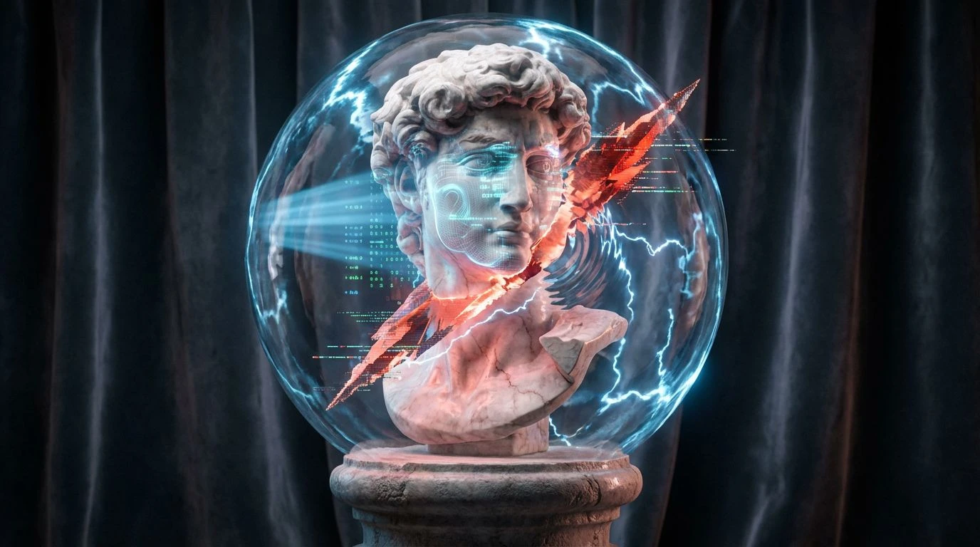
2 Mar 2026 · 5 min readThis visual investigation explores the unlikely collision between the opulent weight of Renaissance portraiture and the raw, electric energy of early personal computing. We are looking at a moment where the grandiosity of the past gets corrupted by the optimism of the 80s tech boom. The aesthetic is not merely a juxtaposition; it is a rewriting of history through a CRT monitor. It speaks to a Gen Z audience that treats historical artifacts and digital noise with equal irreverence, viewing both as raw material for self-expression. By smashing together deep, oily varnishes with the high-frequency radiation of early graphical user interfaces, we create a design language that feels simultaneously prestigious and broken. It is the visual equivalent of a marble statue draped in wireframes, questioning the permanence of tradition while celebrating the beautiful errors of the digital dawn.
Velvet Interface 💾
Velvet Interface defines the baseline of this aesthetic experiment, establishing a heavy, luxurious foundation that gets abruptly interrupted. Cardinal Velvet and Antique Gilt provide the expected richness of a historic court painting, suggesting heavy drapery and golden frames. However, the introduction of Hyperlink Blue shatters the illusion of antiquity. It is a color that does not exist in nature, only on screens. This palette works exceptionally well for editorial layouts where the typography needs to cut through dense, textured imagery. The interaction between the metallic Silver Screen gray and the aggressive blue simulates the feeling of a high-definition image failing to load correctly, creating a tension between the prestige of the subject matter and the volatility of the medium displaying it.
Pixelated Aristocrat 👾
There is a distinct softness to Pixelated Aristocrat that recalls faded frescoes and dusty grand halls, represented by Faded Slate and Stone Plinth. These neutrals create a calm, almost melancholic background that makes the sudden appearance of Hot Glitch jarring and exciting. Where traditional design might opt for harmony, this grouping pushes for a deliberate agitation. The punchy magenta of Hot Glitch acts as a digital vandal mark on a classical surface. This arrangement suits brand identities that aim to appear established yet subversive, using the CRT Azure and Fresco Rose to bridge the gap between old-world romance and new-world artificiality. It suggests a narrative of decaying nobility revitalized by a sudden, electric shock of modernity.
Highness High-Res 👑
Highness High-Res abandons subtlety entirely, favoring a maximalist approach that links the power of the church and state with the aggressive saturation of arcade cabinets. Electric Bishop and Imperial Violet nod to the traditional pigments of royalty, but their proximity to Halo Gold and Error Screen Blue transforms them into something radioactive. The energy here is frantic and loud, perfect for packaging or motion graphics that demand immediate attention. It bypasses the quiet contemplation of a gallery and goes straight for the sensory overload of a video arcade. Neon Rouge vibrates against the deep indigo tones, creating a retinal afterimage that feels energetic and youthful. This is the palette of a digital monarchy, confident and unapologetically artificial.
Chiaroscuro Code 🕯️
Chiaroscuro Code retreats into the shadows, drawing heavily from the dramatic lighting techniques of Baroque masters. The overwhelming presence of Void Black and Dried Blood creates a somber, serious atmosphere, recalling the dark backgrounds of Rembrandt portraits. Canvas Clay and Olive Drab add a layer of earthy groundedness, preventing the look from becoming too slick. The disruption comes solely from 8-Bit Sun, a yellow so pure and flat it looks like a cursor blinking in a dark room. This singular point of light recontextualizes the darkness not as emptiness, but as potential. It is an ideal selection for UI design in dark mode or luxury web experiences where the user focuses on a single, illuminated interaction point amidst a sea of deep, rich historical tones.
Monarch Mainframe 🐆
Monarch Mainframe is a study in varying frequencies of blue against a rigid structure of gold and grey. The transition from the deep, authoritative Midnight Uniform to the vibrating intensity of Blue Screen of Death mirrors the startup sequence of an old computer—from the void to the flash of the interface. Bronze Bust and Scepter Gold anchor the visual in a space of physical wealth, while the blues suggest information processing. This hierarchy creates a sophisticated toolset for spatial design or interior concepts where metallic finishes clash with LED lighting. The palette manages to feel both institutional and rebellious, using the specific, hyper-saturated hue of Blue Screen of Death to signal a beautiful system failure within a wealthy, organized environment.
These color combinations suggest that prestige is no longer defined solely by perfection or lineage. Instead, we find value in the interruption, the glitch, and the bold rewriting of established codes. The shift from heavy, dramatic shadows to piercing, artificial lights captures a specific cultural restlessness—a desire to keep the gravity of the past while speeding up the frame rate. Designers utilizing these schemes serve a generation that grew up on screens but craves the tactile imperfection of the physical world. The result is a bold new canon where gold leaf and pixel art sit on the same throne, proving that when history crashes, it often leaves a beautiful wreck. The tension between the archival and the ephemeral is exactly where modern design finds its most compelling pulse.