'%3e%3cpath%20fill-rule='evenodd'%20clip-rule='evenodd'%20d='M51.1303%2019.2492C50.7278%2019.913%2050.1346%2020.4426%2049.3508%2020.838C48.5669%2021.2335%2047.6172%2021.4312%2046.5014%2021.4312C44.8208%2021.4312%2043.4367%2021.0216%2042.3492%2020.2025C41.2617%2019.3833%2040.6686%2018.2394%2040.5697%2016.7706H44.4253C44.4818%2017.3355%2044.6831%2017.7804%2045.0291%2018.1052C45.3751%2018.43%2045.8164%2018.5924%2046.3531%2018.5924C46.8192%2018.5924%2047.1864%2018.4653%2047.4547%2018.2111C47.7231%2017.9569%2047.8572%2017.618%2047.8572%2017.1943C47.8572%2016.8129%2047.7337%2016.4952%2047.4865%2016.241C47.2393%2015.9867%2046.9322%2015.7784%2046.565%2015.616C46.1978%2015.4536%2045.6893%2015.2594%2045.0397%2015.0334C44.0934%2014.7086%2043.3202%2014.3944%2042.72%2014.0907C42.1197%2013.7871%2041.6042%2013.3351%2041.1735%2012.7349C40.7427%2012.1347%2040.5273%2011.3544%2040.5273%2010.394C40.5273%209.50418%2040.7533%208.73448%2041.2053%208.08481C41.6572%207.43515%2042.2821%206.93731%2043.0801%206.5913C43.8781%206.24528%2044.7925%206.07227%2045.8235%206.07227C47.49%206.07227%2048.8141%206.46771%2049.7956%207.25861C50.7772%208.04951%2051.3315%209.13698%2051.4586%2010.5211H47.5395C47.4689%2010.0268%2047.2888%209.63483%2046.9993%209.3453C46.7097%209.05578%2046.3178%208.91102%2045.8235%208.91102C45.3998%208.91102%2045.0573%209.024%2044.7961%209.24997C44.5348%209.47594%2044.4041%209.80783%2044.4041%2010.2457C44.4041%2010.5988%2044.5207%2010.8989%2044.7537%2011.146C44.9867%2011.3932%2045.2798%2011.5944%2045.6328%2011.7498C45.9859%2011.9052%2046.4944%2012.1029%2047.1581%2012.343C48.1185%2012.6678%2048.9023%2012.9891%2049.5096%2013.3069C50.1169%2013.6246%2050.6395%2014.0872%2051.0773%2014.6945C51.5151%2015.3018%2051.734%2016.0927%2051.734%2017.0672C51.734%2017.8581%2051.5328%2018.5854%2051.1303%2019.2492ZM59.0242%206.3053V21.2829H55.4016V6.3053H59.0242ZM73.9409%206.3053V9.18642H69.8734V21.2829H66.2296V9.18642H62.2046V6.3053H73.9409ZM80.7438%209.18642V12.3218H85.8069V15.0546H80.7438V18.3806H86.4425V21.2829H77.1212V6.3053H86.4425V9.18642H80.7438ZM99.667%2016.0291V21.2829H96.0444V6.3053H101.913C103.692%206.3053%20105.048%206.74665%20105.98%207.62934C106.912%208.51204%20107.378%209.7019%20107.378%2011.199C107.378%2012.1311%20107.17%2012.9609%20106.753%2013.6882C106.337%2014.4155%20105.719%2014.9875%20104.9%2015.4042C104.08%2015.8208%20103.085%2016.0291%20101.913%2016.0291H99.667ZM103.692%2011.199C103.692%209.8855%20102.965%209.22879%20101.51%209.22879H99.667V13.1268H101.51C102.965%2013.1268%20103.692%2012.4842%20103.692%2011.199ZM120.092%2018.5501H114.478L113.546%2021.2829H109.732L115.219%206.41123H119.393L124.879%2021.2829H121.024L120.092%2018.5501ZM119.16%2015.7961L117.295%2010.2881L115.41%2015.7961H119.16ZM131.555%2018.5077H136.385V21.2829H127.933V6.3053H131.555V18.5077ZM143.337%209.18642V12.3218H148.4V15.0546H143.337V18.3806H149.035V21.2829H139.714V6.3053H149.035V9.18642H143.337ZM163.507%206.3053V9.18642H159.44V21.2829H155.796V9.18642H151.771V6.3053H163.507ZM177.449%206.3053V9.18642H173.382V21.2829H169.738V9.18642H165.713V6.3053H177.449ZM184.252%209.18642V12.3218H189.315V15.0546H184.252V18.3806H189.951V21.2829H180.629V6.3053H189.951V9.18642H184.252Z'%20fill='%23EEF0ED'/%3e%3cmask%20id='mask0_3101_7327'%20style='mask-type:alpha'%20maskUnits='userSpaceOnUse'%20x='0'%20y='0'%20width='27'%20height='28'%3e%3cpath%20d='M23.8328%200.759766H2.64808C1.18559%200.759766%200%201.94535%200%203.40785V24.5925C0%2026.055%201.18559%2027.2406%202.64808%2027.2406H23.8328C25.2952%2027.2406%2026.4808%2026.055%2026.4808%2024.5925V3.40785C26.4808%201.94535%2025.2952%200.759766%2023.8328%200.759766Z'%20fill='white'/%3e%3c/mask%3e%3cg%20mask='url(%23mask0_3101_7327)'%3e%3cpath%20d='M23.8328%200.759766H2.64808C1.18559%200.759766%200%201.94535%200%203.40785V24.5925C0%2026.055%201.18559%2027.2406%202.64808%2027.2406H23.8328C25.2952%2027.2406%2026.4808%2026.055%2026.4808%2024.5925V3.40785C26.4808%201.94535%2025.2952%200.759766%2023.8328%200.759766Z'%20fill='%23D8D8D8'/%3e%3cpath%20d='M13.2404%200.759766H0V14.0001H13.2404V0.759766Z'%20fill='%238C61FF'/%3e%3cpath%20d='M13.2404%2014H0V27.2404H13.2404V14Z'%20fill='%2336C3FE'/%3e%3cpath%20d='M26.4806%2014H13.2402V27.2404H26.4806V14Z'%20fill='%236592FE'/%3e%3cpath%20d='M26.4806%200.759766H13.2402V14.0002H26.4806V0.759766Z'%20fill='%236059F7'/%3e%3c/g%3e%3c/g%3e%3cdefs%3e%3cclipPath%20id='clip0_3101_7327'%3e%3crect%20width='190'%20height='28'%20fill='white'/%3e%3c/clipPath%3e%3c/defs%3e%3c/svg%3e)
'%3e%3cpath%20d='M23.8328%200.759521H2.64808C1.18559%200.759521%200%201.94511%200%203.40761V24.5923C0%2026.0548%201.18559%2027.2404%202.64808%2027.2404H23.8328C25.2952%2027.2404%2026.4808%2026.0548%2026.4808%2024.5923V3.40761C26.4808%201.94511%2025.2952%200.759521%2023.8328%200.759521Z'%20fill='%23D8D8D8'/%3e%3cpath%20d='M13.2404%200.759521H0V13.9999H13.2404V0.759521Z'%20fill='%238C61FF'/%3e%3cpath%20d='M13.2404%2013.9998H0V27.2402H13.2404V13.9998Z'%20fill='%2336C3FE'/%3e%3cpath%20d='M26.4809%2013.9998H13.2405V27.2402H26.4809V13.9998Z'%20fill='%236592FE'/%3e%3cpath%20d='M26.4809%200.759277H13.2405V13.9997H26.4809V0.759277Z'%20fill='%236059F7'/%3e%3c/g%3e%3c/svg%3e)
Rugged Viking Color Palette: Burnt Orange and Slate Gray
26 Feb 2026 · 6 min readWinter is not merely a season in the northern imagination; it is a siege, a relentless sprawling dark that demands an answer from those who dwell within it. In the deepest trough of the year, when the sun is but a rumor on the horizon, the role of the provider becomes indistinguishable from the role of the protector. The Viking Solstice concept strips away the modern veneer of holiday cheer to reveal a more ancient necessity: the maintenance of life against the cold. Here, the Caregiver is not soft, but sturdy as an oak plank; the Hero is not seeking glory, but hauling firewood through knee-deep drifts. The colors that define this space—burnt orange mimicking the last dying embers and slate gray mirroring the unforgiving sea—tell a story of survival. They speak of the warmth we build with our own hands and the stone-hard reality of the world outside our doors. This aesthetic is for those who understand that comfort is earned, that shelter is a victory, and that the most profound act of love is keeping the fire lit until dawn.
Hearthside Vigil 🛡️
There is a specific quality of light found in a longhouse when the storm rages outside—a chaotic but comforting interplay of shadows and flickering illumination. Hearth-Fire Rust and Winter Berry provide the desperate, pulsing heat of the center, the lifeblood of the gathering. Yet, the periphery is never far away; the chill of Glacial Ice and Fjord Mist creeps in through the cracks, reminding those gathered that safety is temporary and precious. This curation captures the noisy, crowded warmth of a community sheltering together. It feels like thick mismatched textiles thrown over cold shoulders, or the steam rising from a shared bowl of stew. It suggests a brand that supplies not just equipment, but a sense of belonging, appealing to the instinct to cluster together when the world grows freezing and distinct. The deep greens anchor the lighter tones, suggesting that even in the festivities of the solstice, the dark forest watches and waits.
First Light on the Fjord 🏔️
Silence is the defining characteristic of this arrangement. It is the hushed moment when the gale has finally broken, and the first pale rays of the sun touch the heavy snow. Dawn Apricot offers a fragile, tender hope, a softness that seems almost miraculous against the overwhelming authority of Midnight Watch and Storm Cloud Slate. This is the Caregiver in the quieter moments, perhaps checking on sleeping children or tending to the livestock before the rest of the world wakes. The vast, pale wash of Cloud Breath suggests open space, the kind of stillness that allows a person to breathe deeply and steady their mind. For a sustainable tourism initiative, this selection promises peace rather than adrenaline. It speaks of the majesty of the dormant landscape, where the cold is not an enemy to be fought, but a clarity to be accepted. It is the visual equivalent of a deep inhalation of sharp, frosty air.
The Forager’s Pack 🎒
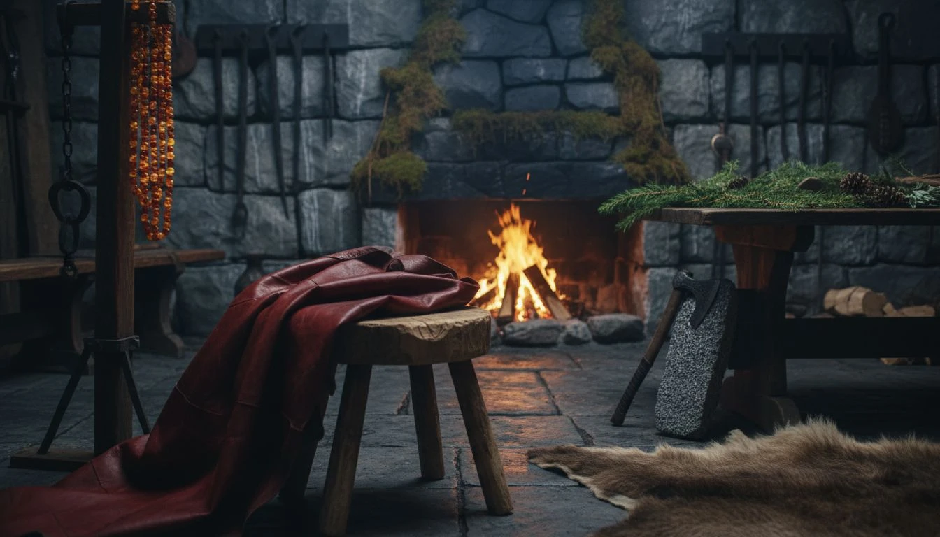
Survival is a tactile business. It is the smell of cured hide, the rough surface of grinding stones, and the scent of pine pitch. This collection is grounded entirely in the material reality of the trail. Oxblood Leather and Amber Resin evoke the well-worn gear of a traveler who knows the terrain, items that have been oiled and mended a dozen times. Interspersed with the organic practicality of Dried Moss and Evergreen Needle, the grays here act as the metallic and stone tools that make life possible in the wild. This is not the aesthetic of the weekend warrior; it is the uniform of the expert guide. It suggests a profound competency, appealing to a consumer who values function over flash. The mood is serious and prepared, embodying the Hero who saves the day not with a sword, but with a medicinal poultice and a dry tinderbox. It feels weathered, reliable, and ancient.
Beacon of the Long Night 🔥
In the absolute blackness of midwinter, a single clear flame is a shout of defiance. Here, the contrast is high and dramatic, centered on the searing intensity of Bonfire Spark against the suffocating weight of Charcoal Soot. This palette tells the story of the signal fire on the cliff's edge, the lighthouse, or the torch carried into the cavern. It is dynamic and energetic, pushing back against the encroaching dark represented by the surrounding muted tones. Muted Red Clay and Mead Hall Gold add a layer of human industry and celebration, suggesting that the fire is man-made, a result of effort and will. For a brand, this communicates urgency and supreme importance. It frames the product or service as the essential element that cuts through the gloom. It is the hero arriving exactly when needed, the lantern lifted high to show the path home when all landmarks have been erased by the night.
Guardian of the North 🐺
Starkness possesses its own kind of beauty, stripped of all pretense. This selection reflects the uncompromising nature of the biological world in winter. Driven Snow provides a blinding canvas upon which the visceral urgency of Rowan Berry Blood and Salmon Run play out. These reds are not festive; they are the colors of life persisting—the heartbeat, the hunt, the holly berry that birds fight over. Ancient Bark and Granite Cliff provide the skeletal structure, the hard impassive bones of the land that remain when the leaves are gone. This is a palette for a brand that saves lives, perhaps medical gear or high-end rescue equipment. It conveys a clinical but rugged precision. There is no room for error here. The Caregiver represented in these shades is the medic on the battlefield or the search party in the blizzard—focused, essential, and fiercely protective of the spark of life amidst the desolation.
To look upon these colors is to understand that the longest night is not an end, but a threshold. The dialogue between the burning warmth of orange and the unyielding solidity of gray captures the very texture of endurance. We find here a visual philosophy for those who serve as the foundation for their communities, suggesting that true strength requires both the hardness of slate to withstand the storm and the heat of the hearth to nurture what remains. These palettes offer more than just a brand identity; they propose a way of being in the world. They remind us that when the shadows lengthen and the wind rises, we do not merely hide. We gather our tools, we wrap ourselves in wool and leather, and we tend the flame. In this rugged balance, we find the promise that the sun will, inevitably, return.