'%3e%3cpath%20fill-rule='evenodd'%20clip-rule='evenodd'%20d='M51.1303%2019.2492C50.7278%2019.913%2050.1346%2020.4426%2049.3508%2020.838C48.5669%2021.2335%2047.6172%2021.4312%2046.5014%2021.4312C44.8208%2021.4312%2043.4367%2021.0216%2042.3492%2020.2025C41.2617%2019.3833%2040.6686%2018.2394%2040.5697%2016.7706H44.4253C44.4818%2017.3355%2044.6831%2017.7804%2045.0291%2018.1052C45.3751%2018.43%2045.8164%2018.5924%2046.3531%2018.5924C46.8192%2018.5924%2047.1864%2018.4653%2047.4547%2018.2111C47.7231%2017.9569%2047.8572%2017.618%2047.8572%2017.1943C47.8572%2016.8129%2047.7337%2016.4952%2047.4865%2016.241C47.2393%2015.9867%2046.9322%2015.7784%2046.565%2015.616C46.1978%2015.4536%2045.6893%2015.2594%2045.0397%2015.0334C44.0934%2014.7086%2043.3202%2014.3944%2042.72%2014.0907C42.1197%2013.7871%2041.6042%2013.3351%2041.1735%2012.7349C40.7427%2012.1347%2040.5273%2011.3544%2040.5273%2010.394C40.5273%209.50418%2040.7533%208.73448%2041.2053%208.08481C41.6572%207.43515%2042.2821%206.93731%2043.0801%206.5913C43.8781%206.24528%2044.7925%206.07227%2045.8235%206.07227C47.49%206.07227%2048.8141%206.46771%2049.7956%207.25861C50.7772%208.04951%2051.3315%209.13698%2051.4586%2010.5211H47.5395C47.4689%2010.0268%2047.2888%209.63483%2046.9993%209.3453C46.7097%209.05578%2046.3178%208.91102%2045.8235%208.91102C45.3998%208.91102%2045.0573%209.024%2044.7961%209.24997C44.5348%209.47594%2044.4041%209.80783%2044.4041%2010.2457C44.4041%2010.5988%2044.5207%2010.8989%2044.7537%2011.146C44.9867%2011.3932%2045.2798%2011.5944%2045.6328%2011.7498C45.9859%2011.9052%2046.4944%2012.1029%2047.1581%2012.343C48.1185%2012.6678%2048.9023%2012.9891%2049.5096%2013.3069C50.1169%2013.6246%2050.6395%2014.0872%2051.0773%2014.6945C51.5151%2015.3018%2051.734%2016.0927%2051.734%2017.0672C51.734%2017.8581%2051.5328%2018.5854%2051.1303%2019.2492ZM59.0242%206.3053V21.2829H55.4016V6.3053H59.0242ZM73.9409%206.3053V9.18642H69.8734V21.2829H66.2296V9.18642H62.2046V6.3053H73.9409ZM80.7438%209.18642V12.3218H85.8069V15.0546H80.7438V18.3806H86.4425V21.2829H77.1212V6.3053H86.4425V9.18642H80.7438ZM99.667%2016.0291V21.2829H96.0444V6.3053H101.913C103.692%206.3053%20105.048%206.74665%20105.98%207.62934C106.912%208.51204%20107.378%209.7019%20107.378%2011.199C107.378%2012.1311%20107.17%2012.9609%20106.753%2013.6882C106.337%2014.4155%20105.719%2014.9875%20104.9%2015.4042C104.08%2015.8208%20103.085%2016.0291%20101.913%2016.0291H99.667ZM103.692%2011.199C103.692%209.8855%20102.965%209.22879%20101.51%209.22879H99.667V13.1268H101.51C102.965%2013.1268%20103.692%2012.4842%20103.692%2011.199ZM120.092%2018.5501H114.478L113.546%2021.2829H109.732L115.219%206.41123H119.393L124.879%2021.2829H121.024L120.092%2018.5501ZM119.16%2015.7961L117.295%2010.2881L115.41%2015.7961H119.16ZM131.555%2018.5077H136.385V21.2829H127.933V6.3053H131.555V18.5077ZM143.337%209.18642V12.3218H148.4V15.0546H143.337V18.3806H149.035V21.2829H139.714V6.3053H149.035V9.18642H143.337ZM163.507%206.3053V9.18642H159.44V21.2829H155.796V9.18642H151.771V6.3053H163.507ZM177.449%206.3053V9.18642H173.382V21.2829H169.738V9.18642H165.713V6.3053H177.449ZM184.252%209.18642V12.3218H189.315V15.0546H184.252V18.3806H189.951V21.2829H180.629V6.3053H189.951V9.18642H184.252Z'%20fill='%23EEF0ED'/%3e%3cmask%20id='mask0_3101_7327'%20style='mask-type:alpha'%20maskUnits='userSpaceOnUse'%20x='0'%20y='0'%20width='27'%20height='28'%3e%3cpath%20d='M23.8328%200.759766H2.64808C1.18559%200.759766%200%201.94535%200%203.40785V24.5925C0%2026.055%201.18559%2027.2406%202.64808%2027.2406H23.8328C25.2952%2027.2406%2026.4808%2026.055%2026.4808%2024.5925V3.40785C26.4808%201.94535%2025.2952%200.759766%2023.8328%200.759766Z'%20fill='white'/%3e%3c/mask%3e%3cg%20mask='url(%23mask0_3101_7327)'%3e%3cpath%20d='M23.8328%200.759766H2.64808C1.18559%200.759766%200%201.94535%200%203.40785V24.5925C0%2026.055%201.18559%2027.2406%202.64808%2027.2406H23.8328C25.2952%2027.2406%2026.4808%2026.055%2026.4808%2024.5925V3.40785C26.4808%201.94535%2025.2952%200.759766%2023.8328%200.759766Z'%20fill='%23D8D8D8'/%3e%3cpath%20d='M13.2404%200.759766H0V14.0001H13.2404V0.759766Z'%20fill='%238C61FF'/%3e%3cpath%20d='M13.2404%2014H0V27.2404H13.2404V14Z'%20fill='%2336C3FE'/%3e%3cpath%20d='M26.4806%2014H13.2402V27.2404H26.4806V14Z'%20fill='%236592FE'/%3e%3cpath%20d='M26.4806%200.759766H13.2402V14.0002H26.4806V0.759766Z'%20fill='%236059F7'/%3e%3c/g%3e%3c/g%3e%3cdefs%3e%3cclipPath%20id='clip0_3101_7327'%3e%3crect%20width='190'%20height='28'%20fill='white'/%3e%3c/clipPath%3e%3c/defs%3e%3c/svg%3e)
'%3e%3cpath%20d='M23.8328%200.759521H2.64808C1.18559%200.759521%200%201.94511%200%203.40761V24.5923C0%2026.0548%201.18559%2027.2404%202.64808%2027.2404H23.8328C25.2952%2027.2404%2026.4808%2026.0548%2026.4808%2024.5923V3.40761C26.4808%201.94511%2025.2952%200.759521%2023.8328%200.759521Z'%20fill='%23D8D8D8'/%3e%3cpath%20d='M13.2404%200.759521H0V13.9999H13.2404V0.759521Z'%20fill='%238C61FF'/%3e%3cpath%20d='M13.2404%2013.9998H0V27.2402H13.2404V13.9998Z'%20fill='%2336C3FE'/%3e%3cpath%20d='M26.4809%2013.9998H13.2405V27.2402H26.4809V13.9998Z'%20fill='%236592FE'/%3e%3cpath%20d='M26.4809%200.759277H13.2405V13.9997H26.4809V0.759277Z'%20fill='%236059F7'/%3e%3c/g%3e%3c/svg%3e)
Grass Green and Teal Color Palettes for Modern Design
26 Feb 2026 · 6 min readIn the sprawling expanse of the modern metropolis, a new aesthetic narrative emerges—one that refuses to choose between the rigorous demands of the boardroom and the restorative power of the park. This is the visual language of the Corporate Jungle Gym, a concept that reimagines the daily grind as a navigable, breathable ecosystem. It is an exploration of how the pragmatic spirit of the Everyman archetype finds its rhythm within a landscape of steel, glass, and unexpected verdure. Here, the sterile whites of the office interface are invaded by the unapologetic vitality of living greens, creating a tension that is both functional and deeply optimistic. We step away from the intimidating prestige of luxury darks and move toward a brighter, more democratic spectrum. This is design that breathes, organizing the chaos of urban living into approachable, sun-drenched pockets of productivity and play, signaling a shift where professional tools feel less like obligations and more like essential, life-affirming accessories.
Concrete Canopy 🌿
The immediate sensation here is one of rupture—where the manicured perfection of Sprint Turf breaks through the unending seriousness of Asphalt Noir. It captures the very specific energy of a lunch break spent in a pocket park, surrounded by the towering neutrals of City Fog yet grounded by the startling aliveness of Electric Lime. This is not wild nature; it is curated, purposeful nature designed for the busy professional who craves a visual deep breath. The interaction between the softer Moss Velvet and the stark Clean Slate suggests a workspace that acknowledges the organic needs of its inhabitants while maintaining a rigorous, organized facade. It feels like rolling up sleeves in a glass office, ready to tackle logistics with a renewed, chlorophyll-fueled spirit. The contrast is sharp, almost sporty, lending itself perfectly to interfaces that need to communicate urgent progression without inducing stress.
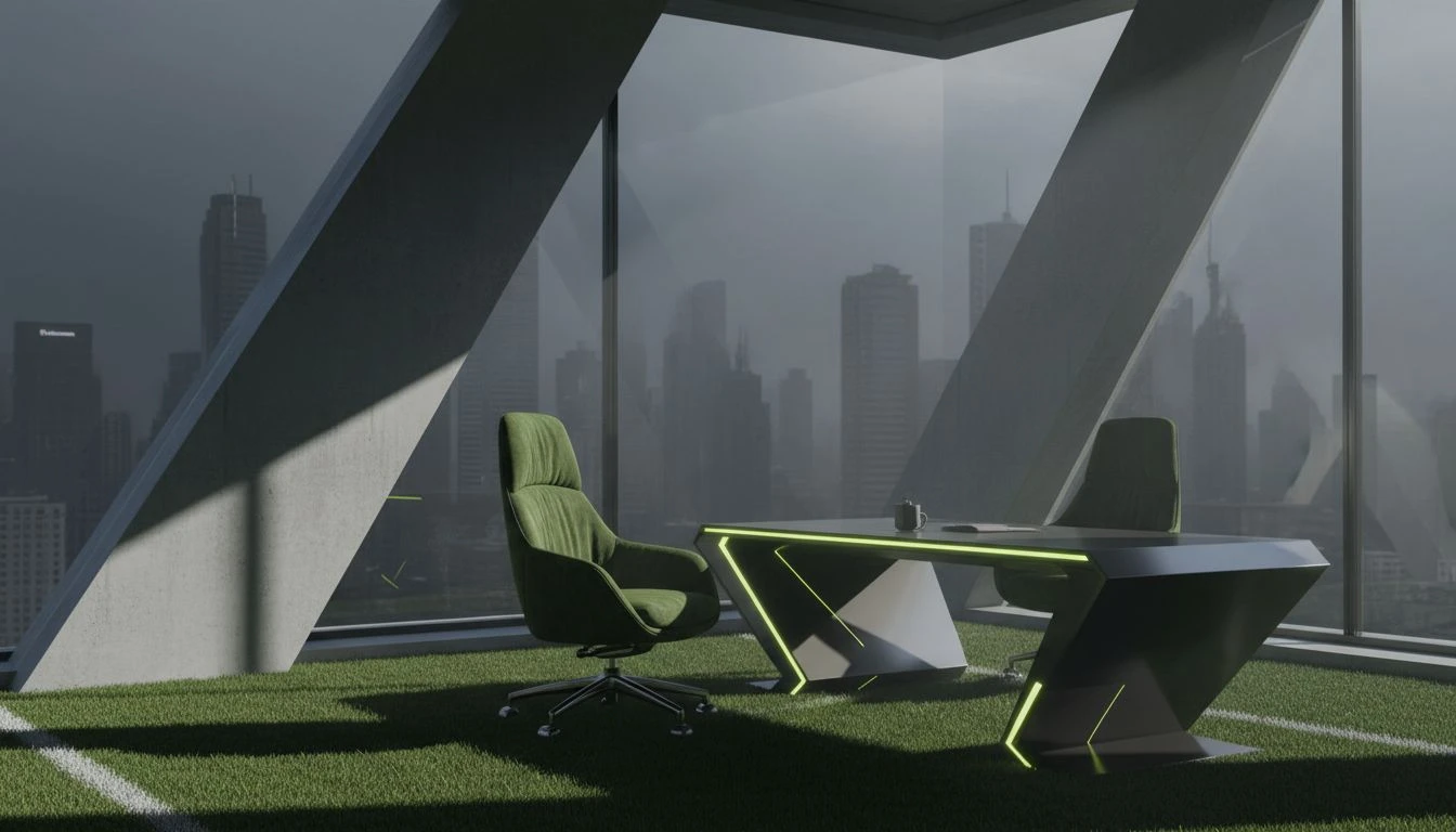
Executive Playground 🧩
There is a hushed quality to this arrangement, a quiet confidence that does not need to shout. The dominance of Boardroom Charcoal and Steel Girder sets a foundation of absolute reliability, the uniform of the pragmatist. Yet, it is the intrusion of Mint Cooler that changes the conversation entirely, introducing a cooling breeze into a stifling atmosphere. Paired with the grounding Fairway Green, the visual story shifts from rigid corporate structure to a mindful wellness retreat tucked inside a skyscraper. It suggests an interface or a physical space where clarity is paramount, where the noise of the city is dampened by the softness of Cloud Nine. The result is a sophisticated calm, accessible yet elevated, perfect for organizing chaotic schedules with a sense of zen-like detachment. It strips away the clutter, leaving only what is essential and refreshing.
Urban Arboretum 🏢
Here we witness a full spectrum of growth, a stratification of greens that mimics the depth of a dense forest transplanted into a metropolis. From the shadowed depths of Pine Needle to the brilliant, almost artificial pop of Laser Green, the eye travels through layers of ambition and potential. The greys—Obsidian and Pavement—act merely as a canvas, receding into the background to let the foliage take the stage. This creates an environment that feels dense with resources, a visual library of tools and opportunities waiting to be utilized. It speaks to the complexity of urban planning, where every inch of green space is a victory against the concrete. The mood is industrious and vibrant, suggesting a brand or space that is constantly evolving, branching out, and refusing to remain static in a monochrome world. It is the color of sustainability meeting strategy.
Blueprints & Botany 🏙️
A distinctive pivot occurs with the introduction of Architect's Azure, a hue that brings the cool, intellectual rigor of a blueprint into the warmth of the garden. The interplay between the punchy Zest Green and the technical Draftsman Grey creates a dynamic tension between the natural and the man-made. It feels like the moment a plan becomes reality, where the conceptual lines on paper turn into living, breathing structures. Sprout Light adds a touch of tentative optimism, the first shoot breaking soil, while Iron Beam provides the necessary structural integrity. This selection is ideal for those intersection points where engineering meets ecology, offering a visual identity that is as smart as it is spirited. It frames the world not just as a place to exist, but as a puzzle to be solved with ingenuity and a splash of cool water.
Monday Morning Park ☕
Stripped back to the essentials, this grouping champions the beauty of the blank page and the grounded earth. The expansive use of Starched Collar and Silver Lining creates a vast, open arena for thought, uncluttered and pristine. Into this white cube enters the organic warmth of Espresso Bean and the straightforward honesty of Park Bench Green. It is the morning coffee consumed on a brisk walk; it is the clarity of a well-organized calendar. The presence of Cobblestone anchors the lighter tones, preventing them from floating away, ensuring that the optimism remains rooted in reality. This is the palette of the fresh start, the clean slate that invites the 'everyman' to build their day with precision. It feels approachable, stripped of artifice, and incredibly lucid, perfect for tools that declutter the mind and simplify the complex rhythms of daily urban life.
traversing these curated selections reveals a profound shift in how we perceive the intersection of work and wellness. We have moved from the electric shock of high-visibility limes against asphalt, representing the sudden bursts of energy in a structured day, to the medicinal tranquility of pale mints and soft charcoals. The narrative woven here proves that the 'everyman' sensibility is far from mundane; it is a sophisticated reclaiming of vitality within the concrete framework. By grounding ethereal whites with earthy browns and technical greys, we establish a sense of reliability that never feels stagnant. The strategic use of teal and azure acts as a bridge, connecting the emotional expanse of the sky with the logical grid of the city plan. Ultimately, these chromatic stories offer a promise: that our digital and physical environments can be as organized as a spreadsheet yet as invigorating as a brisk walk through a morning glade, grounded in reality but reaching for growth.