'%3e%3cpath%20fill-rule='evenodd'%20clip-rule='evenodd'%20d='M51.1303%2019.2492C50.7278%2019.913%2050.1346%2020.4426%2049.3508%2020.838C48.5669%2021.2335%2047.6172%2021.4312%2046.5014%2021.4312C44.8208%2021.4312%2043.4367%2021.0216%2042.3492%2020.2025C41.2617%2019.3833%2040.6686%2018.2394%2040.5697%2016.7706H44.4253C44.4818%2017.3355%2044.6831%2017.7804%2045.0291%2018.1052C45.3751%2018.43%2045.8164%2018.5924%2046.3531%2018.5924C46.8192%2018.5924%2047.1864%2018.4653%2047.4547%2018.2111C47.7231%2017.9569%2047.8572%2017.618%2047.8572%2017.1943C47.8572%2016.8129%2047.7337%2016.4952%2047.4865%2016.241C47.2393%2015.9867%2046.9322%2015.7784%2046.565%2015.616C46.1978%2015.4536%2045.6893%2015.2594%2045.0397%2015.0334C44.0934%2014.7086%2043.3202%2014.3944%2042.72%2014.0907C42.1197%2013.7871%2041.6042%2013.3351%2041.1735%2012.7349C40.7427%2012.1347%2040.5273%2011.3544%2040.5273%2010.394C40.5273%209.50418%2040.7533%208.73448%2041.2053%208.08481C41.6572%207.43515%2042.2821%206.93731%2043.0801%206.5913C43.8781%206.24528%2044.7925%206.07227%2045.8235%206.07227C47.49%206.07227%2048.8141%206.46771%2049.7956%207.25861C50.7772%208.04951%2051.3315%209.13698%2051.4586%2010.5211H47.5395C47.4689%2010.0268%2047.2888%209.63483%2046.9993%209.3453C46.7097%209.05578%2046.3178%208.91102%2045.8235%208.91102C45.3998%208.91102%2045.0573%209.024%2044.7961%209.24997C44.5348%209.47594%2044.4041%209.80783%2044.4041%2010.2457C44.4041%2010.5988%2044.5207%2010.8989%2044.7537%2011.146C44.9867%2011.3932%2045.2798%2011.5944%2045.6328%2011.7498C45.9859%2011.9052%2046.4944%2012.1029%2047.1581%2012.343C48.1185%2012.6678%2048.9023%2012.9891%2049.5096%2013.3069C50.1169%2013.6246%2050.6395%2014.0872%2051.0773%2014.6945C51.5151%2015.3018%2051.734%2016.0927%2051.734%2017.0672C51.734%2017.8581%2051.5328%2018.5854%2051.1303%2019.2492ZM59.0242%206.3053V21.2829H55.4016V6.3053H59.0242ZM73.9409%206.3053V9.18642H69.8734V21.2829H66.2296V9.18642H62.2046V6.3053H73.9409ZM80.7438%209.18642V12.3218H85.8069V15.0546H80.7438V18.3806H86.4425V21.2829H77.1212V6.3053H86.4425V9.18642H80.7438ZM99.667%2016.0291V21.2829H96.0444V6.3053H101.913C103.692%206.3053%20105.048%206.74665%20105.98%207.62934C106.912%208.51204%20107.378%209.7019%20107.378%2011.199C107.378%2012.1311%20107.17%2012.9609%20106.753%2013.6882C106.337%2014.4155%20105.719%2014.9875%20104.9%2015.4042C104.08%2015.8208%20103.085%2016.0291%20101.913%2016.0291H99.667ZM103.692%2011.199C103.692%209.8855%20102.965%209.22879%20101.51%209.22879H99.667V13.1268H101.51C102.965%2013.1268%20103.692%2012.4842%20103.692%2011.199ZM120.092%2018.5501H114.478L113.546%2021.2829H109.732L115.219%206.41123H119.393L124.879%2021.2829H121.024L120.092%2018.5501ZM119.16%2015.7961L117.295%2010.2881L115.41%2015.7961H119.16ZM131.555%2018.5077H136.385V21.2829H127.933V6.3053H131.555V18.5077ZM143.337%209.18642V12.3218H148.4V15.0546H143.337V18.3806H149.035V21.2829H139.714V6.3053H149.035V9.18642H143.337ZM163.507%206.3053V9.18642H159.44V21.2829H155.796V9.18642H151.771V6.3053H163.507ZM177.449%206.3053V9.18642H173.382V21.2829H169.738V9.18642H165.713V6.3053H177.449ZM184.252%209.18642V12.3218H189.315V15.0546H184.252V18.3806H189.951V21.2829H180.629V6.3053H189.951V9.18642H184.252Z'%20fill='%23EEF0ED'/%3e%3cmask%20id='mask0_3101_7327'%20style='mask-type:alpha'%20maskUnits='userSpaceOnUse'%20x='0'%20y='0'%20width='27'%20height='28'%3e%3cpath%20d='M23.8328%200.759766H2.64808C1.18559%200.759766%200%201.94535%200%203.40785V24.5925C0%2026.055%201.18559%2027.2406%202.64808%2027.2406H23.8328C25.2952%2027.2406%2026.4808%2026.055%2026.4808%2024.5925V3.40785C26.4808%201.94535%2025.2952%200.759766%2023.8328%200.759766Z'%20fill='white'/%3e%3c/mask%3e%3cg%20mask='url(%23mask0_3101_7327)'%3e%3cpath%20d='M23.8328%200.759766H2.64808C1.18559%200.759766%200%201.94535%200%203.40785V24.5925C0%2026.055%201.18559%2027.2406%202.64808%2027.2406H23.8328C25.2952%2027.2406%2026.4808%2026.055%2026.4808%2024.5925V3.40785C26.4808%201.94535%2025.2952%200.759766%2023.8328%200.759766Z'%20fill='%23D8D8D8'/%3e%3cpath%20d='M13.2404%200.759766H0V14.0001H13.2404V0.759766Z'%20fill='%238C61FF'/%3e%3cpath%20d='M13.2404%2014H0V27.2404H13.2404V14Z'%20fill='%2336C3FE'/%3e%3cpath%20d='M26.4806%2014H13.2402V27.2404H26.4806V14Z'%20fill='%236592FE'/%3e%3cpath%20d='M26.4806%200.759766H13.2402V14.0002H26.4806V0.759766Z'%20fill='%236059F7'/%3e%3c/g%3e%3c/g%3e%3cdefs%3e%3cclipPath%20id='clip0_3101_7327'%3e%3crect%20width='190'%20height='28'%20fill='white'/%3e%3c/clipPath%3e%3c/defs%3e%3c/svg%3e)
'%3e%3cpath%20d='M23.8328%200.759521H2.64808C1.18559%200.759521%200%201.94511%200%203.40761V24.5923C0%2026.0548%201.18559%2027.2404%202.64808%2027.2404H23.8328C25.2952%2027.2404%2026.4808%2026.0548%2026.4808%2024.5923V3.40761C26.4808%201.94511%2025.2952%200.759521%2023.8328%200.759521Z'%20fill='%23D8D8D8'/%3e%3cpath%20d='M13.2404%200.759521H0V13.9999H13.2404V0.759521Z'%20fill='%238C61FF'/%3e%3cpath%20d='M13.2404%2013.9998H0V27.2402H13.2404V13.9998Z'%20fill='%2336C3FE'/%3e%3cpath%20d='M26.4809%2013.9998H13.2405V27.2402H26.4809V13.9998Z'%20fill='%236592FE'/%3e%3cpath%20d='M26.4809%200.759277H13.2405V13.9997H26.4809V0.759277Z'%20fill='%236059F7'/%3e%3c/g%3e%3c/svg%3e)
Holistic Health Color Palettes for Modern Wellness Apps
21 Feb 2026 · 5 min readWe used to associate health branding with the smell of antiseptic and walls painted in a depression-inducing shade of magnolia. Now, our doctors live in our pockets, communicated through glowing rectangles, and the visual language of wellness is shifting away from the terrifyingly sterile hospital corridor toward something that feels like a spa break in the metaverse. It is less about sickness and more about optimization. Designers are finally waking up to the fact that looking after your body shouldn't feel like filling out tax forms. We are seeing a move toward electric coolness, deep soothing data-viz darks, and highlights that suggest vitality rather than just hygiene. This is where Silicon Valley ambition meets the calm of a Zen garden, creating interfaces that monitor our heart rates without raising our blood pressure. The goal is to make medical data feel approachable, turning the anxiety of diagnostics into a sleek, manageable lifestyle aesthetic.
Digital Botanicals 🌿
There is a curious tension here between the organic and the artificial, reflecting the very nature of modern bio-hacking. Clinical Jade provides the expected nod to nature—because what is a health app without a leaf icon somewhere?—but it serves mostly as a polite introduction. The real personality emerges when things get weirdly beautiful with Synthetic Lilac and Digital Bruise. These shades suggest a dashboard where your meditation stats are tracked with the precision of a stock market ticker. The contrast between the stark Starchy Gown background and the Deep Screen darks creates a reading experience that is easy on the eyes during those 3 AM insomnia scrolls. It feels like a boutique pharmacy that sells artisanal sleeping pills—soft enough to be comforting, but sharp enough to remind you that there is serious science happening behind the pixels.
Sterile Glitch 🧊
This is Scandinavian design applied to the cardiovascular system. It refuses to shout, preferring to whisper its competence. Pure Monitor and Aluminum Casing create a framework that is almost aggressively neutral, the digital equivalent of a doctor with a perfect bedside manner who refuses to give you bad news until they are absolutely certain. The interest comes entirely from Diagnostic Cyan. It cuts through the fog of grey like a laser scalpel or the hum of an MRI machine. This collection works best for interfaces that need to convey absolute trust and precision—think robotic surgery controls or a mental clarity timer. It strips away the comforting clutter to leave only the essential data points, suggesting that clarity itself is the ultimate form of healing.
Deep Sleep Data 🧬
Most medical branding fears the dark, terrified of looking grim or foreboding. This arrangement embraces the void with a sophistication usually reserved for luxury banking or high-end fashion. Ultra-Violet Night is a heavy, confident shade that suggests authority—or perhaps the deep REM cycle we are all chasing but rarely catching. Paired with the graduating greys of Silver Instrument and Shadow Grey, it feels expensive. This is not a free symptom checker; this is concierge medicine for people who own cryogenic chambers. The starkness of Lab Coat keeps it usable for text, but the heavy use of purple moves it away from "hospital" and toward "exclusive longevity club." It is moody, serious, and surprisingly comforting in its solidity, offering a digital space where users can feel protected.
Bio-Luminescence 🧪
If a petri dish could be fashionable, it would look like this. The spectrum moves from the alert shock of Enzyme Yellow to the murky depths of Midnight Void, mimicking the beautiful, terrifying biological chaos of living things. Krypton Green and Chart Lime vibrate against the darker tones, creating a sense of active monitoring. It feels alive, almost teeming. This isn't for a meditation guide; it is for fitness tracking, nutrition breakdowns, or metabolic analysis. The interplay of Frozen Oxygen and Deep Sea Algae suggests fluidity and change. It captures the energy of a body in motion rather than a body at rest, trading calmness for a sort of neon-soaked vitality that demands attention. It frames the human body not as a temple, but as a complex, glowing machine.
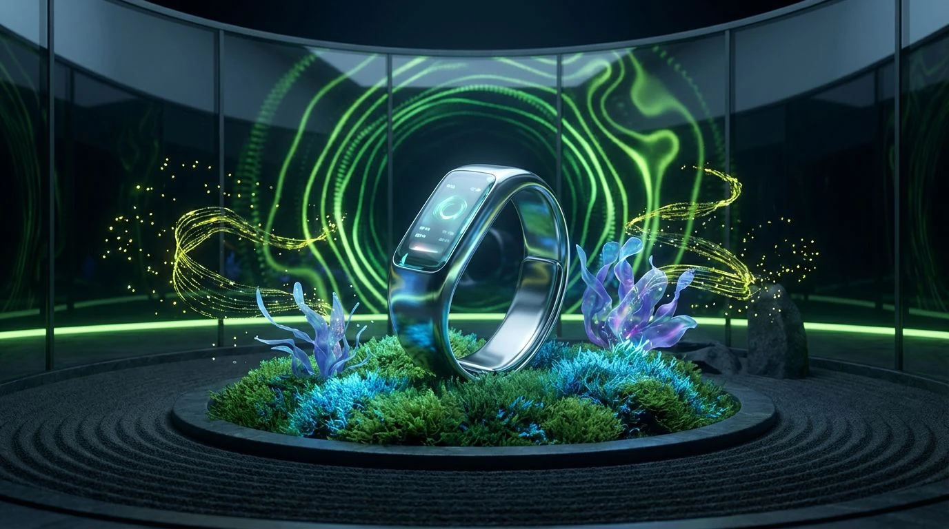
Connected Cardio ⌚
Sometimes you just want the classics, remastered for a high-definition screen. This is the visual anchor of the wearable tech world. Pulse Green and Hydration Blue are the colors of every "goal achieved" ring you have ever closed on a smartwatch. It feels practical, optimistic, and energetic. Forest Data provides a grounded, leafy counterpoint to the electric brightness of the blues, suggesting that while you might be running on a treadmill in a basement, you are spiritually jogging through a pine grove. The Graphite Sensor grey ties it all together, reminding us that behind the wellness aesthetic is rigid, unyielding hardware. It is reliable and functional, catering to the user who treats their body like a project to be managed with KPIs and spreadsheets.
What these color selections reveal is a departure from dread in the medical space. We are no longer designing for patients; we are designing for users, and the distinction matters. The visual gap between a high-end lifestyle publication and a blood pressure monitor is closing rapidly. By introducing electric purples, bioluminescent greens, and soothing dark modes, we acknowledge that health is a daily practice, not just an emergency response. These schemes manage to be precise without being cold, and human without being messy. They promise a future where managing our physical well-being looks as sleek as the devices we use to do it, turning the act of self-care into a highly visual, almost recreational experience.