'%3e%3cpath%20fill-rule='evenodd'%20clip-rule='evenodd'%20d='M51.1303%2019.2492C50.7278%2019.913%2050.1346%2020.4426%2049.3508%2020.838C48.5669%2021.2335%2047.6172%2021.4312%2046.5014%2021.4312C44.8208%2021.4312%2043.4367%2021.0216%2042.3492%2020.2025C41.2617%2019.3833%2040.6686%2018.2394%2040.5697%2016.7706H44.4253C44.4818%2017.3355%2044.6831%2017.7804%2045.0291%2018.1052C45.3751%2018.43%2045.8164%2018.5924%2046.3531%2018.5924C46.8192%2018.5924%2047.1864%2018.4653%2047.4547%2018.2111C47.7231%2017.9569%2047.8572%2017.618%2047.8572%2017.1943C47.8572%2016.8129%2047.7337%2016.4952%2047.4865%2016.241C47.2393%2015.9867%2046.9322%2015.7784%2046.565%2015.616C46.1978%2015.4536%2045.6893%2015.2594%2045.0397%2015.0334C44.0934%2014.7086%2043.3202%2014.3944%2042.72%2014.0907C42.1197%2013.7871%2041.6042%2013.3351%2041.1735%2012.7349C40.7427%2012.1347%2040.5273%2011.3544%2040.5273%2010.394C40.5273%209.50418%2040.7533%208.73448%2041.2053%208.08481C41.6572%207.43515%2042.2821%206.93731%2043.0801%206.5913C43.8781%206.24528%2044.7925%206.07227%2045.8235%206.07227C47.49%206.07227%2048.8141%206.46771%2049.7956%207.25861C50.7772%208.04951%2051.3315%209.13698%2051.4586%2010.5211H47.5395C47.4689%2010.0268%2047.2888%209.63483%2046.9993%209.3453C46.7097%209.05578%2046.3178%208.91102%2045.8235%208.91102C45.3998%208.91102%2045.0573%209.024%2044.7961%209.24997C44.5348%209.47594%2044.4041%209.80783%2044.4041%2010.2457C44.4041%2010.5988%2044.5207%2010.8989%2044.7537%2011.146C44.9867%2011.3932%2045.2798%2011.5944%2045.6328%2011.7498C45.9859%2011.9052%2046.4944%2012.1029%2047.1581%2012.343C48.1185%2012.6678%2048.9023%2012.9891%2049.5096%2013.3069C50.1169%2013.6246%2050.6395%2014.0872%2051.0773%2014.6945C51.5151%2015.3018%2051.734%2016.0927%2051.734%2017.0672C51.734%2017.8581%2051.5328%2018.5854%2051.1303%2019.2492ZM59.0242%206.3053V21.2829H55.4016V6.3053H59.0242ZM73.9409%206.3053V9.18642H69.8734V21.2829H66.2296V9.18642H62.2046V6.3053H73.9409ZM80.7438%209.18642V12.3218H85.8069V15.0546H80.7438V18.3806H86.4425V21.2829H77.1212V6.3053H86.4425V9.18642H80.7438ZM99.667%2016.0291V21.2829H96.0444V6.3053H101.913C103.692%206.3053%20105.048%206.74665%20105.98%207.62934C106.912%208.51204%20107.378%209.7019%20107.378%2011.199C107.378%2012.1311%20107.17%2012.9609%20106.753%2013.6882C106.337%2014.4155%20105.719%2014.9875%20104.9%2015.4042C104.08%2015.8208%20103.085%2016.0291%20101.913%2016.0291H99.667ZM103.692%2011.199C103.692%209.8855%20102.965%209.22879%20101.51%209.22879H99.667V13.1268H101.51C102.965%2013.1268%20103.692%2012.4842%20103.692%2011.199ZM120.092%2018.5501H114.478L113.546%2021.2829H109.732L115.219%206.41123H119.393L124.879%2021.2829H121.024L120.092%2018.5501ZM119.16%2015.7961L117.295%2010.2881L115.41%2015.7961H119.16ZM131.555%2018.5077H136.385V21.2829H127.933V6.3053H131.555V18.5077ZM143.337%209.18642V12.3218H148.4V15.0546H143.337V18.3806H149.035V21.2829H139.714V6.3053H149.035V9.18642H143.337ZM163.507%206.3053V9.18642H159.44V21.2829H155.796V9.18642H151.771V6.3053H163.507ZM177.449%206.3053V9.18642H173.382V21.2829H169.738V9.18642H165.713V6.3053H177.449ZM184.252%209.18642V12.3218H189.315V15.0546H184.252V18.3806H189.951V21.2829H180.629V6.3053H189.951V9.18642H184.252Z'%20fill='%23EEF0ED'/%3e%3cmask%20id='mask0_3101_7327'%20style='mask-type:alpha'%20maskUnits='userSpaceOnUse'%20x='0'%20y='0'%20width='27'%20height='28'%3e%3cpath%20d='M23.8328%200.759766H2.64808C1.18559%200.759766%200%201.94535%200%203.40785V24.5925C0%2026.055%201.18559%2027.2406%202.64808%2027.2406H23.8328C25.2952%2027.2406%2026.4808%2026.055%2026.4808%2024.5925V3.40785C26.4808%201.94535%2025.2952%200.759766%2023.8328%200.759766Z'%20fill='white'/%3e%3c/mask%3e%3cg%20mask='url(%23mask0_3101_7327)'%3e%3cpath%20d='M23.8328%200.759766H2.64808C1.18559%200.759766%200%201.94535%200%203.40785V24.5925C0%2026.055%201.18559%2027.2406%202.64808%2027.2406H23.8328C25.2952%2027.2406%2026.4808%2026.055%2026.4808%2024.5925V3.40785C26.4808%201.94535%2025.2952%200.759766%2023.8328%200.759766Z'%20fill='%23D8D8D8'/%3e%3cpath%20d='M13.2404%200.759766H0V14.0001H13.2404V0.759766Z'%20fill='%238C61FF'/%3e%3cpath%20d='M13.2404%2014H0V27.2404H13.2404V14Z'%20fill='%2336C3FE'/%3e%3cpath%20d='M26.4806%2014H13.2402V27.2404H26.4806V14Z'%20fill='%236592FE'/%3e%3cpath%20d='M26.4806%200.759766H13.2402V14.0002H26.4806V0.759766Z'%20fill='%236059F7'/%3e%3c/g%3e%3c/g%3e%3cdefs%3e%3cclipPath%20id='clip0_3101_7327'%3e%3crect%20width='190'%20height='28'%20fill='white'/%3e%3c/clipPath%3e%3c/defs%3e%3c/svg%3e)
'%3e%3cpath%20d='M23.8328%200.759521H2.64808C1.18559%200.759521%200%201.94511%200%203.40761V24.5923C0%2026.0548%201.18559%2027.2404%202.64808%2027.2404H23.8328C25.2952%2027.2404%2026.4808%2026.0548%2026.4808%2024.5923V3.40761C26.4808%201.94511%2025.2952%200.759521%2023.8328%200.759521Z'%20fill='%23D8D8D8'/%3e%3cpath%20d='M13.2404%200.759521H0V13.9999H13.2404V0.759521Z'%20fill='%238C61FF'/%3e%3cpath%20d='M13.2404%2013.9998H0V27.2402H13.2404V13.9998Z'%20fill='%2336C3FE'/%3e%3cpath%20d='M26.4809%2013.9998H13.2405V27.2402H26.4809V13.9998Z'%20fill='%236592FE'/%3e%3cpath%20d='M26.4809%200.759277H13.2405V13.9997H26.4809V0.759277Z'%20fill='%236059F7'/%3e%3c/g%3e%3c/svg%3e)
Industrial Terracotta Color Palettes for Warehouse Design
21 Feb 2026 · 5 min readArchitectural reclamation operates on a fundamental tension: the dialogue between the unyielding rigidity of industrial skeletons and the human desire for habitation. In the conversion of a manufacturing floor to a boutique studio, one finds a specific visual language—a vernacular of survival and adaptation. This collection investigates that precise intersection, where the coolness of poured cement meets the baked earth history of terracotta. It is not merely a stylistic preference but an acknowledgment of material honesty. These hues do not hide the past; they frame it, allowing the raw, utilitarian origins of a space to coexist with modern comfort. The aesthetic is one of reliability, suggesting a foundation that has weathered economic cycles and elemental wear to emerge as something enduring and resourceful. It is a study in how color can define the temperature of a room, transforming vast, echoing chambers into grounded places of work and thought.
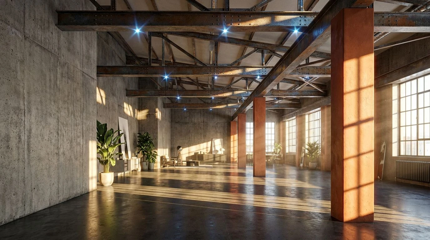
The Foundry Narrative 🏭
The interplay here suggests a space where the dust has only recently settled. Midnight Soot and Structural Steel provide the heavy, necessary grounding of load-bearing columns, the immutable facts of the building's engineering. However, the introduction of Morning Light and Welder's Spark disrupts this gravity with a kinetic energy, reminiscent of sparks flying in a dark workshop or the first rays of sun hitting a steel-framed window. It mimics the visual experience of walking into a high-ceilinged room where shadows occupy the corners, but the center is bathed in an optimistic, golden luminance. This arrangement speaks to a resourceful spirit, suited for environments that value the raw evidence of labor while creating a space for new ideas to incubate. It avoids sterility by retaining the dusty warmth of the brickwork, balancing the monochromatic darkness with moments of sudden, bright clarity.
Masonry & Mortar 🧱
There is a directness to Masonry & Mortar that mirrors the exterior facade of a turn-of-the-century manufacture. Kiln Red and Aged Timber serve as the historical anchors, representing the clay bricks and wooden beams that define the structural rhythm of the loft. Yet, the inclusion of Safety Yellow offers a knowing nod to the instructional signage and machinery that once populated the floor. It is a functional pop of color amidst the limestone and iron, preventing the atmosphere from feeling purely antiquated. The mood here is one of constructed stability. It creates an interior that feels established and solid, a reliable backdrop for architectural firms that wish to project a sense of permanence and practical expertise without sacrificing a touch of designed wit. The greys act not as shadows, but as the binding agent, the mortar that holds the warmer, richer history in place.
Architect's Hearth 🔥
Moving away from the cold shell, the Architect's Hearth focuses entirely on the organic heat generated within the design studio. It is density and saturation personified. The gradation from Deep Mahogany through Weathered Brick to Sunbaked Clay replicates the varying temperatures of the firing process itself. Drafting Ink provides the only moment of visual rest, a necessary void that allows the reds and oranges to advance. This is the palette of late nights and intense creativity, physically warmer and more enveloping than its counterparts. In a sprawling concrete box, these shades act as a localized fire, drawing occupants toward specific zones of activity and conversation. It transforms the vastness of a warehouse into a series of intimate, heated moments, suggesting that even in the grandest industrial spaces, comfort is created through the layering of rich, earthy tones.
Skyline Loft 🏙️
The narrative shifts upward here, acknowledging that the definition of a loft includes the expansive volume of air above the occupant. While Espresso Wood and Copper Pipe maintain the necessary connection to the floor and plumbing, Blueprint Blue and Daylight Pane introduce the vast, cool light entering through saw-tooth roof monitors or clerestory windows. This shocking injection of cool tones against the warm earth creates a vibration that feels intellectually sharp and modern. It represents the planning stage of architecture—the clean lines of a schematic laid out on a rough wooden table. This combination suits spaces that prioritize clarity and vision, using the contrast between the cyan tones and the rusted hues to foster an environment of alert, forward-thinking resourcefulness. It suggests a studio where the sky is just as much a material as the brick.
Raw Materiality 🏗️
Subtraction is often the strongest move in design. By stripping away extraneous hues, Raw Materiality presents the naked truth of the refurbished aesthetic. Polished Asphalt and Cured Leather sit in opposition to the softer, powdery notes of Apricot Plaster and Adobe Wall. The absence of bright primaries forces the eye to appreciate the texture and grade of the colors themselves. It suggests a tactile environment where the smoothness of the floor meets the rough grain of a partition. This is the selection for the purist, for the firm that believes the materials should speak clearly without the need for decoration. It conveys quiet confidence, relying on the quality of basic elements—the clay, the stone, the shadow—to construct a narrative of timeless utility. The resulting atmosphere is one of calm competence, where every element has earned its place through function.
The enduring appeal of the industrial terracotta aesthetic lies in its refusal to mask the truth of construction. These palettes do not decorate; they reveal. From the cool precision of a blueprint to the intense heat of a kiln-dried brick, they encompass the full lifecycle of the architectural process. They remind us that warmth in a modern environment is not achieved by covering up the concrete, but by understanding its relationship to the earthier, humbler materials that accompany it. For the boutique firm or the creative resident, these colors offer a method to ground themselves in history while looking outward. They provide a reliable visual lexicon that celebrates the beauty of things that last, bridging the gap between the hard edge of industry and the soft, organic adaptability of human life.