'%3e%3cpath%20fill-rule='evenodd'%20clip-rule='evenodd'%20d='M51.1303%2019.2492C50.7278%2019.913%2050.1346%2020.4426%2049.3508%2020.838C48.5669%2021.2335%2047.6172%2021.4312%2046.5014%2021.4312C44.8208%2021.4312%2043.4367%2021.0216%2042.3492%2020.2025C41.2617%2019.3833%2040.6686%2018.2394%2040.5697%2016.7706H44.4253C44.4818%2017.3355%2044.6831%2017.7804%2045.0291%2018.1052C45.3751%2018.43%2045.8164%2018.5924%2046.3531%2018.5924C46.8192%2018.5924%2047.1864%2018.4653%2047.4547%2018.2111C47.7231%2017.9569%2047.8572%2017.618%2047.8572%2017.1943C47.8572%2016.8129%2047.7337%2016.4952%2047.4865%2016.241C47.2393%2015.9867%2046.9322%2015.7784%2046.565%2015.616C46.1978%2015.4536%2045.6893%2015.2594%2045.0397%2015.0334C44.0934%2014.7086%2043.3202%2014.3944%2042.72%2014.0907C42.1197%2013.7871%2041.6042%2013.3351%2041.1735%2012.7349C40.7427%2012.1347%2040.5273%2011.3544%2040.5273%2010.394C40.5273%209.50418%2040.7533%208.73448%2041.2053%208.08481C41.6572%207.43515%2042.2821%206.93731%2043.0801%206.5913C43.8781%206.24528%2044.7925%206.07227%2045.8235%206.07227C47.49%206.07227%2048.8141%206.46771%2049.7956%207.25861C50.7772%208.04951%2051.3315%209.13698%2051.4586%2010.5211H47.5395C47.4689%2010.0268%2047.2888%209.63483%2046.9993%209.3453C46.7097%209.05578%2046.3178%208.91102%2045.8235%208.91102C45.3998%208.91102%2045.0573%209.024%2044.7961%209.24997C44.5348%209.47594%2044.4041%209.80783%2044.4041%2010.2457C44.4041%2010.5988%2044.5207%2010.8989%2044.7537%2011.146C44.9867%2011.3932%2045.2798%2011.5944%2045.6328%2011.7498C45.9859%2011.9052%2046.4944%2012.1029%2047.1581%2012.343C48.1185%2012.6678%2048.9023%2012.9891%2049.5096%2013.3069C50.1169%2013.6246%2050.6395%2014.0872%2051.0773%2014.6945C51.5151%2015.3018%2051.734%2016.0927%2051.734%2017.0672C51.734%2017.8581%2051.5328%2018.5854%2051.1303%2019.2492ZM59.0242%206.3053V21.2829H55.4016V6.3053H59.0242ZM73.9409%206.3053V9.18642H69.8734V21.2829H66.2296V9.18642H62.2046V6.3053H73.9409ZM80.7438%209.18642V12.3218H85.8069V15.0546H80.7438V18.3806H86.4425V21.2829H77.1212V6.3053H86.4425V9.18642H80.7438ZM99.667%2016.0291V21.2829H96.0444V6.3053H101.913C103.692%206.3053%20105.048%206.74665%20105.98%207.62934C106.912%208.51204%20107.378%209.7019%20107.378%2011.199C107.378%2012.1311%20107.17%2012.9609%20106.753%2013.6882C106.337%2014.4155%20105.719%2014.9875%20104.9%2015.4042C104.08%2015.8208%20103.085%2016.0291%20101.913%2016.0291H99.667ZM103.692%2011.199C103.692%209.8855%20102.965%209.22879%20101.51%209.22879H99.667V13.1268H101.51C102.965%2013.1268%20103.692%2012.4842%20103.692%2011.199ZM120.092%2018.5501H114.478L113.546%2021.2829H109.732L115.219%206.41123H119.393L124.879%2021.2829H121.024L120.092%2018.5501ZM119.16%2015.7961L117.295%2010.2881L115.41%2015.7961H119.16ZM131.555%2018.5077H136.385V21.2829H127.933V6.3053H131.555V18.5077ZM143.337%209.18642V12.3218H148.4V15.0546H143.337V18.3806H149.035V21.2829H139.714V6.3053H149.035V9.18642H143.337ZM163.507%206.3053V9.18642H159.44V21.2829H155.796V9.18642H151.771V6.3053H163.507ZM177.449%206.3053V9.18642H173.382V21.2829H169.738V9.18642H165.713V6.3053H177.449ZM184.252%209.18642V12.3218H189.315V15.0546H184.252V18.3806H189.951V21.2829H180.629V6.3053H189.951V9.18642H184.252Z'%20fill='%23EEF0ED'/%3e%3cmask%20id='mask0_3101_7327'%20style='mask-type:alpha'%20maskUnits='userSpaceOnUse'%20x='0'%20y='0'%20width='27'%20height='28'%3e%3cpath%20d='M23.8328%200.759766H2.64808C1.18559%200.759766%200%201.94535%200%203.40785V24.5925C0%2026.055%201.18559%2027.2406%202.64808%2027.2406H23.8328C25.2952%2027.2406%2026.4808%2026.055%2026.4808%2024.5925V3.40785C26.4808%201.94535%2025.2952%200.759766%2023.8328%200.759766Z'%20fill='white'/%3e%3c/mask%3e%3cg%20mask='url(%23mask0_3101_7327)'%3e%3cpath%20d='M23.8328%200.759766H2.64808C1.18559%200.759766%200%201.94535%200%203.40785V24.5925C0%2026.055%201.18559%2027.2406%202.64808%2027.2406H23.8328C25.2952%2027.2406%2026.4808%2026.055%2026.4808%2024.5925V3.40785C26.4808%201.94535%2025.2952%200.759766%2023.8328%200.759766Z'%20fill='%23D8D8D8'/%3e%3cpath%20d='M13.2404%200.759766H0V14.0001H13.2404V0.759766Z'%20fill='%238C61FF'/%3e%3cpath%20d='M13.2404%2014H0V27.2404H13.2404V14Z'%20fill='%2336C3FE'/%3e%3cpath%20d='M26.4806%2014H13.2402V27.2404H26.4806V14Z'%20fill='%236592FE'/%3e%3cpath%20d='M26.4806%200.759766H13.2402V14.0002H26.4806V0.759766Z'%20fill='%236059F7'/%3e%3c/g%3e%3c/g%3e%3cdefs%3e%3cclipPath%20id='clip0_3101_7327'%3e%3crect%20width='190'%20height='28'%20fill='white'/%3e%3c/clipPath%3e%3c/defs%3e%3c/svg%3e)
'%3e%3cpath%20d='M23.8328%200.759521H2.64808C1.18559%200.759521%200%201.94511%200%203.40761V24.5923C0%2026.0548%201.18559%2027.2404%202.64808%2027.2404H23.8328C25.2952%2027.2404%2026.4808%2026.0548%2026.4808%2024.5923V3.40761C26.4808%201.94511%2025.2952%200.759521%2023.8328%200.759521Z'%20fill='%23D8D8D8'/%3e%3cpath%20d='M13.2404%200.759521H0V13.9999H13.2404V0.759521Z'%20fill='%238C61FF'/%3e%3cpath%20d='M13.2404%2013.9998H0V27.2402H13.2404V13.9998Z'%20fill='%2336C3FE'/%3e%3cpath%20d='M26.4809%2013.9998H13.2405V27.2402H26.4809V13.9998Z'%20fill='%236592FE'/%3e%3cpath%20d='M26.4809%200.759277H13.2405V13.9997H26.4809V0.759277Z'%20fill='%236059F7'/%3e%3c/g%3e%3c/svg%3e)
Sustainable Color Palettes for Modern Brand Identities
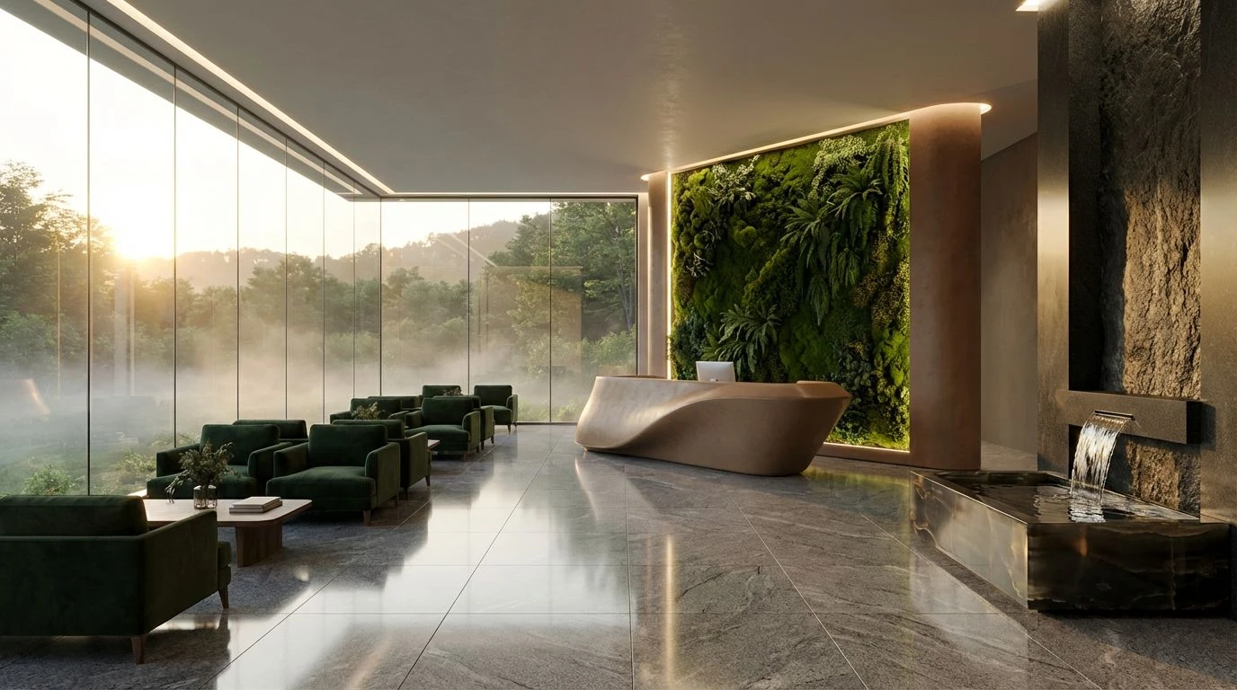
20 Feb 2026 · 5 min readIn the modern marketplace, the visual language of sustainability has matured significantly. Gone are the days when rough textures and muted browns were the sole indicators of an eco-conscious mission. Today, the intersection of ecology and corporate responsibility demands a more sophisticated approach, one that signals institutional reliability alongside environmental stewardship. As organizations adopt the role of the Caregiver or the Sage, they require a visual identity that communicates wisdom, protection, and renewal without sacrificing professional polish. This shift represents a move toward an ethical aesthetic, where the colors of lush rainforests, meadows, and mineral earth are refined into systems that project stability. The goal is to build trust through a visual promise of growth and preservation, engaging an audience that values transparency as much as they value design. These palettes explore how filtered organic tones can establish a sense of authority, proving that a commitment to the planet is a defining characteristic of modern leadership.
Regenerative Earth 🌏
This selection captures the complete cycle of a thriving ecosystem, balancing the warmth of the soil with the cool reliability of water and stone. The interplay between Clay Hearth and Granite Foundation establishes a sense of permanence, suggesting an organization that is built on solid ground. This geological stability supports the vivid greenery of Spring Shoot and the deeper, serious tone of Ancient Canopy, representing the biological growth that thrives upon a stable infrastructure. The addition of River Basin and Morning Mist introduces an element of clarity and air, preventing the earth tones from feeling too heavy. It is a configuration that speaks to closed-loop systems and regenerative agriculture, ideal for entities that wish to appear established yet active in their preservation efforts.
Biodiversity Archive 🌿
There is a density to this grouping that calls to mind the complex, teeming life of a protected rainforest or a coral reef. It moves away from minimalism to improved complexity, mirroring the intricate web of life found in nature. The deep, grounding presence of Obsidian and Rainforest Fern provides a backdrop of serious scientific inquiry, while the unexpected bursts of Lagoon and Andean Berry suggest rare flora and fauna. This variety allows a brand to communicate richness and discovery. It fits the Sage archetype well, implying a deep repository of knowledge or a conservation effort that protects the rare and the beautiful. The inclusion of Sandstone and Dried Wheat keeps the visual firmly rooted in the physical world, ensuring that even the brighter colors feel organic rather than synthetic.
Solar Economy ☀️
High energy and optimism define this arrangement, which bridges the gap between biological growth and renewable technology. The presence of Solar Ray and Sprout indicates immediate activity and the conversion of light into energy, making it particularly effective for clean energy firms or initiatives focused on rapid innovation. Unlike more somber environmental palettes, this one projects a future where technology assists nature. The transition from the grounded Topsoil to the airy Atmosphere suggests an upward trajectory, a visual metaphor for progress and cleaner air. It avoids the murky ambiguity of some eco-palettes in favor of clarity and brightness, appealing to a modern audience that looks to innovation as the solution to ecological challenges.
Botanical Wisdom 🍃
A study in monochromatic sophistication, this set relies on the calming and authoritative spectrum of greens to convey health and expertise. The progression from the dark, serious Deep Evergreen to the restorative Sage Leaf implies a deep understanding of natural remedies and biological science. It is clinical without being cold, maintaining the soft approachability of the Caregiver while asserting the expertise of the Sage. The inclusion of Glacial Water adds a critical element of purity, lightening the visual weight and suggesting cleanliness. This collection is suited for wellness brands or pharmaceutical alternatives that prioritize plant-based solutions, as the lack of warm hues creates a focused, tranquil environment where the viewer feels safe and informed.
Adaptive Reuse 🍂
This grouping tells a story of transformation, specifically the reclaiming of urban spaces by natural forces. The juxtaposition of industrial tones like Steel Beam and Pavement against the vibrant Park Lawn and warm Brickwork suggests a narrative of restoration. It touches on the concept of the circular economy, where old structures are given new life through green design. The warmth of Fallen Leaf and Olive Oil adds a humanizing touch to the greys, preventing the industrial colors from feeling sterile. It creates a visual identity for architecture firms, urban planners, or recycling initiatives that view the city as a living organism. The balance here is between the man-made and the organic, asserting that sustainability is as much about fixing the built environment as it is about protecting the wild.
The transition toward a more refined sustainable aesthetic reflects a broader cultural acknowledgment of environmental responsibility as a standard of excellence rather than a niche interest. By moving beyond the initial tropes of green marketing, these color selections offer a pathway for brands to articulate complex narratives of preservation, technology, and renewal. The precise arrangement of these tones allows organizations to project the wisdom of the Sage and the nurturing instinct of the Caregiver, creating a visual dialogue that is both inviting and authoritative. Whether through the vibrant energy of solar-inspired hues or the grounded stability of deep forest shades, the result is a demonstration of how color can influence perception. It reinforces the idea that ethical business practices and high-level design are not mutually exclusive, but are instead partners in defining the future of commerce.