'%3e%3cpath%20fill-rule='evenodd'%20clip-rule='evenodd'%20d='M51.1303%2019.2492C50.7278%2019.913%2050.1346%2020.4426%2049.3508%2020.838C48.5669%2021.2335%2047.6172%2021.4312%2046.5014%2021.4312C44.8208%2021.4312%2043.4367%2021.0216%2042.3492%2020.2025C41.2617%2019.3833%2040.6686%2018.2394%2040.5697%2016.7706H44.4253C44.4818%2017.3355%2044.6831%2017.7804%2045.0291%2018.1052C45.3751%2018.43%2045.8164%2018.5924%2046.3531%2018.5924C46.8192%2018.5924%2047.1864%2018.4653%2047.4547%2018.2111C47.7231%2017.9569%2047.8572%2017.618%2047.8572%2017.1943C47.8572%2016.8129%2047.7337%2016.4952%2047.4865%2016.241C47.2393%2015.9867%2046.9322%2015.7784%2046.565%2015.616C46.1978%2015.4536%2045.6893%2015.2594%2045.0397%2015.0334C44.0934%2014.7086%2043.3202%2014.3944%2042.72%2014.0907C42.1197%2013.7871%2041.6042%2013.3351%2041.1735%2012.7349C40.7427%2012.1347%2040.5273%2011.3544%2040.5273%2010.394C40.5273%209.50418%2040.7533%208.73448%2041.2053%208.08481C41.6572%207.43515%2042.2821%206.93731%2043.0801%206.5913C43.8781%206.24528%2044.7925%206.07227%2045.8235%206.07227C47.49%206.07227%2048.8141%206.46771%2049.7956%207.25861C50.7772%208.04951%2051.3315%209.13698%2051.4586%2010.5211H47.5395C47.4689%2010.0268%2047.2888%209.63483%2046.9993%209.3453C46.7097%209.05578%2046.3178%208.91102%2045.8235%208.91102C45.3998%208.91102%2045.0573%209.024%2044.7961%209.24997C44.5348%209.47594%2044.4041%209.80783%2044.4041%2010.2457C44.4041%2010.5988%2044.5207%2010.8989%2044.7537%2011.146C44.9867%2011.3932%2045.2798%2011.5944%2045.6328%2011.7498C45.9859%2011.9052%2046.4944%2012.1029%2047.1581%2012.343C48.1185%2012.6678%2048.9023%2012.9891%2049.5096%2013.3069C50.1169%2013.6246%2050.6395%2014.0872%2051.0773%2014.6945C51.5151%2015.3018%2051.734%2016.0927%2051.734%2017.0672C51.734%2017.8581%2051.5328%2018.5854%2051.1303%2019.2492ZM59.0242%206.3053V21.2829H55.4016V6.3053H59.0242ZM73.9409%206.3053V9.18642H69.8734V21.2829H66.2296V9.18642H62.2046V6.3053H73.9409ZM80.7438%209.18642V12.3218H85.8069V15.0546H80.7438V18.3806H86.4425V21.2829H77.1212V6.3053H86.4425V9.18642H80.7438ZM99.667%2016.0291V21.2829H96.0444V6.3053H101.913C103.692%206.3053%20105.048%206.74665%20105.98%207.62934C106.912%208.51204%20107.378%209.7019%20107.378%2011.199C107.378%2012.1311%20107.17%2012.9609%20106.753%2013.6882C106.337%2014.4155%20105.719%2014.9875%20104.9%2015.4042C104.08%2015.8208%20103.085%2016.0291%20101.913%2016.0291H99.667ZM103.692%2011.199C103.692%209.8855%20102.965%209.22879%20101.51%209.22879H99.667V13.1268H101.51C102.965%2013.1268%20103.692%2012.4842%20103.692%2011.199ZM120.092%2018.5501H114.478L113.546%2021.2829H109.732L115.219%206.41123H119.393L124.879%2021.2829H121.024L120.092%2018.5501ZM119.16%2015.7961L117.295%2010.2881L115.41%2015.7961H119.16ZM131.555%2018.5077H136.385V21.2829H127.933V6.3053H131.555V18.5077ZM143.337%209.18642V12.3218H148.4V15.0546H143.337V18.3806H149.035V21.2829H139.714V6.3053H149.035V9.18642H143.337ZM163.507%206.3053V9.18642H159.44V21.2829H155.796V9.18642H151.771V6.3053H163.507ZM177.449%206.3053V9.18642H173.382V21.2829H169.738V9.18642H165.713V6.3053H177.449ZM184.252%209.18642V12.3218H189.315V15.0546H184.252V18.3806H189.951V21.2829H180.629V6.3053H189.951V9.18642H184.252Z'%20fill='%23EEF0ED'/%3e%3cmask%20id='mask0_3101_7327'%20style='mask-type:alpha'%20maskUnits='userSpaceOnUse'%20x='0'%20y='0'%20width='27'%20height='28'%3e%3cpath%20d='M23.8328%200.759766H2.64808C1.18559%200.759766%200%201.94535%200%203.40785V24.5925C0%2026.055%201.18559%2027.2406%202.64808%2027.2406H23.8328C25.2952%2027.2406%2026.4808%2026.055%2026.4808%2024.5925V3.40785C26.4808%201.94535%2025.2952%200.759766%2023.8328%200.759766Z'%20fill='white'/%3e%3c/mask%3e%3cg%20mask='url(%23mask0_3101_7327)'%3e%3cpath%20d='M23.8328%200.759766H2.64808C1.18559%200.759766%200%201.94535%200%203.40785V24.5925C0%2026.055%201.18559%2027.2406%202.64808%2027.2406H23.8328C25.2952%2027.2406%2026.4808%2026.055%2026.4808%2024.5925V3.40785C26.4808%201.94535%2025.2952%200.759766%2023.8328%200.759766Z'%20fill='%23D8D8D8'/%3e%3cpath%20d='M13.2404%200.759766H0V14.0001H13.2404V0.759766Z'%20fill='%238C61FF'/%3e%3cpath%20d='M13.2404%2014H0V27.2404H13.2404V14Z'%20fill='%2336C3FE'/%3e%3cpath%20d='M26.4806%2014H13.2402V27.2404H26.4806V14Z'%20fill='%236592FE'/%3e%3cpath%20d='M26.4806%200.759766H13.2402V14.0002H26.4806V0.759766Z'%20fill='%236059F7'/%3e%3c/g%3e%3c/g%3e%3cdefs%3e%3cclipPath%20id='clip0_3101_7327'%3e%3crect%20width='190'%20height='28'%20fill='white'/%3e%3c/clipPath%3e%3c/defs%3e%3c/svg%3e)
'%3e%3cpath%20d='M23.8328%200.759521H2.64808C1.18559%200.759521%200%201.94511%200%203.40761V24.5923C0%2026.0548%201.18559%2027.2404%202.64808%2027.2404H23.8328C25.2952%2027.2404%2026.4808%2026.0548%2026.4808%2024.5923V3.40761C26.4808%201.94511%2025.2952%200.759521%2023.8328%200.759521Z'%20fill='%23D8D8D8'/%3e%3cpath%20d='M13.2404%200.759521H0V13.9999H13.2404V0.759521Z'%20fill='%238C61FF'/%3e%3cpath%20d='M13.2404%2013.9998H0V27.2402H13.2404V13.9998Z'%20fill='%2336C3FE'/%3e%3cpath%20d='M26.4809%2013.9998H13.2405V27.2402H26.4809V13.9998Z'%20fill='%236592FE'/%3e%3cpath%20d='M26.4809%200.759277H13.2405V13.9997H26.4809V0.759277Z'%20fill='%236059F7'/%3e%3c/g%3e%3c/svg%3e)
Brutalist Color Palettes for Modern UI and Documentation
19 Feb 2026 · 6 min readFunctionality often masquerades as ugliness, but in the realm of software development documentation and backend interfaces, raw utility possesses a specific, undeniable beauty. The movement toward a 'brutalist' aesthetic in developer tools effectively strips away the veneer of decorative design, revealing the structural honesty of the digital environment. It is akin to exposing the HVAC systems and concrete pillars in a modern loft; there is no pretense, only the machinery of operation. We find ourselves looking at high-contrast environments where clarity is not merely a preference but a survival mechanism for the weary eye scanning thousands of lines of code. This is not minimalism for the sake of being chic; it is a reductionist approach where color serves strictly as a signifier—a warning, a link, a variable—rather than an adornment.
Terminal Velocity ⚡
There is a distinct audible quality to this arrangement, sounding much like the rhythmic clatter of a mechanical keyboard in a quiet room. The interplay between Void Black and the stark Vapor White creates a vacuum of pure potential, a blank terminal window waiting for command input. It is strict, almost severe, until the syntax highlighting kicks in. The introduction of Runtime Violet and Compiler Rust cuts through the monochromatic silence with sharp, deliberate intent. These hues are not here to please; they are here to categorize, separating the logic from the data. The visual weight relies heavily on Brutal Concrete and Aluminum Frame to build the scaffolding of the interface, ensuring that the hierarchy remains rigid. When Hyperlink Cyan appears, it acts as a portal, a directive that demands interaction. This is the visual language of the late-night commit, where the only light in the room comes from the monitor's glow, offering a workspace that respects the intense focus required to build complex systems from scratch.
Version Control 🌿
Here we recall the industrial reliability of version control systems, where every change is tracked and every movement is permanent. The dominant foundation of Midnight Shell and Graphite Plate creates a subterranean atmosphere, reminiscent of backend server logs or the dark recesses of a terminal running continuous integration scripts. It is a working-class palette for the digital age. The sudden appearance of Success Green is the only approval one seeks—a passed test, a successful build, a clean merge. Unlike more fragile schemes, there is a durability to the interaction between Steel Wire and Active State Blue; it feels constructed from heavy durable materials rather than pixels. Deep Ocean Link provides a navigational depth, suggesting layers of directories and submodules that go on endlessly. Using this scheme feels like stepping into a well-oiled engine room; it is not comfortable in the traditional sense, but it is deeply reassuring to those who know that the machinery is running exactly as it should.
Deprecated Syntax 📜
A certain scholarly dust settles over this selection, evoking the feeling of referencing archived manuals or long-forgotten documentation pages that hold the ancient solution to a modern bug. The background tone of Manila Folder Cream softens the harshness usually associated with coding environments, replacing the clinical hospital-white with something that feels like paper aged by the heat of a processor. Shadow Chassis and Deep Archive act as the ink, grounding the text with necessary weight, while Retro Teal adds a specific vintage computing nostalgia, reminding one of the early days of personal computing interfaces. Memory Leak Lilac is the anomaly here, a ghostly highlight that suggests a cursor blinking in a command line or a special variable that breaks the established pattern. It feels less like a sterile cockpit and more like the cluttered but organized desk of a senior engineer, where every tool has a history and every color choice is steeped in the lore of legacy codebases.
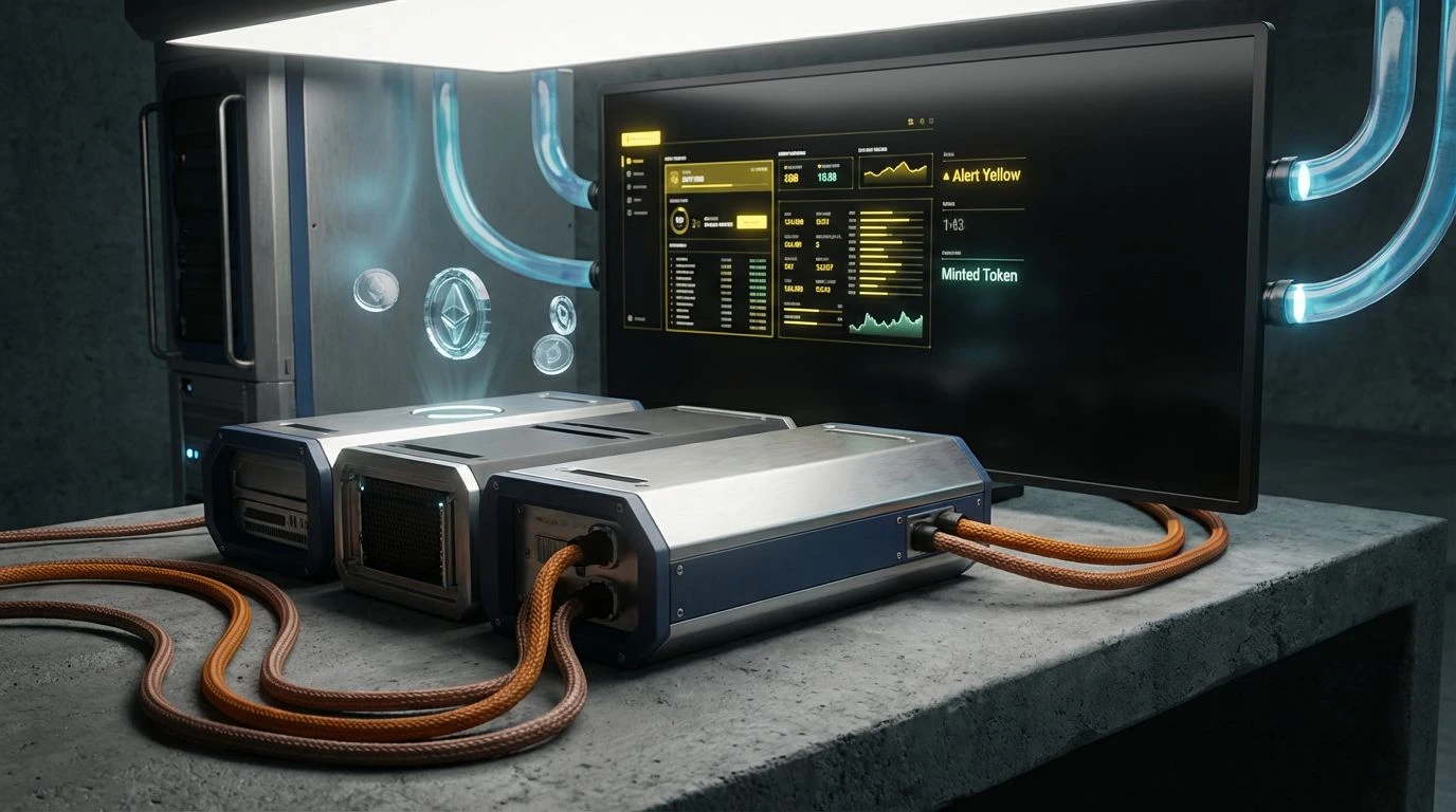
Hard Reset 💥
Urgency dictates the rhythm here. This is the sensory experience of a dashboard lighting up during a critical incident, where information must be digested instantly. The profound darkness of Obsidian Screen allows the incandescent indicators of Alert Yellow and Warning Orange to sear themselves into the retina. Nothing is passive; the environment is alive with monitoring signals. Faded Copper and Minted Token act as secondary metrics, traffic lights in a high-speed data metropolis, guiding the eye across graphs and fluctuating integers. It captures the adrenaline of real-time analytics, where a spike in Azure Stream indicates a surge in traffic or a potential bottleneck. The contrast is aggressive, bordering on abrasive, yet it ensures that no detail is missed in the chaos. It transforms the screen into a mission control panel, demanding a reaction, forcing the user to engage with the raw output of the system rather than passively observing it.
Binary Standard 🖱️
We reach the absolute zero of the interface design world. Binary Standard rejects the notion of spectrum, opting instead for a binary existence where things are either on or off, visible or hidden. Absolute White and Null Black stand in total opposition, creating a typographic landscape that is as legible as it is unforgiving. There is no room for error or ambiguity here. Stone Render and Heavy Metal provide the faintest hint of structure—grid lines, borders, barely perceptible containers—but the primary experience is one of suspended data. The singular jolt of Primary Directive Blue is startling in its isolation; it becomes the only possible action, the singular button or link that propels the user forward. This reflects the philosophy of "don't make me think," stripped to its barest bones. It is the visual equivalent of a perfectly optimized algorithm: nothing wasted, nothing extraneous, just the brutal efficiency of logic made visible.
The move toward these brutalist, high-contrast aesthetics in developer tools is a rejection of the superficial. We see a cultural shift acknowledging that for the creators of digital infrastructure, beauty lies in the unobstructed flow of information. These palettes do not attempt to sedate the user with soft transitions or comforting gradients; instead, they offer a crisp handshake and a direct line of sight to the problem at hand. Whether through the nostalgic sepia of legacy documentation or the neon urgency of a live server monitor, the visual language prioritizes truth over comfort. By treating the user interface as a utility—much like the electricity powering the machine—these schemes honor the intelligence of the developer, providing a workbench that is as sharp, durable, and precise as the code being written upon it.