'%3e%3cpath%20fill-rule='evenodd'%20clip-rule='evenodd'%20d='M51.1303%2019.2492C50.7278%2019.913%2050.1346%2020.4426%2049.3508%2020.838C48.5669%2021.2335%2047.6172%2021.4312%2046.5014%2021.4312C44.8208%2021.4312%2043.4367%2021.0216%2042.3492%2020.2025C41.2617%2019.3833%2040.6686%2018.2394%2040.5697%2016.7706H44.4253C44.4818%2017.3355%2044.6831%2017.7804%2045.0291%2018.1052C45.3751%2018.43%2045.8164%2018.5924%2046.3531%2018.5924C46.8192%2018.5924%2047.1864%2018.4653%2047.4547%2018.2111C47.7231%2017.9569%2047.8572%2017.618%2047.8572%2017.1943C47.8572%2016.8129%2047.7337%2016.4952%2047.4865%2016.241C47.2393%2015.9867%2046.9322%2015.7784%2046.565%2015.616C46.1978%2015.4536%2045.6893%2015.2594%2045.0397%2015.0334C44.0934%2014.7086%2043.3202%2014.3944%2042.72%2014.0907C42.1197%2013.7871%2041.6042%2013.3351%2041.1735%2012.7349C40.7427%2012.1347%2040.5273%2011.3544%2040.5273%2010.394C40.5273%209.50418%2040.7533%208.73448%2041.2053%208.08481C41.6572%207.43515%2042.2821%206.93731%2043.0801%206.5913C43.8781%206.24528%2044.7925%206.07227%2045.8235%206.07227C47.49%206.07227%2048.8141%206.46771%2049.7956%207.25861C50.7772%208.04951%2051.3315%209.13698%2051.4586%2010.5211H47.5395C47.4689%2010.0268%2047.2888%209.63483%2046.9993%209.3453C46.7097%209.05578%2046.3178%208.91102%2045.8235%208.91102C45.3998%208.91102%2045.0573%209.024%2044.7961%209.24997C44.5348%209.47594%2044.4041%209.80783%2044.4041%2010.2457C44.4041%2010.5988%2044.5207%2010.8989%2044.7537%2011.146C44.9867%2011.3932%2045.2798%2011.5944%2045.6328%2011.7498C45.9859%2011.9052%2046.4944%2012.1029%2047.1581%2012.343C48.1185%2012.6678%2048.9023%2012.9891%2049.5096%2013.3069C50.1169%2013.6246%2050.6395%2014.0872%2051.0773%2014.6945C51.5151%2015.3018%2051.734%2016.0927%2051.734%2017.0672C51.734%2017.8581%2051.5328%2018.5854%2051.1303%2019.2492ZM59.0242%206.3053V21.2829H55.4016V6.3053H59.0242ZM73.9409%206.3053V9.18642H69.8734V21.2829H66.2296V9.18642H62.2046V6.3053H73.9409ZM80.7438%209.18642V12.3218H85.8069V15.0546H80.7438V18.3806H86.4425V21.2829H77.1212V6.3053H86.4425V9.18642H80.7438ZM99.667%2016.0291V21.2829H96.0444V6.3053H101.913C103.692%206.3053%20105.048%206.74665%20105.98%207.62934C106.912%208.51204%20107.378%209.7019%20107.378%2011.199C107.378%2012.1311%20107.17%2012.9609%20106.753%2013.6882C106.337%2014.4155%20105.719%2014.9875%20104.9%2015.4042C104.08%2015.8208%20103.085%2016.0291%20101.913%2016.0291H99.667ZM103.692%2011.199C103.692%209.8855%20102.965%209.22879%20101.51%209.22879H99.667V13.1268H101.51C102.965%2013.1268%20103.692%2012.4842%20103.692%2011.199ZM120.092%2018.5501H114.478L113.546%2021.2829H109.732L115.219%206.41123H119.393L124.879%2021.2829H121.024L120.092%2018.5501ZM119.16%2015.7961L117.295%2010.2881L115.41%2015.7961H119.16ZM131.555%2018.5077H136.385V21.2829H127.933V6.3053H131.555V18.5077ZM143.337%209.18642V12.3218H148.4V15.0546H143.337V18.3806H149.035V21.2829H139.714V6.3053H149.035V9.18642H143.337ZM163.507%206.3053V9.18642H159.44V21.2829H155.796V9.18642H151.771V6.3053H163.507ZM177.449%206.3053V9.18642H173.382V21.2829H169.738V9.18642H165.713V6.3053H177.449ZM184.252%209.18642V12.3218H189.315V15.0546H184.252V18.3806H189.951V21.2829H180.629V6.3053H189.951V9.18642H184.252Z'%20fill='%23EEF0ED'/%3e%3cmask%20id='mask0_3101_7327'%20style='mask-type:alpha'%20maskUnits='userSpaceOnUse'%20x='0'%20y='0'%20width='27'%20height='28'%3e%3cpath%20d='M23.8328%200.759766H2.64808C1.18559%200.759766%200%201.94535%200%203.40785V24.5925C0%2026.055%201.18559%2027.2406%202.64808%2027.2406H23.8328C25.2952%2027.2406%2026.4808%2026.055%2026.4808%2024.5925V3.40785C26.4808%201.94535%2025.2952%200.759766%2023.8328%200.759766Z'%20fill='white'/%3e%3c/mask%3e%3cg%20mask='url(%23mask0_3101_7327)'%3e%3cpath%20d='M23.8328%200.759766H2.64808C1.18559%200.759766%200%201.94535%200%203.40785V24.5925C0%2026.055%201.18559%2027.2406%202.64808%2027.2406H23.8328C25.2952%2027.2406%2026.4808%2026.055%2026.4808%2024.5925V3.40785C26.4808%201.94535%2025.2952%200.759766%2023.8328%200.759766Z'%20fill='%23D8D8D8'/%3e%3cpath%20d='M13.2404%200.759766H0V14.0001H13.2404V0.759766Z'%20fill='%238C61FF'/%3e%3cpath%20d='M13.2404%2014H0V27.2404H13.2404V14Z'%20fill='%2336C3FE'/%3e%3cpath%20d='M26.4806%2014H13.2402V27.2404H26.4806V14Z'%20fill='%236592FE'/%3e%3cpath%20d='M26.4806%200.759766H13.2402V14.0002H26.4806V0.759766Z'%20fill='%236059F7'/%3e%3c/g%3e%3c/g%3e%3cdefs%3e%3cclipPath%20id='clip0_3101_7327'%3e%3crect%20width='190'%20height='28'%20fill='white'/%3e%3c/clipPath%3e%3c/defs%3e%3c/svg%3e)
'%3e%3cpath%20d='M23.8328%200.759521H2.64808C1.18559%200.759521%200%201.94511%200%203.40761V24.5923C0%2026.0548%201.18559%2027.2404%202.64808%2027.2404H23.8328C25.2952%2027.2404%2026.4808%2026.0548%2026.4808%2024.5923V3.40761C26.4808%201.94511%2025.2952%200.759521%2023.8328%200.759521Z'%20fill='%23D8D8D8'/%3e%3cpath%20d='M13.2404%200.759521H0V13.9999H13.2404V0.759521Z'%20fill='%238C61FF'/%3e%3cpath%20d='M13.2404%2013.9998H0V27.2402H13.2404V13.9998Z'%20fill='%2336C3FE'/%3e%3cpath%20d='M26.4809%2013.9998H13.2405V27.2402H26.4809V13.9998Z'%20fill='%236592FE'/%3e%3cpath%20d='M26.4809%200.759277H13.2405V13.9997H26.4809V0.759277Z'%20fill='%236059F7'/%3e%3c/g%3e%3c/svg%3e)
70s Retro Sportswear Color Palettes for Modern Design
19 Feb 2026 · 6 min readEntering the visual landscape of seventies athletics implies a sensory journey through tactile nostalgia and sun-drenched memory. It is a world where synthetic fibers met the rugged outdoors, creating a distinct vocabulary of color that defined a decade of leisure. This era did not just dress the body for movement; it draped the cultural psyche in hues of burnt earth, synthetic sunshine, and the cool shadows of the bleachers. The revival of this aesthetic in contemporary streetwear is not merely a repetition of the past but a reinterpretation of comfort and rebellion. We see a shift away from the hyper-digital neons of later decades, returning instead to a grounded, organic warmth that feels worn-in and lived-in. Understanding these shades requires looking past the garment and seeing the lifestyle: the Sunday morning jog, the roller rink vernacular, and the hazy, golden-hour light that seemed to coat every photograph of the period. These selections capture that specific intersection of grit and glamour.
Varsity Weekend 🌲
There is a distinct academic charm to Varsity Weekend, unmistakably recalling the crisp air of a college football game in late October. The grounding presence of Stadium Turf and Leather Football suggests a narrative of tradition and rugged play, while the lighter Faded Sky brings a necessary breath of fresh air to the composition. Imagine the texture of heavy cotton and wool; this grouping speaks to the heritage side of streetwear, where the focus lies on durability and classic silhouettes. Tangerine Piping cuts through the muted earthy tones like a sudden cheer from the crowd, offering a singular point of high energy against the neutral backdrop of Fawn Jersey. It feels studious yet active, perfect for branding that values history and substance over fleeting trends. The interplay between the Denim Warm-up blue and the deep browns creates a sophisticated friction, suitable for a collection that transitions from the hiking trail to the library.
Sunset Sprint ⚡
Speed and heat define the aggressive energy of Sunset Sprint. This is the palette of hot asphalt and fast cars, capturing the more rebellious, gasoline-fueled side of the seventies. The deep, consuming darkness of Vinyl Seat provides a heavy anchor, allowing the searing brightness of Solar Flare to pop with electric intensity. It brings to mind the glossy finish of a muscle car or the high-contrast stripes on a racing jacket. Marigold Nylon adds a layer of synthetic warmth, suggesting the rise of technical sportswear fabrics that began to dominate the era. This arrangement refuses to be subtle; it demands attention and vibrates with an almost audible hum of activity. Designers might employ this selection for statement pieces—windbreakers or sneakers that are meant to be seen from a distance. The inclusion of Olive Drab adds a gritty, utilitarian undertone, preventing the brights from becoming too cheerful and maintaining an edge of urban toughness.
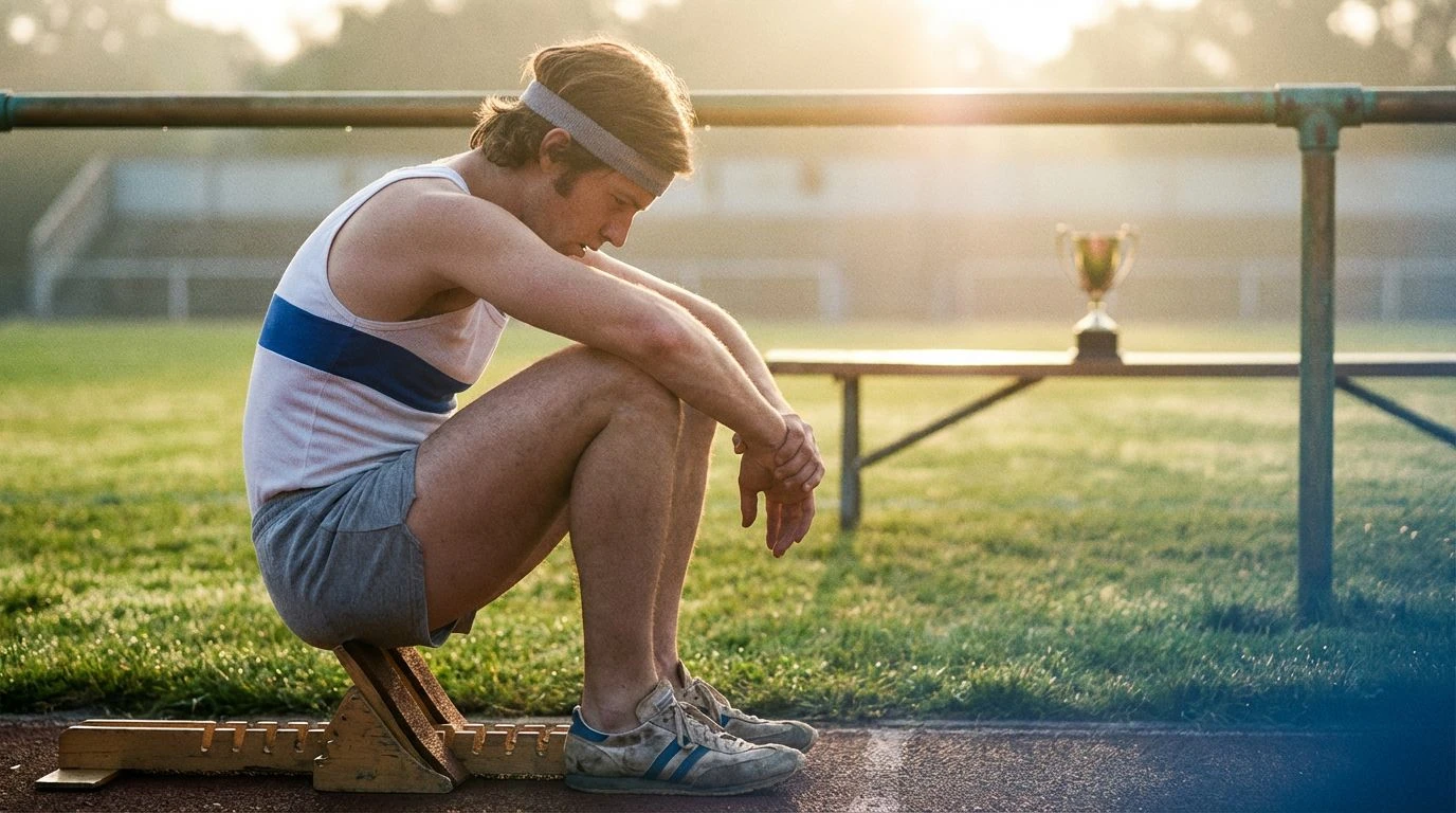
Olympic Archive 🥇
Polished, prestigious, and undeniably classic, Olympic Archive draws inspiration from the global stage of competitive sports. The crispness of Mesh White and Heather Grey sets a foundation of discipline and training, reminiscent of the simple cotton t-shirts worn during practice sessions. Against this neutral base, Champion Azure and Court Green emerge as the colors of national pride and manicured fields. There is a sense of order here, a clean geometry that defined the graphic design of major sporting events in the seventies. Trophy Gold provides the necessary accent of victory, shining with a metallic luster that elevates the entire composition. This selection suits a brand looking to communicate excellence and timelessness. It avoids the murky undertones of counter-culture in favor of a bright, hopeful aesthetic. One can almost hear the snap of a flag in the wind or the whistle of a referee; it is organized, purposeful, and strikingly clean.
Venice Boardwalk 🛹
The haze of the West Coast afternoon permeates Venice Boardwalk, a collection that feels baked by the sun and dusted with sand. Red Clay and Sandstone Court mimic the scorched surfaces of public tennis courts and skate parks, offering a warm, inviting base that feels inherently casual. This is the leisurely side of athletics, where the sport is secondary to the lifestyle. Canvas Shoe and California Sun suggest breathable fabrics and long days spent outdoors, creating a mood that is relaxed and effortlessly cool. The surprise of Neon Tennis Ball injects a jolt of acidity, breaking the monochrome of the sandy tones with a touch of seventies psychedelia. It reflects a youth culture that was beginning to experiment with brighter, bolder visuals while maintaining a connection to the earth. Fashion lines focusing on skate culture or summer leisure would find a natural ally in these hues, which communicate a sense of freedom and endless summer days.
Asphalt & Autumn 🍂
Asphalt & Autumn explores the moodier, darker spectrum of the era, focusing on the solitary runner moving through a city at dusk. The palette is heavy and rich, dominated by the brooding presence of Midnight Runner and Shadows. This is not the bright sunshine of the beach, but the cool, clouded atmosphere of an urban changing season. Oxblood Sneaker introduces a deep, visceral red that feels sophisticated and mature, paired beautifully with the muted warmth of Amber Lens. The inclusion of Chartreuse Stripe acts as a safety reflector in the night, a small but necessary detail that adds functional visibility to the dark tones. This scheme works exceptionally well for autumn collections or technical outerwear designed for city living. It strips away the candy-colored optimism of the disco era to reveal something rawer and more grounded, emphasizing the solitude and determination of the individual athlete against the backdrop of a grey metropolis.
Reflecting on these curated collections reveals how the visual identity of nineteen-seventies sport style transcends mere clothing to become a shorthand for an entire mood. From the scholastic discipline of deep greens and browns to the unapologetic heat of solar oranges and yellows, each arrangement tells a story of movement and stillness. Contemporary designers look to these specific tones not just for their retro appeal, but for their ability to ground modern technical fabrics in something human and recognizable. The enduring power of this era lies in its balance; it manages to be vibrant without being shrill, and earthy without being dull. As the lines between performance wear and daily uniforms continue to blur, the lessons from this decade remain clear: color is an experience, a texture, and a memory all woven into one. These palettes offer a roadmap for reclaiming that spirited energy, reminding us that style, at its best, is always in motion.