'%3e%3cpath%20fill-rule='evenodd'%20clip-rule='evenodd'%20d='M51.1303%2019.2492C50.7278%2019.913%2050.1346%2020.4426%2049.3508%2020.838C48.5669%2021.2335%2047.6172%2021.4312%2046.5014%2021.4312C44.8208%2021.4312%2043.4367%2021.0216%2042.3492%2020.2025C41.2617%2019.3833%2040.6686%2018.2394%2040.5697%2016.7706H44.4253C44.4818%2017.3355%2044.6831%2017.7804%2045.0291%2018.1052C45.3751%2018.43%2045.8164%2018.5924%2046.3531%2018.5924C46.8192%2018.5924%2047.1864%2018.4653%2047.4547%2018.2111C47.7231%2017.9569%2047.8572%2017.618%2047.8572%2017.1943C47.8572%2016.8129%2047.7337%2016.4952%2047.4865%2016.241C47.2393%2015.9867%2046.9322%2015.7784%2046.565%2015.616C46.1978%2015.4536%2045.6893%2015.2594%2045.0397%2015.0334C44.0934%2014.7086%2043.3202%2014.3944%2042.72%2014.0907C42.1197%2013.7871%2041.6042%2013.3351%2041.1735%2012.7349C40.7427%2012.1347%2040.5273%2011.3544%2040.5273%2010.394C40.5273%209.50418%2040.7533%208.73448%2041.2053%208.08481C41.6572%207.43515%2042.2821%206.93731%2043.0801%206.5913C43.8781%206.24528%2044.7925%206.07227%2045.8235%206.07227C47.49%206.07227%2048.8141%206.46771%2049.7956%207.25861C50.7772%208.04951%2051.3315%209.13698%2051.4586%2010.5211H47.5395C47.4689%2010.0268%2047.2888%209.63483%2046.9993%209.3453C46.7097%209.05578%2046.3178%208.91102%2045.8235%208.91102C45.3998%208.91102%2045.0573%209.024%2044.7961%209.24997C44.5348%209.47594%2044.4041%209.80783%2044.4041%2010.2457C44.4041%2010.5988%2044.5207%2010.8989%2044.7537%2011.146C44.9867%2011.3932%2045.2798%2011.5944%2045.6328%2011.7498C45.9859%2011.9052%2046.4944%2012.1029%2047.1581%2012.343C48.1185%2012.6678%2048.9023%2012.9891%2049.5096%2013.3069C50.1169%2013.6246%2050.6395%2014.0872%2051.0773%2014.6945C51.5151%2015.3018%2051.734%2016.0927%2051.734%2017.0672C51.734%2017.8581%2051.5328%2018.5854%2051.1303%2019.2492ZM59.0242%206.3053V21.2829H55.4016V6.3053H59.0242ZM73.9409%206.3053V9.18642H69.8734V21.2829H66.2296V9.18642H62.2046V6.3053H73.9409ZM80.7438%209.18642V12.3218H85.8069V15.0546H80.7438V18.3806H86.4425V21.2829H77.1212V6.3053H86.4425V9.18642H80.7438ZM99.667%2016.0291V21.2829H96.0444V6.3053H101.913C103.692%206.3053%20105.048%206.74665%20105.98%207.62934C106.912%208.51204%20107.378%209.7019%20107.378%2011.199C107.378%2012.1311%20107.17%2012.9609%20106.753%2013.6882C106.337%2014.4155%20105.719%2014.9875%20104.9%2015.4042C104.08%2015.8208%20103.085%2016.0291%20101.913%2016.0291H99.667ZM103.692%2011.199C103.692%209.8855%20102.965%209.22879%20101.51%209.22879H99.667V13.1268H101.51C102.965%2013.1268%20103.692%2012.4842%20103.692%2011.199ZM120.092%2018.5501H114.478L113.546%2021.2829H109.732L115.219%206.41123H119.393L124.879%2021.2829H121.024L120.092%2018.5501ZM119.16%2015.7961L117.295%2010.2881L115.41%2015.7961H119.16ZM131.555%2018.5077H136.385V21.2829H127.933V6.3053H131.555V18.5077ZM143.337%209.18642V12.3218H148.4V15.0546H143.337V18.3806H149.035V21.2829H139.714V6.3053H149.035V9.18642H143.337ZM163.507%206.3053V9.18642H159.44V21.2829H155.796V9.18642H151.771V6.3053H163.507ZM177.449%206.3053V9.18642H173.382V21.2829H169.738V9.18642H165.713V6.3053H177.449ZM184.252%209.18642V12.3218H189.315V15.0546H184.252V18.3806H189.951V21.2829H180.629V6.3053H189.951V9.18642H184.252Z'%20fill='%23EEF0ED'/%3e%3cmask%20id='mask0_3101_7327'%20style='mask-type:alpha'%20maskUnits='userSpaceOnUse'%20x='0'%20y='0'%20width='27'%20height='28'%3e%3cpath%20d='M23.8328%200.759766H2.64808C1.18559%200.759766%200%201.94535%200%203.40785V24.5925C0%2026.055%201.18559%2027.2406%202.64808%2027.2406H23.8328C25.2952%2027.2406%2026.4808%2026.055%2026.4808%2024.5925V3.40785C26.4808%201.94535%2025.2952%200.759766%2023.8328%200.759766Z'%20fill='white'/%3e%3c/mask%3e%3cg%20mask='url(%23mask0_3101_7327)'%3e%3cpath%20d='M23.8328%200.759766H2.64808C1.18559%200.759766%200%201.94535%200%203.40785V24.5925C0%2026.055%201.18559%2027.2406%202.64808%2027.2406H23.8328C25.2952%2027.2406%2026.4808%2026.055%2026.4808%2024.5925V3.40785C26.4808%201.94535%2025.2952%200.759766%2023.8328%200.759766Z'%20fill='%23D8D8D8'/%3e%3cpath%20d='M13.2404%200.759766H0V14.0001H13.2404V0.759766Z'%20fill='%238C61FF'/%3e%3cpath%20d='M13.2404%2014H0V27.2404H13.2404V14Z'%20fill='%2336C3FE'/%3e%3cpath%20d='M26.4806%2014H13.2402V27.2404H26.4806V14Z'%20fill='%236592FE'/%3e%3cpath%20d='M26.4806%200.759766H13.2402V14.0002H26.4806V0.759766Z'%20fill='%236059F7'/%3e%3c/g%3e%3c/g%3e%3cdefs%3e%3cclipPath%20id='clip0_3101_7327'%3e%3crect%20width='190'%20height='28'%20fill='white'/%3e%3c/clipPath%3e%3c/defs%3e%3c/svg%3e)
'%3e%3cpath%20d='M23.8328%200.759521H2.64808C1.18559%200.759521%200%201.94511%200%203.40761V24.5923C0%2026.0548%201.18559%2027.2404%202.64808%2027.2404H23.8328C25.2952%2027.2404%2026.4808%2026.0548%2026.4808%2024.5923V3.40761C26.4808%201.94511%2025.2952%200.759521%2023.8328%200.759521Z'%20fill='%23D8D8D8'/%3e%3cpath%20d='M13.2404%200.759521H0V13.9999H13.2404V0.759521Z'%20fill='%238C61FF'/%3e%3cpath%20d='M13.2404%2013.9998H0V27.2402H13.2404V13.9998Z'%20fill='%2336C3FE'/%3e%3cpath%20d='M26.4809%2013.9998H13.2405V27.2402H26.4809V13.9998Z'%20fill='%236592FE'/%3e%3cpath%20d='M26.4809%200.759277H13.2405V13.9997H26.4809V0.759277Z'%20fill='%236059F7'/%3e%3c/g%3e%3c/svg%3e)
Calm Fintech Color Palettes for Mindful App Design
18 Feb 2026 · 5 min readThe architecture of our financial lives is undergoing a quiet renovation. For decades, the visual language of banking was dominated by the urgent glare of ticker-tape red and the imposing, sterile navy of institutional authority. This aesthetic reflected an era where money was synonymous with stress, speed, and status. Today, however, a new philosophy is rewriting the code. By borrowing the vocabulary of Scandinavian interiors and the restorative atmosphere of wellness retreats, modern financial interfaces are acknowledging a simple truth: managing wealth is emotional labor. The screen we stare at should not induce anxiety but quell it. We are seeing a pivot toward interfaces that function less like trading desks and more like digital sanctuaries, where clarity replaces clutter and the user experience feels as organic as a breath of fresh air. This shift is not merely cosmetic; it is a fundamental reordering of priorities, placing mental well-being alongside fiscal health.
Nordic Sunrise 🌤️
This arrangement captures the precise moment when light breaks over a cold horizon, offering a study in regulated optimism. The foundation rests on steady, serious tones like Slate Rock and Midnight Ocean, which provide the necessary gravity for a banking application. However, the energy is completely transformed by the inclusion of Apricot Zest and Morning Sun. Unlike the aggressive alerts of traditional stock apps, these yellows and oranges suggest warmth and possibility, much like the inviting accent pillows in a modern living room. It balances the demand for productivity with a sense of hopeful progression. The cool Glacial Ice bridges the gap between the dark corporate blues and the friendly citrus tones, creating a user interface that feels alert but never alarming. It speaks to a user base that wants their financial tools to be responsive and bright, shedding the dusty, heavy coat of legacy banking.
Digital Archipelago 🏝️
Here we see the transition from the boardroom to the bathhouse, utilizing the calming properties of water to induce a state of flow. The spectrum relies heavily on the psychological safety associated with deep blues and greens. Deep Kelp and Mariana Blue offer a submerged, secure background, suggesting that one's assets are protected in the depths. The introduction of Lagoon Turquoise and Mist Lavender softens the typically masculine edge of financial tech, bringing in the "healing spa" element that recenters the user. Electric Cobalt remains the only nod to high-speed technology, acting as a focal point for primary actions without disrupting the overall tranquility. This selection is particularly effective for investment platforms where the goal is long-term growth rather than day-trading adrenaline, encouraging a mindset that is fluid, deep, and composed.
Bauhaus Ledger 📐
Restraint is the defining characteristic of this group, mirroring the disciplined minimalism found in Scandinavian design. The stark contrast between Canvas White, Concrete, and Charcoal creates a rigorous, grid-like structure that implies absolute precision—a highly desirable trait for any institution handling money. Amidst this monochrome efficiency, Turmeric provides a singular, organic touch, reminiscent of natural wood or raw textiles often found in Scandi-boho interiors. It warms the otherwise industrial atmosphere, making the data feel personal rather than robotic. Klein Blue acts as the digital anchor, a reminder of the software's capability. This sets a mood of uncluttered, productive focus. It tells the user that the system is clean, the math is correct, and there are no hidden distractions. It is the visual equivalent of a perfectly organized desk.
Earthen Equity 🏺
Departing significantly from the sleek glass-and-steel aesthetic of traditional fintech, this collection grounds the user in the tangible world. The presence of Espresso and Terracotta Clay introduces a warmth that is almost tactile, evoking the clay pots and wooden furniture of a bohemian loft. These earthy browns are stabilized by the cool, metallic notes of Silver Birch and Oxidized Copper, preventing the interface from feeling too rustic. The combination suggests that money is a resource to be cultivated, like a garden, rather than hunted. It appeals to a generation looking for sustainability and organic growth. The interplay of Deep River and Pewter ensures readability and structure, but the emotional weight is carried by the red-browns and teals, creating an atmosphere of homegrown stability and artisanal care.
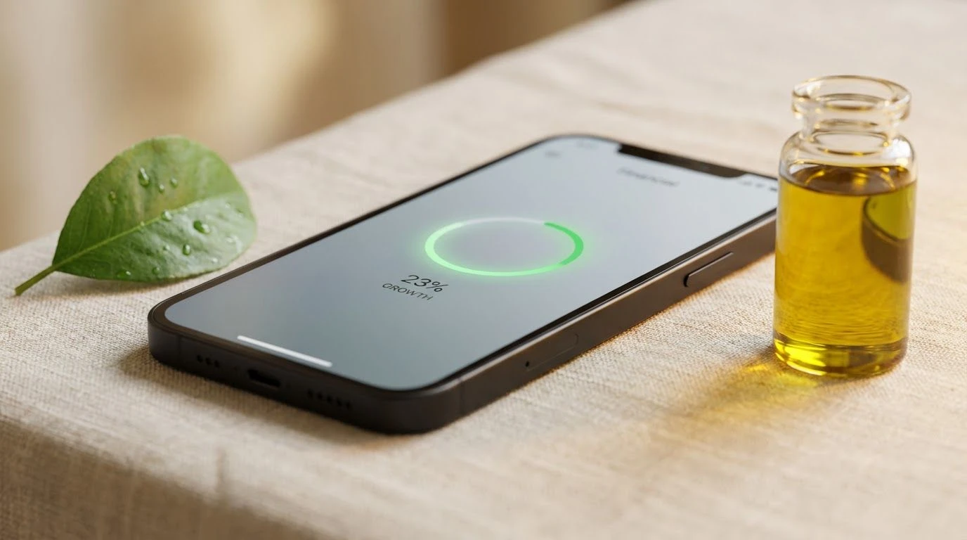
Botanical Interest 🌿
This is the purest expression of the "healing spa" concept applied to finance. The complete absence of black or harsh darks creates an incredibly soft, approachable interface. Oat Milk serves as a gentle, creamy background that reduces eye strain, a significant departure from the stark bright white of standard apps. The greens, ranging from the fresh Spring Shoot to the mature Spruce, drive home the metaphor of organic accumulation and health. It feels medicinal in the best way—curative and restorative. Olive Oil adds a sophisticated, savory gold tone that signifies value without the gaudiness of standard metallics. This palette is ideally suited for savings and budgeting tools where the objective is to nurture better habits. It transforms the act of checking a balance into a moment of calm reflection.
As we move further into this era of mindful money management, the palette transformation suggests a broader cultural acceptance that financial health cannot be separated from emotional stability. These color schemes do more than decorate a screen; they reframe the conversation around wealth, shifting it from a source of panic to a cultivated resource. By adopting the textures of the natural world and the disciplined minimalism of Northern European design, fintech companies are signaling that they understand the human behind the transaction. The result is a digital environment where users feel invited to stay, plan, and grow, firmly rooting the abstract concept of digital currency in a tangible, comforting reality. This is the new aesthetic of trust: quiet, composed, and undeniably human.