'%3e%3cpath%20fill-rule='evenodd'%20clip-rule='evenodd'%20d='M51.1303%2019.2492C50.7278%2019.913%2050.1346%2020.4426%2049.3508%2020.838C48.5669%2021.2335%2047.6172%2021.4312%2046.5014%2021.4312C44.8208%2021.4312%2043.4367%2021.0216%2042.3492%2020.2025C41.2617%2019.3833%2040.6686%2018.2394%2040.5697%2016.7706H44.4253C44.4818%2017.3355%2044.6831%2017.7804%2045.0291%2018.1052C45.3751%2018.43%2045.8164%2018.5924%2046.3531%2018.5924C46.8192%2018.5924%2047.1864%2018.4653%2047.4547%2018.2111C47.7231%2017.9569%2047.8572%2017.618%2047.8572%2017.1943C47.8572%2016.8129%2047.7337%2016.4952%2047.4865%2016.241C47.2393%2015.9867%2046.9322%2015.7784%2046.565%2015.616C46.1978%2015.4536%2045.6893%2015.2594%2045.0397%2015.0334C44.0934%2014.7086%2043.3202%2014.3944%2042.72%2014.0907C42.1197%2013.7871%2041.6042%2013.3351%2041.1735%2012.7349C40.7427%2012.1347%2040.5273%2011.3544%2040.5273%2010.394C40.5273%209.50418%2040.7533%208.73448%2041.2053%208.08481C41.6572%207.43515%2042.2821%206.93731%2043.0801%206.5913C43.8781%206.24528%2044.7925%206.07227%2045.8235%206.07227C47.49%206.07227%2048.8141%206.46771%2049.7956%207.25861C50.7772%208.04951%2051.3315%209.13698%2051.4586%2010.5211H47.5395C47.4689%2010.0268%2047.2888%209.63483%2046.9993%209.3453C46.7097%209.05578%2046.3178%208.91102%2045.8235%208.91102C45.3998%208.91102%2045.0573%209.024%2044.7961%209.24997C44.5348%209.47594%2044.4041%209.80783%2044.4041%2010.2457C44.4041%2010.5988%2044.5207%2010.8989%2044.7537%2011.146C44.9867%2011.3932%2045.2798%2011.5944%2045.6328%2011.7498C45.9859%2011.9052%2046.4944%2012.1029%2047.1581%2012.343C48.1185%2012.6678%2048.9023%2012.9891%2049.5096%2013.3069C50.1169%2013.6246%2050.6395%2014.0872%2051.0773%2014.6945C51.5151%2015.3018%2051.734%2016.0927%2051.734%2017.0672C51.734%2017.8581%2051.5328%2018.5854%2051.1303%2019.2492ZM59.0242%206.3053V21.2829H55.4016V6.3053H59.0242ZM73.9409%206.3053V9.18642H69.8734V21.2829H66.2296V9.18642H62.2046V6.3053H73.9409ZM80.7438%209.18642V12.3218H85.8069V15.0546H80.7438V18.3806H86.4425V21.2829H77.1212V6.3053H86.4425V9.18642H80.7438ZM99.667%2016.0291V21.2829H96.0444V6.3053H101.913C103.692%206.3053%20105.048%206.74665%20105.98%207.62934C106.912%208.51204%20107.378%209.7019%20107.378%2011.199C107.378%2012.1311%20107.17%2012.9609%20106.753%2013.6882C106.337%2014.4155%20105.719%2014.9875%20104.9%2015.4042C104.08%2015.8208%20103.085%2016.0291%20101.913%2016.0291H99.667ZM103.692%2011.199C103.692%209.8855%20102.965%209.22879%20101.51%209.22879H99.667V13.1268H101.51C102.965%2013.1268%20103.692%2012.4842%20103.692%2011.199ZM120.092%2018.5501H114.478L113.546%2021.2829H109.732L115.219%206.41123H119.393L124.879%2021.2829H121.024L120.092%2018.5501ZM119.16%2015.7961L117.295%2010.2881L115.41%2015.7961H119.16ZM131.555%2018.5077H136.385V21.2829H127.933V6.3053H131.555V18.5077ZM143.337%209.18642V12.3218H148.4V15.0546H143.337V18.3806H149.035V21.2829H139.714V6.3053H149.035V9.18642H143.337ZM163.507%206.3053V9.18642H159.44V21.2829H155.796V9.18642H151.771V6.3053H163.507ZM177.449%206.3053V9.18642H173.382V21.2829H169.738V9.18642H165.713V6.3053H177.449ZM184.252%209.18642V12.3218H189.315V15.0546H184.252V18.3806H189.951V21.2829H180.629V6.3053H189.951V9.18642H184.252Z'%20fill='%23EEF0ED'/%3e%3cmask%20id='mask0_3101_7327'%20style='mask-type:alpha'%20maskUnits='userSpaceOnUse'%20x='0'%20y='0'%20width='27'%20height='28'%3e%3cpath%20d='M23.8328%200.759766H2.64808C1.18559%200.759766%200%201.94535%200%203.40785V24.5925C0%2026.055%201.18559%2027.2406%202.64808%2027.2406H23.8328C25.2952%2027.2406%2026.4808%2026.055%2026.4808%2024.5925V3.40785C26.4808%201.94535%2025.2952%200.759766%2023.8328%200.759766Z'%20fill='white'/%3e%3c/mask%3e%3cg%20mask='url(%23mask0_3101_7327)'%3e%3cpath%20d='M23.8328%200.759766H2.64808C1.18559%200.759766%200%201.94535%200%203.40785V24.5925C0%2026.055%201.18559%2027.2406%202.64808%2027.2406H23.8328C25.2952%2027.2406%2026.4808%2026.055%2026.4808%2024.5925V3.40785C26.4808%201.94535%2025.2952%200.759766%2023.8328%200.759766Z'%20fill='%23D8D8D8'/%3e%3cpath%20d='M13.2404%200.759766H0V14.0001H13.2404V0.759766Z'%20fill='%238C61FF'/%3e%3cpath%20d='M13.2404%2014H0V27.2404H13.2404V14Z'%20fill='%2336C3FE'/%3e%3cpath%20d='M26.4806%2014H13.2402V27.2404H26.4806V14Z'%20fill='%236592FE'/%3e%3cpath%20d='M26.4806%200.759766H13.2402V14.0002H26.4806V0.759766Z'%20fill='%236059F7'/%3e%3c/g%3e%3c/g%3e%3cdefs%3e%3cclipPath%20id='clip0_3101_7327'%3e%3crect%20width='190'%20height='28'%20fill='white'/%3e%3c/clipPath%3e%3c/defs%3e%3c/svg%3e)
'%3e%3cpath%20d='M23.8328%200.759521H2.64808C1.18559%200.759521%200%201.94511%200%203.40761V24.5923C0%2026.0548%201.18559%2027.2404%202.64808%2027.2404H23.8328C25.2952%2027.2404%2026.4808%2026.0548%2026.4808%2024.5923V3.40761C26.4808%201.94511%2025.2952%200.759521%2023.8328%200.759521Z'%20fill='%23D8D8D8'/%3e%3cpath%20d='M13.2404%200.759521H0V13.9999H13.2404V0.759521Z'%20fill='%238C61FF'/%3e%3cpath%20d='M13.2404%2013.9998H0V27.2402H13.2404V13.9998Z'%20fill='%2336C3FE'/%3e%3cpath%20d='M26.4809%2013.9998H13.2405V27.2402H26.4809V13.9998Z'%20fill='%236592FE'/%3e%3cpath%20d='M26.4809%200.759277H13.2405V13.9997H26.4809V0.759277Z'%20fill='%236059F7'/%3e%3c/g%3e%3c/svg%3e)
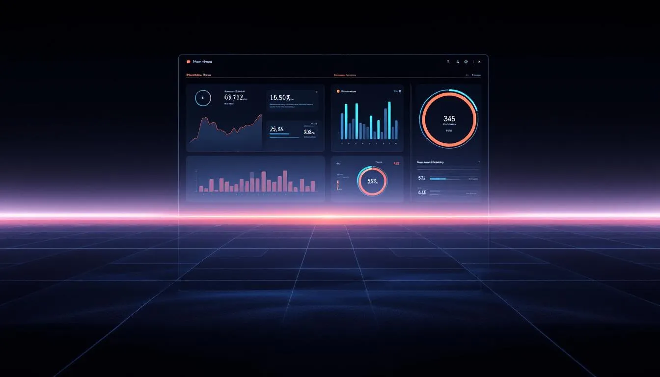
Synthwave Color Palettes for SaaS Dashboard UI Design
16 Feb 2026 · 6 min readIn a digital landscape seemingly dominated by sterile whites and apologetic pastels, a rhythmic rebellion is taking place behind the screen. We are witnessing a resurgence of high-octane aesthetics, where the reckless abandon of 1980s Miami sunsets crashes into the disciplined grid of modern software. This is not merely about decoration; it is about injecting a pulse into the flatlining world of enterprise tools. The synthwave movement, with its penchant for cinematic drama and neon-soaked horizons, offers a surprising antidote to the fatigue of staring at spreadsheets. By adopting the jagged energy of retro-futurism, designers can transform a mundane analytics view into a cockpit of intergalactic potential. It changes the relationship between the user and the data from one of passive observation to active piloting. When we stripe a user interface with electric magentas against a void of midnight soaring, we are not just organizing information; we are curating a mood. It creates a workspace that feels less like a cubicle and more like the interior of a DeLorean speeding towards a digital horizon. This approach demands confidence, substituting safe neutrality for a distinct, atmospheric voice that commands attention.
Analog Signal Sunrise 📼
There is a distinct tactile quality to Analog Signal Sunrise, recalling the heavy, satisfying click of a physical button on a hi-fi system. The foundation here is built upon Matte Charcoal and Graphite Tape, shades that provide a substantial, industrial weight to the background of any interface. Against this machinery-inspired darkness, the sudden intrusion of Electric Cobalt acts as a jolt of pure energy, guiding the eye with the precision of a laser grid. It is the Amber Warning, however, that steals the scene, mimicking the warm, glowing diode of a power indicator coming to life in a dim studio. This scheme avoids the overwhelming darkness often associated with the genre by introducing Static Snow and Aluminum Housing, allowing for panels of high readability that still maintain that gritty, retro-tech atmosphere. It suggests a dashboard that is meant to be used, not just admired—a reliable piece of hardware translated into pixels.
Grid Runner Nights 🌃
Grid Runner Nights plunges the viewer directly into the submerged world of the digital underground. The dominant force here is the Deep Space Void, a navy so profound it threatens to swallow the screen, creating the perfect canvas for light to behave like liquid. Into this abyss, Cyber Mint and Glacial Data pour like bioluminescent fluid through cooling tubes, outlining varying data streams with glowing efficacy. This is the palette of the nocturnal coder, the interface that comes alive only after the sun sets. Chromatic Steel bridges the gap between the blinding highlights and the shadowy depths, offering a metallic sheen that feels cool to the touch. The Laser Blue provides the final punch, a sharp, decisive tone ideal for call-to-action buttons that demand immediate interaction. It feels fast, frictionless, and impossibly sleek, evoking the sensation of speeding through a wireframe city where the only illumination comes from the information itself.
Cassette Deck Interface 📻
While sharing a genetic code with its analog predecessors, Cassette Deck Interface leans heavily into the interplay between light and structure. The Onyx Casing creates a severe, boxed-in environment reminiscent of classic Walkman designs, where every element is contained and protected. Here, the Sunset LED serves as the emotional center, a burst of warmth that disrupts the cool, mechanical logical of the Silver Trim and Shadow Grey. It is a study in controlled vibrancy. The Hyperlink Blue vibrates against the darker tones, creating a phantom image effect that makes charts and graphs appear to float above the surface. Usage of Porcelain Key prevents the aesthetic from becoming too claustrophobic, offering breathing room that keeps the layout breathable and crisp. This selection fits a platform that manages complex workflows, turning the chaos of daily tasks into a curated mixtape of organized actions.
Monochrome Mainframe 🎹
Stripped of all neon distraction, Monochrome Mainframe embraces the stark, brutalist architecture of early computing. It is the skeletal structure of the synthwave dream before the color is applied—raw, binary, and unyielding. The contrast between Absolute Void and Blank Canvas is maximized to create a purely graphical experience that feels more like an editorial layout than a software tool. Concrete Brutalism and Asphalt Circuit add the necessary nuance, providing layers of depth without breaking the grayscale discipline. This restraint speaks to a high-end sophistication, an interface that does not need to shout to be heard. It evokes the mood of noir photography or the stark lines of 1980s corporate logos. In a SaaS context, this severe minimalism clears the stage for the content to perform without competition, making it an incredibly stylish choice for text-heavy applications or code editors where clarity is the only metric that matters.
Midnight Velocity 🏎️
Midnight Velocity is a breathtaking gradient of speed and motion, capturing the rush of driving down a coastal highway with the top down. The spectrum of blues—from the deepest Midnight Ocean to the electrifying Voltage Blue—creates a sense of infinite depth and movement. It is indistinguishable from the sky at twilight. Tarmac Black grounds the design, ensuring that the lighter tones like Turquoise Lagoon and Horizon Blue pop with radioactive intensity. The inclusion of Hazed Lavender adds a subtle, almost imperceptible touch of romance to the otherwise cold spectrum, softening the edges of the dark UI components. This collection is perfect for real-time analytics or financial tickers, where the colors themselves imply momentum and trajectory. It transforms static tables into a flowing river of intelligence, washing over the user in a cool, cohesive wave of high-fidelity design.
Stepping away from these electric dreams, one realizes that the power of the synthwave aesthetic lies not in pure mimicry of the past, but in its ability to dramatize the present. These collections demonstrate that software need not be devoid of soul or style to remain functional. By borrowing the vocabulary of arcade cabinets and analog synthesizers—the stark contrasts, the glowing accents, the brutalist greys—we grant data a stage worthy of its importance. The user experience shifts from a chore to a performance. Whether through the blinding speed of electric blues or the grounding tactile sensation of charcoal darks, these palettes prove that clarity and character can coexist. As we move forward, the interface becomes a darker, sleeker, and more vibrant place, reminding us that even in the most technical workflows, there is room for the cinematic, the bold, and the beautifully nostalgic. We leave the beige cubicle behind, favoring instead the glow of the monitor in a darkened room, where every metric tells a story.