'%3e%3cpath%20fill-rule='evenodd'%20clip-rule='evenodd'%20d='M51.1303%2019.2492C50.7278%2019.913%2050.1346%2020.4426%2049.3508%2020.838C48.5669%2021.2335%2047.6172%2021.4312%2046.5014%2021.4312C44.8208%2021.4312%2043.4367%2021.0216%2042.3492%2020.2025C41.2617%2019.3833%2040.6686%2018.2394%2040.5697%2016.7706H44.4253C44.4818%2017.3355%2044.6831%2017.7804%2045.0291%2018.1052C45.3751%2018.43%2045.8164%2018.5924%2046.3531%2018.5924C46.8192%2018.5924%2047.1864%2018.4653%2047.4547%2018.2111C47.7231%2017.9569%2047.8572%2017.618%2047.8572%2017.1943C47.8572%2016.8129%2047.7337%2016.4952%2047.4865%2016.241C47.2393%2015.9867%2046.9322%2015.7784%2046.565%2015.616C46.1978%2015.4536%2045.6893%2015.2594%2045.0397%2015.0334C44.0934%2014.7086%2043.3202%2014.3944%2042.72%2014.0907C42.1197%2013.7871%2041.6042%2013.3351%2041.1735%2012.7349C40.7427%2012.1347%2040.5273%2011.3544%2040.5273%2010.394C40.5273%209.50418%2040.7533%208.73448%2041.2053%208.08481C41.6572%207.43515%2042.2821%206.93731%2043.0801%206.5913C43.8781%206.24528%2044.7925%206.07227%2045.8235%206.07227C47.49%206.07227%2048.8141%206.46771%2049.7956%207.25861C50.7772%208.04951%2051.3315%209.13698%2051.4586%2010.5211H47.5395C47.4689%2010.0268%2047.2888%209.63483%2046.9993%209.3453C46.7097%209.05578%2046.3178%208.91102%2045.8235%208.91102C45.3998%208.91102%2045.0573%209.024%2044.7961%209.24997C44.5348%209.47594%2044.4041%209.80783%2044.4041%2010.2457C44.4041%2010.5988%2044.5207%2010.8989%2044.7537%2011.146C44.9867%2011.3932%2045.2798%2011.5944%2045.6328%2011.7498C45.9859%2011.9052%2046.4944%2012.1029%2047.1581%2012.343C48.1185%2012.6678%2048.9023%2012.9891%2049.5096%2013.3069C50.1169%2013.6246%2050.6395%2014.0872%2051.0773%2014.6945C51.5151%2015.3018%2051.734%2016.0927%2051.734%2017.0672C51.734%2017.8581%2051.5328%2018.5854%2051.1303%2019.2492ZM59.0242%206.3053V21.2829H55.4016V6.3053H59.0242ZM73.9409%206.3053V9.18642H69.8734V21.2829H66.2296V9.18642H62.2046V6.3053H73.9409ZM80.7438%209.18642V12.3218H85.8069V15.0546H80.7438V18.3806H86.4425V21.2829H77.1212V6.3053H86.4425V9.18642H80.7438ZM99.667%2016.0291V21.2829H96.0444V6.3053H101.913C103.692%206.3053%20105.048%206.74665%20105.98%207.62934C106.912%208.51204%20107.378%209.7019%20107.378%2011.199C107.378%2012.1311%20107.17%2012.9609%20106.753%2013.6882C106.337%2014.4155%20105.719%2014.9875%20104.9%2015.4042C104.08%2015.8208%20103.085%2016.0291%20101.913%2016.0291H99.667ZM103.692%2011.199C103.692%209.8855%20102.965%209.22879%20101.51%209.22879H99.667V13.1268H101.51C102.965%2013.1268%20103.692%2012.4842%20103.692%2011.199ZM120.092%2018.5501H114.478L113.546%2021.2829H109.732L115.219%206.41123H119.393L124.879%2021.2829H121.024L120.092%2018.5501ZM119.16%2015.7961L117.295%2010.2881L115.41%2015.7961H119.16ZM131.555%2018.5077H136.385V21.2829H127.933V6.3053H131.555V18.5077ZM143.337%209.18642V12.3218H148.4V15.0546H143.337V18.3806H149.035V21.2829H139.714V6.3053H149.035V9.18642H143.337ZM163.507%206.3053V9.18642H159.44V21.2829H155.796V9.18642H151.771V6.3053H163.507ZM177.449%206.3053V9.18642H173.382V21.2829H169.738V9.18642H165.713V6.3053H177.449ZM184.252%209.18642V12.3218H189.315V15.0546H184.252V18.3806H189.951V21.2829H180.629V6.3053H189.951V9.18642H184.252Z'%20fill='%23EEF0ED'/%3e%3cmask%20id='mask0_3101_7327'%20style='mask-type:alpha'%20maskUnits='userSpaceOnUse'%20x='0'%20y='0'%20width='27'%20height='28'%3e%3cpath%20d='M23.8328%200.759766H2.64808C1.18559%200.759766%200%201.94535%200%203.40785V24.5925C0%2026.055%201.18559%2027.2406%202.64808%2027.2406H23.8328C25.2952%2027.2406%2026.4808%2026.055%2026.4808%2024.5925V3.40785C26.4808%201.94535%2025.2952%200.759766%2023.8328%200.759766Z'%20fill='white'/%3e%3c/mask%3e%3cg%20mask='url(%23mask0_3101_7327)'%3e%3cpath%20d='M23.8328%200.759766H2.64808C1.18559%200.759766%200%201.94535%200%203.40785V24.5925C0%2026.055%201.18559%2027.2406%202.64808%2027.2406H23.8328C25.2952%2027.2406%2026.4808%2026.055%2026.4808%2024.5925V3.40785C26.4808%201.94535%2025.2952%200.759766%2023.8328%200.759766Z'%20fill='%23D8D8D8'/%3e%3cpath%20d='M13.2404%200.759766H0V14.0001H13.2404V0.759766Z'%20fill='%238C61FF'/%3e%3cpath%20d='M13.2404%2014H0V27.2404H13.2404V14Z'%20fill='%2336C3FE'/%3e%3cpath%20d='M26.4806%2014H13.2402V27.2404H26.4806V14Z'%20fill='%236592FE'/%3e%3cpath%20d='M26.4806%200.759766H13.2402V14.0002H26.4806V0.759766Z'%20fill='%236059F7'/%3e%3c/g%3e%3c/g%3e%3cdefs%3e%3cclipPath%20id='clip0_3101_7327'%3e%3crect%20width='190'%20height='28'%20fill='white'/%3e%3c/clipPath%3e%3c/defs%3e%3c/svg%3e)
'%3e%3cpath%20d='M23.8328%200.759521H2.64808C1.18559%200.759521%200%201.94511%200%203.40761V24.5923C0%2026.0548%201.18559%2027.2404%202.64808%2027.2404H23.8328C25.2952%2027.2404%2026.4808%2026.0548%2026.4808%2024.5923V3.40761C26.4808%201.94511%2025.2952%200.759521%2023.8328%200.759521Z'%20fill='%23D8D8D8'/%3e%3cpath%20d='M13.2404%200.759521H0V13.9999H13.2404V0.759521Z'%20fill='%238C61FF'/%3e%3cpath%20d='M13.2404%2013.9998H0V27.2402H13.2404V13.9998Z'%20fill='%2336C3FE'/%3e%3cpath%20d='M26.4809%2013.9998H13.2405V27.2402H26.4809V13.9998Z'%20fill='%236592FE'/%3e%3cpath%20d='M26.4809%200.759277H13.2405V13.9997H26.4809V0.759277Z'%20fill='%236059F7'/%3e%3c/g%3e%3c/svg%3e)
Soft Industrial Design: Tactile UI Color Palettes for SaaS
13 Feb 2026 · 5 min readWe are watching a fascinating tactical retreat from the hyper-minimalism that dominated the last decade of interface design. For years, the screen was treated as a void, a place where information floated in a vacuum of white space. But humans interact with physical objects—we pull levers, press buttons, and run our hands over textured surfaces. The new wave of SaaS dashboards acknowledges this need for sensory resistance. By borrowing the visual language of the workshop and the atelier—the roughness of concrete, the softness of compressed wool, and the gleam of machined brass—designers are grounding complex data in reality. This isn't about skeuomorphism returning; it is about weight. We are building digital tools that feel heavy, expensive, and reliable, using color to suggest a tactile hierarchy that sterile blues and greys never could.
Structured Concrete 🏗️
This selection mimics the raw potential of an unfinished architectural site. It suggests a dashboard that acts as a foundation, sturdy enough to hold massive amounts of data without cracking under pressure. The combination of strong greys creates a neutral background, much like a factory floor, allowing the brighter, functional colors to direct attention where it matters most. Safety Gold behaves like a warning line on a concrete slab, demanding immediate focus, while Hyperlink Blue provides the digital bridge between static information and action. It feels utilitarian yet curated, perfect for software that manages logistics or infrastructure. The user feels they are operating heavy machinery rather than just scrolling through rows of numbers.
Anodized Current ⚡
Here we move away from the matte surfaces of fabric and cement toward the sleek, cold finish of anodized metal and backlit glass. This is the industrial aesthetic of the clean room rather than the construction site. Deep Ocean provides a high-contrast dark mode base, reminiscent of a terminal screen, while Neon Patina and Cobalt Circuit suggest the hum of electricity running through a motherboard. It captures the energy of data transfer. This grouping fits perfectly for real-time monitoring tools or cybersecurity dashboards where clarity and speed are paramount. The colors vibrate slightly, creating a sense of live activity, yet the moody undertones keep the overall experience grounded and serious. It feels like looking into the engine of the software.
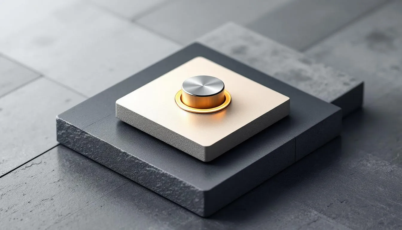
Gilded Blueprint 📐
There is an undeniable luxury in the combination of gold and deep, ink-like darks. This arrangement speaks to the heritage of drafting tables and precision engineering, where brass instruments met dark ledgers. Brushed Brass brings a warmth usually absent in tech products, elevating the interface from a mere utility to an executive tool. When paired with Midnight Ink and the technical precision of Blueprint Cyan, the result is an aesthetic of high-value craft. It suggests that the data being viewed is precious. This serves financial tech or executive overview suites exceptionally well, offering a visual experience that mirrors the solidity of a bank vault or a bespoke timepiece. It communicates trust through material wealth associations.
Clay & Carbon 🧱
Perhaps the most surprising entry, this collection abandons the coldness of tech entirely for something earthen and sculpted. It introduces warmth through Umber Clay and Terracotta, grounding the digital experience in the natural world. This is the satisfying friction of unglazed ceramic or the matte finish on high-end consumer electronics. Carbon Black and Silver Ash ensure the text remains legible and crisp, but the surrounding atmosphere is inviting rather than stark. It challenges the expectation that professional software must be blue. Instead, it offers a workspace that feels like a modern studio—creative, warm, and human-centric. This fits project management tools or creative collaboration platforms where the user creates rather than just analyzes.
Bringing the physical world into the pixelated one transforms how we perceive digital labor. These color stories prove that efficiency does not require sterility. By introducing the implied textures of felt, gold, and oxidized metal, we give the user a subconscious anchor. The screen ceases to be a flat plane of light and becomes a workspace with depth, weight, and personality. As we continue to refine this soft industrial approach, the boundary between the tool in our hand and the software on our screen becomes permeable. We start to feel the software, not just see it. This shift makes long hours in a dashboard less fatiguing and more engaging, treating the user as a craftsman rather than a mere operator.