'%3e%3cpath%20fill-rule='evenodd'%20clip-rule='evenodd'%20d='M51.1303%2019.2492C50.7278%2019.913%2050.1346%2020.4426%2049.3508%2020.838C48.5669%2021.2335%2047.6172%2021.4312%2046.5014%2021.4312C44.8208%2021.4312%2043.4367%2021.0216%2042.3492%2020.2025C41.2617%2019.3833%2040.6686%2018.2394%2040.5697%2016.7706H44.4253C44.4818%2017.3355%2044.6831%2017.7804%2045.0291%2018.1052C45.3751%2018.43%2045.8164%2018.5924%2046.3531%2018.5924C46.8192%2018.5924%2047.1864%2018.4653%2047.4547%2018.2111C47.7231%2017.9569%2047.8572%2017.618%2047.8572%2017.1943C47.8572%2016.8129%2047.7337%2016.4952%2047.4865%2016.241C47.2393%2015.9867%2046.9322%2015.7784%2046.565%2015.616C46.1978%2015.4536%2045.6893%2015.2594%2045.0397%2015.0334C44.0934%2014.7086%2043.3202%2014.3944%2042.72%2014.0907C42.1197%2013.7871%2041.6042%2013.3351%2041.1735%2012.7349C40.7427%2012.1347%2040.5273%2011.3544%2040.5273%2010.394C40.5273%209.50418%2040.7533%208.73448%2041.2053%208.08481C41.6572%207.43515%2042.2821%206.93731%2043.0801%206.5913C43.8781%206.24528%2044.7925%206.07227%2045.8235%206.07227C47.49%206.07227%2048.8141%206.46771%2049.7956%207.25861C50.7772%208.04951%2051.3315%209.13698%2051.4586%2010.5211H47.5395C47.4689%2010.0268%2047.2888%209.63483%2046.9993%209.3453C46.7097%209.05578%2046.3178%208.91102%2045.8235%208.91102C45.3998%208.91102%2045.0573%209.024%2044.7961%209.24997C44.5348%209.47594%2044.4041%209.80783%2044.4041%2010.2457C44.4041%2010.5988%2044.5207%2010.8989%2044.7537%2011.146C44.9867%2011.3932%2045.2798%2011.5944%2045.6328%2011.7498C45.9859%2011.9052%2046.4944%2012.1029%2047.1581%2012.343C48.1185%2012.6678%2048.9023%2012.9891%2049.5096%2013.3069C50.1169%2013.6246%2050.6395%2014.0872%2051.0773%2014.6945C51.5151%2015.3018%2051.734%2016.0927%2051.734%2017.0672C51.734%2017.8581%2051.5328%2018.5854%2051.1303%2019.2492ZM59.0242%206.3053V21.2829H55.4016V6.3053H59.0242ZM73.9409%206.3053V9.18642H69.8734V21.2829H66.2296V9.18642H62.2046V6.3053H73.9409ZM80.7438%209.18642V12.3218H85.8069V15.0546H80.7438V18.3806H86.4425V21.2829H77.1212V6.3053H86.4425V9.18642H80.7438ZM99.667%2016.0291V21.2829H96.0444V6.3053H101.913C103.692%206.3053%20105.048%206.74665%20105.98%207.62934C106.912%208.51204%20107.378%209.7019%20107.378%2011.199C107.378%2012.1311%20107.17%2012.9609%20106.753%2013.6882C106.337%2014.4155%20105.719%2014.9875%20104.9%2015.4042C104.08%2015.8208%20103.085%2016.0291%20101.913%2016.0291H99.667ZM103.692%2011.199C103.692%209.8855%20102.965%209.22879%20101.51%209.22879H99.667V13.1268H101.51C102.965%2013.1268%20103.692%2012.4842%20103.692%2011.199ZM120.092%2018.5501H114.478L113.546%2021.2829H109.732L115.219%206.41123H119.393L124.879%2021.2829H121.024L120.092%2018.5501ZM119.16%2015.7961L117.295%2010.2881L115.41%2015.7961H119.16ZM131.555%2018.5077H136.385V21.2829H127.933V6.3053H131.555V18.5077ZM143.337%209.18642V12.3218H148.4V15.0546H143.337V18.3806H149.035V21.2829H139.714V6.3053H149.035V9.18642H143.337ZM163.507%206.3053V9.18642H159.44V21.2829H155.796V9.18642H151.771V6.3053H163.507ZM177.449%206.3053V9.18642H173.382V21.2829H169.738V9.18642H165.713V6.3053H177.449ZM184.252%209.18642V12.3218H189.315V15.0546H184.252V18.3806H189.951V21.2829H180.629V6.3053H189.951V9.18642H184.252Z'%20fill='%23EEF0ED'/%3e%3cmask%20id='mask0_3101_7327'%20style='mask-type:alpha'%20maskUnits='userSpaceOnUse'%20x='0'%20y='0'%20width='27'%20height='28'%3e%3cpath%20d='M23.8328%200.759766H2.64808C1.18559%200.759766%200%201.94535%200%203.40785V24.5925C0%2026.055%201.18559%2027.2406%202.64808%2027.2406H23.8328C25.2952%2027.2406%2026.4808%2026.055%2026.4808%2024.5925V3.40785C26.4808%201.94535%2025.2952%200.759766%2023.8328%200.759766Z'%20fill='white'/%3e%3c/mask%3e%3cg%20mask='url(%23mask0_3101_7327)'%3e%3cpath%20d='M23.8328%200.759766H2.64808C1.18559%200.759766%200%201.94535%200%203.40785V24.5925C0%2026.055%201.18559%2027.2406%202.64808%2027.2406H23.8328C25.2952%2027.2406%2026.4808%2026.055%2026.4808%2024.5925V3.40785C26.4808%201.94535%2025.2952%200.759766%2023.8328%200.759766Z'%20fill='%23D8D8D8'/%3e%3cpath%20d='M13.2404%200.759766H0V14.0001H13.2404V0.759766Z'%20fill='%238C61FF'/%3e%3cpath%20d='M13.2404%2014H0V27.2404H13.2404V14Z'%20fill='%2336C3FE'/%3e%3cpath%20d='M26.4806%2014H13.2402V27.2404H26.4806V14Z'%20fill='%236592FE'/%3e%3cpath%20d='M26.4806%200.759766H13.2402V14.0002H26.4806V0.759766Z'%20fill='%236059F7'/%3e%3c/g%3e%3c/g%3e%3cdefs%3e%3cclipPath%20id='clip0_3101_7327'%3e%3crect%20width='190'%20height='28'%20fill='white'/%3e%3c/clipPath%3e%3c/defs%3e%3c/svg%3e)
'%3e%3cpath%20d='M23.8328%200.759521H2.64808C1.18559%200.759521%200%201.94511%200%203.40761V24.5923C0%2026.0548%201.18559%2027.2404%202.64808%2027.2404H23.8328C25.2952%2027.2404%2026.4808%2026.0548%2026.4808%2024.5923V3.40761C26.4808%201.94511%2025.2952%200.759521%2023.8328%200.759521Z'%20fill='%23D8D8D8'/%3e%3cpath%20d='M13.2404%200.759521H0V13.9999H13.2404V0.759521Z'%20fill='%238C61FF'/%3e%3cpath%20d='M13.2404%2013.9998H0V27.2402H13.2404V13.9998Z'%20fill='%2336C3FE'/%3e%3cpath%20d='M26.4809%2013.9998H13.2405V27.2402H26.4809V13.9998Z'%20fill='%236592FE'/%3e%3cpath%20d='M26.4809%200.759277H13.2405V13.9997H26.4809V0.759277Z'%20fill='%236059F7'/%3e%3c/g%3e%3c/svg%3e)
The Versatility of Silver: Its Influence Across Seasons
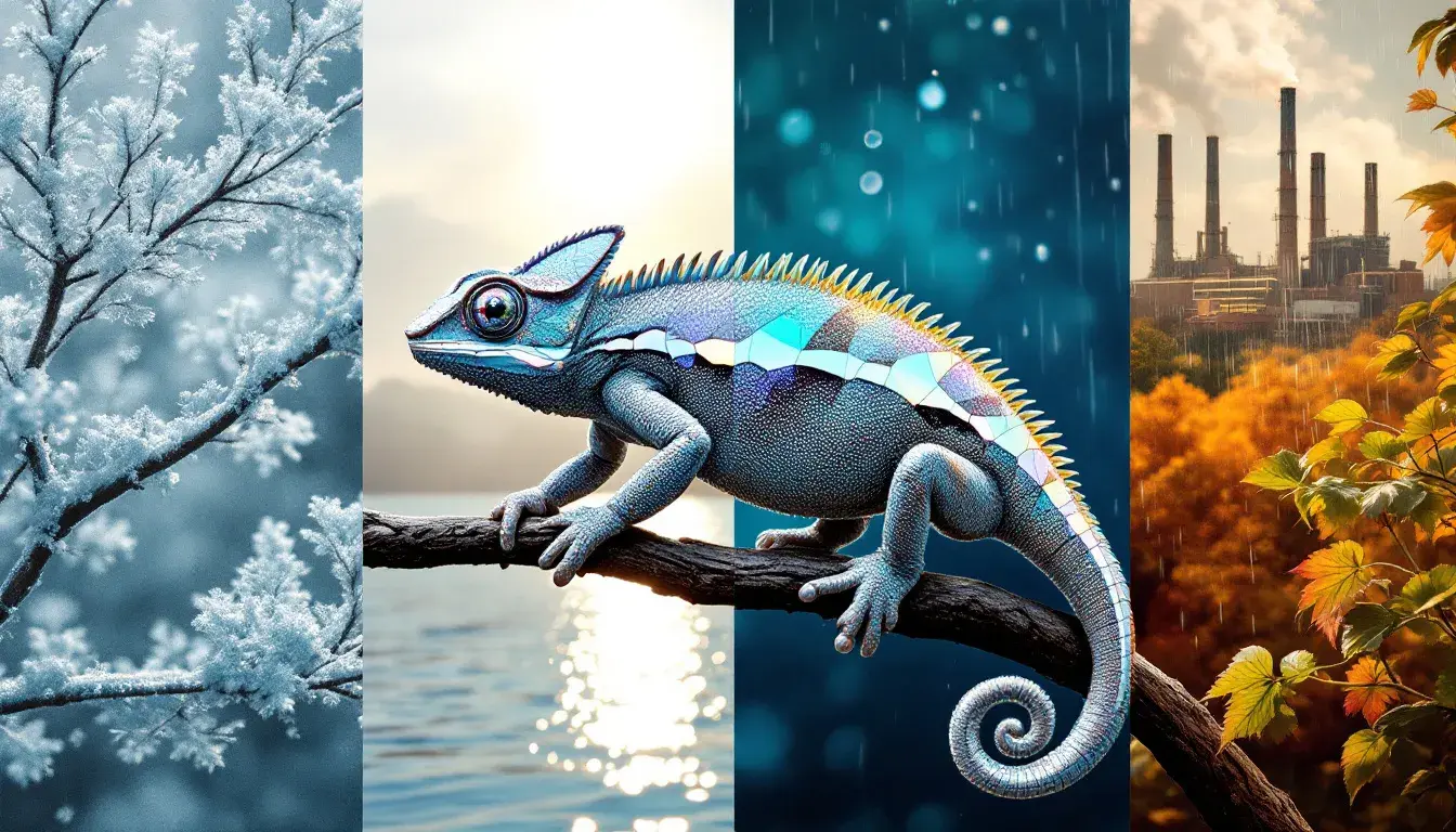
26 Sep 2025 · 3 min readSilver, or the idea of it, shifts with the light. It's never simply a color, but a reflection—of frost on a winter branch, the glint of sunlight on summer water, the cool industrial edge of autumn machinery, or the subtle sheen of a spring rain shower. More than just a metallic tone, silver is a chameleon, adapting to and enhancing whatever surrounds it. It speaks of sleek modernity but also whispers of timeless elegance. It can be both assertive and demure, a quiet backdrop or a dazzling highlight. Consider how easily silver jewelry complements almost any outfit, how a silver frame can elevate a photograph, or how silver lettering adds a touch of class to an invitation. This adaptability makes it a constant, yet ever-changing, presence throughout the year, influencing not just visuals but also the feeling of spaces, the perception of materials, and even the mood of occasions. The capacity of this singular tone to capture light and translate it into distinct seasonal experiences is truly remarkable.
The "Modern Edge" palette presents silver – here, a Light Silver Gray – as a grounding force amidst bolder declarations. Pure White leads, suggesting a blank canvas ready for impact. The Bright Coral Red and Steel Blue introduce a calculated tension, a push and pull between warmth and coolness, energy and stability. The Deep Black and Dark Teal Blue anchors the composition with a sense of gravity. Neutral Gray offers a bridge between extremes. This interplay makes "Modern Edge" feel ideally suited for transitional seasons. Think of early autumn, where the last bursts of summer color meet the approaching coolness of winter, or late spring, when the landscape is a complex mix of budding greens and lingering browns. Visualise this combination as the lobby of a contemporary art museum, or a cutting-edge tech company. It’s a space where innovation meets sophistication, where the Light Silver Gray provides a quiet backdrop allowing the other elements to step forward and command attention. It brings to mind the reflective surfaces of modern architecture, the sleek lines of minimalist furniture, or the subtle sheen of metallic accents. It suggests a sharp contrast, where the raw edges of industrial materials meet the refined details of high-end design. The overall effect is one of understated confidence coupled with a forward-looking vision.
"Verdant Contrast" introduces Light Silver as an understated support role against a bolder gesture: the vibrant dance of greens. Pure White sets the stage with airy lightness. The Bright Mint immediately captures attention, acting as a beacon of freshness and revitalization. The Deep Forest Green brings balance back offering grounding stability. The Medium Gray and Charcoal Black define the edges. Picture this palette in the context of spring: it is the crispness of the morning air, the unfurling of new leaves, and the sense of renewed vibrancy that permeates the season. The Light Silver here enhances the natural world, echoing the subtle sheen of morning dew on grass and the reflective surface of water. The cool tones suggest a sense of calm energy, not unlike the revitalizing atmosphere just after a spring rain. This balance would translate seamlessly to the world of wellness retreats and spas. It suggests the calming influence of natural light filtering through trees or the serenity of a garden sanctuary, where the brightness of the mint contrasts beautifully with the deep, grounding forest green. This feels like the perfect embodiment of the earth reawakening.
With the "Modern Contrast" palette, Light Silver acts as a refined, somewhat muted counterpoint to the richer hues. The Pure White provides a crisp spaciousness. The Pale Yellow and Golden Yellow hints at warmth, suggesting the glow of late-afternoon sunlight. The Dusty Rose and Bright Crimson provide the depth. The Azure Blue stands out with an intriguing counterpoint, a refreshing coolness amidst the overall warmth. The Neutral Gray, Deep Charcoal and Dark Maroon add shades to enhance the palette. This palette resonates across multiple seasons. It could capture the feeling of a late-summer evening, where the warm hues of the setting sun meet the cool air, or the ambiance of a winter holiday party, where the shimmer of silver accents complements the rich colors of decorations. It evokes the sophisticated atmosphere of a modern art gallery or a high-end retail space. It imagines the texture of silk scarves and cashmere sweaters, the smooth surfaces of polished stone, and the subtle gleam of metallic details. This arrangement of colors creates a feeling of calm luxury, where the Light Silver adds a touch of contemporary elegance.
The "Elegant Greyscale" palette presents silver in its purest expression, almost a study in light and reflection, highlighting the core of the 'silver' concept. Pure White is juxtaposed with Deep Black. Medium Gray and Charcoal Gray provides shadow. The resulting composition feels both minimalist and luxurious. This palette speaks most clearly during winter. The way snow reflects the light on a clear, cold day. It evokes a sense of quiet, refined beauty. Think of the icy landscape or the frost on bare tree branches. "Elegant Greyscale" conveys a sense of timeless sophistication. The Light Silver here is not just a color, but a representation of a mood: cool, calm, and collected. This palette could inform the interiors of a modern penthouse. It evokes the smooth surfaces of glass and steel; the understated beauty of natural stone; the soft texture of wool and cashmere.
Silver's true strength lies not in its inherent qualities, but in its ability to play a supporting role. It's a quiet yet powerful presence, able to amplify the beauty of other colors, to reflect the mood of different seasons, and to add a touch of elegance. From the modern edge of technology to the tranquil stillness of a winter landscape, silver's adaptability makes it an indispensable element in any palette, always ready to transform.