'%3e%3cpath%20fill-rule='evenodd'%20clip-rule='evenodd'%20d='M51.1303%2019.2492C50.7278%2019.913%2050.1346%2020.4426%2049.3508%2020.838C48.5669%2021.2335%2047.6172%2021.4312%2046.5014%2021.4312C44.8208%2021.4312%2043.4367%2021.0216%2042.3492%2020.2025C41.2617%2019.3833%2040.6686%2018.2394%2040.5697%2016.7706H44.4253C44.4818%2017.3355%2044.6831%2017.7804%2045.0291%2018.1052C45.3751%2018.43%2045.8164%2018.5924%2046.3531%2018.5924C46.8192%2018.5924%2047.1864%2018.4653%2047.4547%2018.2111C47.7231%2017.9569%2047.8572%2017.618%2047.8572%2017.1943C47.8572%2016.8129%2047.7337%2016.4952%2047.4865%2016.241C47.2393%2015.9867%2046.9322%2015.7784%2046.565%2015.616C46.1978%2015.4536%2045.6893%2015.2594%2045.0397%2015.0334C44.0934%2014.7086%2043.3202%2014.3944%2042.72%2014.0907C42.1197%2013.7871%2041.6042%2013.3351%2041.1735%2012.7349C40.7427%2012.1347%2040.5273%2011.3544%2040.5273%2010.394C40.5273%209.50418%2040.7533%208.73448%2041.2053%208.08481C41.6572%207.43515%2042.2821%206.93731%2043.0801%206.5913C43.8781%206.24528%2044.7925%206.07227%2045.8235%206.07227C47.49%206.07227%2048.8141%206.46771%2049.7956%207.25861C50.7772%208.04951%2051.3315%209.13698%2051.4586%2010.5211H47.5395C47.4689%2010.0268%2047.2888%209.63483%2046.9993%209.3453C46.7097%209.05578%2046.3178%208.91102%2045.8235%208.91102C45.3998%208.91102%2045.0573%209.024%2044.7961%209.24997C44.5348%209.47594%2044.4041%209.80783%2044.4041%2010.2457C44.4041%2010.5988%2044.5207%2010.8989%2044.7537%2011.146C44.9867%2011.3932%2045.2798%2011.5944%2045.6328%2011.7498C45.9859%2011.9052%2046.4944%2012.1029%2047.1581%2012.343C48.1185%2012.6678%2048.9023%2012.9891%2049.5096%2013.3069C50.1169%2013.6246%2050.6395%2014.0872%2051.0773%2014.6945C51.5151%2015.3018%2051.734%2016.0927%2051.734%2017.0672C51.734%2017.8581%2051.5328%2018.5854%2051.1303%2019.2492ZM59.0242%206.3053V21.2829H55.4016V6.3053H59.0242ZM73.9409%206.3053V9.18642H69.8734V21.2829H66.2296V9.18642H62.2046V6.3053H73.9409ZM80.7438%209.18642V12.3218H85.8069V15.0546H80.7438V18.3806H86.4425V21.2829H77.1212V6.3053H86.4425V9.18642H80.7438ZM99.667%2016.0291V21.2829H96.0444V6.3053H101.913C103.692%206.3053%20105.048%206.74665%20105.98%207.62934C106.912%208.51204%20107.378%209.7019%20107.378%2011.199C107.378%2012.1311%20107.17%2012.9609%20106.753%2013.6882C106.337%2014.4155%20105.719%2014.9875%20104.9%2015.4042C104.08%2015.8208%20103.085%2016.0291%20101.913%2016.0291H99.667ZM103.692%2011.199C103.692%209.8855%20102.965%209.22879%20101.51%209.22879H99.667V13.1268H101.51C102.965%2013.1268%20103.692%2012.4842%20103.692%2011.199ZM120.092%2018.5501H114.478L113.546%2021.2829H109.732L115.219%206.41123H119.393L124.879%2021.2829H121.024L120.092%2018.5501ZM119.16%2015.7961L117.295%2010.2881L115.41%2015.7961H119.16ZM131.555%2018.5077H136.385V21.2829H127.933V6.3053H131.555V18.5077ZM143.337%209.18642V12.3218H148.4V15.0546H143.337V18.3806H149.035V21.2829H139.714V6.3053H149.035V9.18642H143.337ZM163.507%206.3053V9.18642H159.44V21.2829H155.796V9.18642H151.771V6.3053H163.507ZM177.449%206.3053V9.18642H173.382V21.2829H169.738V9.18642H165.713V6.3053H177.449ZM184.252%209.18642V12.3218H189.315V15.0546H184.252V18.3806H189.951V21.2829H180.629V6.3053H189.951V9.18642H184.252Z'%20fill='%23EEF0ED'/%3e%3cmask%20id='mask0_3101_7327'%20style='mask-type:alpha'%20maskUnits='userSpaceOnUse'%20x='0'%20y='0'%20width='27'%20height='28'%3e%3cpath%20d='M23.8328%200.759766H2.64808C1.18559%200.759766%200%201.94535%200%203.40785V24.5925C0%2026.055%201.18559%2027.2406%202.64808%2027.2406H23.8328C25.2952%2027.2406%2026.4808%2026.055%2026.4808%2024.5925V3.40785C26.4808%201.94535%2025.2952%200.759766%2023.8328%200.759766Z'%20fill='white'/%3e%3c/mask%3e%3cg%20mask='url(%23mask0_3101_7327)'%3e%3cpath%20d='M23.8328%200.759766H2.64808C1.18559%200.759766%200%201.94535%200%203.40785V24.5925C0%2026.055%201.18559%2027.2406%202.64808%2027.2406H23.8328C25.2952%2027.2406%2026.4808%2026.055%2026.4808%2024.5925V3.40785C26.4808%201.94535%2025.2952%200.759766%2023.8328%200.759766Z'%20fill='%23D8D8D8'/%3e%3cpath%20d='M13.2404%200.759766H0V14.0001H13.2404V0.759766Z'%20fill='%238C61FF'/%3e%3cpath%20d='M13.2404%2014H0V27.2404H13.2404V14Z'%20fill='%2336C3FE'/%3e%3cpath%20d='M26.4806%2014H13.2402V27.2404H26.4806V14Z'%20fill='%236592FE'/%3e%3cpath%20d='M26.4806%200.759766H13.2402V14.0002H26.4806V0.759766Z'%20fill='%236059F7'/%3e%3c/g%3e%3c/g%3e%3cdefs%3e%3cclipPath%20id='clip0_3101_7327'%3e%3crect%20width='190'%20height='28'%20fill='white'/%3e%3c/clipPath%3e%3c/defs%3e%3c/svg%3e)
'%3e%3cpath%20d='M23.8328%200.759521H2.64808C1.18559%200.759521%200%201.94511%200%203.40761V24.5923C0%2026.0548%201.18559%2027.2404%202.64808%2027.2404H23.8328C25.2952%2027.2404%2026.4808%2026.0548%2026.4808%2024.5923V3.40761C26.4808%201.94511%2025.2952%200.759521%2023.8328%200.759521Z'%20fill='%23D8D8D8'/%3e%3cpath%20d='M13.2404%200.759521H0V13.9999H13.2404V0.759521Z'%20fill='%238C61FF'/%3e%3cpath%20d='M13.2404%2013.9998H0V27.2402H13.2404V13.9998Z'%20fill='%2336C3FE'/%3e%3cpath%20d='M26.4809%2013.9998H13.2405V27.2402H26.4809V13.9998Z'%20fill='%236592FE'/%3e%3cpath%20d='M26.4809%200.759277H13.2405V13.9997H26.4809V0.759277Z'%20fill='%236059F7'/%3e%3c/g%3e%3c/svg%3e)
Retro Revival: Exploring the Color Palette of Industries Through Time
26 Sep 2025 · 5 min readThe past whispers in colors, a visual echo of the industries that shaped our world. Not just monuments and technologies, but the very hues that defined their ambitions, aesthetics, and consumer appeal. Think of streamlined locomotives, gleaming chrome reflecting a bold optimism, or the smoky blues of jazz halls, hinting at late nights and artistic rebellion. These weren't accidental choices – they were deliberate expressions of a brand, a moment, a collective mood. To revisit them now is to enter a time capsule, unlocking sensations and stories that continue to influence design today. Colors, powerful and coded, give us vivid access. This is about more than just nostalgia; it's about understanding the language of the past to inform the present and anticipate the aesthetics of tomorrow. Like carefully curated vintage shops or remixed soundtracks, color palettes can be creatively revived and reinterpreted for a contemporary audience. The following selections provide a journey through distinct industrial landscapes, showcasing how color has always been a powerful force in shaping our perceptions of progress and aspiration.
"Modern Elegance" presents a fascinating synthesis of old and new. Pure White leads the way, a stark canvas upon which the other shades play. Light Gray anchors the palette in a grounded neutrality, hinting at polished concrete and minimalist design. From there: a sudden spark of energy with Burnt Orange, a flash of sunset against steel and glass. Aqua Teal whispers of innovation, of clean lines and transparent interfaces. Lime Green, vibrant and unexpected, injects a vital, almost bio-futuristic quality. Vivid Raspberry adds a pop of audacious confidence. Teal Green, Russet Brown, Deep Indigo, and Deep Charcoal ground the composition, offering a sense of established authority and thoughtful restraint. Taken together, “Modern Elegance” evokes a high-end tech firm that favors natural light and commissioned art. It's the lobby of a sustainable skyscraper on a crisp autumn day. To revive this palette means more than replicating specific tones. It means channeling the ethos of understated luxury and responsible innovation. Imagine a campaign for electric vehicles, using these colors to project both environmental consciousness and a sophisticated understanding of design.
"Betting Blueprint" conjures the atmosphere of calculated risk and strategic ambition. Bright Gold shimmers with the promise of reward. It is restrained, not ostentatious, suggesting informed financial acumen. Light Lavender introduces an unexpected air of sophistication, a calculated attempt to soften the severity of the core business. Steel Gray provides a structural backbone, a foundation of logic and analytical rigor. Olive Green quietly alludes to growth, an organic metaphor in a world of spreadsheets and algorithms. Dark Brown acts as a counterweight, grounding the palette in a sense of legacy, heritage, and established tradition. Reviving "Betting Blueprint" for modern use demands restraint. It's not about gaudy displays of wealth, but instead the quiet confidence that comes from meticulous planning. Imagine a fintech startup whose branding relies on this color story: conveying trust and reliability while hinting at the revolutionary potential of their technology. This palette's power lies in its ability to project seriousness, strategy, and a subtly daring ambition.
"Modern Contrast" feels distinctly urban, a study in the interplay of natural and artificial elements. Golden Tan invokes sun-baked brick and weathered signage, the soul of a city with historical roots. Sky Blue offers a counterpoint of openness, of digital space and limitless possibility above the skyline. Russet Brown connects us to the materiality of our surroundings—aged leather, patinated metal, the comforting weight of heritage. Muted Gray speaks to the sleek anonymity of contemporary architecture, while Deep Forest provides a grounding element, introducing nature into the technological landscape. To revive "Modern Contrast" is to celebrate the beauty of juxtaposition: old versus new, organic versus engineered. Consider a social media campaign for an urban development project. It should use these colors to tell a story of harmonious integration, of preserving the past while embracing the future. "Modern Contrast" suggests a world that honors its heritage while simultaneously pushing boundaries, a concept as timeless as the colors themselves.
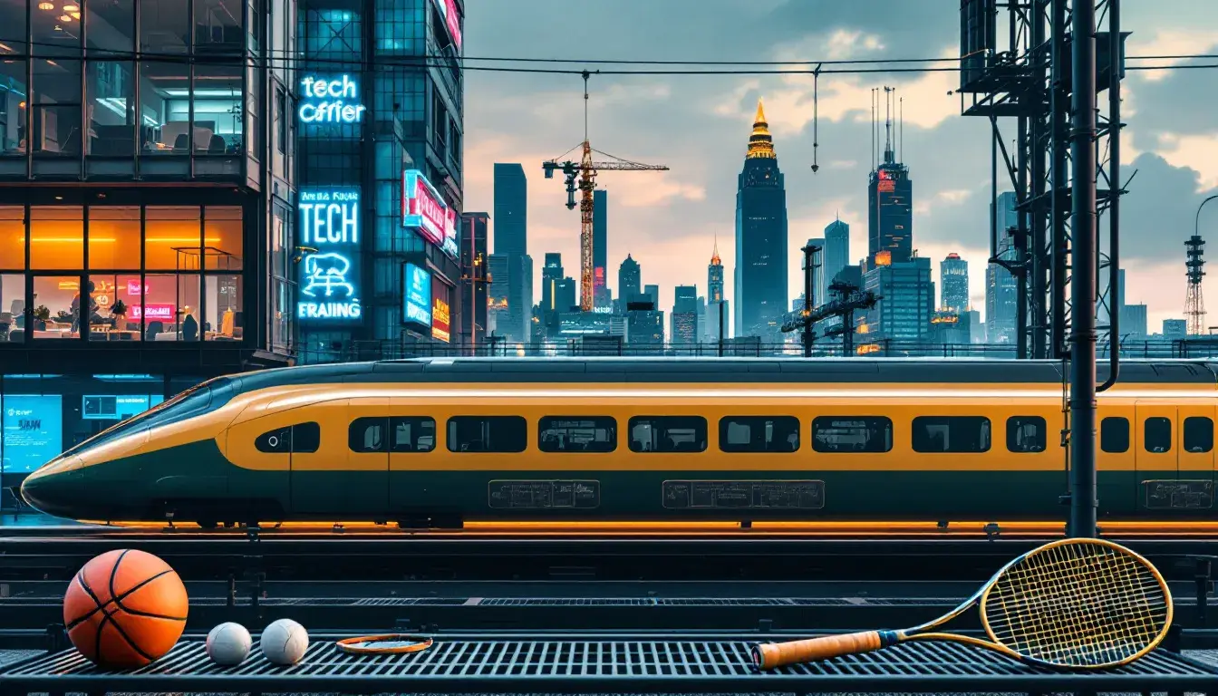
"Energetic Sport" is an adrenaline surge translated into color. Electric Green screams of action, of sudden bursts of speed and impossible feats of athleticism. Powder Blue softens the edge, like a cool towel after a strenuous workout or the crisp air of a mountaintop vista. Neutral Gray provides a steadfast foundation, the unwavering focus required to push past limitations. Deep Teal nods to both the natural world and cutting-edge technology, drawing a line between peak physical performance and the data-driven age of sports optimization. Dark Slate adds a touch of seriousness, the discipline and mental fortitude necessary to achieve victory. Bringing back "Energetic Sport" isn't about simply mimicking neon hues. Instead, focus on capturing the essence of movement, the feeling of pushing your body to its limits, and the sense of accomplishment that follows. Imagine using this palette for a new line of fitness trackers, highlighting their ability to quantify personal progress and transform everyday movement into meaningful data. Its energy is undeniable, a visual reminder that boundaries are meant to be broken.
These palettes remind us that the "Retro Revival" is not just about repeating the past. It's about remixing it. Color becomes a bridge: thoughtfully referencing the styles and spirit of specific industries, then reimagining these qualities for a contemporary setting. The hues we choose become storytellers, whispering of bygone eras while simultaneously pointing towards exciting innovations. Rather than simply replicating, we should strive to understand the context that gave these colors meaning, then use that knowledge to create something entirely new. It's about finding the resonance between then and now, creating designs that feel both familiar and forward-looking. Ultimately, the power of these palettes lies in their power to connect us to something bigger than ourselves: a timeline of industrial innovation, cultural shifts, and collective aspirations, all expressed through the universal language of color.