'%3e%3cpath%20fill-rule='evenodd'%20clip-rule='evenodd'%20d='M51.1303%2019.2492C50.7278%2019.913%2050.1346%2020.4426%2049.3508%2020.838C48.5669%2021.2335%2047.6172%2021.4312%2046.5014%2021.4312C44.8208%2021.4312%2043.4367%2021.0216%2042.3492%2020.2025C41.2617%2019.3833%2040.6686%2018.2394%2040.5697%2016.7706H44.4253C44.4818%2017.3355%2044.6831%2017.7804%2045.0291%2018.1052C45.3751%2018.43%2045.8164%2018.5924%2046.3531%2018.5924C46.8192%2018.5924%2047.1864%2018.4653%2047.4547%2018.2111C47.7231%2017.9569%2047.8572%2017.618%2047.8572%2017.1943C47.8572%2016.8129%2047.7337%2016.4952%2047.4865%2016.241C47.2393%2015.9867%2046.9322%2015.7784%2046.565%2015.616C46.1978%2015.4536%2045.6893%2015.2594%2045.0397%2015.0334C44.0934%2014.7086%2043.3202%2014.3944%2042.72%2014.0907C42.1197%2013.7871%2041.6042%2013.3351%2041.1735%2012.7349C40.7427%2012.1347%2040.5273%2011.3544%2040.5273%2010.394C40.5273%209.50418%2040.7533%208.73448%2041.2053%208.08481C41.6572%207.43515%2042.2821%206.93731%2043.0801%206.5913C43.8781%206.24528%2044.7925%206.07227%2045.8235%206.07227C47.49%206.07227%2048.8141%206.46771%2049.7956%207.25861C50.7772%208.04951%2051.3315%209.13698%2051.4586%2010.5211H47.5395C47.4689%2010.0268%2047.2888%209.63483%2046.9993%209.3453C46.7097%209.05578%2046.3178%208.91102%2045.8235%208.91102C45.3998%208.91102%2045.0573%209.024%2044.7961%209.24997C44.5348%209.47594%2044.4041%209.80783%2044.4041%2010.2457C44.4041%2010.5988%2044.5207%2010.8989%2044.7537%2011.146C44.9867%2011.3932%2045.2798%2011.5944%2045.6328%2011.7498C45.9859%2011.9052%2046.4944%2012.1029%2047.1581%2012.343C48.1185%2012.6678%2048.9023%2012.9891%2049.5096%2013.3069C50.1169%2013.6246%2050.6395%2014.0872%2051.0773%2014.6945C51.5151%2015.3018%2051.734%2016.0927%2051.734%2017.0672C51.734%2017.8581%2051.5328%2018.5854%2051.1303%2019.2492ZM59.0242%206.3053V21.2829H55.4016V6.3053H59.0242ZM73.9409%206.3053V9.18642H69.8734V21.2829H66.2296V9.18642H62.2046V6.3053H73.9409ZM80.7438%209.18642V12.3218H85.8069V15.0546H80.7438V18.3806H86.4425V21.2829H77.1212V6.3053H86.4425V9.18642H80.7438ZM99.667%2016.0291V21.2829H96.0444V6.3053H101.913C103.692%206.3053%20105.048%206.74665%20105.98%207.62934C106.912%208.51204%20107.378%209.7019%20107.378%2011.199C107.378%2012.1311%20107.17%2012.9609%20106.753%2013.6882C106.337%2014.4155%20105.719%2014.9875%20104.9%2015.4042C104.08%2015.8208%20103.085%2016.0291%20101.913%2016.0291H99.667ZM103.692%2011.199C103.692%209.8855%20102.965%209.22879%20101.51%209.22879H99.667V13.1268H101.51C102.965%2013.1268%20103.692%2012.4842%20103.692%2011.199ZM120.092%2018.5501H114.478L113.546%2021.2829H109.732L115.219%206.41123H119.393L124.879%2021.2829H121.024L120.092%2018.5501ZM119.16%2015.7961L117.295%2010.2881L115.41%2015.7961H119.16ZM131.555%2018.5077H136.385V21.2829H127.933V6.3053H131.555V18.5077ZM143.337%209.18642V12.3218H148.4V15.0546H143.337V18.3806H149.035V21.2829H139.714V6.3053H149.035V9.18642H143.337ZM163.507%206.3053V9.18642H159.44V21.2829H155.796V9.18642H151.771V6.3053H163.507ZM177.449%206.3053V9.18642H173.382V21.2829H169.738V9.18642H165.713V6.3053H177.449ZM184.252%209.18642V12.3218H189.315V15.0546H184.252V18.3806H189.951V21.2829H180.629V6.3053H189.951V9.18642H184.252Z'%20fill='%23EEF0ED'/%3e%3cmask%20id='mask0_3101_7327'%20style='mask-type:alpha'%20maskUnits='userSpaceOnUse'%20x='0'%20y='0'%20width='27'%20height='28'%3e%3cpath%20d='M23.8328%200.759766H2.64808C1.18559%200.759766%200%201.94535%200%203.40785V24.5925C0%2026.055%201.18559%2027.2406%202.64808%2027.2406H23.8328C25.2952%2027.2406%2026.4808%2026.055%2026.4808%2024.5925V3.40785C26.4808%201.94535%2025.2952%200.759766%2023.8328%200.759766Z'%20fill='white'/%3e%3c/mask%3e%3cg%20mask='url(%23mask0_3101_7327)'%3e%3cpath%20d='M23.8328%200.759766H2.64808C1.18559%200.759766%200%201.94535%200%203.40785V24.5925C0%2026.055%201.18559%2027.2406%202.64808%2027.2406H23.8328C25.2952%2027.2406%2026.4808%2026.055%2026.4808%2024.5925V3.40785C26.4808%201.94535%2025.2952%200.759766%2023.8328%200.759766Z'%20fill='%23D8D8D8'/%3e%3cpath%20d='M13.2404%200.759766H0V14.0001H13.2404V0.759766Z'%20fill='%238C61FF'/%3e%3cpath%20d='M13.2404%2014H0V27.2404H13.2404V14Z'%20fill='%2336C3FE'/%3e%3cpath%20d='M26.4806%2014H13.2402V27.2404H26.4806V14Z'%20fill='%236592FE'/%3e%3cpath%20d='M26.4806%200.759766H13.2402V14.0002H26.4806V0.759766Z'%20fill='%236059F7'/%3e%3c/g%3e%3c/g%3e%3cdefs%3e%3cclipPath%20id='clip0_3101_7327'%3e%3crect%20width='190'%20height='28'%20fill='white'/%3e%3c/clipPath%3e%3c/defs%3e%3c/svg%3e)
'%3e%3cpath%20d='M23.8328%200.759521H2.64808C1.18559%200.759521%200%201.94511%200%203.40761V24.5923C0%2026.0548%201.18559%2027.2404%202.64808%2027.2404H23.8328C25.2952%2027.2404%2026.4808%2026.0548%2026.4808%2024.5923V3.40761C26.4808%201.94511%2025.2952%200.759521%2023.8328%200.759521Z'%20fill='%23D8D8D8'/%3e%3cpath%20d='M13.2404%200.759521H0V13.9999H13.2404V0.759521Z'%20fill='%238C61FF'/%3e%3cpath%20d='M13.2404%2013.9998H0V27.2402H13.2404V13.9998Z'%20fill='%2336C3FE'/%3e%3cpath%20d='M26.4809%2013.9998H13.2405V27.2402H26.4809V13.9998Z'%20fill='%236592FE'/%3e%3cpath%20d='M26.4809%200.759277H13.2405V13.9997H26.4809V0.759277Z'%20fill='%236059F7'/%3e%3c/g%3e%3c/svg%3e)
Golden Zenith: A Year-Over-Year Analysis of Yellow's Prevalence
26 Sep 2025 · 3 min readThe allure of yellow is a complicated thing. Sometimes a bolt of summer sunshine on a rain-slicked street, other times a warning sign, sharply contrasting against softer hues. It’s the flavor of lemon sorbet enjoyed in the shade of a Tuscan summer, and the flash of gold in a Byzantine icon. From subtle to striking, the presence, or absence, of yellow speaks to larger shifts in our collective desires and aesthetic sensibilities. We look to palettes to mirror the changing world, the rise and fall of cultural ideals, the yearning for experiences that shift with each passing year. Here we consider a journey through a set of palettes, tracking yellow’s captivating narrative across time, like a painter studying the changing light.
Stepping into the "Mobile Sauna" palette, a sanctuary of warmth appears nestled amidst cool tones. Imagine the pure white of freshly fallen snow against the bright yellow glow emanating from the sauna itself—a beacon promising respite. The pale yellow hinting at gentle heat and the bright yellow declares the full, revitalizing embrace. The forest green evokes the surrounding woodlands, the dark olive whispering earthiness. Vivid blue adds a jolt of cold contrast, the imagined crisp air of the Nordic winter before re-entry into the steam. It's a marriage of opposites, where the magenta pink feels playful and unexpected, like the first blush on cheeks after intense heat. The palette echoes the experience of contrast itself, the push and pull of extremes that define sensory awakening. This palette suggests immersion: allowing oneself to be thoroughly enveloped, whether by heat, color, or the stark beauty of winter’s landscape, the deep indigo of a twilight sky a muted promise for renewal. The light gray and dark gray are grounding elements, suggesting the solid construction that allows such an experience to exist. This palette offers an experience—a ritual, both ancient and thoroughly modern, a brief escape, a balm.
The "Vibrant Contrast" palette presents a compelling visual statement, leaning into the drama of opposition. Golden yellow, the undeniable star, doesn't whisper; it declares itself with confidence, like the last rays of sun clinging to autumn leaves. The teal blue provides a necessary coolness, a calming counterpoint to the yellow’s warmth. Brick red injects a dose of earthy passion, the memory of sun-baked terracotta underfoot. Off white acts as a canvas, allowing its neighboring colors to fully express themselves without overwhelming the senses, like the quiet interlude between musical crescendos. The deep charcoal feels like the grounded perspective of a master craftsman’s touch. The overall impression is one of dynamic equilibrium—colors vying for attention yet ultimately balanced. It’s a palette that speaks to bold choices, the willingness to pair unexpected elements and embrace the frisson that results, the inherent tension between opposing forces. It feels like the moment of creative friction.
In the "Vibrant Chaos" palette, one finds a playful disregard for convention, a delightful explosion of color that refuses to be confined. The vibrancy is indeed the point, a celebration of contrasts and unexpected pairings that somehow, miraculously, work. Vibrant yellow grabs attention without demanding it, holding its own amidst the bold landscape of hues. Lime green provides a jolt of electric energy. Salmon pink softens the edges, whispering of sunsets and fleeting beauty. Cool gray acts as a grounding influence, a touch of sophistication amidst the exuberance. Teal green hints at hidden depths. Crimson red is unabashedly bold, injecting passion. The royal blue is a splash of majestic whimsy, a mischievous wink. Deep indigo anchors the palette, the still, calm center holding the chaos in place. And all of this plays against the backdrop of pure white, giving everything room to breathe, a limitless canvas. Slate gray emerges as a stabilizing force. This is not a palette for the faint of heart; it's a call to embrace the unconventional, to find beauty in unexpected places, to revel in the freedom of unapologetic expression.
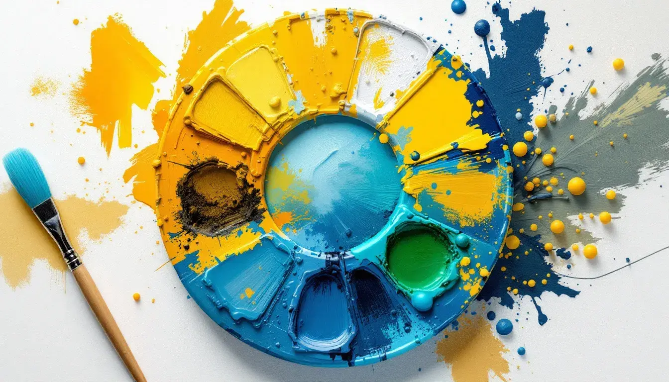
The "Tech Palette" presents a futuristic vision, reminiscent of sleek interfaces and the promise of innovation. Here, golden yellow pulses with energy, as information streams across glowing screens. A softer bright yellow whispers of user-friendly interfaces, intuitive interactions. Electric cyan crackles with possibility, the thrill of discovery found in every keystroke. Vivid blue grounds the palette, a deep, reassuring presence like a mainframe humming in a secure server room. Periwinkle blue suggests a sense of calm focus, the ability to navigate complex systems with ease. The grayish taupe adds a touch of human warmth, bridging the gap between technology and our everyday existence. Intense red provides that flash of urgency, the potential consequences in every action. Dusty brown, offers a certain grounded presence. And the foundations? Pure white providing a clean slate, and deep charcoal, offering a subtle hint of shadowy possibilities. This palette appeals to those who embrace the constant flux of the digital age, the melding of human ingenuity and computer precision. This a world on the brink of evolution.
Ultimately, these palettes reveal that color transcends mere aesthetics. They reflect the evolving currents of culture, the collective yearnings, the subtle shifts in our relationship with the world around us. Each palette tells a story, offering a glimpse into the zeitgeist of its moment. From the quiet escape offered by the "Mobile Sauna", to the audacious energy of "Vibrant Chaos", they offer us not just colors, but curated experiences. The tech palette provides a view into our digital frontier; and the "Vibrant Contrast" a bold claim. The subtle variances of the yellows, the ways they harmonize or clash with surrounding hues, invite us to reflect on our relationship with this most evocative of colors, and what its presence, or absence, says about the world we are creating.