Brightness Level Preferences Across Different Styles
26 Sep 2025 · 3 min readColor has the power to whisper secrets of mood, to define space, and to shape experience. It's a primal language, understood on an instinctive level. Within interior design, it’s more than just decoration: it dictates atmosphere, influences emotion, and gives tangible form to intangible feelings. The delicate interplay of dark and light is a key element manipulating these responses. Think of a cavernous room drenched in pale, diffused light – it inspires a completely different feeling than an intimate space cloaked in shadows, punctuated by flickers of intense color. The choices we make regarding the intensity of light, its presence or absence, are inextricably linked to the style narratives rooms are telling. How do different design sensibilities approach and manipulate light, and what narratives do the results build? These palettes offer glimpses into that conversation, each a world created with shadows and brightness.
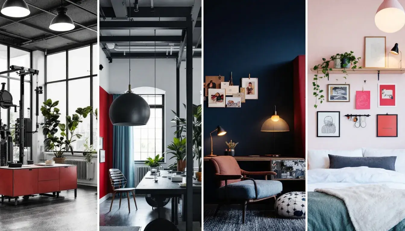
The Spartan Spirit emerges as a study in contrasts, a place where a Pale Beige attempts to lighten the weight of Midnight Blue and Ebony Black. The palette possesses a muted energy, conjuring images of a gymnasium bathed in the cool, steely light of dawn. It’s a palette suggestive of spaces built for focused exertion, where physical activity takes center stage. Think of exposed brick walls painted a light Neutral Gray, offsetting the intensity of exercise equipment rendered in Vivid Green. The echoes of a basketball bouncing off the court, the determined expressions of athletes pushing their limits – these are the sensory details that this color story supports. One imagines a web design for a sports-related brand using this palette to convey both the discipline required for athletic success. The shadows deepen the commitment, while the lighter shades create space for movement and energy. The overall feeling is of resilient strength, of the focused intensity found within controlled spaces.
Betting Blueprint reveals a space of calculated risks, where a sudden flash of Bright Gold might illuminate the careful considerations cast in colors of Steel Gray, Olive Green, and Dark Brown. This feels like the hush of a private study, leather-bound books lining the walls, beneath a single, focused light. The Light Lavender softens the angles in the scene, but the overall impression remains serious, built for strategy. Imagine a financial firm's presentation, using these colors to indicate security and innovation. The palette is well-suited to spaces dedicated to intellectual pursuits, where clear thinking is paramount. This is a world of controlled illumination, where shadows are deep but information is always visible. In a minimalist interior, a single piece of art or a statement lamp in Bright Gold could be the critical pivot point pulling focus against the stillness represented by the darker tones.
Eclectic Mix, a play on textures and tones, offers a glimpse into a world where Golden Yellow dances with Light Coral, and where Dark Moss and Charcoal Gray ground the space. The palette hums with an understated energy, recalling the interior of a creative studio awash in the soft, diffused light of a late afternoon. It suggests an easy tension between vintage and modern, where a plush velvet sofa in Dusty Taupe might sit alongside sleek, minimalist shelving. Envision a living room brought to life through these shades, featuring a mural bathed in Golden Yellow. The palette gives space to casual conversation, the sharing of ideas, and the simple pleasure of creating. It suits spaces where spontaneity is encouraged, where the unexpected is always welcome. The mix is not chaotic, but curated: a collection of found objects and treasured pieces arranged to invite creative exploration.
Subtle Sophistication unfolds like a hushed conversation, where Mint Green intersects with Rose Beige, and where Crimson Red adds an unexpected spark. This palette whispers of understated elegance, evoking the atmosphere of a bedroom designed for quiet contemplation. Muted Gray grounds the space, while the Dark Graphite reinforces the sense of intimate enclosure. Imagine a website using these colors to project a feeling of trust. The palette encourages a sense of calm, suggesting a space where one can retreat from the outside world. It’s a refuge built on soft textures and diffused light, where shadows deepen the sense of peace. This is a color landscape stripped down to its most essential elements, designed to nurture a feeling of relaxed sophistication.
These palettes, each a miniature world, suggest something pivotal: light isn't simply about illumination, but about crafting a particular kind of drama. Whether it's the focused glow in a study, the playful diffusion in a creative space, or the bold contrasts in a gym, its careful arrangement molds mood. Spaces are built not just with walls and furnishings, but with the dance of luminosity and shadow. Each palette showcases a kind of conversation, one held between the designers and the very nature of existence.