'%3e%3cpath%20fill-rule='evenodd'%20clip-rule='evenodd'%20d='M51.1303%2019.2492C50.7278%2019.913%2050.1346%2020.4426%2049.3508%2020.838C48.5669%2021.2335%2047.6172%2021.4312%2046.5014%2021.4312C44.8208%2021.4312%2043.4367%2021.0216%2042.3492%2020.2025C41.2617%2019.3833%2040.6686%2018.2394%2040.5697%2016.7706H44.4253C44.4818%2017.3355%2044.6831%2017.7804%2045.0291%2018.1052C45.3751%2018.43%2045.8164%2018.5924%2046.3531%2018.5924C46.8192%2018.5924%2047.1864%2018.4653%2047.4547%2018.2111C47.7231%2017.9569%2047.8572%2017.618%2047.8572%2017.1943C47.8572%2016.8129%2047.7337%2016.4952%2047.4865%2016.241C47.2393%2015.9867%2046.9322%2015.7784%2046.565%2015.616C46.1978%2015.4536%2045.6893%2015.2594%2045.0397%2015.0334C44.0934%2014.7086%2043.3202%2014.3944%2042.72%2014.0907C42.1197%2013.7871%2041.6042%2013.3351%2041.1735%2012.7349C40.7427%2012.1347%2040.5273%2011.3544%2040.5273%2010.394C40.5273%209.50418%2040.7533%208.73448%2041.2053%208.08481C41.6572%207.43515%2042.2821%206.93731%2043.0801%206.5913C43.8781%206.24528%2044.7925%206.07227%2045.8235%206.07227C47.49%206.07227%2048.8141%206.46771%2049.7956%207.25861C50.7772%208.04951%2051.3315%209.13698%2051.4586%2010.5211H47.5395C47.4689%2010.0268%2047.2888%209.63483%2046.9993%209.3453C46.7097%209.05578%2046.3178%208.91102%2045.8235%208.91102C45.3998%208.91102%2045.0573%209.024%2044.7961%209.24997C44.5348%209.47594%2044.4041%209.80783%2044.4041%2010.2457C44.4041%2010.5988%2044.5207%2010.8989%2044.7537%2011.146C44.9867%2011.3932%2045.2798%2011.5944%2045.6328%2011.7498C45.9859%2011.9052%2046.4944%2012.1029%2047.1581%2012.343C48.1185%2012.6678%2048.9023%2012.9891%2049.5096%2013.3069C50.1169%2013.6246%2050.6395%2014.0872%2051.0773%2014.6945C51.5151%2015.3018%2051.734%2016.0927%2051.734%2017.0672C51.734%2017.8581%2051.5328%2018.5854%2051.1303%2019.2492ZM59.0242%206.3053V21.2829H55.4016V6.3053H59.0242ZM73.9409%206.3053V9.18642H69.8734V21.2829H66.2296V9.18642H62.2046V6.3053H73.9409ZM80.7438%209.18642V12.3218H85.8069V15.0546H80.7438V18.3806H86.4425V21.2829H77.1212V6.3053H86.4425V9.18642H80.7438ZM99.667%2016.0291V21.2829H96.0444V6.3053H101.913C103.692%206.3053%20105.048%206.74665%20105.98%207.62934C106.912%208.51204%20107.378%209.7019%20107.378%2011.199C107.378%2012.1311%20107.17%2012.9609%20106.753%2013.6882C106.337%2014.4155%20105.719%2014.9875%20104.9%2015.4042C104.08%2015.8208%20103.085%2016.0291%20101.913%2016.0291H99.667ZM103.692%2011.199C103.692%209.8855%20102.965%209.22879%20101.51%209.22879H99.667V13.1268H101.51C102.965%2013.1268%20103.692%2012.4842%20103.692%2011.199ZM120.092%2018.5501H114.478L113.546%2021.2829H109.732L115.219%206.41123H119.393L124.879%2021.2829H121.024L120.092%2018.5501ZM119.16%2015.7961L117.295%2010.2881L115.41%2015.7961H119.16ZM131.555%2018.5077H136.385V21.2829H127.933V6.3053H131.555V18.5077ZM143.337%209.18642V12.3218H148.4V15.0546H143.337V18.3806H149.035V21.2829H139.714V6.3053H149.035V9.18642H143.337ZM163.507%206.3053V9.18642H159.44V21.2829H155.796V9.18642H151.771V6.3053H163.507ZM177.449%206.3053V9.18642H173.382V21.2829H169.738V9.18642H165.713V6.3053H177.449ZM184.252%209.18642V12.3218H189.315V15.0546H184.252V18.3806H189.951V21.2829H180.629V6.3053H189.951V9.18642H184.252Z'%20fill='%23EEF0ED'/%3e%3cmask%20id='mask0_3101_7327'%20style='mask-type:alpha'%20maskUnits='userSpaceOnUse'%20x='0'%20y='0'%20width='27'%20height='28'%3e%3cpath%20d='M23.8328%200.759766H2.64808C1.18559%200.759766%200%201.94535%200%203.40785V24.5925C0%2026.055%201.18559%2027.2406%202.64808%2027.2406H23.8328C25.2952%2027.2406%2026.4808%2026.055%2026.4808%2024.5925V3.40785C26.4808%201.94535%2025.2952%200.759766%2023.8328%200.759766Z'%20fill='white'/%3e%3c/mask%3e%3cg%20mask='url(%23mask0_3101_7327)'%3e%3cpath%20d='M23.8328%200.759766H2.64808C1.18559%200.759766%200%201.94535%200%203.40785V24.5925C0%2026.055%201.18559%2027.2406%202.64808%2027.2406H23.8328C25.2952%2027.2406%2026.4808%2026.055%2026.4808%2024.5925V3.40785C26.4808%201.94535%2025.2952%200.759766%2023.8328%200.759766Z'%20fill='%23D8D8D8'/%3e%3cpath%20d='M13.2404%200.759766H0V14.0001H13.2404V0.759766Z'%20fill='%238C61FF'/%3e%3cpath%20d='M13.2404%2014H0V27.2404H13.2404V14Z'%20fill='%2336C3FE'/%3e%3cpath%20d='M26.4806%2014H13.2402V27.2404H26.4806V14Z'%20fill='%236592FE'/%3e%3cpath%20d='M26.4806%200.759766H13.2402V14.0002H26.4806V0.759766Z'%20fill='%236059F7'/%3e%3c/g%3e%3c/g%3e%3cdefs%3e%3cclipPath%20id='clip0_3101_7327'%3e%3crect%20width='190'%20height='28'%20fill='white'/%3e%3c/clipPath%3e%3c/defs%3e%3c/svg%3e)
'%3e%3cpath%20d='M23.8328%200.759521H2.64808C1.18559%200.759521%200%201.94511%200%203.40761V24.5923C0%2026.0548%201.18559%2027.2404%202.64808%2027.2404H23.8328C25.2952%2027.2404%2026.4808%2026.0548%2026.4808%2024.5923V3.40761C26.4808%201.94511%2025.2952%200.759521%2023.8328%200.759521Z'%20fill='%23D8D8D8'/%3e%3cpath%20d='M13.2404%200.759521H0V13.9999H13.2404V0.759521Z'%20fill='%238C61FF'/%3e%3cpath%20d='M13.2404%2013.9998H0V27.2402H13.2404V13.9998Z'%20fill='%2336C3FE'/%3e%3cpath%20d='M26.4809%2013.9998H13.2405V27.2402H26.4809V13.9998Z'%20fill='%236592FE'/%3e%3cpath%20d='M26.4809%200.759277H13.2405V13.9997H26.4809V0.759277Z'%20fill='%236059F7'/%3e%3c/g%3e%3c/svg%3e)
The Rise of Monochromatic Modernism: A Deep Dive into Monochromatic Colors with a Modern Style
25 Sep 2025 · 3 min readMonochromatic modernism isn't just about grayscale; it’s a study in controlled expression. Color, reduced to a single hue and its variations, becomes a powerful tool for shaping space and mood. It allows textures and forms to command attention, lending a serene and deliberate feel to interiors and designs. Think of the hushed elegance of a gallery, or the quiet authority of a minimalist workspace. It’s about subtracting the superfluous to discover richness in the essential. The palettes explored here offer avenues for achieving this effect, each with its own personality and potential. They are not merely selections of colors, but curated atmospheres, offering possibilities for creation.
Corporate Harmony suggests a working environment where focus and creativity coexist. Pure White, the anchor, is balanced by a progression of increasingly saturated hues. Deep Indigo and Neutral Gray offer grounded, serious notes, while Sky Blue and Bright Green, offset with Golden Yellow and Magenta-Rose, introduce moments of inspiration and upliftment. Soft Gray-Green is an interesting counterpoint to the expected monochrome, hinting at organic forms peeking through a polished surface. Dark Sienna adds a touch of the unexpected, like a vintage leather chair in a tech startup. The overall effect is a space that feels both cutting-edge and comfortingly familiar, suited perhaps to a firm that values both innovation and tradition. The careful distribution of color intensity prevents any one shade from overwhelming the others, resulting in a workspace that fosters concentration without feeling sterile, where a collaborative environment feels both approachable and orderly. These colors can evoke the feeling of trust and expertise.
Warm Contrast offers a compelling take on minimalist interiors. Pure White meets Onyx Black in a dance of opposites, softened by the earthy undertones of Sandy Brown, Taupe Gray and Burnt Umber. This combination allows for bolder silhouettes in furniture and decor, as the color narrative doesn't compete for attention. Touches such as Lemon Yellow, Bright Orange, Steel Blue, and Vivid Blue bring energy to the scheme, but within strictly controlled measures, preventing the space from feeling chaotic. Magenta Purple is an accent that speaks to individuality, yet still falls into the modern desire for visual reduction. The palette suggests an environment that is both welcoming and sophisticated — a living room where conversation flows easily, or an office designed to inspire focused work. The controlled introduction of color ensures that the focus remains on form and texture. This palette provides an invitation to quiet evenings and intellectual inspiration, reflecting curated comfort.
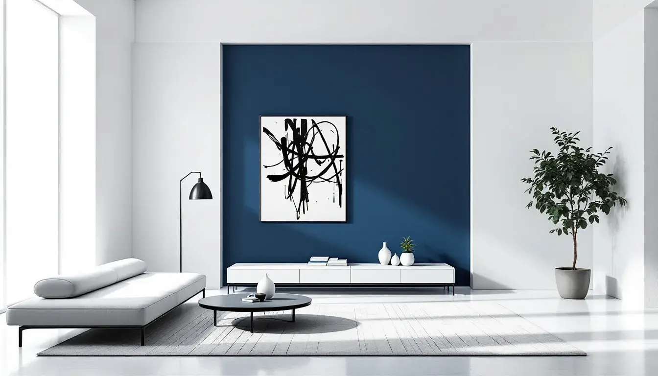
Modern Contrast presents a strong statement. The juxtaposition of Pure White and Jet Black creates a stark canvas, ready for carefully chosen additions. A striking array of colors provide moments of intrigue. Golden Yellow draws in the eye, as the Lavender Blue gives the sense of futuristic technology balanced with nature. Teal Green is an unexpected natural touch, working well with the overall scheme of the darker shades. Magenta Pink and Bright Red act as carefully positioned exclamation points, breaking up potential monotony, while Burgundy offers a grounding counterpoint. Light Gray and Dark Gray add depth, preventing the contrast from feeling too clinical. This palette would suit a space that values bold design and isn’t afraid to make a statement. Think of a gallery showcasing avant-garde art or a tech company’s headquarters. The palette encourages clear thinking, but it also holds space to show a unique personality.
Subtle Contrast offers a particularly nuanced vision of monochromatic modernism. It does not rely on high drama, but rather on the quiet interplay of tones. Pure White anchors the scheme, while Light Gray, Medium Gray, Dark Charcoal, and Deep Black create a gentle cascade of shades. Mustard Yellow and Olive Green introduce organic notes, hinting at the outside world, as Deep Red and Bright Blue act as delicate, controlled moments of surprise. Sky Blue brings a futuristic tone, while remaining a safe choice for the scheme. This palette lends itself to calm spaces: a peaceful office, a minimalist living room, or a gallery designed for contemplative viewing. The overall effect is one of understated sophistication, allowing texture and form to come into their own. The controlled introduction of color creates visual and tactile balance, resulting in an environment that invites contemplation, while avoiding a severe aesthetic.
Across these divergent palettes, a trend emerges. Pure White, the canvas, is the most recurring choice, but the inclusion of darker monochrome provides balance. The controlled use of color—never overwhelming, always deliberate—allows for the creation of serene, sophisticated environments. While maintaining a modern tone, each palette provides an opportunity to create something timeless.