The Classic Touch: Top 3 Most Frequenct Dominant Colors for 'Classic' palettes
25 Sep 2025 · 4 min readThe pursuit of timeless elegance often begins with color. A whisper of parchment, the deep sigh of aged leather, the glint of polished silver—these are the sensations that define the classic aesthetic. It’s a world of quiet confidence, of legacy and enduring style. Within the vast landscape of color, certain palettes stand out, not for their boldness, but for their restraint, their ability to evoke a sense of history and refined taste. These are the colors that clad stately homes and line the shelves of venerable libraries, hues that speak of lineage and whispered stories. We seek to understand these dominant classic shades. Finding the most recurrent of these gentle, yet powerful, colors is not simply about aesthetics, it is about understanding how generations have shaped our visual understanding of sophistication. Colors in the classic mood transcend fleeting fads; they are the bedrock upon which enduring style is built. These are the shades that compose the atmosphere of tradition. Thinking about color this way lets us build visual experiences, and stories, that last.
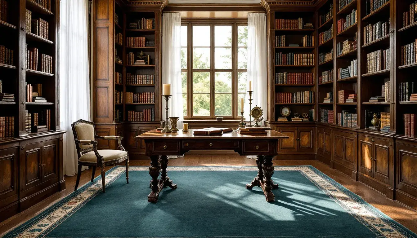
The Scholarly Palette 🎓 is akin to entering an old university library; the air is still and scented with old paper and leather. Pale White, like the aged pages of treasured books, is prominent. Mustard Yellow, appearing like brass desk lamps casting pools of gentle light, speaks of a studious atmosphere. Ocean Blue and Royal Blue, deep and unwavering, present the weight of knowledge. Charcoal Gray lends its strength, much as the stone walls of a monument to learning. The experience of this palette is one of measured consideration; each color contributes to the steady feeling of a sanctuary dedicated to thought. This is a reserved array of colors, the sort that encourages deep attention. Thinking about classic style in this sense reveals a pathway centered around the enduring power of knowledge. The balanced application of these shades crafts a space where intellectual curiosity not only thrives but feels natural.
The Senatorial Palette 🏛️ evokes a deep sense of order and considered judgment. These are colors of deliberation, of grand halls and hushed voices. These are the colors of legislative process and timeless tradition. Light Gray emerges as a neutral foundation, suggesting the impartiality sought in halls of law and public life. Slate Grey brings to mind tailored suits. Olive Drab, a subtle echo of the natural world, hints at the weight of the land and its resources. Burgundy Red introduces a touch of regality, like the flash of a silk lining or an antique chair. Deep Charcoal acts as an anchor, representing steadfast principles. These choices coalesce to create an atmosphere of studied composure and the gravity of important decision-making. It’s a palette that says power should be thoughtful, and decisions should be well considered. This palette can inspire spaces that feel at once powerful and dignified, spaces where weighty discussions happen, where the future is debated with careful and measured words.
The Gridiron Palette 🏈, at first glance, may seem an unexpected inclusion; it evokes the dynamism of the arena, but on a deeper level, it speaks to the classic virtues of strength, strategy, and enduring spirit. Golden Khaki and Grayish Beige provide a sense of history, of weathered leather and sun-faded stadium seats. Brick Red brings the flash of ambition and heated competition. Dark Teal introduces an element of measured contemplation. Blackish Brown provides a grounding force, suggesting the earth and the hard-won victories that build legacies. This palette is not merely about sporting contests. Instead, it is about heritage. The way these colors combine tells a story about the dedication to the game, about the lasting values that define a team and its connection to a wider tradition. Its classic style echoes the strength, rigor, and time-worn appeal of the field.
With Earthy Elegance 🍂 we see a vision of luxury tempered by nature, style that’s both sophisticated and grounded. Imagine a drawing room filled with antique furniture, bathed in the light of the afternoon sun. Pale Yellow introduces the first hint of warmth. Khaki Green follows, speaking of forests and aged tapestries. Grayish Taupe brings the grounding influence of stone, of a building that has lived through the ages. Dark Olive brings the touch of polished wood. Charcoal Gray brings contrast and sophistication. This palette invites a sense of calm, of quiet beauty. These colors bring a sense of enduring allure and timeless grace. The style brings a sense of serenity.
So, what can discerning eyes draw from these classic palettes? We gain an appreciation of history, of order, strength, and timelessness. White provides a canvas for elegance, a sense of clarity. Dark muted colors and charcoals speak of sophistication, a nod to the weight of tradition, while the spectrum of nature's most enduring tones brings a sense of serenity and comfort. Combining these observations allows us to see the subtle, often unseen, foundations upon which truly enduring aesthetics are built. Classic style, then, is not a rigid adherence to rules, but a sensitivity to the nuances of tradition, and an ability to craft stories that will last.